 Have you ever wanted to create a bubble chart using JavaScript but did not know how? Then this tutorial is for you! Carry on reading to learn more about bubble charts and how we can build them quickly and painlessly.
Bubble charts are an extension of the scatter plot. Most commonly, they display three variables which are expressed as the horizontal distance of the point (x), the vertical distance of the point (y), and the size of the point (z). A bubble chart is a great visualization technique to let users compare data points. When designed well, it can be really eye-catching and engaging.
In this tutorial, I will teach you how to build your very own interactive JS bubble chart and bring it to life through customization. All examples will be available with the full code.
For this “getting started” guide, I have decided to explore the data of the top 30 grossing movies. Let’s look at the amount of money each movie has grossed, the budget, as well as the year of release. A bubble chart is a particularly good choice for the visualization of this dataset as it will allow us to easily compare these three numeric variables in an interesting and beautiful way.
Bubble Chart to Be Created
Building JavaScript Bubble Chart
Building a JavaScript bubble chart can be done by following these four easy steps:
- Create an HTML page.
- Add the necessary scripts.
- Load the data that will be visualized.
- Draw the chart.
1. Create an HTML page
The first thing we need to do is set up an HTML page as well as add an HTML container to host our data visualization. This is done as follows:
<!DOCTYPE html>
<html>
  <head>
    <title>JavaScript Bubble Chart</title>
    <style>
      html,
      body,
      #container {
        width: 100%;
        height: 100%;
        margin: 0;
        padding: 0;
      }
    </style>
  </head>
  <body>
    <div id="container"></div>
    <script>
        // chart code goes here
    </script>
  </body>
</html>
There are two things I would like to highlight here. First and most important, there is a div element that I have named container. This is a block level element in which we will be drawing our chart.
Second, I have written CSS rules to manage the appearance of our container element. These particular rules will ensure that our JavaScript-based bubble chart occupies the entire page.
2. Add the necessary scripts
The second item on the list is adding the necessary scripts.
We will be using the AnyChart JS Charts library which will allow us to build our visualizations quickly and easily. It is a lightweight, strong, and flexible charting solution, free for non-profit use.
In order to use AnyChart, we need to reference its base script. As we will be loading our data from an external JSON source, we should also reference AnyChart’s data adapter script.
<script src="https://cdn.anychart.com/releases/v8/js/anychart-base.min.js"></script>
<script src="https://cdn.anychart.com/releases/v8/js/anychart-data-adapter.min.js"></script>
3. Load the data we are going to be visualizing
We will be visualizing data from the IMDb movie data set available on Kaggle.com. Kaggle has a number of user-provided datasets covering a wide range of applications. For convenience, I have already pre-processed the data by dropping unused variables as well as renaming the ones we will be using to make them recognized by AnyChart. In particular, I have renamed the release year as x, the budget as value and the amount grossed as size. The data is available as a JSON file which can be found here.
Uploading and using this data could be tricky. But AnyChart’s library provides a number of solutions for working with data — JSON, CSV, and even Google Sheets, and more.
In our situation, we need to use the following code to load the data:
anychart.data.loadJsonFile('data.json', function (data) {
  // chart code goes here
})
The code for drawing our chart will be placed within the data loading function. This will ensure that our chart is only drawn once the data is loaded.
So far, with everything included, we have the following:
<!DOCTYPE html>
<html>
  <head>
    <title>JavaScript Bubble Chart</title>
    <style>
      html,
      body,
      #container {
        width: 100%;
        height: 100%;
        margin: 0;
        padding: 0;
      }
    </style>
    <script src="https://cdn.anychart.com/releases/v8/js/anychart-base.min.js"></script>
    <script src="https://cdn.anychart.com/releases/v8/js/anychart-data-adapter.min.js"></script>
  </head>
  <body>
    <div id="container" style="width: 100%; height: 100%"></div>
    <script>
      anychart.data.loadJsonFile('data.json', function (data) {
        // chart code goes here
      })
    </script>
  </body>
</html>
4. Draw the chart
Finally, we get to drawing our chart.
The whole chart code must be written within the anychart.onDocumentReady() function. This function is executed when the page is loaded.
anychart.onDocumentReady(function() {

  // load data
  anychart.data.loadJsonFile('data.json', function (data) {

    // create a chart
    chart = anychart.bubble(data);
    // set a chart title
    chart.title("Top 30 Grossing Movies");
    // set titles for axes
    chart.xAxis().title("Years");
    chart.yAxis().title("Budget");
    // draw the chart
    chart.container("container").draw();

  })

});
And this is the result:
How easy was that? With the help of AnyChart, we’ve built a basic bubble chart rather effortlessly. Here’s the final code of this data visualization:
<!DOCTYPE html>
<html>
  <head>
    <title>JavaScript Bubble Chart</title>
    <style>
      html,
      body,
      #container {
        width: 100%;
        height: 100%;
        margin: 0;
        padding: 0;
      }
    </style>
    <script src="https://cdn.anychart.com/releases/v8/js/anychart-base.min.js"></script>
    <script src="https://cdn.anychart.com/releases/v8/js/anychart-data-adapter.min.js"></script>
  </head>
  <body>
    <div id="container" style="width: 100%; height: 100%"></div>
    <script>anychart.onDocumentReady(function() {

      // load data
      anychart.data.loadJsonFile('data.json', function (data) {

        // create a chart
        chart = anychart.bubble(data);
        // set a chart title
        chart.title("Top 30 Grossing Movies");
        // set titles for axes
        chart.xAxis().title("Years");
        chart.yAxis().title("Budget");
        // draw the chart
        chart.container("container").draw();

      })

    });
    </script>
  </body>
</html>
Customizing Bubble Chart Appearance
There are a number of ways to customize our newly made data visualization. We could use CSS to modify the HTML elements. But AnyChart comes with a variety of easy-to-implement and chart-specific customization options via its API. Let’s take a look at some of these.
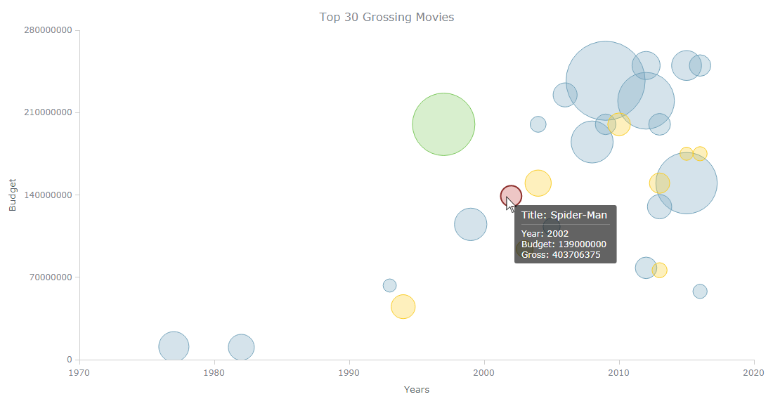
Tooltip
To begin with, let’s customize the bubble chart’s tooltip. The tooltip is the information we see when hovering over a data point. AnyChart’s API allows us to customize the title and the body of the tooltip independently. To include a variable from a point, we will use a special syntax: {%variable_name}.
The following code adds the movie title as well as the other correct variable names to the tooltip:
var tooltip = chart.tooltip();
tooltip.titleFormat("Title: {%title}");
tooltip.format("Year: {%x} \nBudget: {%value} \nGross: {%size}");
Color
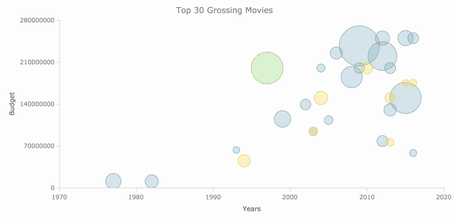
As I mentioned before, bubble charts are great at visualizing three variables. This can be extended further by changing the color of the points based on a fourth variable. In our case, we can visualize the movie genre as the fourth one.
In order to customize the color like that using a fourth variable, first we need to separate our dataset into different series based on the genre. We can achieve this by using a JavaScript filter function:
var data_sci_fi = data.filter(function(entry) {
  return entry.genres === "Sci-Fi/Fantasy";
});

var data_animation = data.filter(function(entry) {
  return entry.genres === "Animation";
});

var data_other = data.filter(function(entry) {
  return entry.genres === "Other";
});
Now that we have different series, we can customize the appearance of each.
The following code changes the stroke and fill of each series making them different. For an in-depth explanation of the API, please have a look at the documentation which can be found here.
var series1 = chart.bubble(data_sci_fi);
series1.normal().fill("#74A4BC", 0.3);
series1.hovered().fill("#C3423F", 0.3);
series1.selected().fill("#C3423F", 0.3);
series1.normal().stroke("#74A4BC", 1);
series1.hovered().stroke("#8E312E", 2);
series1.selected().stroke("#8E312E", 2);

var series2 = chart.bubble(data_animation);
series2.normal().fill("#FACD26", 0.3);
series2.hovered().fill("#C3423F", 0.3);
series2.selected().fill("#C3423F", 0.3);
series2.normal().stroke("#FACD26", 1);
series2.hovered().stroke("#8E312E", 2);
series2.selected().stroke("#8E312E", 2);

var series3 = chart.bubble(data_other);
series3.normal().fill("#7DC95E", 0.3);
series3.hovered().fill("#C3423F", 0.3);
series3.selected().fill("#C3423F", 0.3);
series3.normal().stroke("#7DC95E", 1);
series3.hovered().stroke("#8E312E", 2);
series3.selected().stroke("#8E312E", 2);
Bubble size
Another aspect which is important to know how to customize when making bubble charts is setting the minimum and maximum bubble sizes. In our dataset, there is quite a large variation between the largest and smallest points. Another issue we have is that some of these points are way too large and dominate the visualization.
We can change these minimum and maximum values with the following code:
chart.minBubbleSize("2%");
chart.maxBubbleSize("12%");
And with these changes applied, have a look at our bubble chart now:
The bubble chart shows quite a clear, and quite expected, pattern of the top grossing movies’ budgets increasing as well as newer movies making more money. What is more interesting, however, is that Sci-Fi/Fantasy and Animation clearly dominate this list with Titanic being the outlier in terms of genre!
Here’s the full code of the final customized bubble chart we have just created using JavScript (HTML5):
<!DOCTYPE html>
<html>
  <head>
    <title>JavaScript Bubble Chart</title>
    <style>
      html,
      body,
      #container {
        width: 100%;
        height: 100%;
        margin: 0;
        padding: 0;
      }
    </style>
    <script src="https://cdn.anychart.com/releases/v8/js/anychart-base.min.js"></script>
    <script src="https://cdn.anychart.com/releases/v8/js/anychart-data-adapter.min.js"></script>
  </head>
  <body>
    <div id="container" style="width: 100%; height: 100%"></div>
    <script>anychart.onDocumentReady(function() {

      // load data
      anychart.data.loadJsonFile('data.json', function (data) {

        // create a chart
        chart = anychart.bubble(data);
        // set a chart title
        chart.title("Top 30 Grossing Movies");
        // set titles for axes
        chart.xAxis().title("Years");
        chart.yAxis().title("Budget");

        // customize the tooltip
        var tooltip = chart.tooltip();
        tooltip.titleFormat("Title: {%title}");
        tooltip.format("Year: {%x} \nBudget: {%value} \nGross: {%size}");

        // separate data into different series based on genre

        var data_sci_fi = data.filter(function(entry) {
          return entry.genres === "Sci-Fi/Fantasy";
        });

        var data_animation = data.filter(function(entry) {
          return entry.genres === "Animation";
        });

        var data_other = data.filter(function(entry) {
          return entry.genres === "Other";
        });

        // customize the appearance of each series

        var series1 = chart.bubble(data_sci_fi);
        series1.normal().fill("#74A4BC", 0.3);
        series1.hovered().fill("#C3423F", 0.3);
        series1.selected().fill("#C3423F", 0.3);
        series1.normal().stroke("#74A4BC", 1);
        series1.hovered().stroke("#8E312E", 2);
        series1.selected().stroke("#8E312E", 2);

        var series2 = chart.bubble(data_animation);
        series2.normal().fill("#FACD26", 0.3);
        series2.hovered().fill("#C3423F", 0.3);
        series2.selected().fill("#C3423F", 0.3);
        series2.normal().stroke("#FACD26", 1);
        series2.hovered().stroke("#8E312E", 2);
        series2.selected().stroke("#8E312E", 2);

        var series3 = chart.bubble(data_other);
        series3.normal().fill("#7DC95E", 0.3);
        series3.hovered().fill("#C3423F", 0.3);
        series3.selected().fill("#C3423F", 0.3);
        series3.normal().stroke("#7DC95E", 1);
        series3.hovered().stroke("#8E312E", 2);
        series3.selected().stroke("#8E312E", 2);

        // set the minimum and maximum bubble sizes
        chart.minBubbleSize("2%");
        chart.maxBubbleSize("12%");

        // draw the chart
        chart.container("container").draw();

      })

    });
    </script>
  </body>
</html>
Conclusion
As I have demonstrated, building a bubble chart is not a difficult task with the help of the right JavaScript charting library such as AnyChart JS. Its API is really easy to make a data visualization even more fun and engaging. The dedicated documentation will help you quickly find out what is possible and how.
My suggestion for newcomers to the data visualization development for web sites and apps would be to use this chart as a base and experiment with further customization. Maybe try adding movie posters to the tooltips for a start? Good luck!
- Categories: AnyChart Charting Component, HTML5, JavaScript, JavaScript Chart Tutorials, Tips and Tricks
- No Comments »