 Stacked area charts, a variation of classic area charts, are quite a popular form of data visualization. They work great to graphically represent how multiple variables and their totals are changing over time. In this tutorial, I will show you how to easily create an interactive JavaScript stacked area chart which will look compelling in any HTML5 project, web site or app.
To demonstrate this way, which is quite simple to master even if you only have basic HTML coding skills, I am going to visualize official data about the outbreak of the COVID-19 pandemic in Italy. The visualizations built along the tutorial will display how the numbers of cases, recoveries, and deaths have been changing — from January 31, when the first two cases were confirmed, to yesterday, June 9, when the total number of coronavirus cases in Italy reached 235,561.
4 Steps to Build JS Stacked Area Charts
The development of any JavaScript graph, including a stacked area chart, can be broken down into the following four fundamental steps:
- Create an HTML page for the chart.
- Add necessary JavaScript files.
- Set the data.
- Write the JS code for the chart.
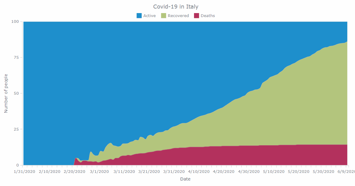
Let’s start with making a basic, value-based JS stacked area chart. Then I will show you how to customize it to suit your own needs and tasks. The final data visualization example will be the following JavaScript percent stacked area chart:
Now, let’s get down to business!
Step 1: Create an HTML page
Begin with creating a basic HTML page. This page should contain the following:
- A relevant title.
- An HTML block element (for example,
<div>) which will store your chart. - An id attribute for the
<div>(for example, “container”).
Note that you can also add CSS rules in the <style> block to modify the space that your stacked area chart will occupy. If you want the graphic to fill the whole page, use 100% for both the width and height parameters.
The HTML page should look like this:
<!DOCTYPE html>
<html>

<head>
  <title>Stacked Area Chart</title>
  <style>
    html,
    body,
    #container {
      width: 100%;
      height: 100%;
      margin: 0;
      padding: 0;
    }
  </style>
</head>

<body>
<div id="container"></div>
</body>

</html>
Step 2: Add necessary JavaScript files
Now, you should reference all the necessary JS files in the <head> section.
The stacked area chart that I will show you in this tutorial is based on AnyChart‘s JS library. Generally, JavaScript libraries enable you to produce the desired output more quickly and easily. AnyChart is lightweight and flexible, so you can be as creative as you want and come up with a fully functional and responsive chart to use on your website or app.
For this charting tutorial, I will include the corresponding CDN links. If you prefer, you can download the scripts locally.
The AnyChart JavaScript library features a modular system which is helpful in optimizing the size of the JS code running on a web page. To make a stacked area chart using it, add two modules: Core and Basic Cartesian. The first one is the basic AnyChart module required to use any other module. The second module powers all Cartesian charts.
Here is the HTML code for what we’ve got so far:
<!DOCTYPE html>
<html>

<head>
  <title>
Stacked Area Chart</title>
  <script src="https://cdn.anychart.com/releases/8.8.0/js/anychart-core.min.js"></script>
  <script src="https://cdn.anychart.com/releases/8.8.0/js/anychart-cartesian.min.js"></script>
  <style>
    html,
    body,
    #container {
      width: 100%;
      height: 100%;
      margin: 0;
      padding: 0;
    }
  </style>
</head>

<body>
  <div id="container"></div>
  <script>
    // The stacked area chart's JS code will be written here.
  </script>
</body>

</html>
Step 3: Add the data to visualize
Load the data
The COVID-19 pandemic is the top-news subject worldwide. In this tutorial, I decided to focus on Italy, the first area outside of China that has been tremendously affected by this crisis. I will visualize data with the number of active cases, recoveries, and deaths to see how the situation has been evolving from the beginning of the outbreak in Italy until the very present time.
I took data from the Johns Hopkins CSSE dataset, which is considered a trustworthy source of official COVID-19 statistics. For the sake of simplicity, I put the Italian data in one CSV file which you can find here. Active cases were calculated by subtracting deaths and recoveries from the confirmed cases.
Loading the CSV file in AnyChart can be done with the help of the Data Adapter module, which you should reference in the <head> section in addition to the library’s scripts that are already referenced there:
<!DOCTYPE html>
<html>

<head>
  <title>Stacked Area Chart</title>
  <script src="https://cdn.anychart.com/releases/8.8.0/js/anychart-core.min.js"></script>
  <script src="https://cdn.anychart.com/releases/8.8.0/js/anychart-cartesian.min.js"></script>
  <script src="https://cdn.anychart.com/releases/8.8.0/js/anychart-data-adapter.min.js"></script>
  <style>
    html,
    body,
    #container {
      width: 100%;
      height: 100%;
      margin: 0;
      padding: 0;
    }
  </style>
</head>

<body>
  <div id="container"></div>
  <script>
    // The stacked area chart's JS code will be written here.
  </script>
</body>

</html>
Now you can use the loadCsvFile method provided by the Data Adapter to load the CSV data.
anychart.data.loadCsvFile ("https://static.anychart.com/git-storage/word-press/data/covid-19-italy/data.csv", function (data) {
});
Then, set the data to be ready for use in your future JavaScript-based stacked area chart:
anychart.data.loadCsvFile ("https://static.anychart.com/git-storage/word-press/data/covid-19-italy/data.csv", function (data) {
  // set the data and ignore the first row that contains headers
  var dataSet = anychart.data.set(data, {ignoreFirstRow: true});
});
Map the data
The chart will display data from three fields: active cases, recoveries, and deaths. So you will need three different data series, one for each field. But how will you “inform” your chart which data to use for each field?
Here is where data mapping comes into play! Observe how this is implemented in the code through calling the mapAs method:
// map data for the deaths series
var deathsData = dataSet.mapAs({ 'x': 0, 'value': 2 });

// map data for the recovered series
var recoveredData = dataSet.mapAs({ 'x': 0, 'value': 3 });

// map data for the active series
var activeData = dataSet.mapAs({ 'x': 0, 'value': 4 });
Step 4: Write the JS code for your chart
Now that everything seems to be in place, you are ready to start coding the JS stacked area chart visualization.
First, add the anychart.onDocumentReady function, which will enclose the whole code of the chart and will be executed when the page is ready.
<script>

anychart.onDocumentReady(function () {
  // The stacked area chart's code will be written here.
});

</script>
Next, add the data from step 3:
<script>

anychart.onDocumentReady(function () {
  anychart.data.loadCsvFile ("https://static.anychart.com/git-storage/word-press/data/covid-19-italy/data.csv", function (data) {
    // set the data and ignore the first row that contains headers
    var dataSet = anychart.data.set(data, {ignoreFirstRow: true});
  });
});

</script>
Then, specify the chart type, set the series and force the chart to stack values by the Y scale:
// specify the area chart type
var chart = anychart.area();

// create a series with the mapped active data
var actSeries = chart.splineArea(activeData);

// create a series with the mapped recovered data
var recSeries = chart.splineArea(recoveredData);

// create a series with the mapped deaths data
var deathsSeries = chart.splineArea(deathsData);

// force the chart to stack values by the y scale
chart.yScale().stackMode('value');
For clarity, let’s give it a title and name its axes (see tips on writing great chart captions if you need advice):
// set the chart title
chart.title('Covid-19 in Italy');

// set the labels of the axes
chart.xAxis().title("Date");
chart.yAxis().title("Number of people");
One more thing: I also want to add a vertical line that will move with the mouse, which should make it easier to see where is what at a glance. In AnyChart, simply use the crosshair feature. The following code shows how can enable the crosshair, with some additional styling:
// turn on the crosshair
var crosshair = chart.crosshair();
crosshair.enabled(true)
  .yStroke(null)
  .xStroke('#fff')
  .zIndex(39);
crosshair.yLabel().enabled(false);
Finally, draw the chart by putting it into the container and using the drawing command.
// set the container id for the chart
chart.container('container');

// initiate chart drawing
chart.draw();
Enjoy the result:
The output provides insight into how the number of active cases, recoveries, and deaths have been changing over time. The total is all confirmed cases. You can move your mouse over the chart and view the exact values at each point. Notice how the crosshair helps in understanding each day’s information!
For your convenience, the full code is below. Feel free to play with this basic JS stacked area chart on AnyChart Playground.
<!DOCTYPE html>
<html>

<head>
  <title>Stacked Area Chart</title>
  <script src="https://cdn.anychart.com/releases/8.8.0/js/anychart-core.min.js"></script>
  <script src="https://cdn.anychart.com/releases/8.8.0/js/anychart-data-adapter.min.js"></script>
  <script src="https://cdn.anychart.com/releases/8.8.0/js/anychart-cartesian.min.js"></script>
  <style>
    html,
    body,
    #container {
      width: 100%;
      height: 100%;
      margin: 0;
      padding: 0;
    }
  </style>
</head>

<body>
  <div id="container"></div>
  <script>

anychart.onDocumentReady(function () {
  anychart.data.loadCsvFile("https://static.anychart.com/git-storage/word-press/data/covid-19-italy/data.csv", function (data) {
    // set the data and ignore the first row that contains headers
    var dataSet = anychart.data.set(data, {ignoreFirstRow: true});

    // map data for the deaths series
    var deathsData = dataSet.mapAs({ 'x': 0, 'value': 2 });

    // map data for the recovered series
    var recoveredData = dataSet.mapAs({ 'x': 0, 'value': 3 });

    // map data for the active series
    var activeData = dataSet.mapAs({ 'x': 0, 'value': 4 });

    // specify the chart type
    var chart = anychart.area();

    // create a series with the mapped active data
    var actSeries = chart.splineArea(activeData);

    // create a series with the mapped recovered data
    var recSeries = chart.splineArea(recoveredData);

    // create a series with the mapped deaths data
    var deathsSeries = chart.splineArea(deathsData);

    // force the chart to stack values by the y scale
    chart.yScale().stackMode('value');

    // set the chart title
    chart.title('Covid-19 in Italy');

    // set the labels of the axes
    chart.xAxis().title("Date");
    chart.yAxis().title("Number of people");

    // turn on the crosshair
    var crosshair = chart.crosshair();
    crosshair.enabled(true)
      .yStroke(null)
      .xStroke('#fff')
      .zIndex(39);
    crosshair.yLabel().enabled(false);

    // set the container id for the chart
    chart.container('container');

    // initiate chart drawing
    chart.draw();
  });
});

</script>
</body>

</html>
Customizing JavaScript Stacked Area Chart
It is very likely that different people prefer different functionalities and aesthetics for their charts, let alone different tasks you might get as a web developer or data visualization designer. Luckily, JS charts powered by AnyChart can be modified to fit your needs and preferences with another ease. I will show you how to perform a few quick customizations right now:
- Add a legend and animation.
- Change values to percentages.
- Configure the tooltip, markers and labels.
- Change colors.
Add a legend and animation
Every chart that shows more than one value should have a legend in order to be readable.
Add the following code to turn on a legend for your JS-based stacked area chart.
chart.legend(true);I would also like to give this chart a bit of wow effect by adding animation. You can quickly make this happen by including a short line to the chart’s JavaScript code:
chart.animation(true);Check out the result and you can find this JS stacked area chart with a legend and animation on AnyChart Playground:
Change values to percentages
Now, let’s switch the stacking mode from values to percentages. In this way, you can visualize how the composition has been changing regardless of the total.
It is very straightforward. To make a JavaScript (HTML5) percent stacked area chart visualizing the same data, just replace “value” with “percent”:
// change the stacking mode to percent
chart.yScale().stackMode('percent');
This JS percent stacked area chart is available on AnyChart Playground.
Configure the tooltip, markers and labels
Let’s make the chart display the series titles in the tooltip and legend. There are many ways to do this. But I also want to modify point markers. So let’s create a helper function where you can write the code needed to customize all these elements:
// helper function to setup tooltip labels for all series and style markers
var setupSeriesLabels = function (series, name) {
  series.name(name)
};
Use this function right there where I am setting up the series and add the corresponding titles:
// create a series with the mapped active data
var actSeries = chart.splineArea(activeData);
setupSeriesLabels(actSeries, 'Active');

// create a series with the mapped recovered data
var recSeries = chart.splineArea(recoveredData);
setupSeriesLabels(recSeries, 'Recovered');

// create a series with the mapped deaths data
var deathsSeries = chart.splineArea(deathsData);
setupSeriesLabels(deathsSeries, 'Deaths');
Now, use the helper function again to style the markers. What I am going to do is to make them all circles, give them a specific size, and specify their stroke weight and color. Finally, I will also specify their zIndex() so that they appear in the front level.
Here is the code:
// helper function to setup series and give them appropriate names in order to distinguish and label them properly
var setupSeries = function (series, name) {
  series.name(name)
  // setting the markers
  series.hovered().stroke('3 #fff 1');
  series.hovered().markers()
    .enabled(true)
    .type('circle')
    .size(4)
    .stroke('1.5 #fff');
  series.markers().zIndex(100);
};
The output of the chart after these changes is as follows:
You are welcome to open this customized JS percent stacked area chart on AnyChart Playground.
Change colors
Finally, I want to modify the colors of the chart to something that makes more sense for me. I am going to put a red shaded color for deaths, green for recoveries, and blue for active cases. Feel free to come up with your own ideas!
Here’s the code:
// create a series with the mapped active series
var actSeries = chart.splineArea(activeData)
.fill("#1E8FCD")
.stroke("#4b9bc6")
setupSeries(actSeries, 'Active');

// create a series with the mapped recovered data
var recSeries = chart.splineArea(recoveredData)
.fill("#B3C67D")
.stroke("#b9c1a0")
setupSeries(recSeries, 'Recovered');

// create a series with the mapped deaths data
var deathsSeries = chart.splineArea(deathsData)
.fill("#b3315d")
.stroke("#b5617d")
setupSeries(deathsSeries, 'Deaths');
Check out the final interactive JavaScript percent stacked area chart I showed in a GIF at the very beginning:
You can find the whole code of this data visualization below and the final JS percent stacked area chart on AnyChart Playground:
<!DOCTYPE html>
<html lang="en">

<head>
  <title>Stacked Area Chart</title>
  <script src="https://cdn.anychart.com/releases/8.8.0/js/anychart-core.min.js"></script>
  <script src="https://cdn.anychart.com/releases/8.8.0/js/anychart-data-adapter.min.js"></script>
  <script src="https://cdn.anychart.com/releases/8.8.0/js/anychart-cartesian.min.js"></script>
  <style>
    html,
    body,
    #container {
      width: 100%;
      height: 100%;
      margin: 0;
      padding: 0;
    }
  </style>
</head>

<body>
  <div id="container"></div>
    <script>

anychart.onDocumentReady(function () {
  anychart.data.loadCsvFile("https://static.anychart.com/git-storage/word-press/data/covid-19-italy/data.csv", function (data) {
    // set the data and ignore the first row that contains headers
    var dataSet = anychart.data.set(data, {ignoreFirstRow: true});

    // map data for the deaths series
    var deathsData = dataSet.mapAs({ 'x': 0, 'value': 2 });

    // map data for the recovered series
    var recoveredData = dataSet.mapAs({ 'x': 0, 'value': 3 });

    // map data for the active series
    var activeData = dataSet.mapAs({ 'x': 0, 'value': 4 });

    // specify the area chart type
    var chart = anychart.area();

    // helper function to setup series and give them appropriate names in order to distinguish and label them properly
    var setupSeries = function (series, name) {
      series.name(name)
      // setting the markers
      series.hovered().stroke('3 #fff 1');
      series.hovered().markers()
        .enabled(true)
        .type('circle')
        .size(4)
        .stroke('1.5 #fff');
      series.markers().zIndex(100);
    };

    // create a series with the mapped active data
    var actSeries = chart.splineArea(activeData)
    .fill("#1E8FCD")
    .stroke("#4b9bc6")
    setupSeries(actSeries, 'Active');

    // create a series with the mapped recovered data
    var recSeries = chart.splineArea(recoveredData)
    .fill("#B3C67D")
    .stroke("#b9c1a0")
    setupSeries(recSeries, 'Recovered');

    // create a series with the mapped deaths data
    var deathsSeries = chart.splineArea(deathsData)
    .fill("#b3315d")
    .stroke("#b5617d")
    setupSeries(deathsSeries, 'Deaths');

    // force the chart to stack values by the y scale
    chart.yScale().stackMode('percent');

    // set the chart title
    chart.title('Covid-19 in Italy');

    // set the labels of the axes
    chart.xAxis().title("Date");
    chart.yAxis().title("Number of people");

    // turn on the crosshair
    var crosshair = chart.crosshair();
    crosshair.enabled(true)
      .yStroke(null)
      .xStroke('#fff')
      .zIndex(39);
    crosshair.yLabel().enabled(false);

    // turn on the legend
    chart.legend(true);

    // turn on the chart animation
    chart.animation(true);

    // set the container id for the chart
    chart.container('container');

    // initiate chart drawing
    chart.draw();
  });
});

</script>
</body>

</html>
Conclusion
Congratulations! You’ve just build your first JavaScript stacked area charts! The process is not really difficult, is it?
Go ahead and keep learning while it’s hot. See the documentation. Check some more examples of stacked area charts in the area charts gallery for inspiration. Feel free to share your own creations and post your questions in the comments ?
Wondering how to visualize data in other charts? See more JS charting tutorials in the AnyChart blog.
See also: How to Create JavaScript Area Chart
- Categories: AnyChart Charting Component, HTML5, JavaScript, JavaScript Chart Tutorials, Tips and Tricks
- No Comments »