New Stunning Data Visualization Examples to See and Learn From — DataViz Weekly
July 9th, 2021 by AnyChart Team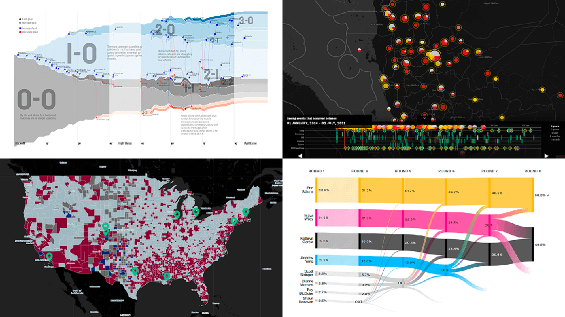 Graphical representation makes data easier to understand and interpret. The DataViz Weekly series on our blog aims to highlight the most vivid examples of clever data visualization in action so you can better realize how it can work or simply have fun exploring new stunning charts and maps.
Today on DataViz Weekly:
- European arms in the bombing of Yemen — Forensic Architecture, Yemeni Archive, ECCHR, and Bellingcat
- All scorelines and goals from the UEFA Euro 2020 group stage — Krist Wongsuphasawat
- Racial residential segregation in the United States — The Othering and Belonging Institute at UC Berkeley
- NYC Democratic mayoral primary vote results — Bloomberg
- Categories: Data Visualization Weekly
- No Comments »
Analyzing Skin Tones, Pandemic Timeline, Chinese Names, and Dutch Elections — DataViz Weekly
March 19th, 2021 by AnyChart Team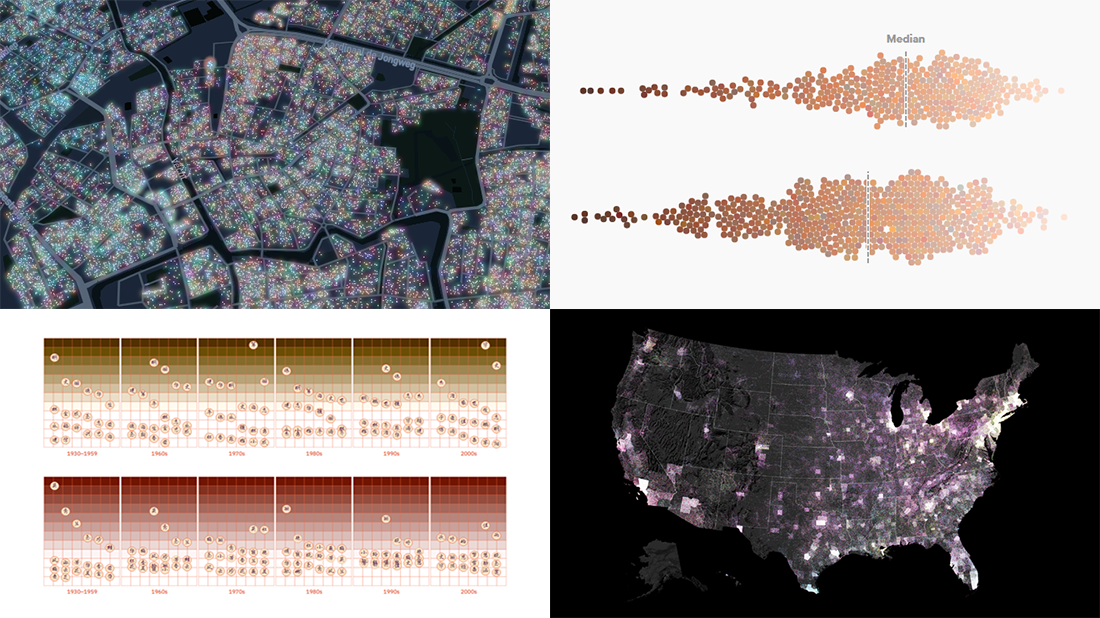 Every day, a number of new data visualizations on various topics come out around the internet. We are keen to curate the most awesome graphics and share them with you on DataViz Weekly! Today in the spotlight:
- Skin tones on the Instagram feeds of fashion and beauty brands — Quartz
- Timeline of the pandemic year — WaPo
- Evolution of Chinese names — Kontinentalist
- Dutch election results in detail — NRC
- Categories: Data Visualization Weekly
- 1 Comment »
How to Create Bubble Map with JavaScript to Visualize Election Results
January 25th, 2021 by Shachee Swadia In these times of exponentially growing data, visualization is a necessary skillset to have in your tool box. Popular techniques include bar charts, line graphs, pie charts, and bubble maps among others.
Building interactive charts from scratch with JavaScript can be a difficult endeavor for any developer, especially someone starting out new. That is exactly why we have JS charting libraries which make it much easier and quicker to conjure up insightful visualizations!
Read on to see how I create a JavaScript Bubble Map with one of these libraries.
Read the JS charting tutorial »
- Categories: AnyChart Charting Component, AnyMap, Big Data, Charts and Art, HTML5, JavaScript, JavaScript Chart Tutorials, Tips and Tricks
- No Comments »
20+ Electoral Maps Visualizing 2020 U.S. Presidential Election Results — DataViz Weekly Special Edition
November 6th, 2020 by AnyChart Team All eyes on election maps! Yes, they could be misleading. And even widely misleading. But it can be at least so fascinating to look at them, especially at times like this! So, we have curated a list of over twenty reputable resources — as of now, to be precise, 24 and counting! — where you can watch the live results of the 2020 United States Presidential election in compelling data visualizations. At the same time, it is a great chance for you to investigate and understand how election maps (and some other graphics) can look and work in practice.
? See also: 2024 U.S. Election Maps (November 2024).
Vote counts may be different on different platforms and update as more data becomes available out there — it’s absolutely okay. The election results are still partial. Over the coming days, all numbers will be adjusted to match the real, final vote count. Just in case: We’ve added only reliable sources — notable, reputable media outlets.
Without further ado, check out maybe the most important data visualizations these days! (Electoral vote count numbers in the text last updated on November 9th, 2020, for each source.)
- Categories: Data Visualization Weekly, News, Third-Party Developers
- 3 Comments »
Pre-Election Data in Charts and Analysis — DataViz Weekly
October 30th, 2020 by AnyChart Team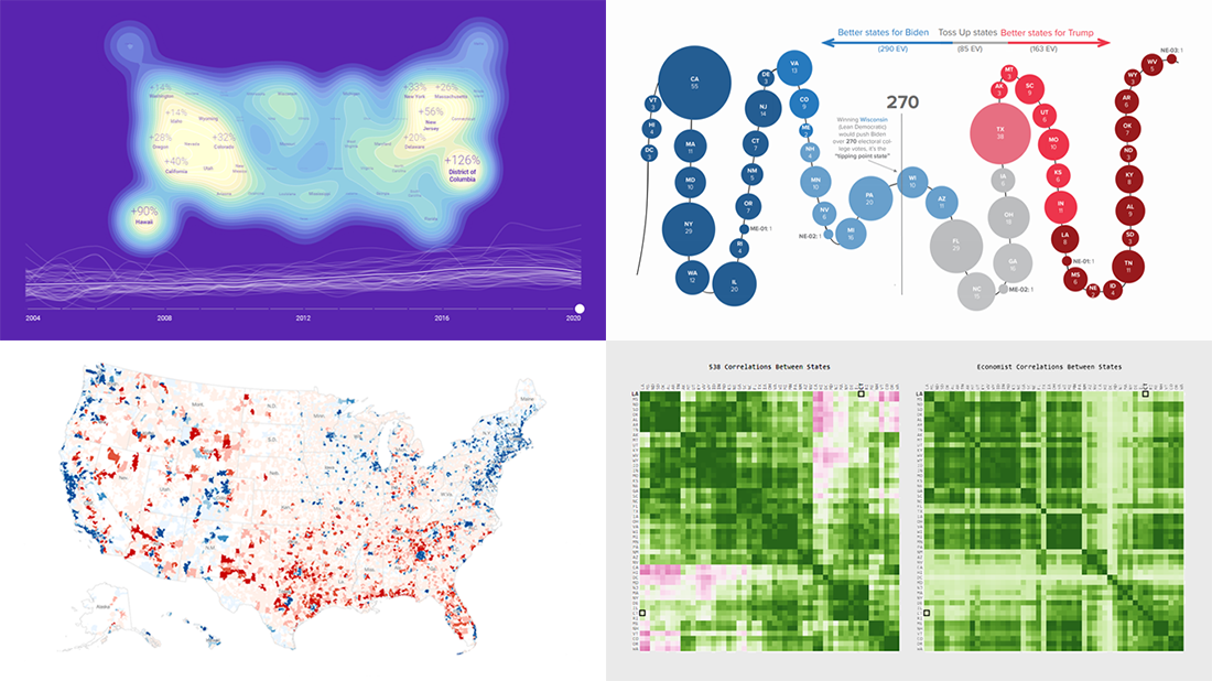 With November 3rd just around the corner, we could not resist the temptation to devote an entire Friday article to the 2020 U.S. election. Indeed, there are many great new data visualization projects on this topic that are worth featuring. Check out some of the most interesting ones in the special pre-election edition of DataViz Weekly:
- Visualizing data about donations to Biden’s and Trump’s campaigns — The New York Times
- Charting the latest Electoral College ratings — The Cook Political Report
- Exploring election forecast correlations — Adam Pearce
- Analyzing search interest in the U.S. election years since 2004 — Truth & Beauty
- Categories: Data Visualization Weekly
- No Comments »
Exploring Data About COVID-19, Road Curvature & U.S. Elections — DataViz Weekly
October 23rd, 2020 by AnyChart Team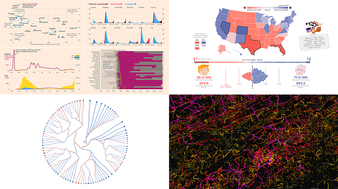 Meet a set of new amazing visualizations we’ve spotted and admired lately. Below is a list of the projects featured today on DataViz Weekly. Keep reading to learn about each and then check them out right away.
- Global COVID-19 crisis in data — FT
- Twisty roads worldwide — Adam Franco
- Ways Biden or Trump could win — FiveThirtyEight
- Electoral College Decision Tree — Kerry Rodden
- Categories: Data Visualization Weekly
- No Comments »
New Maps and Charts Showing Power of Data Visualization — DataViz Weekly
September 11th, 2020 by AnyChart Team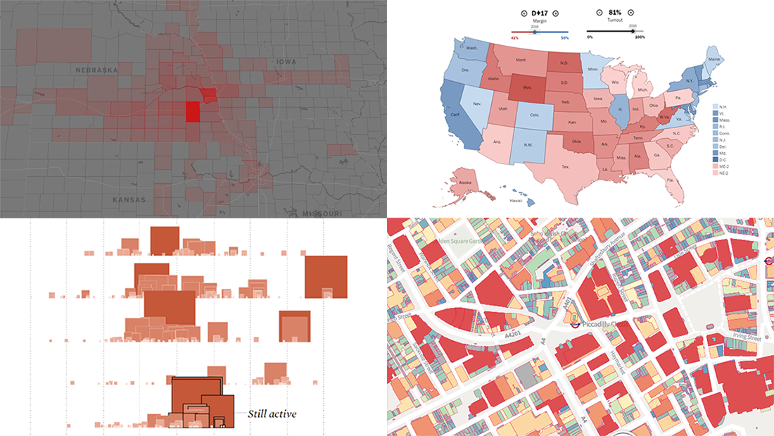 The long wait is over! DataViz Weekly is here bringing some of the best new maps and charts from all over the web to the spotlight! Look at these amazing examples that show the power of smart data visualization:
- College football fan movement and COVID-19 risk — ESPN
- California wildfires over the past 17 years — FlowingData
- London solar opportunities — UCL Energy
- Voter scenarios for the U.S. presidential election — The Washington Post
- Categories: Data Visualization Weekly
- No Comments »
Awesome Fresh Data Visualization Projects for Inspiration — DataViz Weekly
September 4th, 2020 by AnyChart Team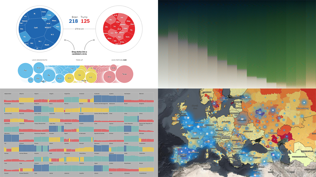 Celebrating the first Friday of September, don’t miss these awesome fresh data visualization projects for inspiration! We have recently met them around the web and are glad to introduce you to them in a quick overview. So our new picks for DataViz Weekly include:
- COVID-19 situation in Europe, a subnational view — WHO/Europe
- Potential outcomes of the U.S. presidential election — The New York Times
- State of democracy worldwide since 2006 — Preity Lodha
- Colors of the American landscape vs electoral map colors — The Upshot
- Categories: Data Visualization Weekly
- 1 Comment »
4 Great Examples of Data Visualization in Action — DataViz Weekly
August 28th, 2020 by AnyChart Team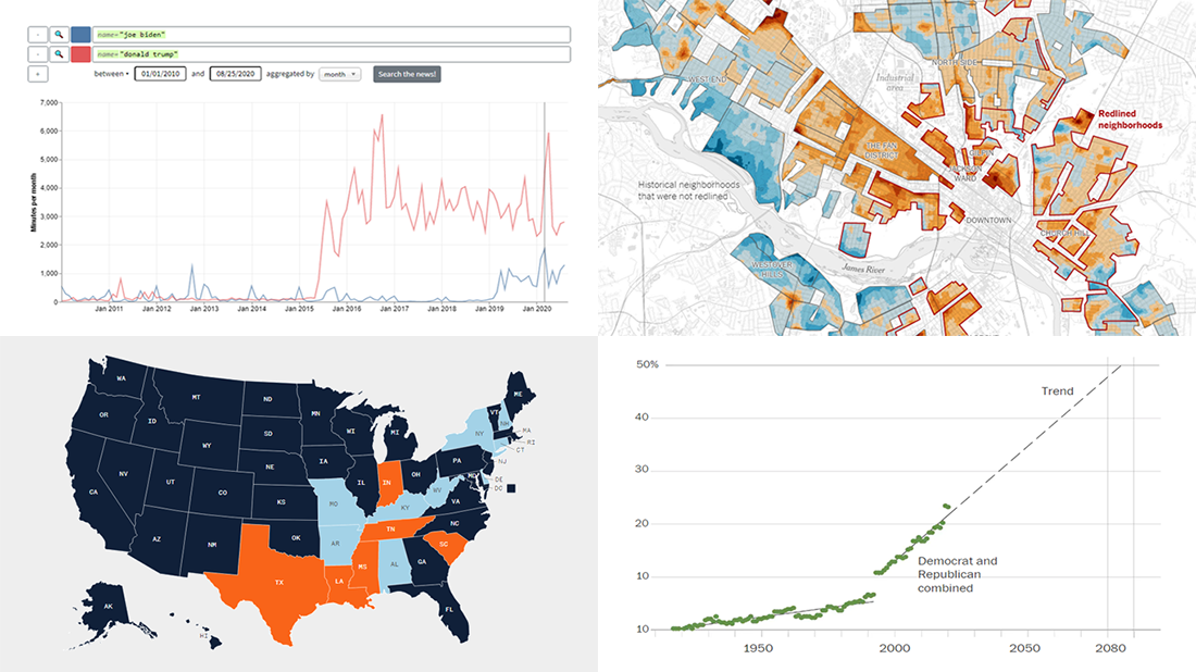 We’ve curated another four great examples of data visualization in action. Would you like to learn about them and check them out right now? Wait no longer! Below is a list of the projects highlighted in the new DataViz Weekly — just give it a glance and go ahead!
- Exploring a link between racism in the housing policy and hotter neighborhoods — The New York Times
- Analyzing the content of cable TV news — Stanford University
- Tracking gender inequality in American politics — The Washington Post
- Summarizing voting rules for the 2020 U.S. election by state — NBC News
- Categories: Data Visualization Weekly
- No Comments »
New Information Visualization Projects Not to Be Missed — DataViz Weekly
August 14th, 2020 by AnyChart Team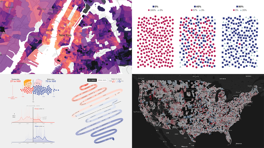 Look at these new cool information visualization projects and notice how different techniques help explore and communicate data, in practice.
Today in DataViz Weekly:
- FiveThirtyEight’s 2020 U.S. presidential election model — FiveThirtyEight
- Herd immunity simulations — The Washington Post
- Unemployment in the United States at the census tract level — The Upshot
- Home prices in America — Realbloc
- Categories: Data Visualization Weekly
- No Comments »