Revealing Insights with Data Visualizations — DataViz Weekly
June 14th, 2024 by AnyChart Team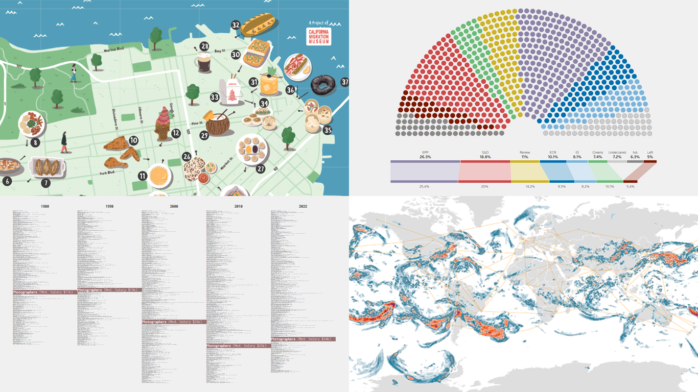 Data visualizations bridge the gap between raw numbers and clear, understandable insights. This week on DataViz Weekly, we showcase four remarkable new examples of how charts and maps illuminate diverse topics in a comprehensible and engaging manner:
- In-flight turbulence — South China Morning Post
- Shifts in occupation and income — FlowingData
- San Francisco’s culinary diversity — California Migration Museum
- EU election results — Reuters
- Categories: Data Visualization Weekly
- No Comments »
New Insightful Data Visualizations in Focus — DataViz Weekly
May 10th, 2024 by AnyChart Team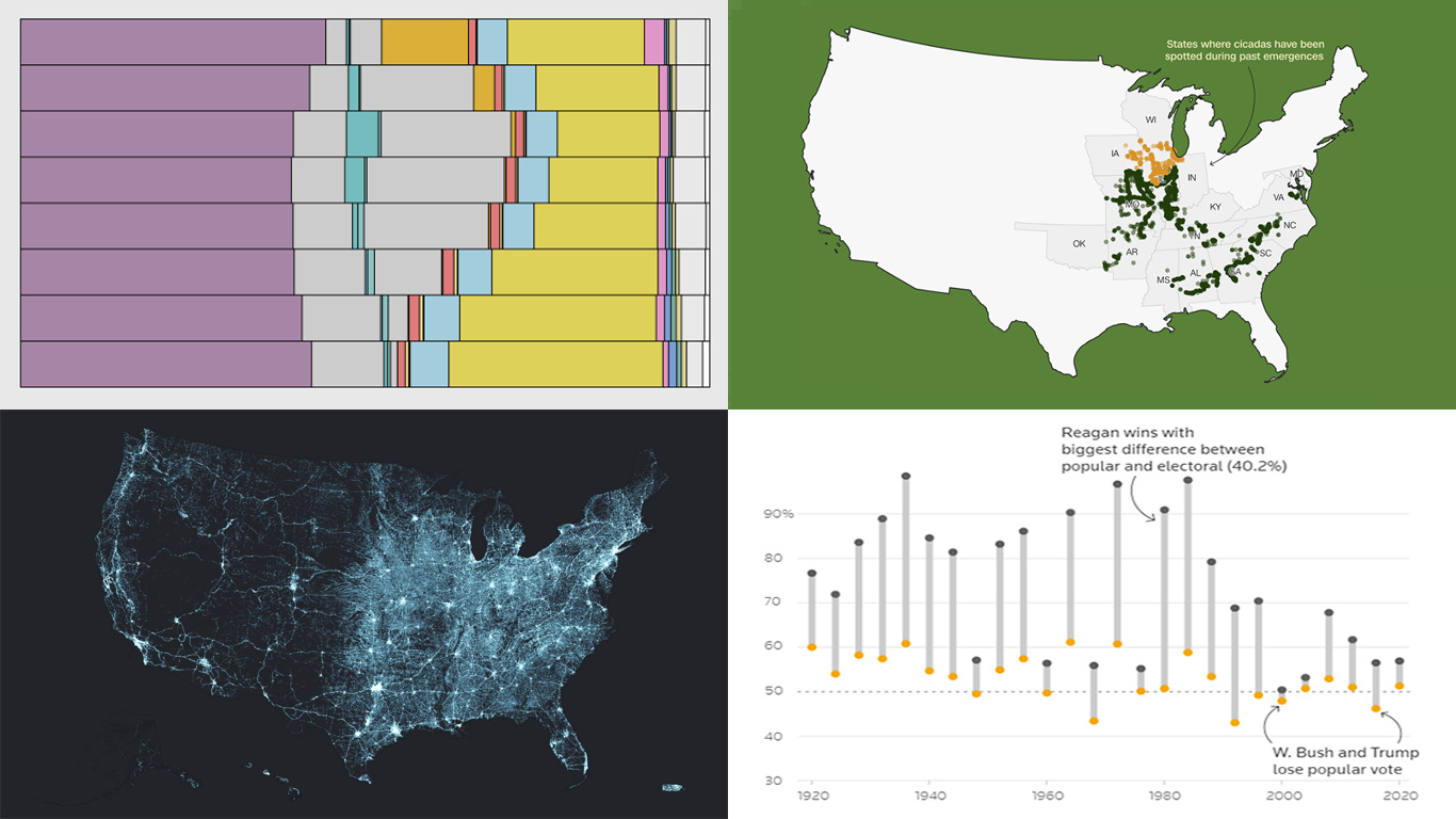 Data visualization serves as a powerful tool that enhances our understanding of complex data, transforming raw figures into insights. DataViz Weekly is here to share several great examples that demonstrate this capability in action. This week, we highlight four data visualization projects that have recently captured our attention:
- Exploring the U.S. bridges — Esri
- Analyzing time use by age — FlowingData
- Tracking historic cicada emergence 2024 — CNN
- Understanding election polls — Reuters
- Categories: Data Visualization Weekly
- No Comments »
Exploring Insights with Data Visualization — DataViz Weekly
May 3rd, 2024 by AnyChart Team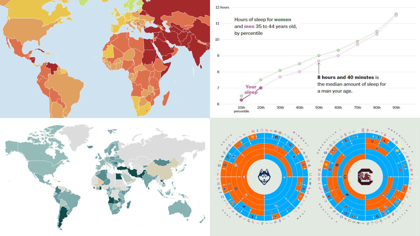 Welcome to the new DataViz Weekly, where we continue exploring the transformative power of data visualization. This edition presents a selection of new examples of how charts and maps can help us understand trends and patterns in various subjects — from sports and philanthropy to global challenges like press freedom and inflation, and everyday topics such as sleep. Here are the projects featured this time:
- March Madness philanthropy challenge — Bloomberg
- 2024 World Press Freedom Index — Reporters Without Borders
- Global Inflation Tracker — Council on Foreign Relations
- Sleep trends in America — The Washington Post
- Categories: Data Visualization Weekly
- No Comments »
New Data-Driven Stories Worth Exploring — DataViz Weekly
April 19th, 2024 by AnyChart Team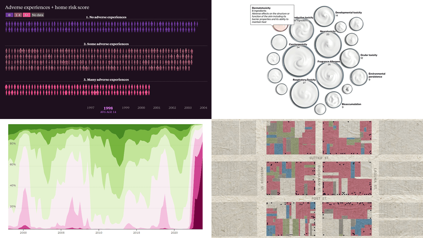 This week’s DataViz Weekly showcases a quartet of compelling data-driven stories, each powered by the adept use of data visualization techniques. These narratives not only inform but inspire, perhaps sparking creative concepts for your upcoming projects.
Here are the visual stories featured in this issue:
- Unraveling the hold of historical mortgage rates in the U.S. — The Upshot
- Retelling the transformation of San Francisco’s Japantown after Roosevelt’s Executive Order 9066 — The San Francisco Chronicle
- Revealing hidden risks in common fragrances — Bloomberg
- Exploring the persistent shadows of teen adversity — The Pudding
- Categories: Data Visualization Weekly
- No Comments »
Exploring Eclipse Impact, Nature Access, Marital Ages, Voter Profiles — DataViz Weekly
April 12th, 2024 by AnyChart Team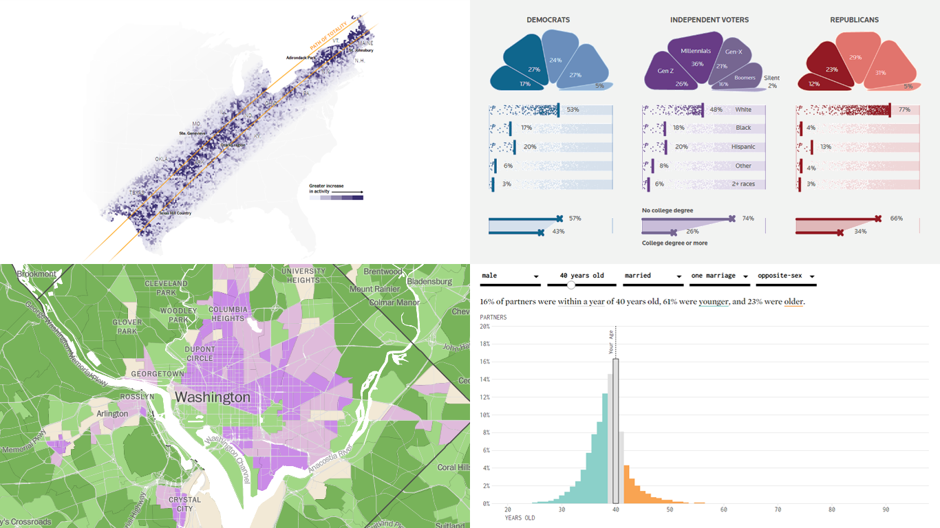
Welcome back to DataViz Weekly! We’re thrilled to restart our series, presenting each Friday a carefully curated selection of recent data visualizations that have caught our eye from around the web. These charts and maps serve as excellent examples of how data can be transformed into insightful and engaging graphical representations for understanding complex issues.
This time, we feature:
- Eclipse traffic and movements — The New York Times
- America’s access to natural spaces — The Washington Post
- Marital age patterns — FlowingData
- Profiling independent voters — Reuters
Join us as we take a closer look at these visualizations and check them out for a dose of inspiration.
- Categories: Data Visualization Weekly
- No Comments »
Best Data Visualizations of 2022 — DataViz Weekly
December 30th, 2022 by AnyChart Team 2022 has been fruitful in terms of data visualizations for every taste and interest. On DataViz Weekly, we’ve shown you more than 200 awesome projects as great examples of effective charting and mapping in action. Today, in the year’s last edition, let’s look at the best data visualizations of 2022 through the eyes of third-party experts!
Find out which projects made it to the “best of the year” selections of Nathan Yau, DataJournalism.com, The Pudding, and Kenneth Field.
- Categories: Data Visualization Weekly
- No Comments »
Impressive New Data Graphics on Abortions, Homes, Names, Land — DataViz Weekly
March 11th, 2022 by AnyChart Team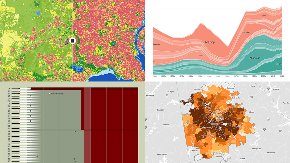 DataViz Weekly is here with another batch of impressive data graphics worth looking at and exploring! Today, we are eager to tell you about the following four new projects:
- Burden of abortion across the United States — FiveThirtyEight
- Real estate investor activity in the 40 major American cities in 2021 — The Washington Post
- Historical popularity of baby names in the U.S. since the 1880s — Namerology
- Australia land cover in detail — Geoscience Australia
- Categories: Data Visualization Weekly
- No Comments »
Beijing Olympics Medal Trackers — DataViz Weekly
February 25th, 2022 by AnyChart Team Following sixteen days of thrilling, action-packed competition, the Beijing 2022 Winter Olympics officially came to an end on Sunday, February 20. Norway finished at the top of the leaderboard, with 16 gold and 37 total medals won by its athletes at the Games.
During the Tokyo 2020 Summer Olympics that took place just six months before, we published a special edition of DataViz Weekly looking at four awesome medal trackers produced by The New York Times’s The Upshot, Bloomberg, Axios, and FiveThirtyEight. These interactive data visualization projects were brought back for the Beijing 2022 Winter Olympics. So now, we invite all lovers of charts and sports to look at their newest editions. They offer a frictionless way to explore medal counts and country standings after the Games with the help of stunning visualizations.
- Categories: Data Visualization Weekly
- 1 Comment »
Best New Charts and Maps Not to Miss — DataViz Weekly
February 4th, 2022 by AnyChart Team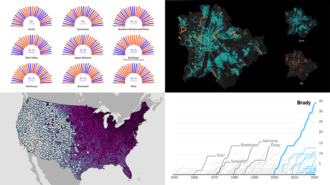 Are you sure you have seen all the best new charts and maps? Let’s see. Check out our new DataViz Weekly roundup and make sure you have not missed these four fascinating data visualization projects!
- Accuracy of Punxsutawney Phil’s and other animal meteorologists’ weather predictions — FiveThirtyEight
- The coldest day of the year across the United States — NOAA NCEI
- Tom Brady’s stellar career in American Football — The Upshot
- Budapest street names — ATLO
- Categories: Data Visualization Weekly
- No Comments »
Visualizing Data on Income, Volcano Eruption, Shopping, Climate — DataViz Weekly
January 28th, 2022 by AnyChart Team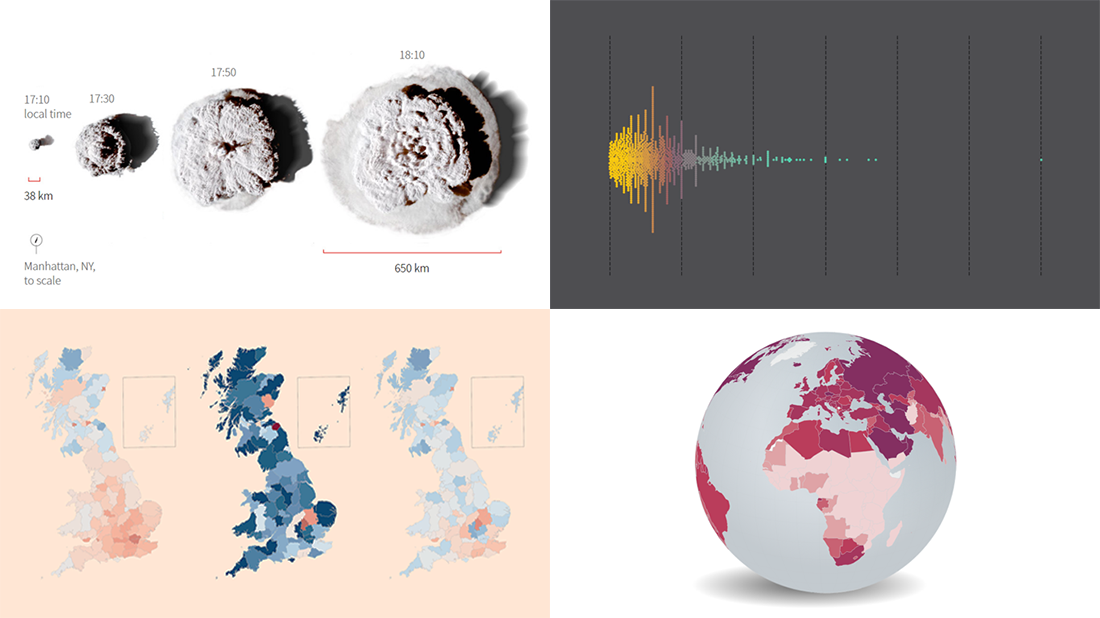 Continuing our regular roundups of the most interesting charts, maps, and infographics, we are glad to spotlight a bunch of new awesome projects for your inspiration. Today on DataViz Weekly:
- Americans’ annual personal income — Nathan Yau
- Tonga eruption’s true scale — Reuters
- High street crisis in Great Britain — The Financial Times
- Climate change drivers and sufferers — Der Tagesspiegel
- Categories: Data Visualization Weekly
- No Comments »