 Welcome to the new DataViz Weekly, where we continue exploring the transformative power of data visualization. This edition presents a selection of new examples of how charts and maps can help us understand trends and patterns in various subjects — from sports and philanthropy to global challenges like press freedom and inflation, and everyday topics such as sleep. Here are the projects featured this time:
- March Madness philanthropy challenge — Bloomberg
- 2024 World Press Freedom Index — Reporters Without Borders
- Global Inflation Tracker — Council on Foreign Relations
- Sleep trends in America — The Washington Post
Data Visualization Weekly: April 26, 2024 — May 3, 2024
Bloomberg’s 2024 March Madness Brackets for a Cause
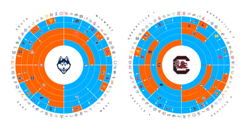
For its ninth consecutive year, Bloomberg continues the tradition of “March Madness Brackets for a Cause,” masterfully blending the excitement of NCAA basketball with a commitment to philanthropy. This initiative brings together leading figures from the business and finance sectors, each of whom pledges $20,000 to forecast outcomes of the NCAA tournament. The pledged funds are then donated to various charities, with distributions based on the accuracy of the participants’ bracket predictions.
Michael Boyle and Julian Burgess have skillfully worked with data to visualize these predictions, using a sunburst chart to capture the progress and intensity as the tournaments marched toward the Final Fours in Phoenix and Cleveland.
Discover this unique intersection of sports, predictions, and charitable giving on Bloomberg.
RSF 2024 World Press Freedom Index
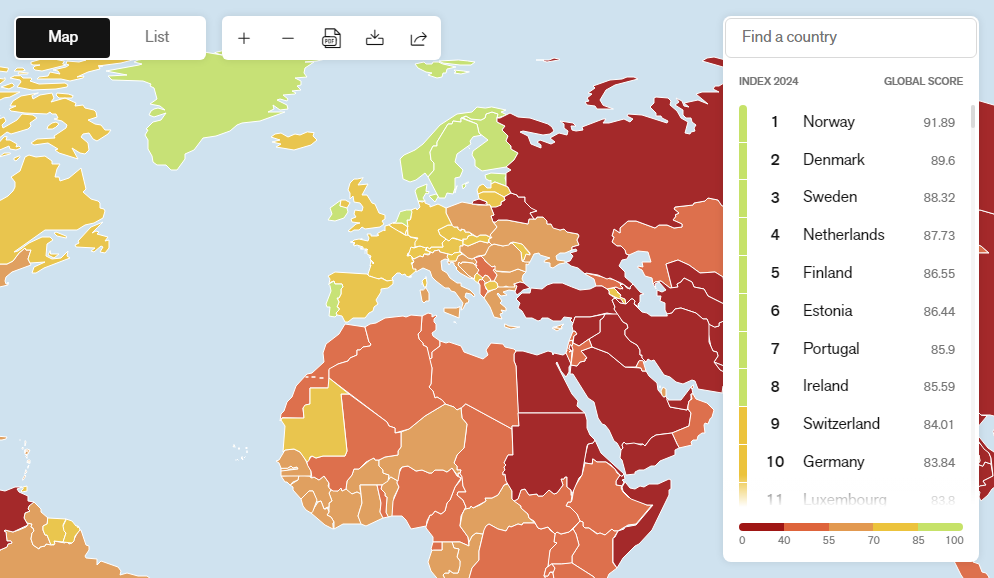
Reporters Without Borders (RSF) has unveiled its annual World Press Freedom Index for 2024, offering a detailed analysis and interactive mapping of press freedom across the globe. Leading the pack are Norway, Denmark, and Sweden. The United States has dropped to 55th place, continuing its descent in the rankings and reflecting concerns about the state of freedom of expression.
This year’s report particularly notes that political authorities often pose a great threat to press freedom. A significant decrease in the political indicator, one of five factors that comprise the global score, highlights this issue, with a global average decline of 7.6 points.
The interactive map on the RSF website not only shows current rankings and year-over-year changes but also enables a deeper dive into each specific indicator—political, economic, legislative, sociocultural, and security. This allows for a comprehensive understanding of the challenges facing press freedom worldwide.
Explore the intricate dynamics of global press freedom and regional variations on Reporters Without Borders’ website.
CFR Global Inflation Tracker
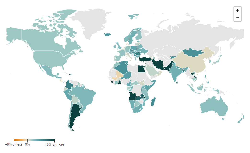
The Council on Foreign Relations has released its comprehensive Global Inflation Tracker, developed by Benn Steil and Elisabeth Harding. This robust tool features an interactive choropleth map that displays inflation trends in nearly two hundred countries that report data to the International Monetary Fund (IMF). Users can explore year-over-year inflation rates by hovering over each country on the map, with darker shades indicating higher rates of inflation.
This tracker is especially significant for its historical depth, including data from as far back as 1990 and covering fourteen different inflation items. You can observe how inflation responded to various global events, such as the economic disruptions caused by COVID-19, which initially led to a decrease in median global inflation, and subsequent supply chain challenges and geopolitical tensions that propelled it to soar. For instance, between 2020 and 2022, median global inflation jumped from 1.9% to 8.8%.
Additional charts within the project let you view the percentage-point contributions of various inflation components — food, energy, housing, services, and others — to a country’s total inflation rate. These visualizations reveal how the contributions of these categories to total inflation have evolved, highlighting, for example, the significant impact of energy prices on U.S. inflation rates in recent years.
Dive into this detailed exploration of global inflation trends on the CFR’s website.
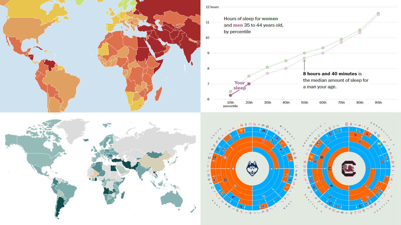
Americans are Sleeping More Than Ever
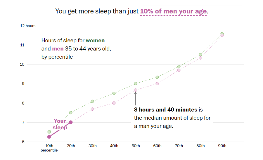
Americans are achieving more sleep than they have in the last two decades, with an average nightly increase of about 10 minutes recorded between 2019 and 2022. This trend is highlighted in The Washington Post’s analysis by Caitlin Gilbert and Luis Melgar, which draws on data from the American Time Use Survey. The most significant increases in sleep duration have been observed among men aged 25 to 34 and individuals without children.
Accompanying the article is an interactive feature that enables readers to input their sleep schedules and see how they compare to national averages, with a line chart.
With the rise of remote work, people are starting their days later, contributing to longer sleep durations. However, the analysis also points out that an increase in sleep quantity does not necessarily imply an improvement in sleep quality. Issues like sleep disorders and intermittent sleep remain widespread, impacting overall health.
Explore the insights and see how your sleep time stacks up against others on The Washington Post.
Wrapping Up
This week’s DataViz Weekly has showcased four impressive visual narratives, highlighting the substantial impact data visualization has in clarifying complex issues. Each project provides a unique perspective on its topic, enriching our understanding through detailed and accessible visual analysis.
We hope these examples inspire you to appreciate the nuanced interplay of data and design in contemporary storytelling. Join us next week for more insightful examples of the power of data visualization in action.
- Categories: Data Visualization Weekly
- No Comments »