Peculiar Data Visualizations and Infographics in DataViz Weekly
September 8th, 2017 by AnyChart Team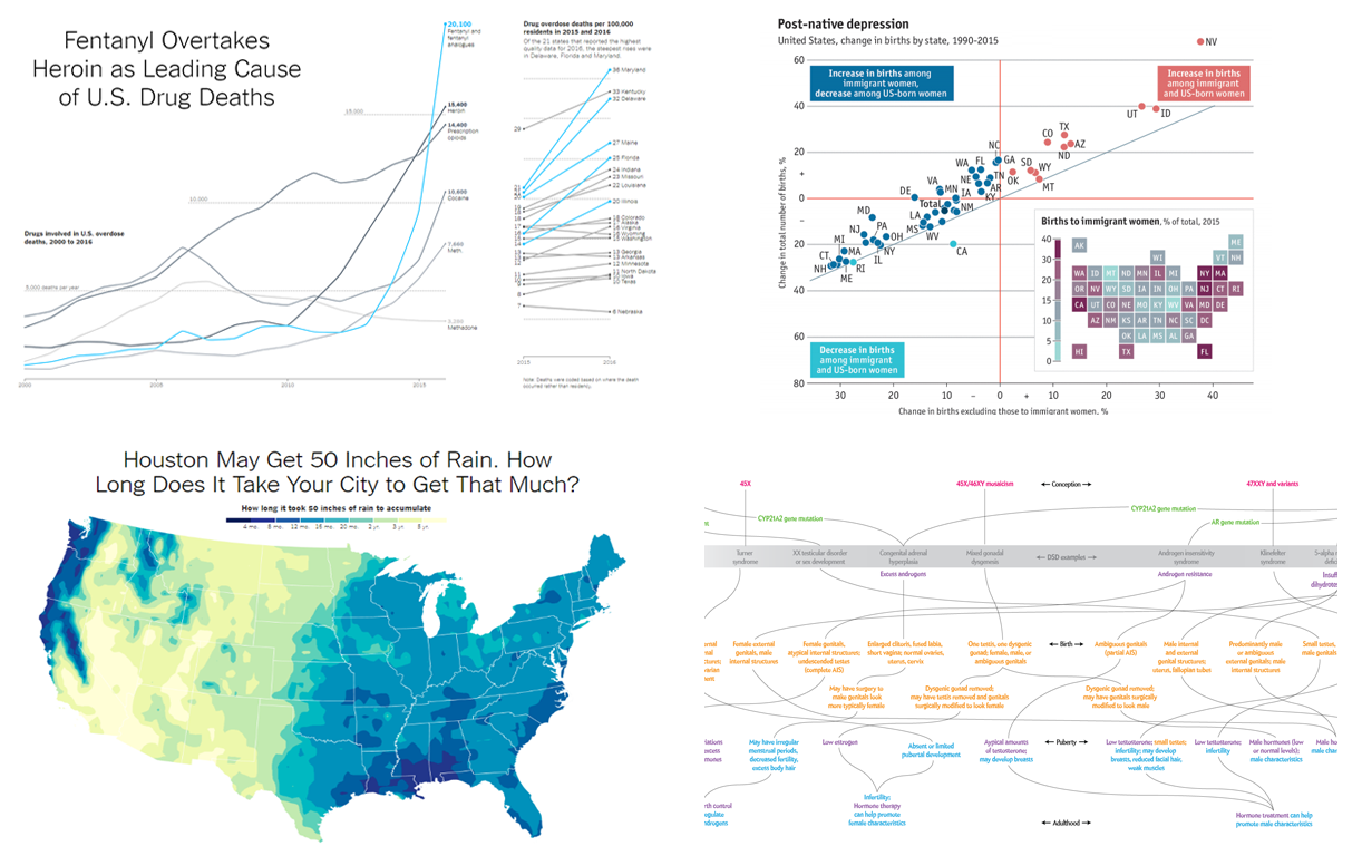 Surfing the Internet in search of new beautiful and peculiar data visualizations is indeed a very captivating activity. In fact, we are doing that literally all the time, looking for the best practices and inspiration that help us get an ever better understanding of the dataviz and further improve our data visualization solutions. And we are always glad to share with you some peculiar chart examples that we happen to find out there from time to time.
The new Data Visualization Weekly collection includes the following visualizations:
- Houston’s 50 inches of rain: How much is it for your city?
- Sex as a spectrum.
- Immigrant families boost the birth rate in the US.
- Fentanyl and other drug death data in the US visualized for 2000-2016.
- Categories: Data Visualization Weekly
- No Comments »
Data Visualization with JavaScript: The Story of AnyChart JS Charts
September 7th, 2017 by AnyChart Team AnyChart is a flexible JavaScript (HTML5) based solution that allows you to create interactive and great looking charts. It is a cross-browser and cross-platform charting solution intended for everybody who deals with creation of dashboard, reporting, analytics, statistical, financial or any other data visualization solutions. AnyChart works everywhere -PCs, Macs, iPhones, iPads, Android devices and helps businesses transform operational data into actionable information.
Kevin William David interviewed Anton Baranchuk, CEO at AnyChart to know more.
- Categories: AnyChart Charting Component, AnyGantt, AnyMap, AnyStock, Business Intelligence, Flash Platform, GraphicsJS, HTML5, JavaScript, Oracle Apex, Qlik, Success Stories
- No Comments »
Creative Data Visualization Examples – DataViz Weekly
September 1st, 2017 by AnyChart Team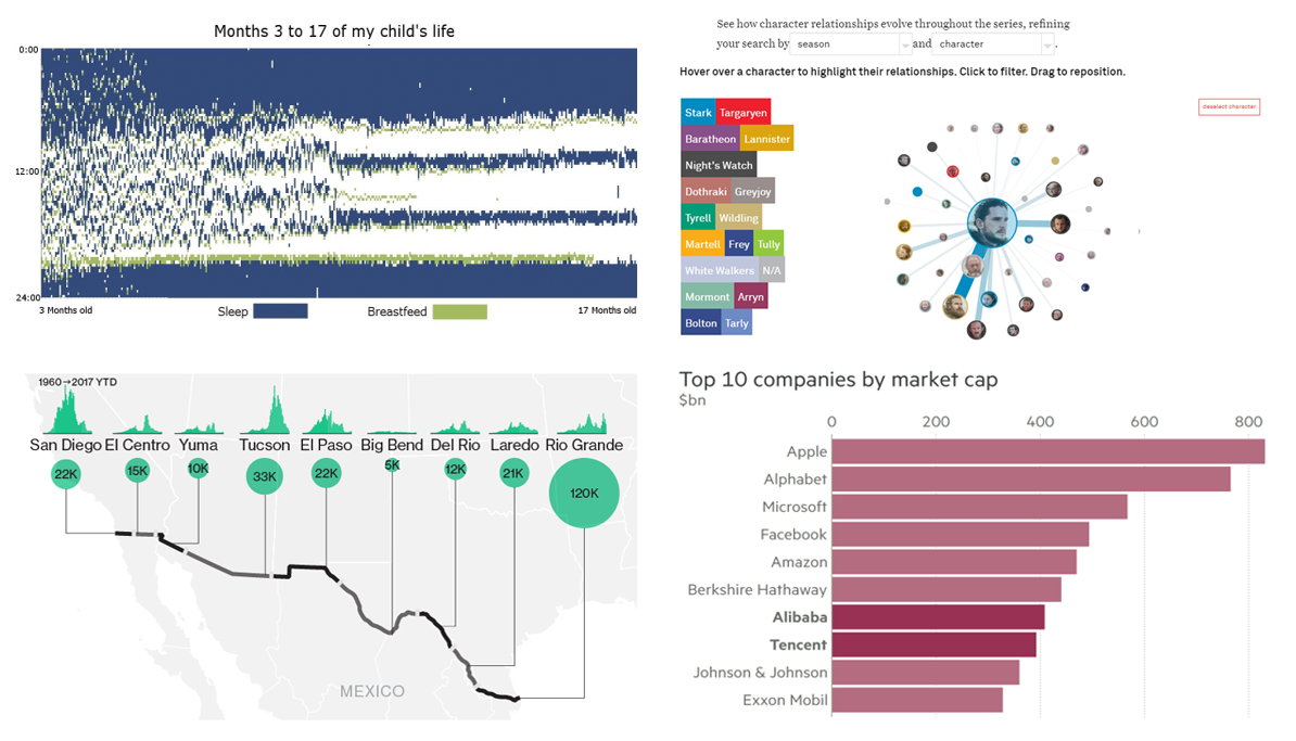 The presentation of data using graphical formats is a global trend. Many people, including us, love data visualization and the amazing creativity that it allows. Your dataviz projects don’t have to be typical and common, they need – at least sometimes and for some reason – to be something that is more unique as well as more captivating. A top notch graphical representation of data will comprise numerous creative elements that many viewers have never seen before. Nothing can make your dataviz project go viral more than creativity, so creative data visualization examples are the key to getting more viewership.
Below are a few of interesting data visualizations projects that we pulled from the Web. Check out how each data expert has applied creativity in their work.
- Categories: Data Visualization Weekly
- No Comments »
Top Data Visualization Mistakes to Avoid
August 29th, 2017 by Jay Stevenson Data visualization is a fast and simple way to convey messages and concepts in an efficient manner. Besides improving the information relay, this approach has also changed the way business is done. Organizations that deal with large amounts of information on a daily basis can now process data and have the intended audience decipher it at lightning-fast speeds, thus enhancing the process of information management. However, data visualization mistakes are quite widespread, and let’s take a look what they are, why they are harmful, and how to avoid them.
- Categories: Business Intelligence, Charts and Art, Dashboards, Tips and Tricks
- 1 Comment »
Examples of Data Visualizations That People Like – DataViz Weekly
August 25th, 2017 by AnyChart Team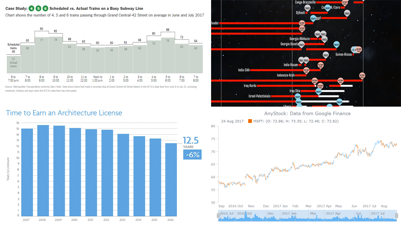 The new Data Visualization Weekly article reviews another set of interesting examples of data visualizations we’ve found on the Web: some amazing, some notable. In fact, data can speak much more clearly when visualized, allowing us to gain and remember more insights than we could reveal and remember from the texts and tables. The following dataviz works are vivid examples of that.
Let’s look at the following samples of creativity in the data visualization sphere:
- The Shadow Peace, a data-driven documentary on nuclear war;
- delays and cancellations in New York’s subway;
- time to earn an architecture license;
- visualizing large date and time based data.
- Categories: Data Visualization Weekly
- No Comments »
Inspirational Data Visuals To Drive the Message Home – DataViz Weekly
August 18th, 2017 by AnyChart Team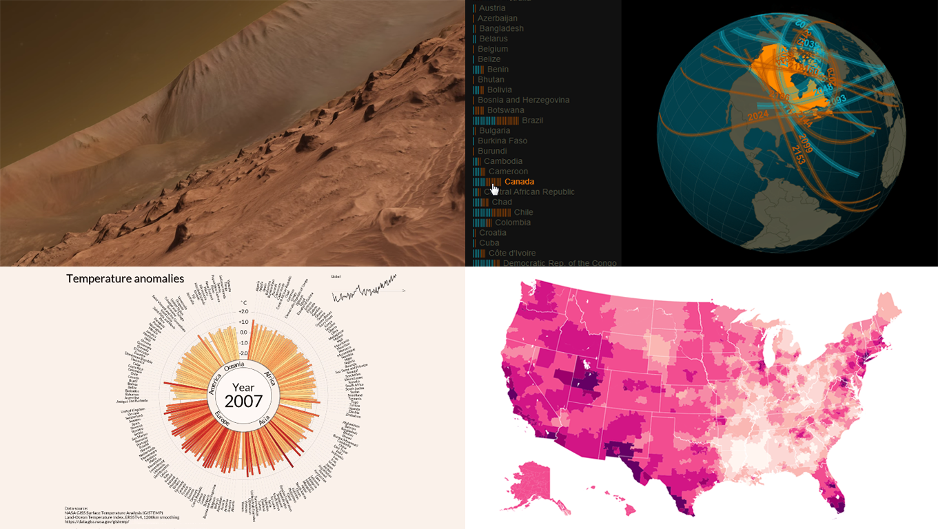 Data visualization (often shortened to ‘dataviz’) makes your data easier and more interesting to read as well as understand. A wide range of visual elements, including maps, charts and images are more effective at driving the message home. Check out our amazing compilation of data visuals pulled from the Web into the new article of Data Visualization Weekly. In fact, these became known just recently:
- New York Times’ detailed fan maps;
- Jan Willem Tulp’s solar eclipse map;
- Carter Emmart’s planet Mars astrovisualization;
- Lipponen’s amazing temperature anomalies chart.
- Categories: Data Visualization Weekly
- No Comments »
Interesting Charting Examples Shared Recently – Data Visualization Weekly
August 4th, 2017 by AnyChart Team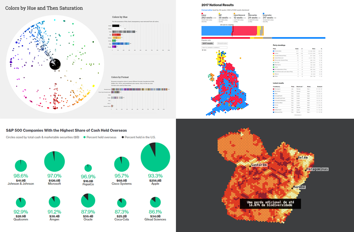 The first Data Visualization Weekly article in August 2017 is out! Check out the four interesting charting examples that we decided to share with you today:
- UK election results;
- the most popular colors on the most visited websites;
- S&P companies with the highest share of cash held overseas;
- forest degradation in the Brazilian Amazon.
- Categories: Data Visualization Weekly
- No Comments »
Worth Seeing Visualizations of Data – DataViz Weekly
July 28th, 2017 by AnyChart Team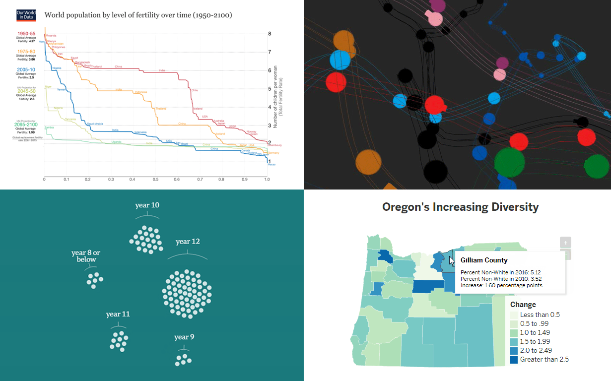 Data visualization quickly evolves as an industry. The wider variety of information emerges on the Internet, the higher quality and more extraordinary visualizations of data it demands. New chart types and features appear, technologies get improved, and all in all, data visualization companies to meet the growing needs of their customers.
As a result, there are more and more interesting data research and visualizations we can find out there, and we are glad to keep sharing some of them in our weekly digest of worth seeing data visualization examples.
This article will show you several interesting and outstanding visualizations of data on the following topics:
- fertility worldwide over time;
- Oregon’s increasing diversity;
- Australian population as 100 people;
- animated visualization of the London Tube.
- Categories: Data Visualization Weekly
- No Comments »
Visualizing Information That Matters: Data Visualization Weekly
July 21st, 2017 by AnyChart Team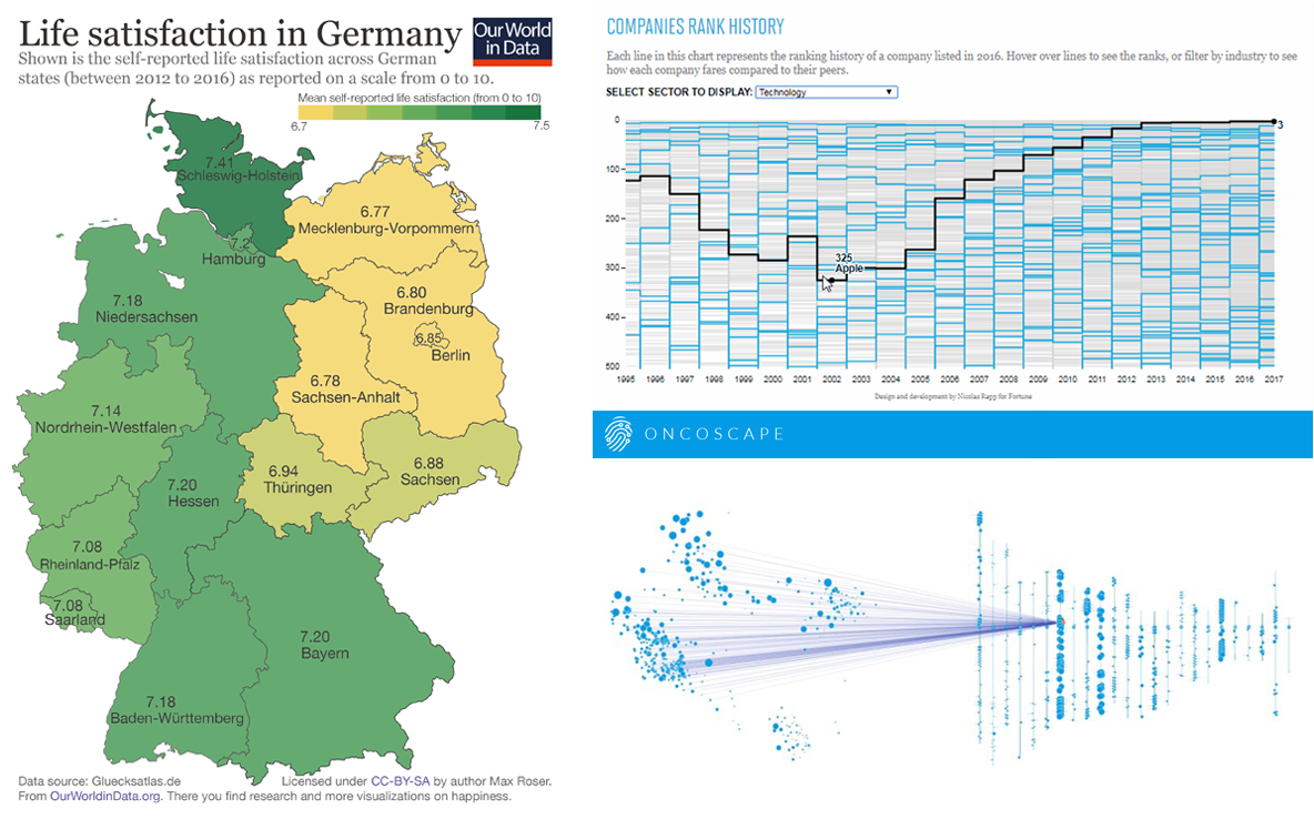 Visualizing information is a complicated matter. But as you are becoming more experienced it gets easier to successfully handle it. All the data visualization examples presented in this issue of DataViz Weekly were created by long-time professionals and made public just lately, but they have already become widely recognized.
So, today’s article is bringing to another light the following data visualization masterpieces:
- map of life satisfaction in Germany by region;
- visualizations of the information from the Fortune 500 list;
- Oncoscape, visualizing clinical and molecular cancer data.
- Categories: Data Visualization Weekly
- No Comments »
Good Data Visualization Examples Worth Checking Out: DataViz Weekly
July 14th, 2017 by AnyChart Team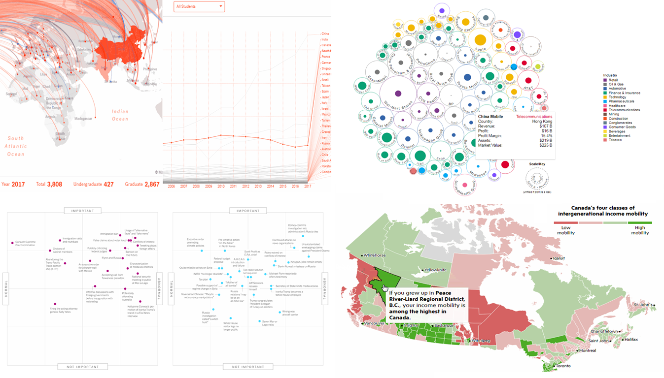 Now it’s time for another cool set of good data visualization examples that became known and even well-known lately. Today’s DataViz Weekly collection consists of the following charts and maps:
- flows of foreign students and researchers to MIT;
- top 100 companies by profit and revenue;
- change in “normality” of Trump’s presidency;
- income mobility in Canada by region.
- Categories: Data Visualization Weekly
- No Comments »