 Surfing the Internet in search of new beautiful and peculiar data visualizations is indeed a very captivating activity. In fact, we are doing that literally all the time, looking for the best practices and inspiration that help us get an ever better understanding of the dataviz and further improve our data visualization solutions. And we are always glad to share with you some peculiar chart examples that we happen to find out there from time to time.
The new Data Visualization Weekly collection includes the following visualizations:
- Houston’s 50 inches of rain: How much is it for your city?
- Sex as a spectrum.
- Immigrant families boost the birth rate in the US.
- Fentanyl and other drug death data in the US visualized for 2000-2016.
Peculiar Data Visualizations Weekly: September 1, 2017 – September 8, 2017
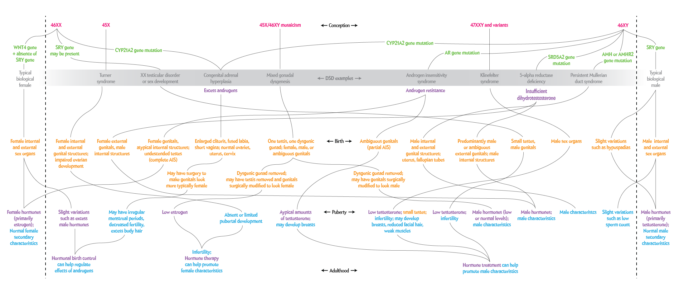
Houston’s 50 Inches of Rain: How Much Is It?
The New York Times visualized data from the Climate Prediction Center of the US National Oceanic and Atmospheric Administration and revealed how long it could take for each region of the USA to get 50 inches of rain, the amount of precipitation predicted for Houston because of Hurricane Harvey.
The map in the article greatly helps feel how much 50 inches of rain actually is. For example, we can expect Manhattan to get such precipitation level for 13 months in total.
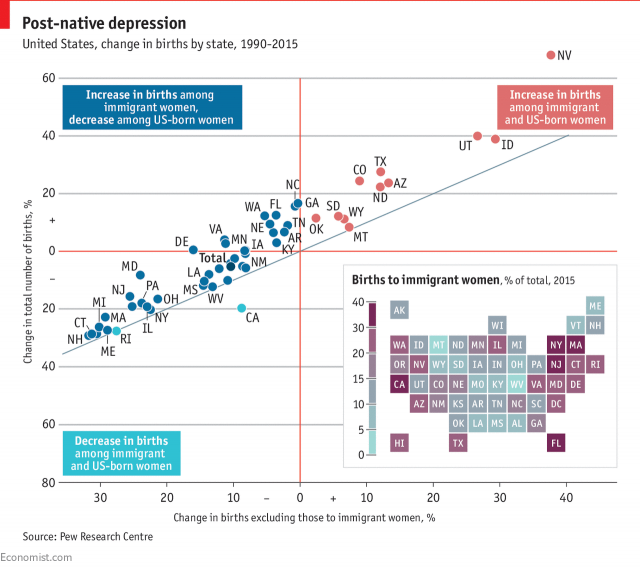
Sex Visualized as Spectrum
Scientific American explored gender self-identification and how it affects the social life. You’ll find the results of this challenging research along with very peculiar data visualizations in the September issue of the magazine.
The announcement shows several examples of charts and infographics that will shed more light on this and are worth-seeing themselves.
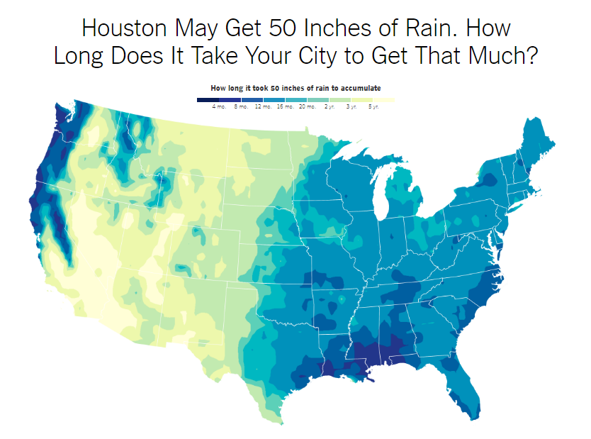
Immigrant Families Boost Birth Rate in US
Immigrants are only 13% of the US population. However, they account for about one-fourth of all births in the US. These charts published by The Economist provide peculiar insights into the change in births across the US along with the corresponding statistics about immigrants.
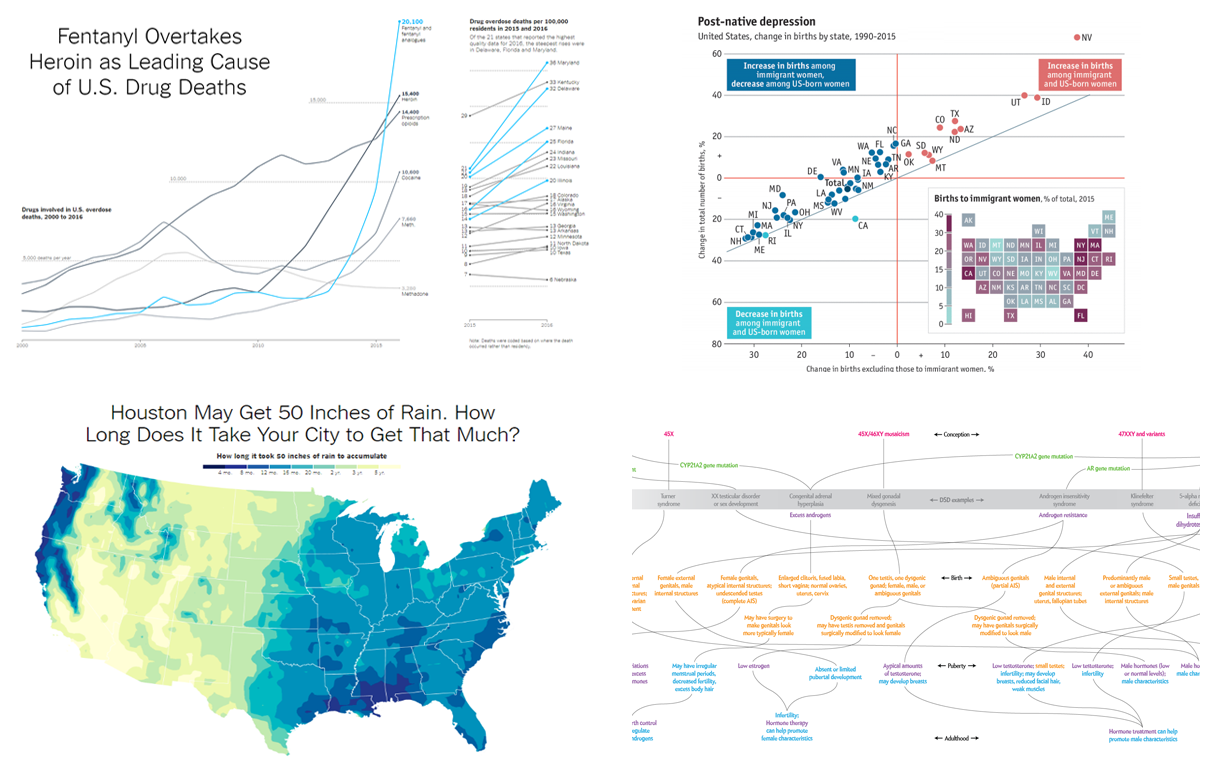
Fentanyl and Other Drug Deaths in US, 2000-2016
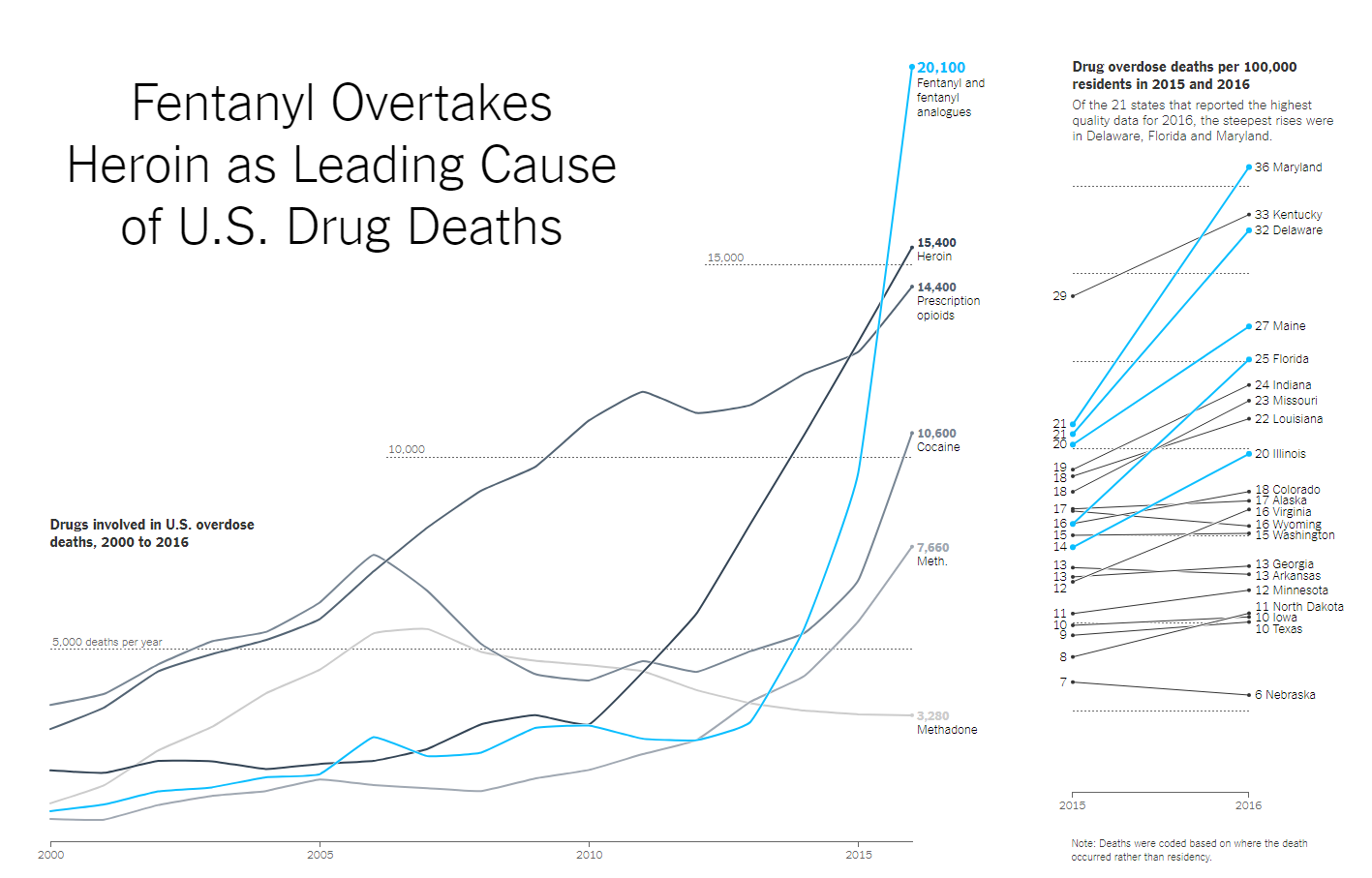
The Upshot outlined the problem of drug deaths which is topical in the US and charted data about how many people died because of one or another drug overdose in 2000 to 2016.
In particular, they found out that while the number of deaths from drug overdose increased, the percentage of deaths from fentanyl has increased by 540% in just three years. In 2016, the number of deaths caused by fentanyl overdose increased to more than 20,000 people, up from 3,000 people three years ago.
***
To see more of peculiar data visualizations published recently on the Web, please read other articles in the Data Visualization Weekly series. When you feel ready to start creating your own charts for any of your own web projects, welcome to our Chart Gallery for inspiration and Documentation for details and tutorials. Feel free to ask any questions, we’re always happy to help!
- Categories: Data Visualization Weekly
- No Comments »