 Data visualization (often shortened to ‘dataviz’) makes your data easier and more interesting to read as well as understand. A wide range of visual elements, including maps, charts and images are more effective at driving the message home. Check out our amazing compilation of data visuals pulled from the Web into the new article of Data Visualization Weekly. In fact, these became known just recently:
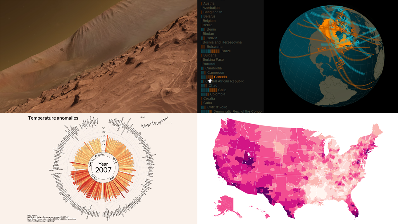
- New York Times’ detailed fan maps;
- Jan Willem Tulp’s solar eclipse map;
- Carter Emmart’s planet Mars astrovisualization;
- Lipponen’s amazing temperature anomalies chart.
Data Visuals Weekly: August 1, 2017 – August 18, 2017
1. New York Times’ Detailed Fan Map Visuals
There are many artists across the country with varying popularity levels according to geographical locations. An artist or a group of artists may be highly popular in one place and less popular in another throughout the country. Every musician has their own geographical fan base.
Data Visualization experts can present this information using a series of remarkable data visuals called Fan Maps. The maps show relative popularity of an artist or a group of artists across different parts of the country using varying saturations of a particular color. If one part of a map is lighter, it does not mean people there were not watching or downloading songs from a particular musician. It just means fans were more likely to listen to a variety of other artists.
Interested in some music to go with your map browsing? NYT presents to you a remarkable series of fan maps to find out who is the artist that many people listen to in your area. Our 50 detailed fan maps reveal what songs Americans love the most. What’s more, we have a cool feature that allows you to get a custom playlist based on the area’s favorite artist among those in our data. All you have to do is to enter a US location in the search box to get a custom playlist. You will get a custom playlist based on that area’s favorite artist among those in our data.
2. Jan Willem Tulp’s Solar Eclipse Map

Solar Eclipse is a unique and natural phenomenon that many people have never witnessed. Imagine watching the moon passing between the sun and the earth while partially or fully blocking the sun at daytime! During a solar eclipse, day turns into the night for a few minutes! Scientists expect this extraordinary phenomenon to take place next week and this will be seen throughout many parts of the world.
Not sure whether or not you will be able to witness the eclipse from your location? Well, try Jan Willem Tulp’s amazing data visualization map showcasing all the places on earth where viewers will be able to witness the eclipse. Simply scroll or swipe down within the text panel using arrows on keyboard, trackpad or mouse to reveal more options. If you did not see your geographic location, you can go to any nearest location shown on the map to witness the occurrence of this unique phenomenon where the moon meets the sun!
What I like the most about this interactive solar eclipse dataviz map 2017 by Willem Tulp are the cool graphics. The guy used high-quality graphics and other key data visualization elements to give readers high-quality insights into where to be to see one of the greatest mysteries of the universe.
3. Carter Emmart’s Planet Mars Images
Check out Carter’s incredible YouTube presentation of planet Mars based on current Mars data from NASA. Images were pulled from one of NASA’s cutting-edge satellites and presented in HD for more clarity and more realistic experience. Amazing visuals indeed, showing you crystal clear pictures of the 5th planet and giving you an in-depth overview of what the surface of this planet which is hundreds of thousands of miles away looks like. From these breath-taking images, we can deduce that the surface of Mars is quite uneven and consists of sand, rocks, ridges and mountains for the most part.
4. Lipponen’s Amazing Temperature Anomalies Chart

Antti Lipponen is a climate change awareness enthusiast. He gathered several statistics on temperature anomalies by country from 1900 to 2016 and wrapped those up in a very cool chart as shown above. His chart contains all the countries in the world and the unique temperature behaviors each one has witnessed over the 20th and 21st centuries. What I love most about this chart is the fact that it’s pretty basic yet it contains a significant amount of insight into global temperature anomalies, which have been witnessed over a very long period of time.
Conclusion
As you can see, data visualization is a powerful way to relay information. It allows your readers to read and interpret your data with ease and engagement. As you can see from each one of the visual elements above, the information that is presented to the reader is not only easy to go through and understand but also engaging for them. Did you enjoy reading and interpreting the data presented through the use of those data visuals? Comment below and let us know your thoughts, and stay tuned for Data Visualization Weekly here on the blog of AnyChart JS Charts.
- Categories: Data Visualization Weekly
- No Comments »