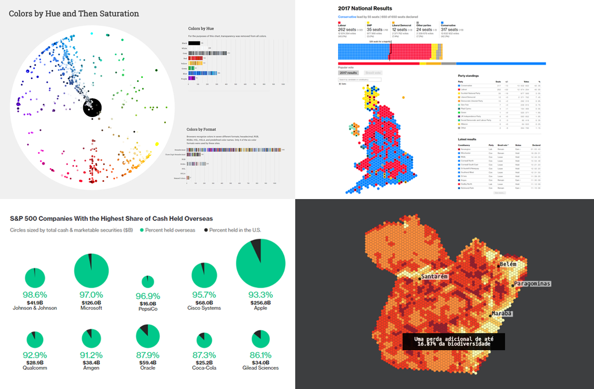
 The first Data Visualization Weekly article in August 2017 is out! Check out the four interesting charting examples that we decided to share with you today:
- UK election results;
- the most popular colors on the most visited websites;
- S&P companies with the highest share of cash held overseas;
- forest degradation in the Brazilian Amazon.
DataViz Weekly: Charting Examples for July 28, 2017 – August 4, 2017
Charting 2017 UK Election Results
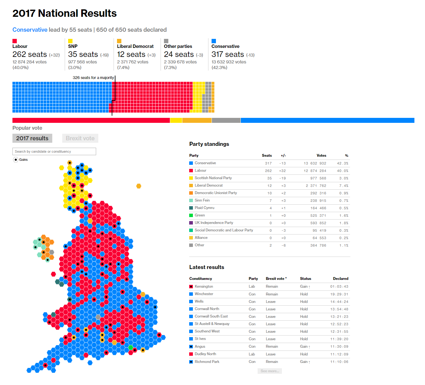
Bloomberg made an informative and colorful data visualization of the 2017 UK parliamentary election results. In essence, there are two interesting charting examples: an interactive geo map and a heat map. While the latter works well to explain the overall situation, the former displays what party took the lead in each constituency, and if you click on a territory, the table with the results for all candidates will appear on your right to provide further details.
The geo map can also show the Brexit vote results: The “Brexit vote” tab turns on a monochrome map of the UK constituencies specifying whether they voted for leaving or staying in the European Union.
Most Popular Colors on Most Visited Websites in Interesting Charting Examples
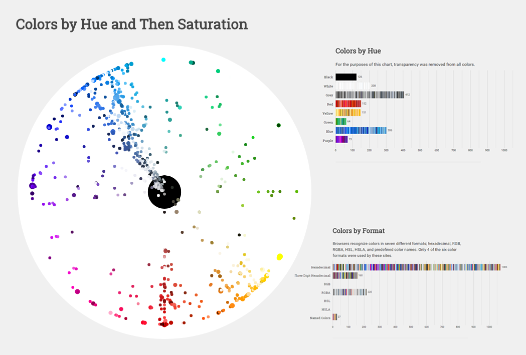
Web developer and graphic designer Paul Heber reviewed the ten most visited websites and revealed the colors that are most frequently used in their HTML and CSS codes. Check out the article to learn more about his findings and explore the charts detail by detail. In particular, don’t forget to play with the sophisticated fan diagram, Colors by Hue and Then Saturation.
In the second part, Paul explains diverse formats of color and how he converted all of them to HSL in order to build those interesting charting examples to visualize the data he managed to collect.
Pie Charts of Top Companies Keeping Cash Overseas
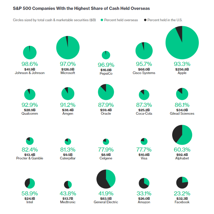
Here’s another peculiar data visualization from Bloomberg. This piece makes use of pie charts to graphically represent the top S&P 500 companies that keep the highest share of cash overseas.
Each pie chart has only two slices representing how much cash (and marketable securities) each company holds in the United States (black) and overseas (green). There’s also a spreadsheet with the detailed data about 50 companies having the largest cash stockpiles overseas, right under the charting examples. By the way, some of them are among our respected customers.
Visualizing Degradation in Brazilian Amazon Rainforest
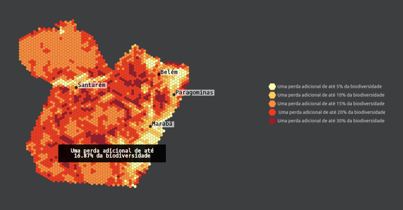
A team of scientists conducted a large scale research of the Brazilian Amazon forest degradation issue, and here’s the final online data visualization based paper they presented. In fact, there are a lot of factors affecting the rainforest: unauthorized lodging, unreported fire, hunting, and even climate change. While the forest degradation is a very significant problem itself, it also leads to the emergence of other problems in flora and fauna, for example, to the extinction of multiple species of birds. In this article, you’ll find peculiar examples of charting using the column, line, and interactive map chart types.
We hope these visualizations have served well for your inspiration or – simply – for fun. Check out the other issues of DataViz Weekly if you remain hungry for interesting charting examples, maps, and infographics popular around the Internet. In the meantime, we wish you an amazing weekend time, folks! 🙂
- Categories: Data Visualization Weekly
- No Comments »