 The new Data Visualization Weekly article reviews another set of interesting examples of data visualizations we’ve found on the Web: some amazing, some notable. In fact, data can speak much more clearly when visualized, allowing us to gain and remember more insights than we could reveal and remember from the texts and tables. The following dataviz works are vivid examples of that.
Let’s look at the following samples of creativity in the data visualization sphere:
- The Shadow Peace, a data-driven documentary on nuclear war;
- delays and cancellations in New York’s subway;
- time to earn an architecture license;
- visualizing large date and time based data.
Weekly Examples of Data Visualizations: August 18, 2017 – August 25, 2017
The Shadow Peace: Documentary on Nuclear War and Peacekeepers

Neil Halloran is known for creating something very different from usual examples of data visualizations with the help of charts. Earlier he introduced an interactive video with a lot of different animated successive charts with the The Fallen of World War II research.
Now, he made The Shadow Peace, a similarly impressive video presentation of how possible the Nuclear War is and what circumstances it may lead to. This visualization is notable for its unusual format of a video with interactive charts, i.e. when you press pause at a specific moment you can interact with the chart displayed. There are a lot of different types of charts in this project: bars, bullets, funnels, maps, stacked variations, and so on. This masterpiece is definitely a must-see for any person interested in data science and data visualization matters.
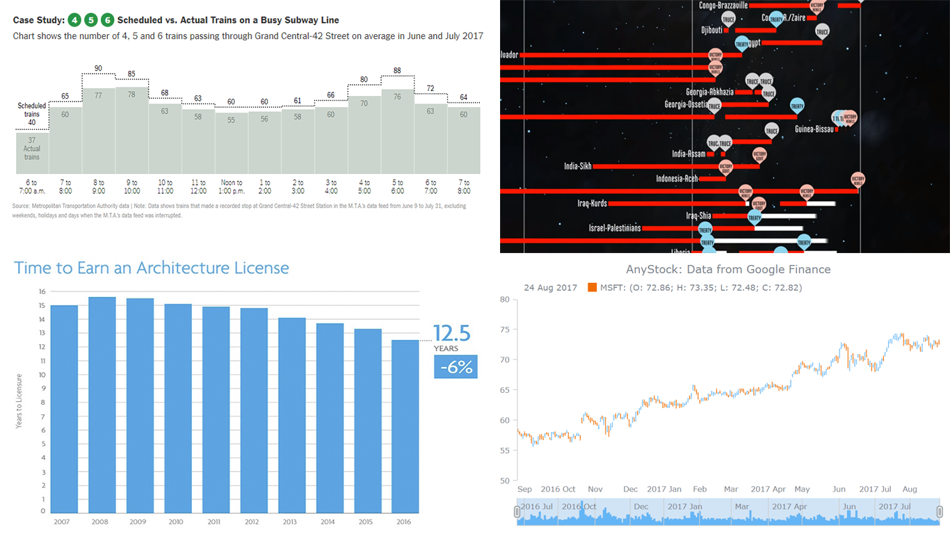
Visualizing New York’s Subway Data About Delays and Cancellations
Many people in New York face transport problems each day: they cannot get to work in time because many subway trains on the Lexington Avenue Line are delayed. The New York Times made an article where this issue is described in details. It appears that the bigger the crowd is, the more trains slow down, and at the same time, the fewer trains serve the line, the bigger crowd becomes. This problem is self-feeding.
It is demonstrated in the article with bar and area charts that this situation – train delay and cancellation – is habitual not only for the rush hour but can take place during the day. It happens because the subway is overcrowded in general. The charts show the difference between the real and the planned number of trains. Also, there is a comparison between the number of trains meeting the even spacing and how many trains operate on schedule (in percent). In fact, it is easy to notice that the former group’s percentage is almost always higher than the latter’s.
Chart of Time to Earn Architecture License

People who want to work as an architect should be aware of multiple nuances covering and related to this field as they become responsible not only for the visual appearance of the houses and other buildings we live and work in but also for their reliability and functionality. The Building Design + Construction magazine published an article in which pointed out that the term of getting an architecture license is getting smaller and smaller over time. Several years ago it used to be 15 years and more, and now it is about 12.5 years. This change is demonstrated on a bar chart at the beginning of the article, and this chart is one of the great examples of data visualizations that are simple and interesting at the same time.
Large Date and Time Based Data Visualization with AnyStock
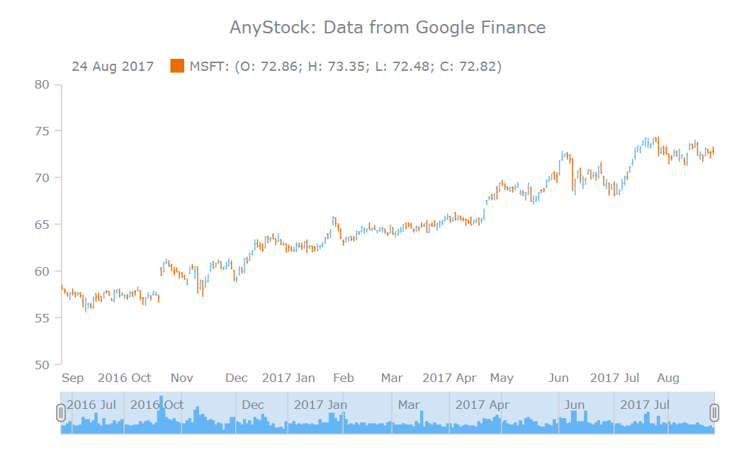
When it comes to visualizing large date and time based data sets, it is necessary to make sure that the dataviz solution you are using is actually able to give you not only the full freedom of creativity, customization and ease of use but also everything you technically need to handle such data. Our Head of R&D Roman Lubushkin wrote another worth-reading article for SitePoint, now on this topic. In this tutorial-based piece, he also makes an introduction to our AnyStock JavaScript charting library.
Chart examples in this article will help you understand the beauty of data mapping, how to load data directly from Google Finance (and, basically, any other market data source like that), and even more.
That’s what we wanted to share with you today. If you’d like to take a look at more examples of data visualizations, check out other articles in the Data Visualization Weekly series. If you feel ready to start creating your own charts, welcome to our JavaScript chart playground for inspiration and see AnyChart’s API reference and docs to learn more and begin.
Have a nice weekend!
- Categories: Data Visualization Weekly
- No Comments »