 The presentation of data using graphical formats is a global trend. Many people, including us, love data visualization and the amazing creativity that it allows. Your dataviz projects don’t have to be typical and common, they need – at least sometimes and for some reason – to be something that is more unique as well as more captivating. A top notch graphical representation of data will comprise numerous creative elements that many viewers have never seen before. Nothing can make your dataviz project go viral more than creativity, so creative data visualization examples are the key to getting more viewership.
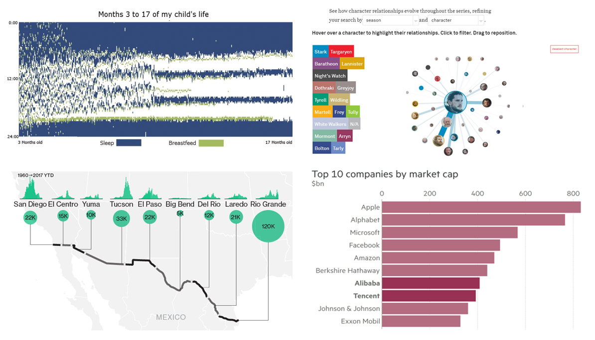
Below are a few of interesting data visualizations projects that we pulled from the Web. Check out how each data expert has applied creativity in their work.
Data Visualization Weekly: August 25, 2017 – September 1, 2017
1. Stunning Game of Thrones Creative Data Visual
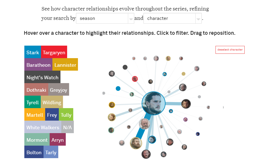
Game of Thrones is a television drama series loved by many. In this epic series from HBO, characters, houses, as well as allegiances, continue to change as characters meet one another, new kings and queens gain power and opposing sides do battle across the show’s extensive plot.
A team of data visualization experts from the Northeastern University has created a cool interactive visualization brilliantly illustrating the connections characters share with each other in this epic British drama series. It’s a creative and interactive network with all Game of Thrones characters presented as circles, sized to the amount of time on screen they receive and colored by house or allegiance. The intensity of the links between characters is scaled to the amount of time they are shown together. Characters form clusters based on the strength of their connections. Click a character to highlight their relationships. Double click to filter and drag to a position.
2. Bloomberg’s Data Visuals Showcasing the US-Mexico Border
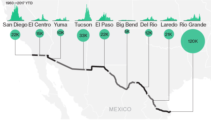
President Trump has ordered Homeland Security to go on with one of his key campaign promises; to construct a wall on the US border with Mexico. However, he has not issued a number of important details about the project, including when as well as how the wall would be constructed, or how much this project would cost the taxpayer.
That’s what Bloomberg says and then shares a few details that we know about the US-Mexico border. It’s about 2000 miles long 70% of which track the Rio Grande River. The land along the border cuts through the desert, wildlife reserves, steep and rocky mountains, rural farmlands as well as through a number of cities such as El Paso, Texas and San Ysidro, California. Check out the amazing data visuals of the US-Mexico border on Bloomberg.
3. Creative Data Visualization Examples Showing Rise of China’s Tech Titans
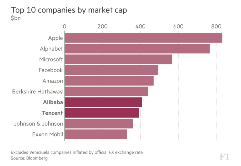
China continues to surprise the world with its progress in technology. The country has risen from being a technologically disadvantaged Asian country to one of the leading technology hubs in the world. Check out the Financial Times’ data story in five charts that show how top Chinese tech companies feel, including Alibaba, Tencent, Weibo, Baidu and others – plenty of information along with creative data visualization.
4. Stunning Visual Illustrating What It Is Like to Parent a Newborn
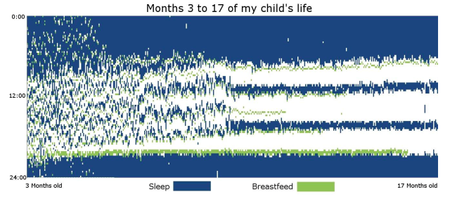
New parents navigating through the overwhelming chaos of life with a newborn can get desperate for information that adds value to their parenting life. When does she tend to nap? At what times should he feed?
A Reddit user together with his wife volunteered to help new parents with the right information by meticulously documenting how every 15-minute increment of their daughter’s life was spent between the ages of 3 months and 17 months. With lots of creativity, they came up with a stunning piece of data visualization that illustrates all the details of early parenthood. Check out this cool and creative data visualization from the new parents to learn one or two things about taking care of a newborn.
Conclusion
As you can see, creativity is an important factor in dataviz. A cleverly executed data visualization project allows your viewers to view as well as interpret your data with much engagement and fun. As you can see from each one of the creative visuals above, the information that is presented to the viewer is not only easy to look at and decipher but also very much engaging to them.
Did you enjoy checking out our selection of creative data visualization examples that we pulled from the Web? If so, what do you think about the use of creativity in dataviz? Feel free to comment below and let us know your thoughts. In the meantime, we will start the media research for the next Data Visualization Weekly article.
- Categories: Data Visualization Weekly
- No Comments »