Data Story and Visualization Examples Worth Seeing – DataViz Weekly
January 12th, 2018 by AnyChart Team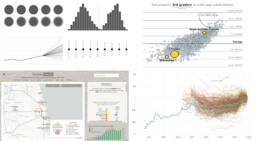 Hi there! Welcome to the new Data Visualization Weekly post! We’ve gathered another four interesting visualizations and data story examples that we hope you’ll like.
Today in DataViz Weekly:
- Options to Visualize Uncertainty in Data
- Renewing Inequality: Data Story, 1950s-1960s
- More and Less Effective US School Districts
- Investing in Bitcoin and Other Cryptocurrencies
- Categories: Data Visualization Weekly
- No Comments »
New 2018 Year Is Here! Take Another Look Back at 2017 in Charts – DataViz Weekly
January 5th, 2018 by AnyChart Team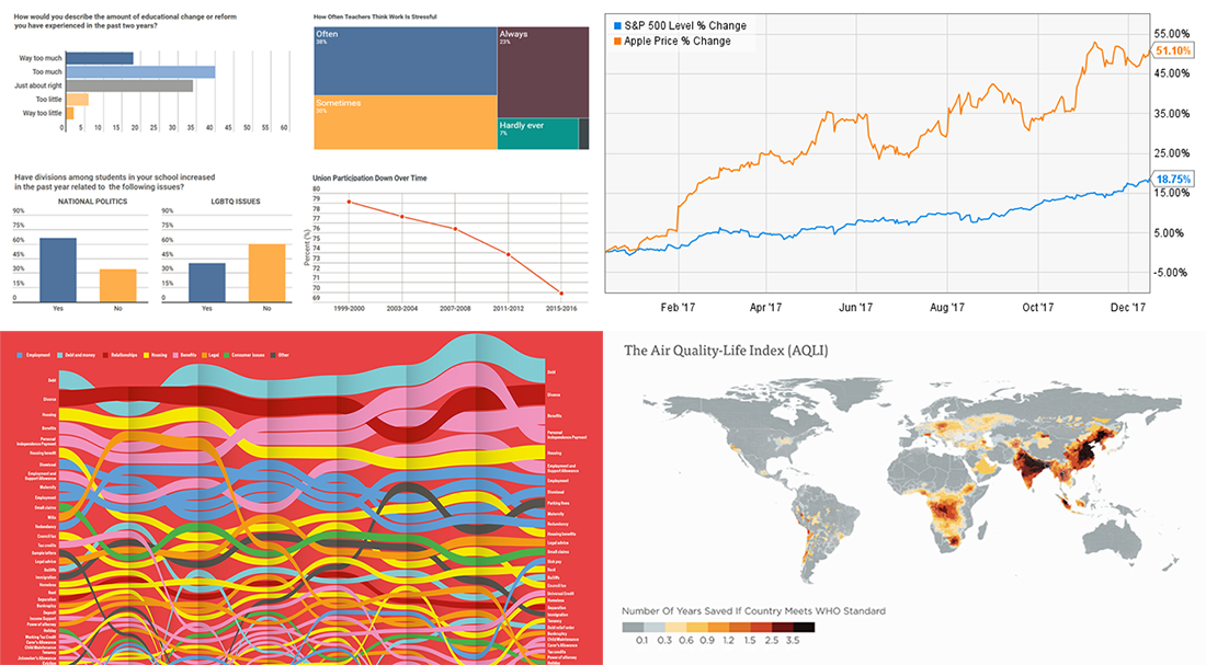 Yay! We are already living in the new 2018 year! And may it bring you plenty of success, joy and happiness!
In the meantime, we at AnyChart continue our Data Visualization Weekly series of articles devoted to some of the interesting data visualization projects and standalone charts and infographics we’ve recently come across. This time, let’s recall the last year once again and see how it looked for:
- the teaching profession,
- UK citizens,
- energy and
- Apple.
- Categories: Data Visualization Weekly
- No Comments »
Data Visualization in 2017: Highlights – DataViz Weekly
December 30th, 2017 by AnyChart Team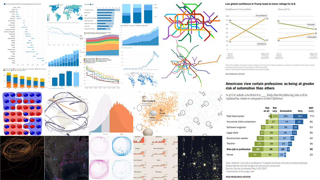
The new 2018 year is coming very soon, and now is a great time to look back and remember the highlights from data visualization in 2017.
A few words about our solutions to start with. After the very productive year of 2016, we at AnyChart JS Charts did a lot in 2017, too. 4 major releases full of new features! After versions 7.13.0 and 7.14.0, we launched the brand new, 8th generation of our JavaScript charting libraries, featuring a modular system and custom JS builder (8.0.0). In December 2017, we released AnyChart 8.1.0. In addition, we published a number of plugins (for Qlik, Android, Angular, Ionic and more) and technical integration samples for popular technology stacks, released Chartopedia and the brand new Playground with a whole bunch of chart examples added to our documentation, API reference and galleries. And even more.
A lot of great charts and infographics were created in 2017 by various people and companies from around the world. In the present, this year’s last Data Visualization Weekly post, we’ll tell you about 4 year-in-review articles featuring the most interesting visualizations of 2017:
- 10 Best Projects in Data Visualization in 2017 — FlowingData.
- Quartz: Top 5 Charts in 2017, According to Reddit — Quartz.
- Year of 2017 in 12 Charts — The World Bank.
- 17 Striking Findings in 2017 — Pew Research.
Compelling Charts Visualizing Data That Matter – DataViz Weekly
December 22nd, 2017 by AnyChart Team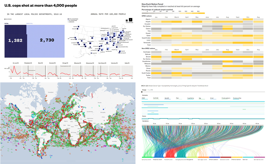 In fact, charts visualizing data are greatly helpful in revealing trends and patterns in this data. That’s why we love dataviz and continue Data Visualization Weekly, our regular blog feature showcasing interesting examples of charts and infographics.
Today in DataViz Weekly:
- US police shoot people more than twice as often as anyone could think;
- charts visualizing data about protein variation;
- marine traffic map showing the location of all major commercial ships worldwide;
- visualizing big gains in curbing the oil output in OPEC and its ally countries.
- Categories: Data Visualization Weekly
- No Comments »
Happy New Year in JavaScript Charting: AnyChart 8.1.0 Is Out!
December 20th, 2017 by AnyChart Team The New Year and Christmas are already just around the corner, and we have something astonishing for you in this magical time! The next major update for our product family of JavaScript charting libraries is now released, so meet AnyChart 8.1.0!
Check out what new cool and useful features are delivered in the new versions of our HTML5-based interactive data visualization solutions AnyChart, AnyStock, AnyGantt and AnyMap, as well as what we are going to work on next.
- Categories: AnyChart Charting Component, AnyGantt, AnyMap, AnyStock, Financial Charts, Gantt Chart, HTML5, JavaScript, News, Qlik, Stock Charts
- 2 Comments »
Various Data Represented in Interesting Visualizations – DataViz Weekly
December 15th, 2017 by AnyChart Team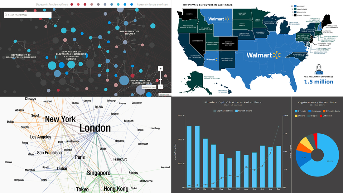 Data visualization is a great thing. It helps humans make sense of various data that’s all around. And we are glad to continue to share with you good dataviz examples on a regular basis, in the Data Visualization Weekly feature on our blog.
So, the new weekly article is here! Look what data visuals we are presenting this time:
- first and business class air travel flow between key global cities;
- the largest employers in every state of the US;
- gender diversity in undergraduate classes across MIT;
- Bitcoin capitalization and market share.
- Categories: Data Visualization Weekly
- No Comments »
Conditional Custom Drawing in JavaScript Charts — Challenge AnyChart!
December 13th, 2017 by Vitaly Radionov The time has come for a new Challenge AnyChart! article! We continue to receive interesting data visualization tasks from our wonderful customers and are happy to share with our blog readers how to solve some of the most inspiring ones with the help of our JavaScript charting libraries.
In today’s tutorial, let’s dig into custom drawing and create an interactive HTML5 line chart of which the segments with negative values are painted with a different color than the rest of the graph.
- Categories: AnyChart Charting Component, Challenge AnyChart!, Charts and Art, HTML5, JavaScript, Tips and Tricks
- No Comments »
DataViz’s Growth in Popularity and How It Is Being Applied in Different Areas – Data Visualization Weekly
December 8th, 2017 by AnyChart Team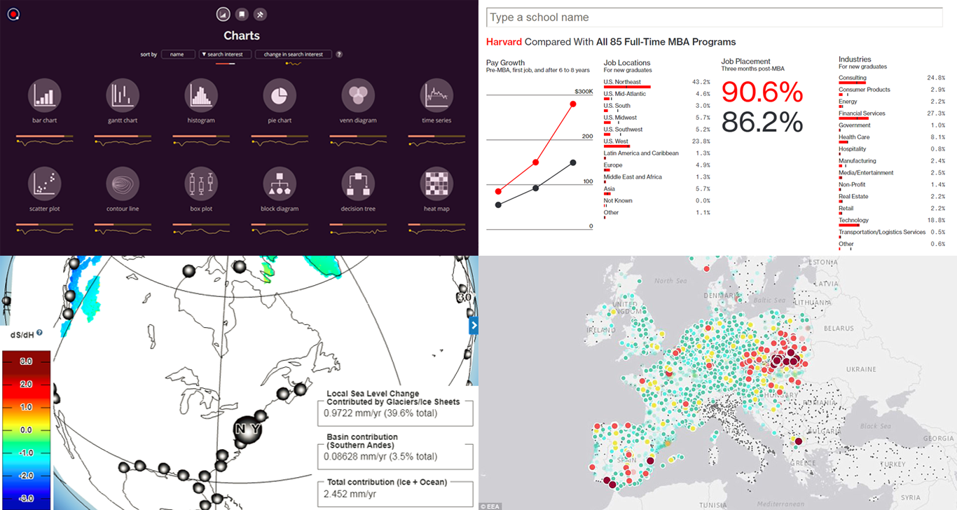 Hello DataViz Weekly readers! Today we will take a look at data visualization’s growth in popularity and how it has been applied in several areas.
This article showcases the following visualizations:
- What chart types, books and tools are most popular in Google search (and how the interest has changed).
- An interactive map revealing deadly air pollution levels across Europe in real time.
- A simple and creative visualization showing the top US graduate business schools.
- An interactive 3D earth map showing how melting glaciers and rising sea levels could destroy some of our cities in the future.
- Categories: Data Visualization Weekly
- No Comments »
How to Create Pie Chart with JavaScript
December 6th, 2017 by Timothy Loginov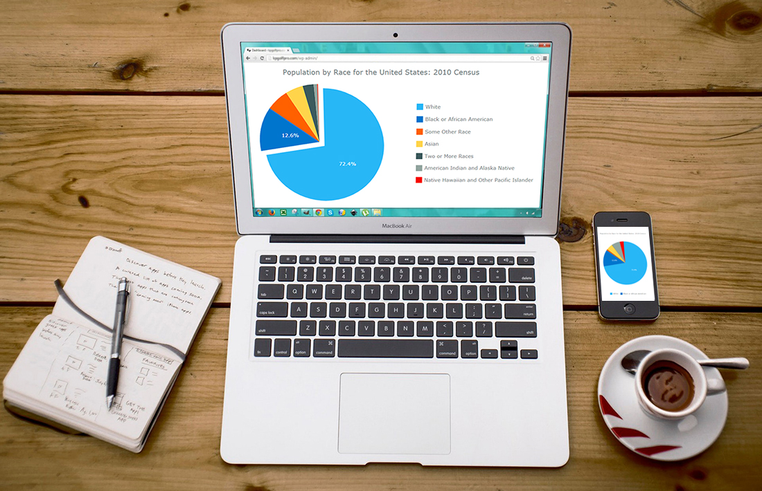 Have you ever wondered, how web developers create and integrate interactive JavaScript pie charts into HTML5 apps and web pages? If the answer is yes – keep on reading! This article explains how to create, change and integrate a pie chart into your web page. Beware! A hot-button political issue is present in this article. But we will not offend anyone!
Pie chart is one of the most popular chart types. Mathematically speaking it looks like a circle divided into sectors which represent a part of a whole. For the most of us, pie charts look like real pies or pizzas cut into several slices. In this article, you will find a detailed tutorial on how to build one, with JS chart code samples.
Read the JS charting tutorial »
- Categories: AnyChart Charting Component, HTML5, JavaScript, JavaScript Chart Tutorials, Tips and Tricks
- 29 Comments »
Brilliant Data Visuals Providing Insights into a Variety of Issues – DataViz Weekly
December 1st, 2017 by AnyChart Team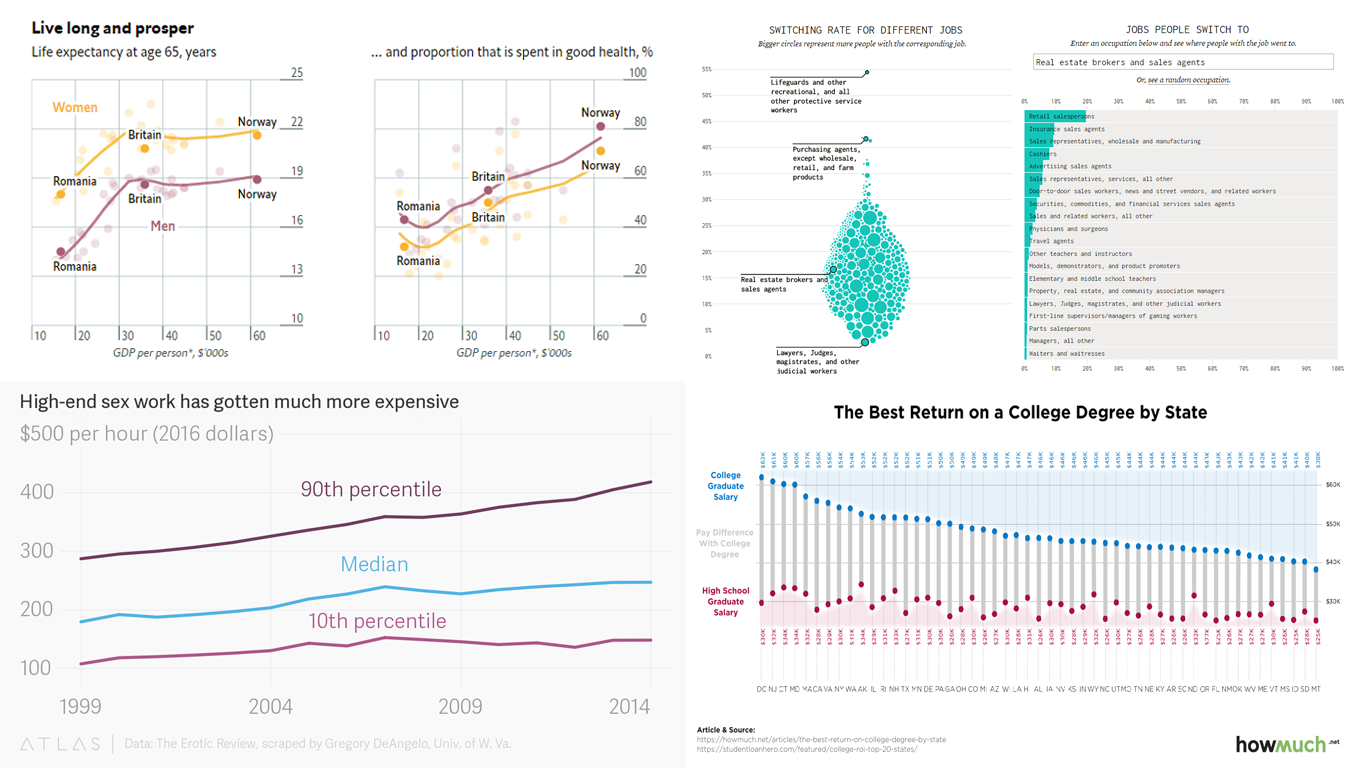 Hello reader, it’s nice to have your attention once again. Today we present to you another DataViz Weekly post, comprising a range of brilliant data visuals, showing different data revolving around four different issues to tell stories about them. In this article, we take a closer look at:
- Some reasons why many people quit their job and where they go after resigning.
- The significance of investing in college education.
- How the internet has impacted the market for sex.
- The relationship between income, life expectancy and health, based on a recent survey carried out in Europe.
The simple charts below will help you understand the data, get new insights into these four areas and see some hidden patterns as well as trends in each one of them. So, let’s get started right away.
- Categories: Data Visualization Weekly
- No Comments »