 Welcome to our Data Visualization Weekly series where we bring you some of the latest news and information on a wide range of topics, from family and property to energy and education. We use creative and amazing data visuals from around the Web to present information.
Today we introduce to you interesting data on 4 specific areas that you will find quite interesting to know something about, using a variety of visual elements. We take a closer look at energy generation, marriage statistics by age, and Chicago housing price trends. Another area that we will focus on is MBA – what schools give the biggest (and smallest) boost to salaries. So let’s begin straight away with the first topic.
Data Visualization Weekly: November 10, 2017 – November 17, 2017
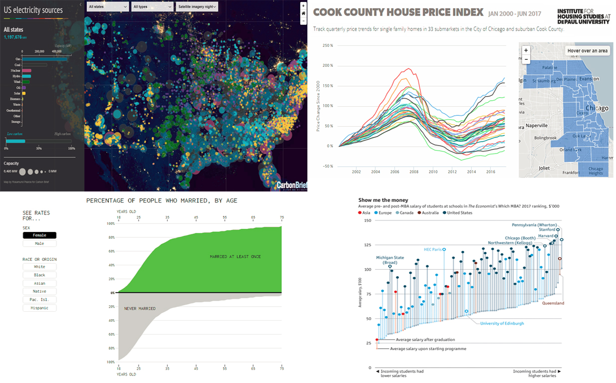
1. US Energy Generation
The US energy is normally described as the world’s largest machine because of its enormous nature. The nation’s power grid is humongous, supplying energy to different sectors from manufacturing and transport to health and family. But do you know how America produces her energy? Well, learn how the energy you utilize at home or within your business premises gets produced.
First, it is important to understand that the US energy system is derived from a wide range of resources and it can be split into different forms. We have hydroelectricity, which is the most popular form of energy, followed by wind and solar, which forms what we call clean energy.
There are many different technologies that are used to generate the country’s energy supply, relying on water, solar, wind or natural gas. The energy gets to the consumer in form of power that can be used for heating, lighting and powering machines regardless of the technology used to produce it.
Check out these interactive, amazing data visuals to see the national power grid with all the power plants in the US. See the relative power-generating capacity of each plant, indicated in form of a bubble.
2. What Business Schools Give the Biggest Boost To Salaries?
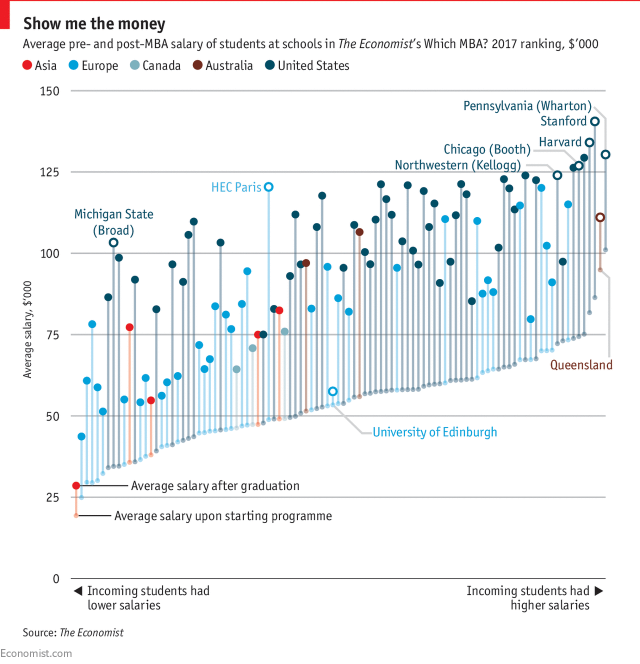
Aspiring to become a successful business executive? Well, enroll for an MBA course today with a reputable university or business college and your dream will come true. Although there are thousands of postgraduate institutions offering approved MBA courses, not all of them will give you a certificate that will see you earn more than the average business executive when you join the corporate world.
Take a look at this chart on The Economist to get more insights on business schools that give the biggest boost to salaries. According to the info-graphics, the largest boost is seen at Stanford University followed by Harvard. Stanford graduates earn about 140,000 US dollars per annum while their Harvard counterparts make around 130,000 US dollars over the same period of time. There are many other good business schools that will see you earn more than the average corporate executive when you graduate, including the University Of Chicago’s Booth School of Business and North Western University’s Kellogg School of Business. The University of Edinburg, however, is the worst business school (among those presented) to enroll with for your MBA course with a pretty tiny boost to salaries.
3. US Marriage Statistics in Amazing Data Visuals
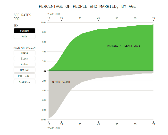
Are you single and not sure whether or not it’s time you settled down? Or are you married and wondering whether you opened the marriage chapter a bit earlier or later than your peers? Well, a lot of people do not know the right time to settle down. If you are among them, check out Nathan Yau’s cool chart visualization showing the percentage of people who married at least once, given your age. You can view the rates for different groups using the buttons on the left. You will notice the curve shifts downwards as you shift from female to male because women tend to marry at a younger age than men.
Also, Caucasians and Asians tend to marry more consistently at earlier ages than other groups. It is however interesting that the marriage rate approaches the 90s as one gets into the older years. This gives quite a baffling impression. According to the data, one would say that many people marry because they are growing older and not because they love their partner and want to start a family together.
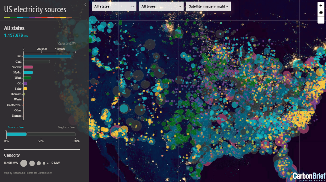
4. Chicago Housing Price Trends
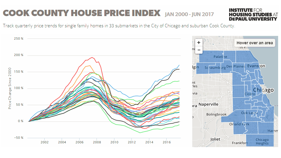
Are you a real estate investor who wants to expand to the city of Chicago or suburban Cook County? Well, before you expand your business to the city or to the county, it is imperative that you assess the economic health of the place.
But how do you do that if you are not an expert? Well, it’s very simple. Simply check the area’s house price trends to get a sense of its economic health.
House price trends are some of the most important things that experts look at when assessing the economy of an area. Understanding how these trends vary within a particular place is critical to making sound investment decisions, especially if you are a property investor.
To help you understand the house price trends in Chicago and Cook County better, the Institute for Housing Studies (IHS) has developed a submarket-level Chicago and Cook County house price indexes to track quarterly price trends for single family homes in 16 submarkets within the city and 17 submarkets within the county.
See these cool charts presenting Chicago and Cook County property price trends in detail – the last one of the amazing data visuals we are featuring in this post.
***
Stay tuned to the DataViz Weekly series and you’ll get a portion of interesting news and revelations represented with the help of amazing data visuals every week.
- Categories: Data Visualization Weekly
- No Comments »