 Another week, another four interesting visualization examples. That’s how our DataViz Weekly feature works!
For the present post, we’ve selected the following visual graphics:
- world map of fitness routes;
- how much Americans need to work to pay mortgage;
- explorer of US state greenhouse gas emissions;
- extensive map of mouse brain wiring.
Data Visualization Weekly: November 3, 2017 – November 10, 2017
World Map of Fitness Routes
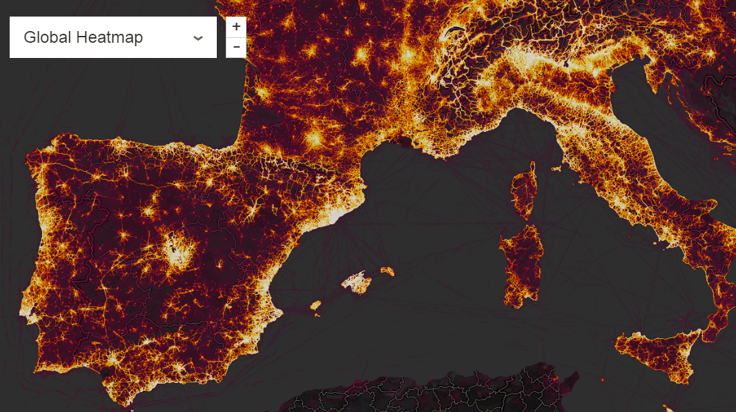
Strava updated their stylish interactive map of popular routes and destinations of athletes based on data from its sports activity tracking app. The developers say they added data about 1 billion activities of 31 different types, worldwide.
Take a look at the map to find the most popular cycling, running and other fitness routes and places in your area.
How Much Americans Need to Work to Pay Mortgage

In an effort to find out and compare how hard-to-bear the mortgage burden is across the United States, Howmuch.net compiled data from the US Census Bureau and Zillow. Then they calculated how many hours an American needs to work in order to earn enough money for a monthly mortgage payment depending on where home is located, and visualized the results on a map.
It’s interesting to note that according to the research model Howmuch.net implemented, New Yorkers have to work 113 hours to afford a home, while only 17 hours is sufficient for those living in Toledo, OH. You’ll find the map along with further interesting conclusions on Howmuch.net.
Explorer of US State Greenhouse Gas Emissions

States of the United States of America remain among the major emitters of the greenhouse gas, globally. To better explore this, World Resource Institute put together data about greenhouse gas emissions for all the states of the United States of America and visualized it in a series of charts.
The interactive chart pictured above clearly shows that the top 10 emitters account for a little less than 50% of the overall national emission. These are Texas (the leader), California, Pennsylvania, Illinois, Ohio, Florida, Indiana, Louisiana, New York and Michigan. The dataviz also allows us to learn about the biggest emission sources for each of them. See the article to explore its interactive version and look at other charts as cool visualization examples for further insights.
Extensive Map of Mouse Brain Wiring

Scientists from the MouseLight team of the Janelia Research Campus made what can now be referred to as the most comprehensive map of the mouse brain. Published as the MouseLight Neuron Browser analysis tool, it displays the position and shape of 300+ neurons inside the mouse brain. The best of the earlier known attempts allowed researchers to trace only dozens of them (out of about 70 million).
Read more about this project and check it out as an outstanding scientific visualization tool. By the way, the entire dataset is available for free download.
***
That’s all for now, folks! Stay tuned and do not miss out on the next posts with visualization examples within the framework of our Data Visualization Weekly series.
- Categories: Data Visualization Weekly
- No Comments »