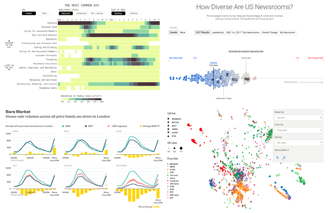
 Here’s the new DataViz Weekly post. It brings to light four cool data visuals on the following areas:
- employee diversity in the major US newsrooms;
- daily routines of different groups of Americans;
- outlook of Britain’s property market;
- new revelations about “hidden” variability in how cancer cells respond to drugs.
Without wasting any more time, let’s go straight to these data visualizations!
Data Visualization Weekly: November 17, 2017 – November 24, 2017
How Diverse Are US Newspaper Publishers In Terms of Employees?
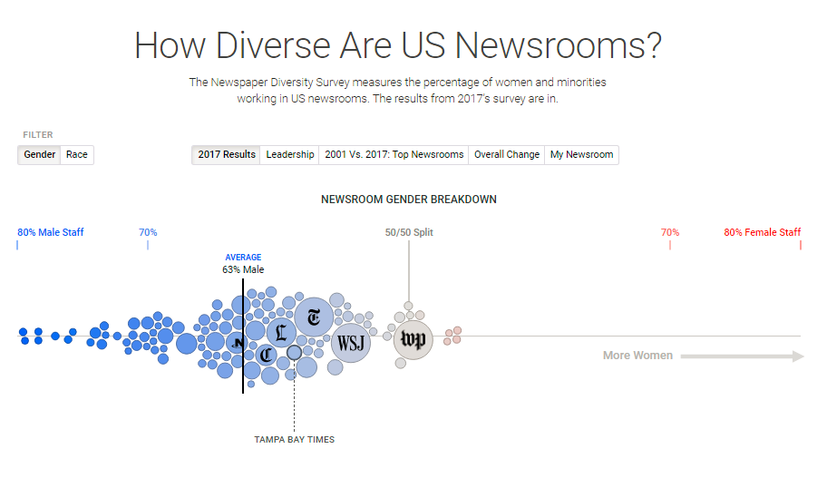
An important survey was conducted recently, measuring the diversity in the workforce of major US newsrooms in terms of gender and race with quite mind-boggling results. The survey found that when it comes to gender, the Washington Post, the New York Times and other major news organizations were not so poorly balanced although men made up the majority of their employees. As far as race is concerned, it discovered that these organizations were almost not as diverse as one would expect.
Check out our cool data visuals on how diverse US newsrooms are, hover your mouse over each newsroom and switch between views to gain more insights of how employee-diverse these organizations are.
What Is Daily Routine of Different Groups of Americans Like?
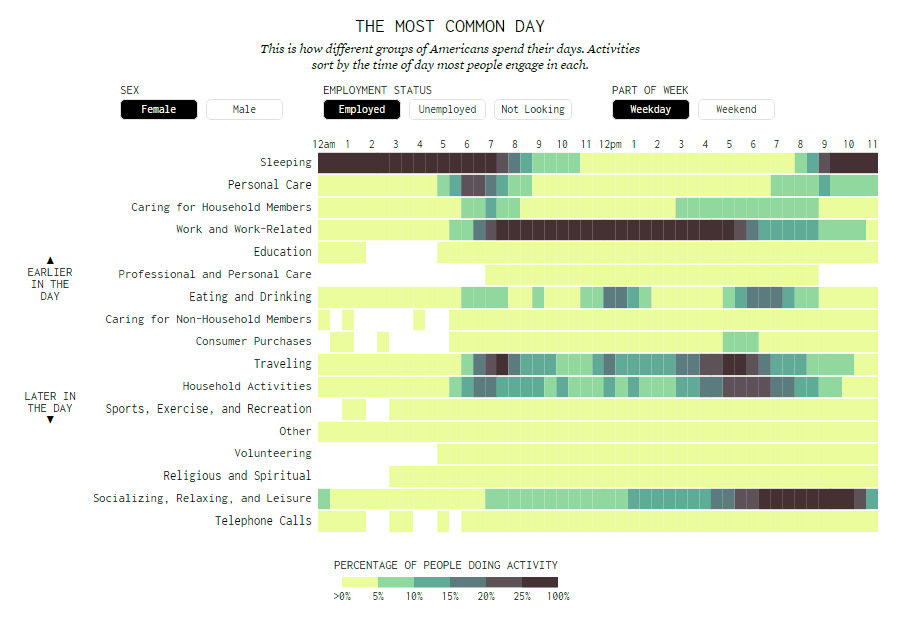
Sleep, work, play and repeat is the common cycle in the life of many Americans. It is the breakdown of many individuals’ daily routine, even though the amount of time allocated for each activity (and rest) varies from person to person.
Check out these cool data visuals on FlowingData to get further insights into the daily routines of different groups of Americans. See how each group juggles work, play, sleep and other important daily pursuits of life.
Charts Showing Britain’s Vanishing Housing Market
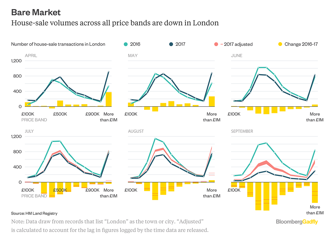
Britain’s property market is not performing so well because there are not so many people buying homes as we speak. This has made investors significantly reduce their property prices in order to attract more buyer interest, with the sharpest price reductions seen in the capital. The rest of the country is catching up quite first.
In places such as London for example, the market has seen a 50 percent price drop since June. Property in all price categories has been hard hit as witnessed in the data from the Land Registry below. Homes located outside the capital are now going at half the price of their city counterparts.
Check out the housing market charts on Bloomberg Quint to understand the sorry state of affairs in Britain’s property market at the moment. In particular, you’ll see how the slowdown has worsened sharply since June in London.
Uncovering “Hidden” Variability in How Cancer Cells Respond to Drugs
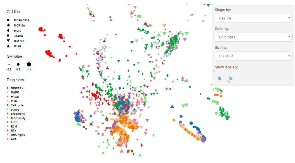
In a recent study conducted by Harvard Medical School, researchers used a special technique known as ‘gene expression profiling’ to analyze how cancer cells respond to anticancer drugs, revealing mind-boggling patterns of variability in how cells respond to drugs. After a few weeks of research, they were able to solve the puzzle of why patients with the same type of cancer can have different responses to a drug.
Based on analyses of over 600 drug as well as breast cancer cell pairings, the researchers found that, for some cells, drug exposure can cause incredible changes in gene expression, bringing about the successful action of a drug on its target without stopping tumor growth. This seems to be caused by certain adaptive resistance mechanisms, which, when identified, can be blocked by other drugs given in combination.
This new knowledge will go a long way in helping scientists enhance drug effectiveness and informing the development of effective drug combinations to overcome the ability of cancer cells to evade treatment. The findings were published in Nature Communications, outlining strategies to better enhance cancer treatment and to ensure every patient who is taking these drugs is able to get cured.
Read more here and check out the interactive visualization showing these new insights.
***
Thanks for your attention to this new showcase of cool data visuals! Stay tuned to the Data Visualization Weekly feature on the AnyChart JS Charts blog.
- Categories: Data Visualization Weekly
- No Comments »