 Hello DataViz Weekly readers! Today we will take a look at data visualization’s growth in popularity and how it has been applied in several areas.
This article showcases the following visualizations:
- What chart types, books and tools are most popular in Google search (and how the interest has changed).
- An interactive map revealing deadly air pollution levels across Europe in real time.
- A simple and creative visualization showing the top US graduate business schools.
- An interactive 3D earth map showing how melting glaciers and rising sea levels could destroy some of our cities in the future.
Data Visualization Weekly: December 1, 2017 – December 8, 2017
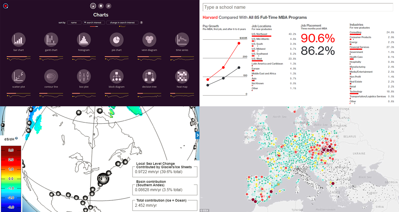
Charts Showing Popularity of Chart Types and DataViz Tools and Books
Information designer Anna Vital has recently released an intriguing dataviz project showing how popular different data visualization types, tools and books have been over the last year.
Titled altogether The Visualization Universe, the charts here are based on Google Trend data. For example, we can notice see that bar charts and Gantt charts are the most popular chart types when it comes to the search interest rate. For more insights, you can play with sorting tools, books and types of visualization by this parameter and its change over the last year.
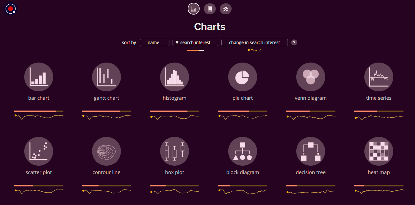
Interactive Map Revealing Deadly Air Pollution Levels Across Europe in Real Time
How dangerous is the air you breathe? How much toxic gas do you inhale every second of your life? We found a nice interactive map that enables you to check air quality in real time across Europe, where a significant number of premature deaths every year have been blamed on air pollution.
As you can see, Germany has the best air quality, with a number of its cities and towns given higher ratings by the EAA data. Five UK cities and towns—London, Norwich, Belfast, Chatham and Newport, on the other hand, had moderate air quality ratings due to substantial levels of PM 2.5 and PM 10. Elsewhere, Eastern European countries typically rated poorly.
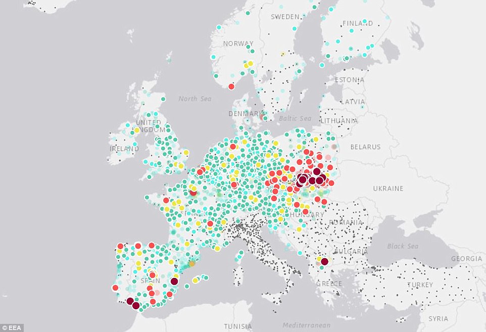
Harvard Ranked the Best Business School for the Third Time Consecutively
For the third time in a row, Harvard retains the best graduate business school position.
See this article on Bloomberg featuring table showing data about the top 85 graduate US business schools in 2017 and the dashboard allowing the reader to compare a school with all the other MBA programs on the list.
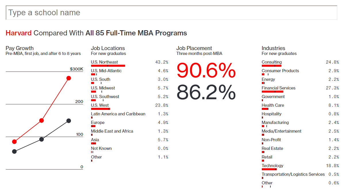
NASA’s Global Simulator Map Highlighting Which Melting Glaciers Could Drown Your City in Future
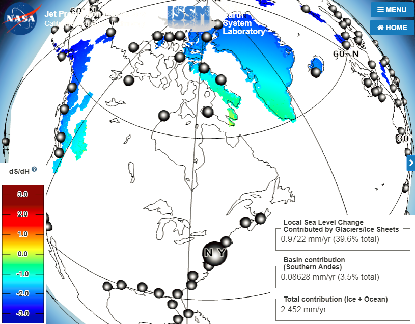
Should you be worried about the rising sea levels due to melting glaciers? Could this drown your city in future? Well, find out by using this intriguing simulator map of the globe created by NASA’s Virtual Earth System Laboratory (VESL) department, pinpointing which cities will be drowned as a result of which melting glaciers causing the rising sea levels.
Click and drag with your mouse across the map to change the view. Scroll to zoom in and out.
***
Thank you for your attention! Stay tuned to Data Visualization Weekly and get a portion of interesting data visualization examples from around the Web every week!
- Categories: Data Visualization Weekly
- No Comments »