How to Create JavaScript Word Cloud Chart — Tutorial for Web Developers
April 30th, 2019 by Irina Maximova
Wondering how to make a beautiful interactive Word Cloud using JS? Then you’re in the right place! In this data visualization tutorial, I’ll guide you through the entire development process, demonstrating it’s easier to create a JavaScript word cloud chart for an HTML5 app or web page than you might think!
Also known as tag clouds, word clouds represent a popular visual technique designed to reveal how often tags (or basically, any words) are mentioned in a given text body. Essentially, the word cloud chart type leverages diverse colors and sizes to display at a glance different levels of relative prominence.
Now that we’ve got an idea of what a word cloud is, let’s get down to learning how to quickly code one using JavaScript!
Read the JS charting tutorial »
- Categories: AnyChart Charting Component, HTML5, JavaScript, JavaScript Chart Tutorials, Tips and Tricks
- 8 Comments »
Visual Data Graphics on EU Regions, Freedom of Press, IMF Forecasts, and Climate Change — DataViz Weekly
April 26th, 2019 by AnyChart Team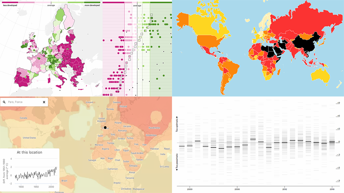 Get ready for another dose of cool visual data graphics — DataViz Weekly is here! Today we are glad to acquaint you with the following new interesting projects:
- The Pudding explains why EU regions redraw their borders.
- Reporters Without Borders shares its annual World Press Freedom Index for 2019.
- Bloomberg analyzes errors in the International Monetary Fund’s spring forecasts of same-year GDP growth.
- BuzzFeed visualizes how climate change has already transformed the planet.
- Categories: Data Visualization Weekly
- No Comments »
FinancesOnline Honors AnyChart Data Visualization Software with Premium Usability and Rising Star Awards
April 23rd, 2019 by AnyChart Team At AnyChart, we believe that companies and organizations should be able to leverage their data without having to waste time on trying to make sense of raw digits and vast spreadsheets. This is why we worked hard to create a no-fuss interactive data visualization software that does not compromise flexibility while giving everyone a unique chance to visualize any data in any way they want and make correct data-driven decisions they need in an instant. It is for this reason that FinancesOnline, a reputable business directory, has included our charting solution in their list of the top data visualization tools and granted us the Premium Usability Award and the Rising Star Award for 2019!
- Categories: AnyChart Charting Component, News
- No Comments »
Data Charting on Health Care, Elections, Income, and Countries — DataViz Weekly
April 19th, 2019 by AnyChart Team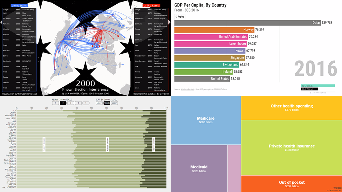 Various data charting examples get published on the web every day. They are part of visual stories, analytical reports, scientific studies, and so on. Every week, we choose four of the most interesting projects with charts and maps we’ve come across and feature them in a special post on the AnyChart blog within the framework of our regular DataViz Weekly series. So here’s a new one!
Today on Data Visualization Weekly:
- estimates of health care expenditures under the “Medicare for All” plan by U.S. Senator Bernie Sanders;
- electoral interference instances by the United States and USSR (Russia) in 1946-2000;
- U.S. households in each state by income level;
- top countries by GDP per capita in 1801-2016.
- Categories: Data Visualization Weekly
- No Comments »
How to Code JS Column Chart with Multi-Level X-Axis — Challenge AnyChart!
April 17th, 2019 by Irina Maximova We continue to update the Challenge AnyChart! section of our blog with new data visualization tutorials. They nicely demonstrate how powerful our JavaScript charting library is, which our Support Team is always eager to prove to everyone. In one of the first challenges, we already told you how to create a JS chart with nested axes. Since our customers keep showing interest in such forms of data presentation, now we’ll show you how to build another interesting chart with a different appearance but quite similar code — an interactive JS column chart with a multi-level X-axis.
- Categories: AnyChart Charting Component, Challenge AnyChart!, HTML5, JavaScript, Tips and Tricks
- No Comments »
Visual Data Presentations About Occupations, Air Quality, Forecasts, and Cherry Blossom — DataViz Weekly
April 12th, 2019 by AnyChart Team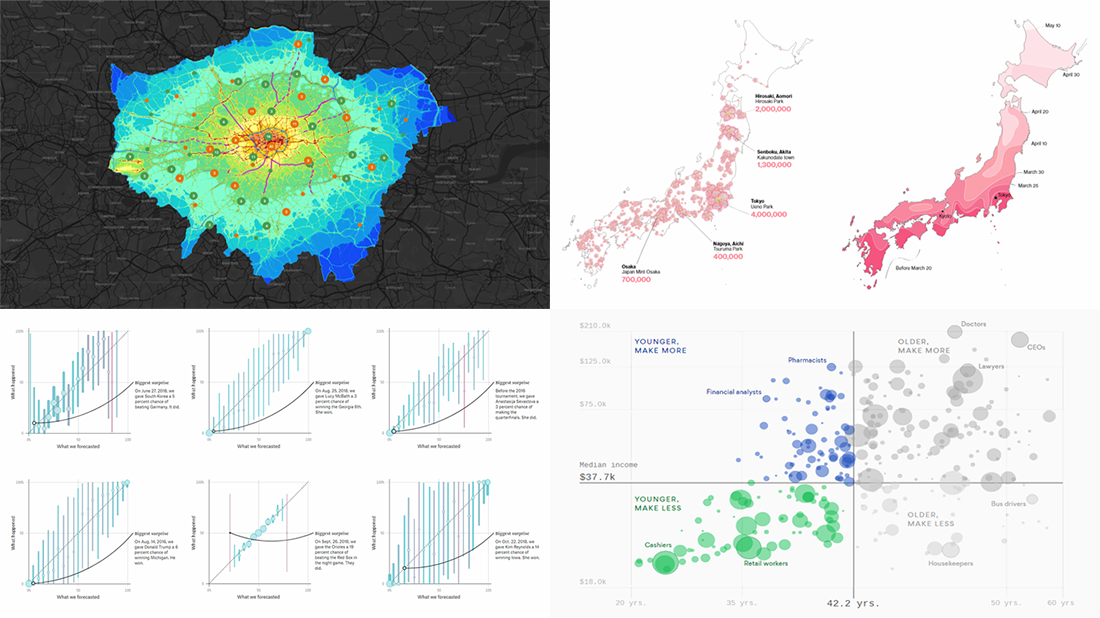 Check out new interesting visual data presentations we’ve found these days — they are good examples of beautiful and insightful data visualization in action.
Today on DataViz Weekly:
- charting occupations in the United States, by age and income,
- mapping London’s air quality,
- analyzing FiveThirtyEight’s forecasts, and
- revealing big business behind the cherry blossom season in Japan.
- Categories: Data Visualization Weekly
- No Comments »
AnyChart Blog Named in 50 Best Data Visualization Blogs to Follow in 2019
April 10th, 2019 by AnyChart Team Yay, AnyChart Blog with our flagship regular feature DataViz Weekly has made it to the Top 50 Data Visualization Blogs and Websites To Follow in 2019! Curated by Feedspot, this newly updated list ranks our blog as high as second — right next to Nathan Yau’s brilliant blog FlowingData deservedly occupying the first place among the best data visualization blogs.
- Categories: News
- 1 Comment »
Data Charts for Visual Analysis of Languages, MLB Fandom, Gender Gap, and IRS Audit Rates — DataViz Weekly
April 5th, 2019 by AnyChart Team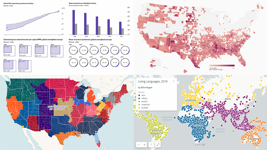 Data charts are greatly helpful in analysis, making it much easier for us people to make sense of numbers and percentages from various statistics and reports through visualization. Let’s take a quick look at how this works in reality.
Today we’ll meet you with four of the new interesting projects we’ve recently come across, featuring cool data visualizations about the following:
- world languages;
- MLB fandom;
- global gender gap;
- IRS audit rates.
- Categories: Data Visualization Weekly
- No Comments »
How to Create Stunning Interactive Bar Charts Using JavaScript — Tutorial
April 3rd, 2019 by Alfrick Opidi Web developer Alfrick Opidi shows how to create beautiful interactive bar charts using JavaScript (HTML5), taking the AnyChart JS charting library as an example along the tutorial.
Read the JS charting tutorial »
- Categories: AnyChart Charting Component, Charts and Art, HTML5, JavaScript, JavaScript Chart Tutorials, Tips and Tricks
- No Comments »
Data Visualization Practices on Relationships, Brands, Hollywood, and Wildlife — DataViz Weekly
March 29th, 2019 by AnyChart Team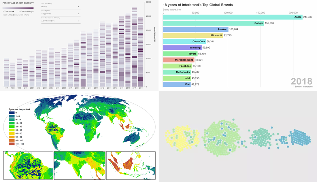 By looking at the best data visualization practices, not only do you have fun and learn something interesting about life and the world around us, but you can also pull together ideas that will help you take your charting skills to the next level. DataViz Weekly on the AnyChart blog is the right place to get such inspiration as that’s where we share with you some of the most interesting charts and graphics-based projects that have recently come to our attention.
Join us as we take a quick overview of new data visualizations on the following subjects:
- relationship timeline in 1970s vs 2010s
- top global brands in 2000-2018
- Asian on-screen representation in Hollywood movies
- global hotspots of human impact on threatened species
- Categories: Data Visualization Weekly
- No Comments »