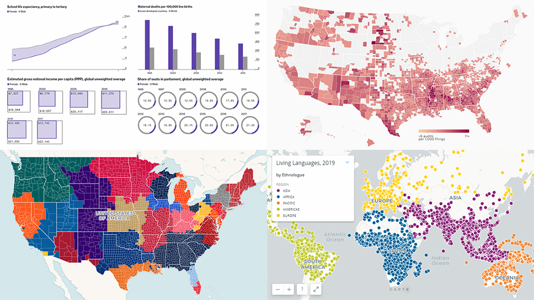
 Data charts are greatly helpful in analysis, making it much easier for us people to make sense of numbers and percentages from various statistics and reports through visualization. Let’s take a quick look at how this works in reality.
Today we’ll meet you with four of the new interesting projects we’ve recently come across, featuring cool data visualizations about the following:
- world languages;
- MLB fandom;
- global gender gap;
- IRS audit rates.
New Interesting Data Charts in DataViz Weekly: March 29, 2019 — April 5, 2019
World Languages
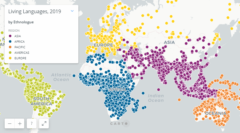
Ethnologue, claiming to be the most authoritative resource on the languages of the world, released the 22nd edition of its database. According to the new information, although 23 languages account for more than 50% of Earth’s population, there are 7,111 living languages overall around the globe.
For an insightful look, Ethnologue visualized all the languages on an interactive dot map according to the geographic areas where they are spoken. Each language is displayed only once, in its primary region.
Check it out and click on the pins to see more information about a certain language. Don’t miss out on the charts below the map, revealing some other interesting findings.
MLB Fandom
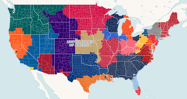
Ticket search engine SeatGeek looked into data about the behavior of its users buying Major League Baseball (MLB) tickets to map what they call “MLB Fandom” across the United States of America, showing at a glance the most popular baseball team in every county.
Look at the results of their work — what MLB team is most loved where — on a cool interactive choropleth map published by SeatGeek on MLB’s opening day, March 28.
Below the map, you’ll also find some of the interesting stories the map reveals.
Global Gender Gap in 1995-2017
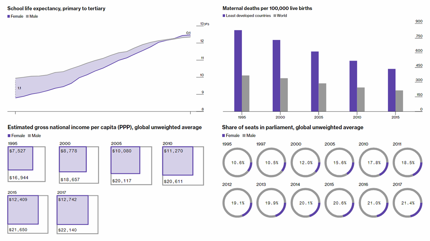
Andre Tartar and Cedric Sam from Bloomberg News conducted an analysis to reveal the current magnitude of the global gender gap and how it has changed over the past two decades.
For the research, the authors took into consideration ten rates: school life expectancy, maternal deaths, adult literacy, share of senior and middle management jobs, life expectancy at birth, share of seats in parliament, labor force participation, gross national income, share of university graduates from Natural Sciences, Mathematics and Statistics programs, and unemployment.
Take a look at the ten charts to learn about the progress and remaining disparities in the global gender gap.
IRS Audit Rates Across U.S.
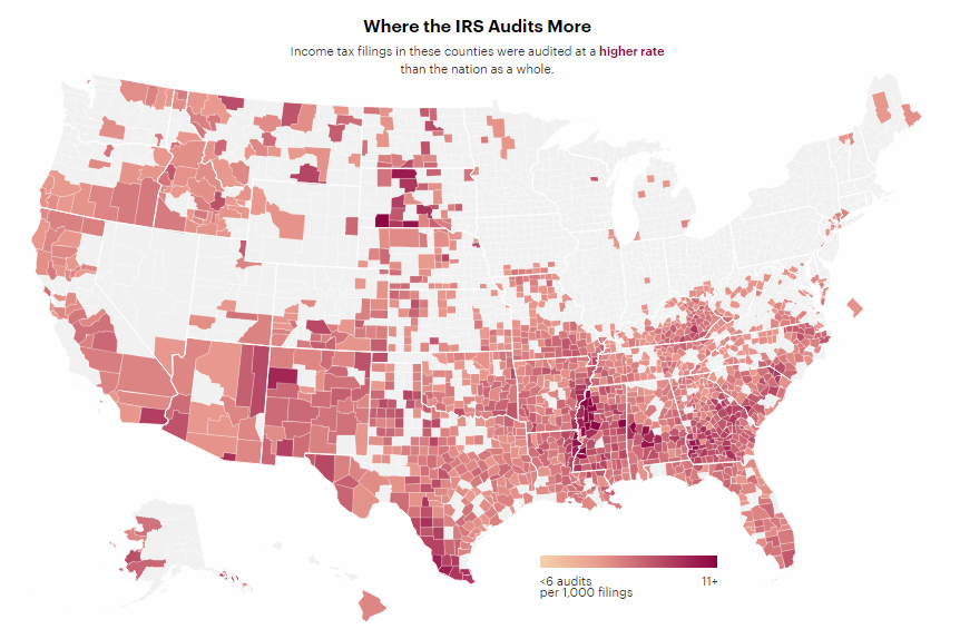
Economist Kim M. Bloomquist studied data about the Internal Revenue Service (IRS) audit rates across the United States of America and discovered disparities.
According to his findings, for example, Mississippi’s Humphreys County, much to everyone’s surprise, appears to be the most heavily audited county in the U.S., although many of the taxpayers living in that area are actually poor and a median household annual income there is as small as $26K. At the same time, Loudoun County in Virginia, known for the highest median household annual income in America, which is $130K, is audited 51% less than Humphreys.
Join ProPublica’s Paul Kiel and Hannah Fresques as they map U.S. counties according to how heavily income tax filings are audited here and there, and as they try to understand the reasons of the way things stand in this field.
***
We’ll continue to show you some of the best examples of data charts in the next issues of Data Visualization Weekly each Friday. Stay tuned.
- Categories: Data Visualization Weekly
- No Comments »