 Check out new interesting visual data presentations we’ve found these days — they are good examples of beautiful and insightful data visualization in action.
Today on DataViz Weekly:
- charting occupations in the United States, by age and income,
- mapping London’s air quality,
- analyzing FiveThirtyEight’s forecasts, and
- revealing big business behind the cherry blossom season in Japan.
New Cool Visual Data Projects: April 5, 2009 — April 12, 2019
Charting U.S. Occupations by Age and Income
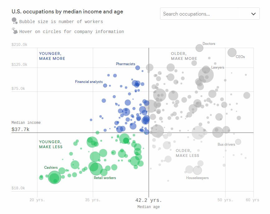
Lazaro Gamio, Deputy Managing Editor for Visuals at Axios, made a cool interactive bubble chart that shows occupations in the United States by age and income.
Based on data from the U.S. Bureau of Labor Statistics, the visualization displays at a glance vast disparities. The lines depicting the median income and median age divide the chart into four parts, bringing greater legibility.
Explore the interactive version of this data visualization on Axios and hover over the points to see more information about the jobs. Also, don’t miss out to look through the quick highlights from reporter Stef W. Kight in the same article with the chart.
Mapping London Air Quality
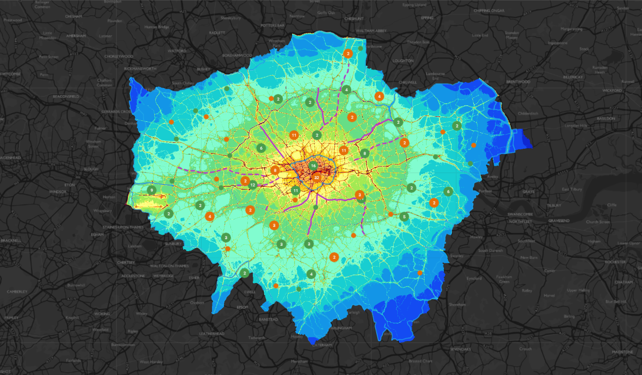
The Mayor of London’s environment team launched an interactive map of London’s air quality. The map visualizes monitoring and modeling data along with the actions undertaken by the Mayor on air pollution across the city.
Choose what you want the visualization to show by adding and removing diverse layers. Zoom in to focus on a specific location. Click the points on the map to learn more.
Analyzing FiveThirtyEight’s Forecasts
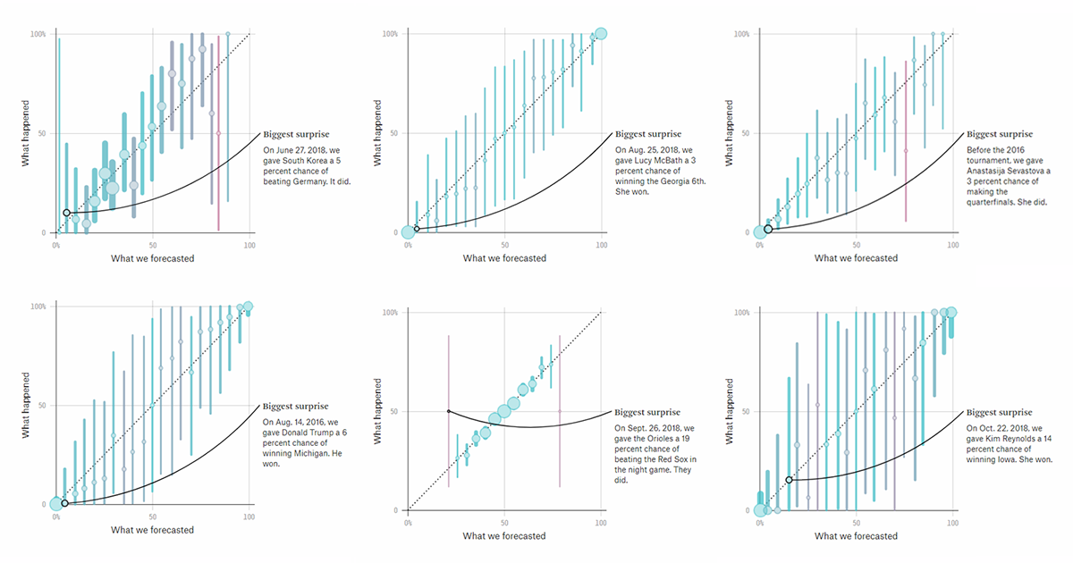
Widely known for compelling stories based on statistical analysis, especially in elections and sports, FiveThirtyEight made a public evaluation of all its major forecasts since 2008 when Nate Silver had launched the website.
Pick a forecast you want to check, and you’ll be offered a special tool dedicated to that forecast, allowing you to see how good it appeared to be in reality. Generally speaking, all these tools show where FiveThirtyEight’s forecasts need some adjustments, but they also make it explicitly obvious that the models have proved to be really strong in performance. Well, take a look by yourself.
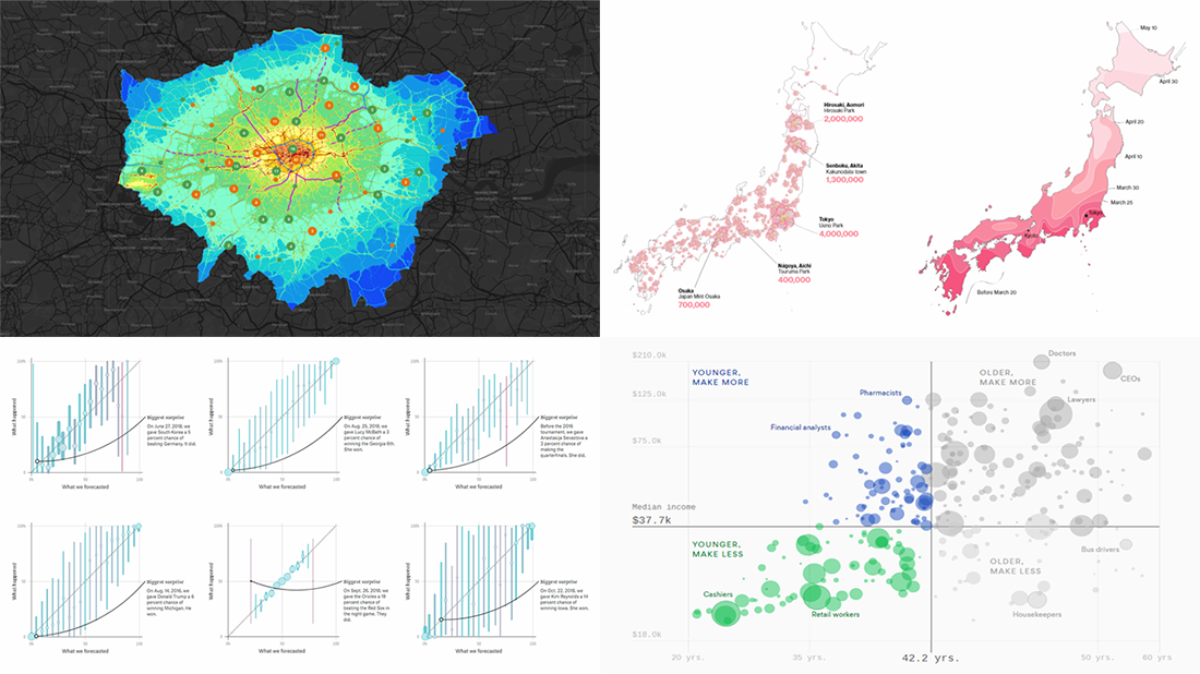
Revealing Big Business Behind Cherry Blossom Viewing Season in Japan
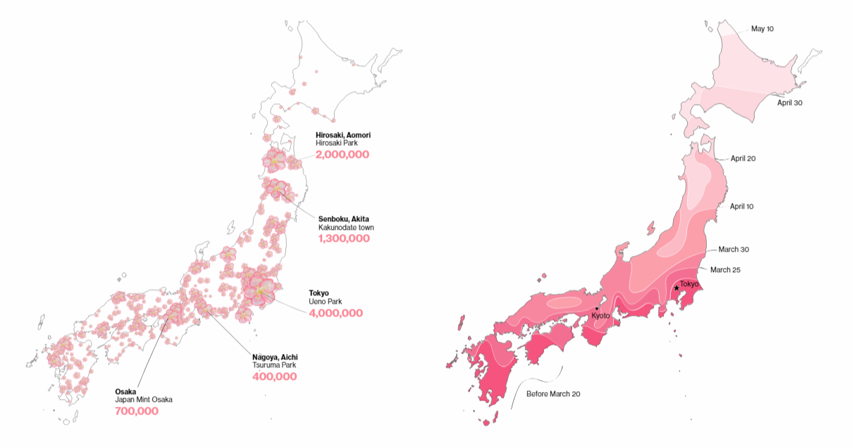
A data analysis conducted by researchers at Kansai University shows that about 63 million people from all over the world come to Japan in the spring in order to witness the cherry blossom blooming season. And they spend more than 300 billion yen, which is approximately $2.7 billion — a real boon to the country’s economy.
Last week, Bloomberg offered a closer look at what they called “the big business of Japan’s cherry blossoms,” building an interesting story around cool visual data presentations. Check out this beautiful piece and learn more about the bloom and its great economic impact.
***
It’s always a great pleasure to see you on our blog! Stay tuned!
- Categories: Data Visualization Weekly
- No Comments »