Maigret.de Picks AnyChart JS Charts to Visualize Data on Georges Simenon’s Work
December 29th, 2021 by AnyChart Team When data is all around, it’s no wonder to see charts here or there as they greatly help make sense of it. With thousands of happy customers worldwide, both for our JS charting library and Qlik charting extensions, we have seen countless applications for data visualization across all fields and industries. Some use cases, however, might be less expected than others. What about a website dedicated to literature?
Maigret.de — a remarkable resource about Georges Simenon, a famous Belgian writer best known for creating police detective Jules Maigret — has recently started to publish interactive data graphics revealing interesting patterns and facts in his immense work. All the charts on the website are built with AnyChart.
We have chatted with Maigret.de’s creator Oliver Hahn about his project, data visualizations, and experience using our solutions. Read the quick interview and go check out the website. (Stack: HTML/MySQL.)
- Categories: AnyChart Charting Component, Books, HTML5, JavaScript, Success Stories
- No Comments »
New Compelling Data Visualization Projects to See on Christmas Eve (or Later) — DataViz Weekly
December 24th, 2021 by AnyChart Team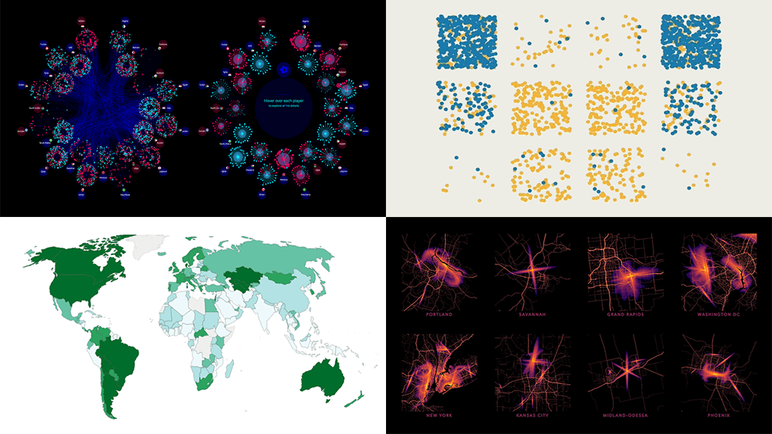 With so many options, we have finally selected the four most compelling of all new data visualization projects seen over the last few days and can’t wait to tell you about them. Welcome to DataViz Weekly on the second last Friday of the year! But before we get down to business: Merry Christmas to all who celebrate!
- Arab soccer national teams and players — Al Jazeera
- America’s noisiest and brightest cities — Esri
- Social distancing in honey bee hives — The Economist
- Global food system in detail — Our World in Data
- Categories: Data Visualization Weekly
- No Comments »
Data Visualization Best Practices in Action — DataViz Weekly
December 17th, 2021 by AnyChart Team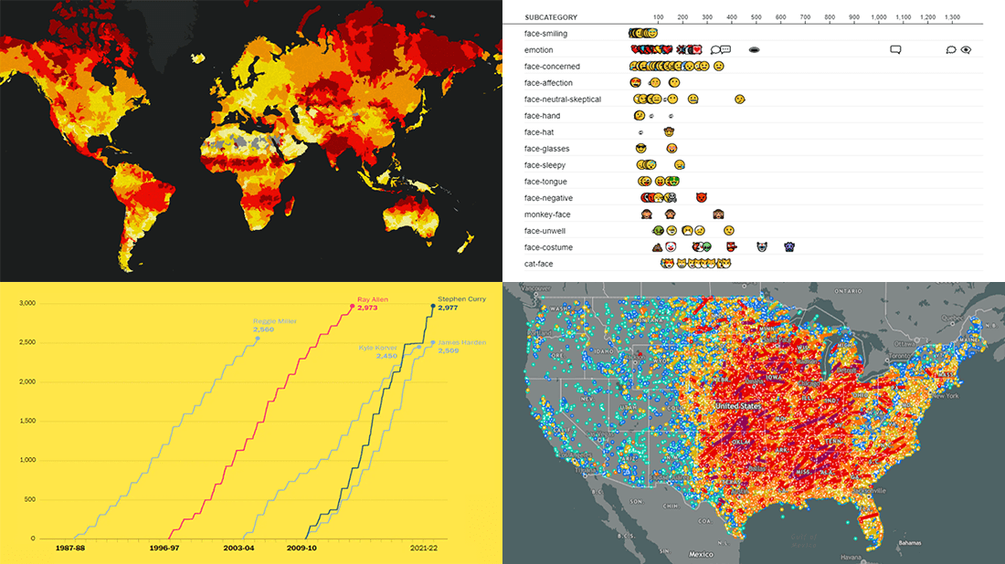 Committed to bringing you the most robust charting solutions, we also continue to curate weekly roundups highlighting projects that greatly implement data visualization best practices, for your inspiration. A new one is here! Look what we’ve got for you to check out this time on DataViz Weekly:
- Tornadoes since the late 19th century — Tornado Archive
- Emoji use frequency in 2021 — Unicode
- Links between climate change and violent conflicts — Crisis Group
- Curry’s rise to the NBA’s three-point king — The Washington Post
- Categories: Data Visualization Weekly
- No Comments »
How to Build Surface Chart Using JavaScript
December 15th, 2021 by Shachee Swadia Data visualization is a must-have skill today with ever-growing data and the need to analyze as well as present that data. You will definitely come across data charts whether you are in the technology industry or not and therefore, it is a good idea to learn how to build visualizations.
I will show you here that building charts is not very tough and with the right tools, you can start creating interactive, interesting visualizations in little time and effort!
In this step-by-step tutorial, I will demonstrate how to represent GDP values of various countries for the past 15 years on a beautiful interactive 3D surface chart using a JavaScript library for data visualization.
The surface plot looks quite complex, but I will show you how straightforward it is to make a compelling and fully functional one.
Read the JS charting tutorial »
- Categories: AnyChart Charting Component, Big Data, HTML5, JavaScript, JavaScript Chart Tutorials, Tips and Tricks
- No Comments »
Excellent New Visualizations on Vaccination Rates, Air Temperatures, Unemployment Benefits, Political Leanings — DataViz Weekly
December 10th, 2021 by AnyChart Team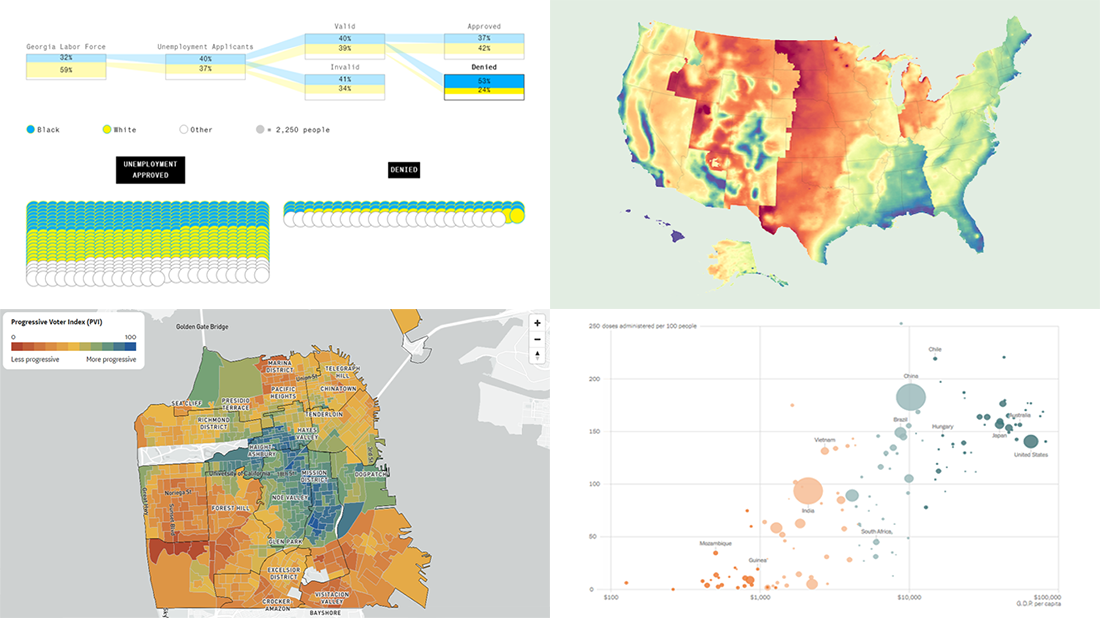 If you love good data visualizations as much as we do, come join us in reviewing some of the most interesting ones we’ve recently come across, in the new issue of DataViz Weekly!
- Global inequality in COVID-19 vaccine supply and demand — The New York Times
- U.S. heat data maps — Erin Davis
- Racial disparity in pandemic unemployment benefits in Georgia — Bloomberg
- Political progressiveness across San Francisco’s neighborhoods — The San Francisco Chronicle
- Categories: Data Visualization Weekly
- No Comments »
AnyChart JS Charts 8.11.0 Released with Awesome New Data Visualization Features
December 7th, 2021 by AnyChart Team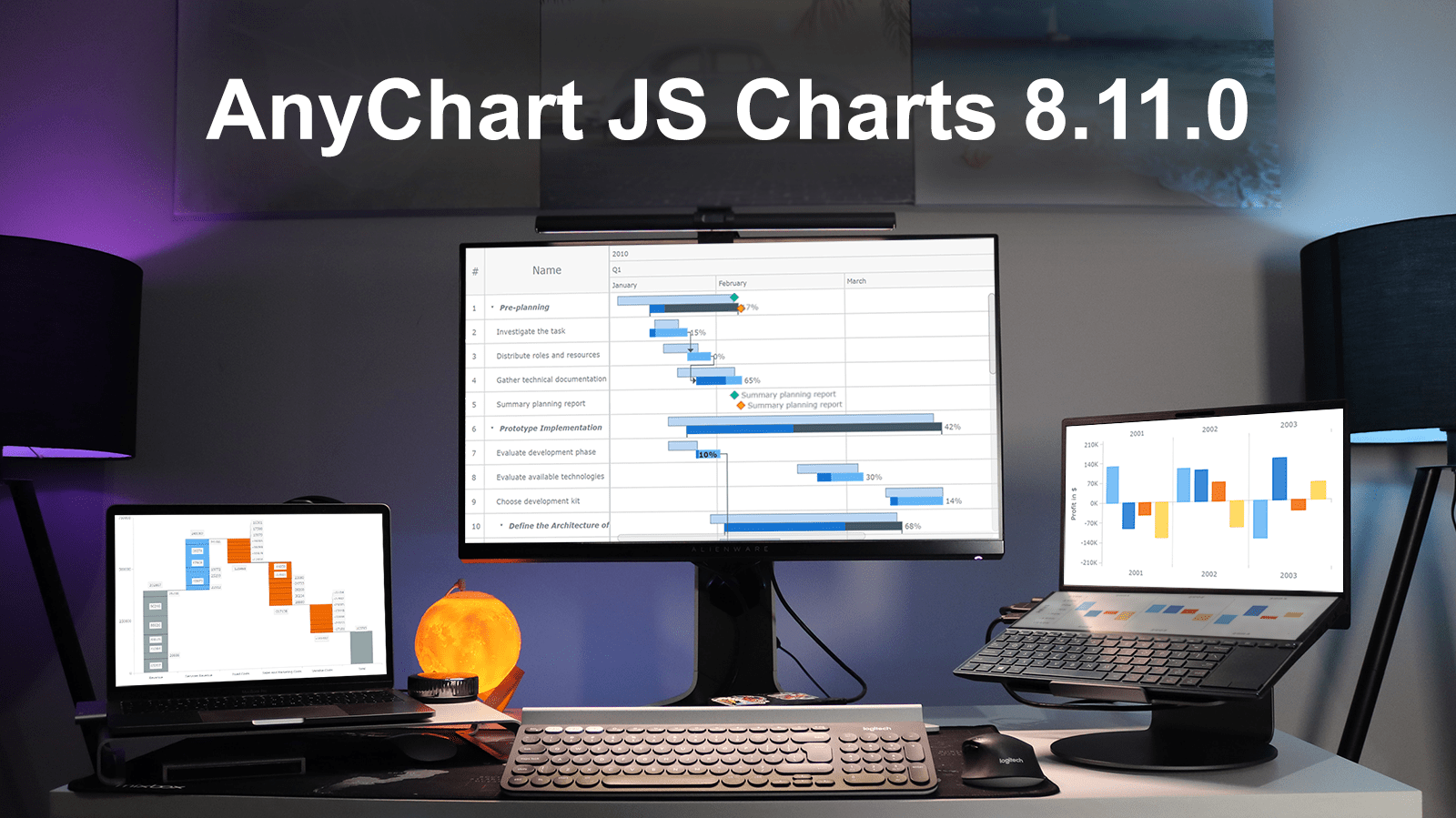 Excited to tell you we’ve just pushed a major update to our JavaScript charting library! The newly arrived features and improvements make our core solution even more flexible, adding awesome fresh capabilities designed to further help you on your data visualization development journey. Intrigued? Let us show what’s new in AnyChart JS Charts 8.11.0 right away!
»»» See What’s New in AnyChart 8.11.0! «««
- Categories: AnyChart Charting Component, AnyGantt, Gantt Chart, HTML5, JavaScript, News
- 3 Comments »
Powerful Visual Storytelling Examples — DataViz Weekly
December 3rd, 2021 by AnyChart Team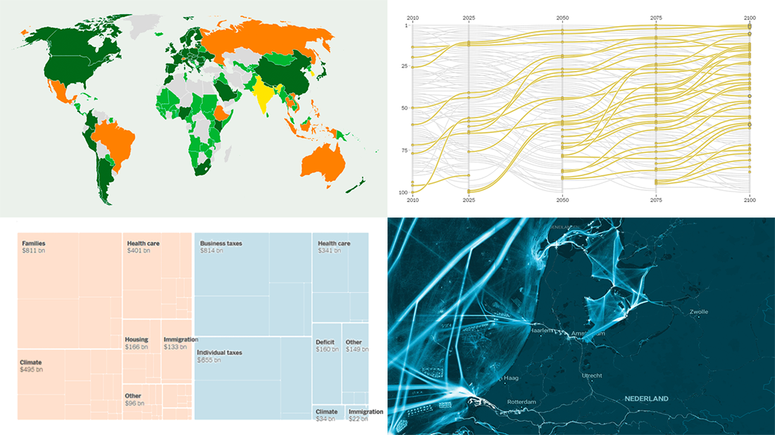 For this DataViz Weekly, we have curated a collection of wonderful new visual storytelling examples from around the web. Take a look through and check them out!
- Rapid urban growth in Africa — The Washington Post
- Maritime activities in the North Sea — TU Delft
- All provisions of the Build Back Better Act — The Upshot
- Climate pledges after COP26 — The Guardian
- Categories: Data Visualization Weekly
- 1 Comment »
Analyzing Population Shifts, Box Office, Heat Exposure, Daily Routines — DataViz Weekly
November 26th, 2021 by AnyChart Team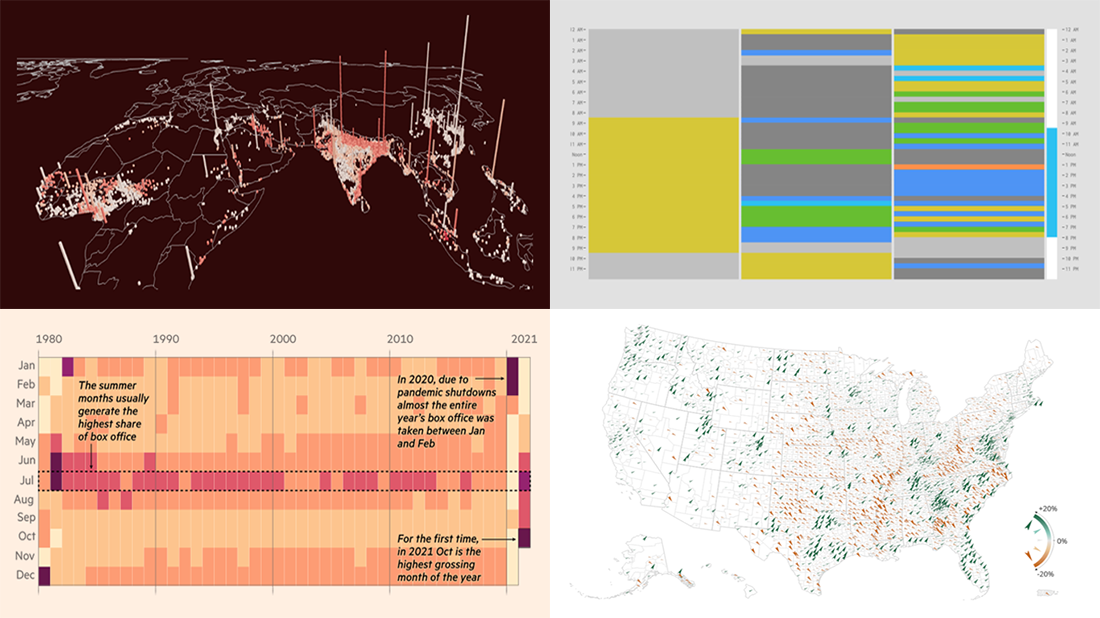 It is much easier to analyze large amounts of data when they are represented using the right visualization techniques. We are ready to show you another four vivid examples! Today on DataViz Weekly:
- Population and racial changes in the United States — Pitch Interactive & Census 2020 Data Co-op
- Box office for cinema-exclusive and simultaneous release movies — FT
- Global extreme urban heat exposure — AP News
- Most common daily time uses — Nathan Yau
- Categories: Data Visualization Weekly
- No Comments »
Roundup of Stunning New Data Visualizations — DataViz Weekly
November 19th, 2021 by AnyChart Team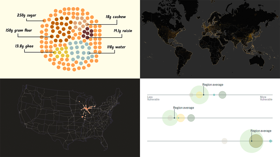 It’s Friday and time for a fresh dose of stunning data visualizations! In this DataViz Weekly roundup, we are going to show you four new projects worth checking out.
- Maternal health risks across the United States — Surgo Ventures
- Impact of human sewage on coastal ecosystems — UCSB & Columbia University
- Deepavali snacks and sweets — Kontinentalist
- U.S. highway signs indicating destination cities — Matt Dzugan on Observable
- Categories: Data Visualization Weekly
- 1 Comment »
Visualizing Data on Prices, Emissions, Workforce, Palm Oil — DataViz Weekly
November 12th, 2021 by AnyChart Team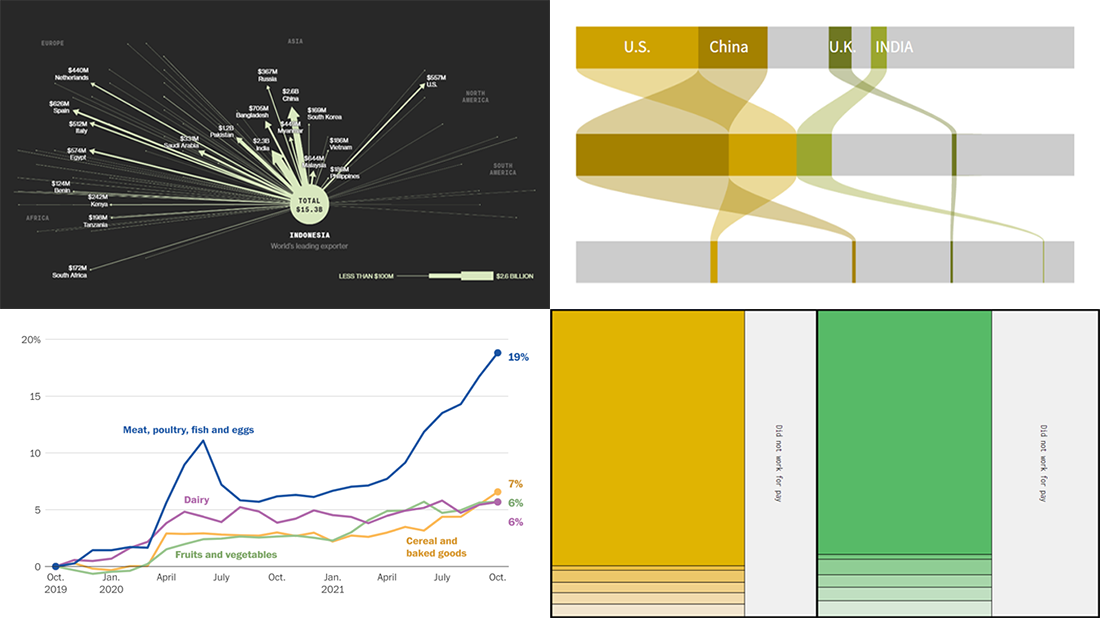 Hi everyone! DataViz Weekly is here to introduce you to some awesome new data visualizations that we have recently found out there and admired!
- Inflation in America — The Washington Post
- Carbon dioxide emissions by country — Reuters
- Shifts in how much U.S. men and women work — Nathan Yau
- Sustainable palm oil problem — Bloomberg Green
- Categories: Data Visualization Weekly
- No Comments »