 With so many options, we have finally selected the four most compelling of all new data visualization projects seen over the last few days and can’t wait to tell you about them. Welcome to DataViz Weekly on the second last Friday of the year! But before we get down to business: Merry Christmas to all who celebrate!
- Arab soccer national teams and players — Al Jazeera
- America’s noisiest and brightest cities — Esri
- Social distancing in honey bee hives — The Economist
- Global food system in detail — Our World in Data
Data Visualization Weekly: December 17, 2021 — December 24, 2021
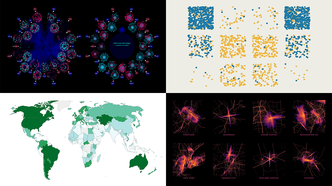
Arab World Soccer National Teams and Players
The first project we are glad to highlight in this DataViz Weekly is about soccer, or just football as many of our customers call it. In the context of the 2021 FIFA Arab Cup in Qatar, which concluded last Saturday, Al Jazeera published an impressive interactive feature that provides an insightful view of the Arab soccer landscape.
Created by Mohammed Hussein, Sebastien Billard-Arbelaez, Mohammed Haddad, and Showkat Shafi, the story features two grand visualizations. The first one amazingly represents the results of all the 1,992 matches played between the Arab countries over the last 65 years, across nine official tournaments and hundreds of friendlies. The other does a brilliant job depicting the age and market value estimate for each of the 582 players of the Arab national teams.
Check out the project on the Al Jazeera website. By the way, congratulations to the winner of the Arab Cup, Algeria, and everyone who supported it!
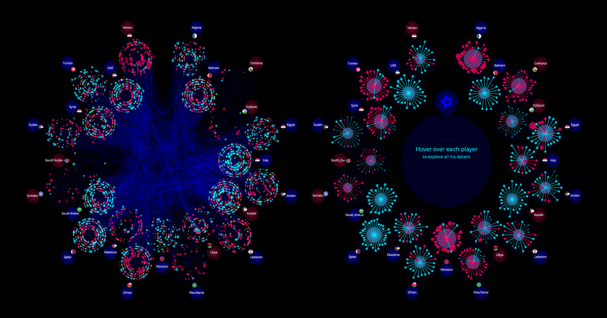
Noisiest and Brightest American Cities
The noisiest city in the United States is Elizabeth, New Jersey. Inglewood in California and Grapevine in Texas complete the top three. That’s according to noise pollution data from the U.S. Department of Transportation (DOT), and now you can easily explore it in a beautiful interactive visualization.
DOT built a noise model map that displays the levels of aircraft and road noise across the entire conterminous United States, and Esri made it available as a new layer in its Living Atlas of the World. The visualization makes it easy to find noise arrangements for particular cities and towns and compare them. The pictures appear to be very interesting and exciting.
Esri went on to identify America’s noisiest and quietest cities based on that. Its specialists also decided to delve into sensory overload further. They worked with light pollution data to determine the brightest and darkest cities and create a new combined metric-based “Lights and Noise” map layer. Learn more in the ArcGIS blog.
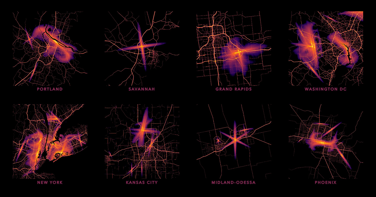
Social Distancing in Honey Bee Hives
Honey bees naturally increase social distancing when their hive is infected with mites. This fascinating discovery was made by a group of researchers from the University of Sassari, University College London, University of Turin, and Martin Luther University Halle-Wittenberg.
They actually made an experiment. The researchers ran comparative behavioral observations on colonies infected and not infected with the ectoparasite Varroa destructor. The results showed that honey bees do react to the mite’s intrusion by changing social interactions and space use patterns to increase the social distance between old (foragers) and young (nurses) cohorts. Waggle dances of the former (communicating where food is located) and allogrooming of the latter (cleaning debris or parasites from others) both took place throughout the parasite-free hive. In the infected hive, foraging dances were concentrated near the entrance, keeping potentially infected foragers far away from brood cells.
The Economist produced visualizations that greatly show it all at a glance. Look how honey bees prevent parasites from spreading by segregating behaviors in different parts of the hive.
Global Food System in Detail
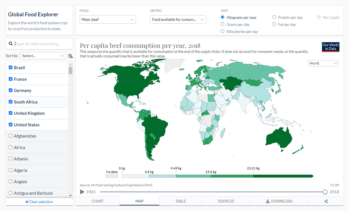
Have you ever wondered where in the world the per-capita beef consumption is the highest? Or what country produces the most maize? Now it is easy to find answers to these and all similar questions, in Our World in Data’s new Global Food Explorer!
Created by Hannah Ritchie, Lucas Rodés-Guirao, and Marcel Gerber, it is an interactive dashboard allowing everyone to investigate the global food system crop by crop, from production to consumption, for all countries in the world, since 1961. The main representation view is a map with multiple filters. You can also explore trends over time in line charts.
Just choose a product and a metric (production, land use, exports, and so on). You can also switch from total to per capita, change units, and select multiple countries for comparisons.
***
In this festive season, we wish you and your families lots of joy and happiness! Enjoy life! And stay tuned for Data Visualization Weekly!
- Categories: Data Visualization Weekly
- No Comments »