Creating Bullseye Chart with JS to Visualize the COVID-19 Vaccine Pipeline
March 25th, 2022 by Shachee Swadia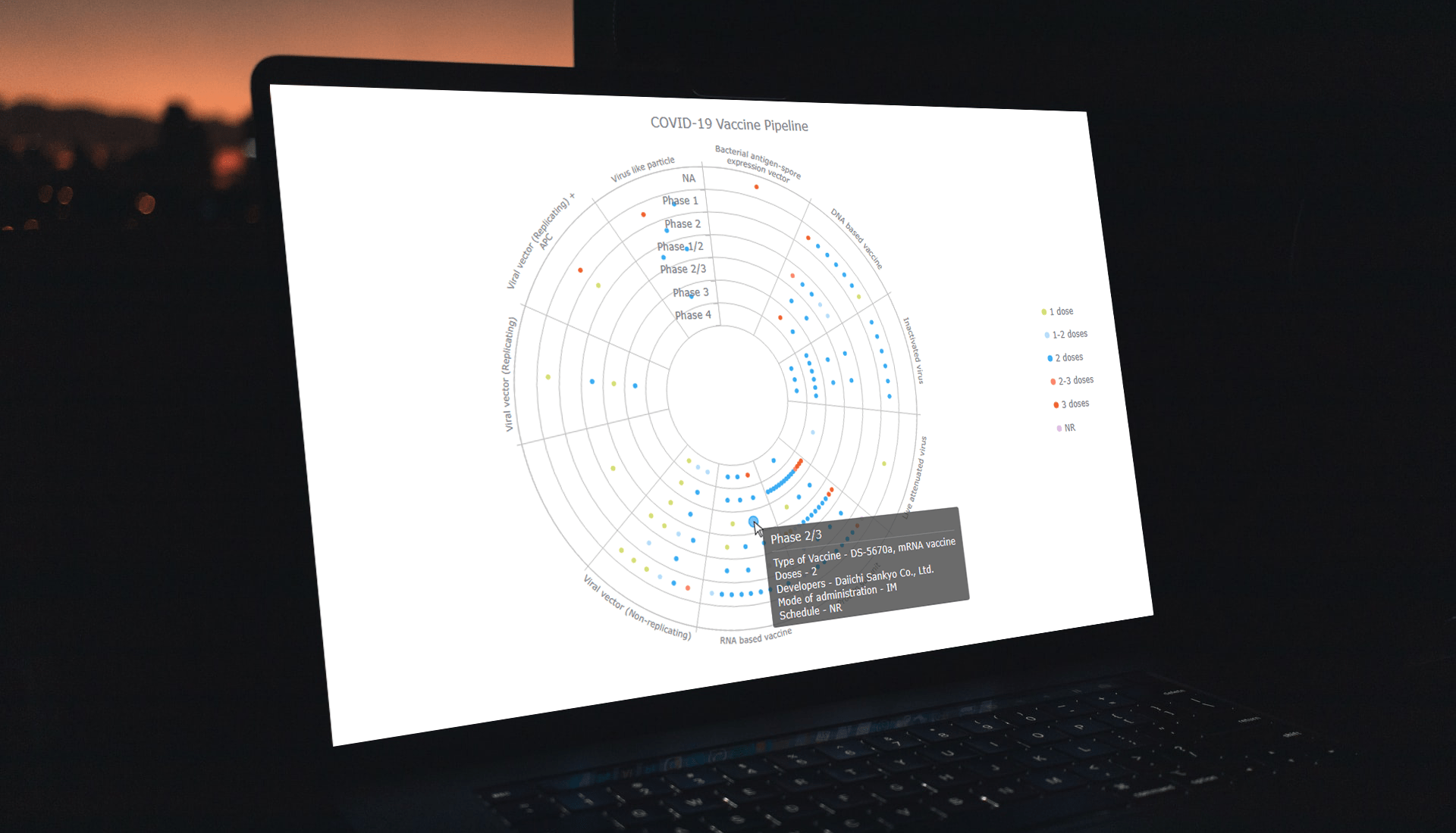 Visualizing data across a set of concentric rings, bullseye charts are widely used in drug pipeline and clinical trials data analysis. This tutorial will explain how to create this type of diagram with JavaScript. What’s more, you’ll see an excellent, typical example of an interactive bullseye chart in action!
I collated detailed information about all the COVID-19 vaccine candidates currently undergoing clinical studies from the WHO’s vaccine tracker. Now, join me as I plot it all in an interactive JS-based bullseye chart, by vaccine type and development phase!
Read the JS charting tutorial »
- Categories: AnyChart Charting Component, Big Data, Business Intelligence, HTML5, JavaScript, JavaScript Chart Tutorials, Tips and Tricks
- No Comments »
Most Interesting Visualizations to Check Out and Learn From — DataViz Weekly
March 4th, 2022 by AnyChart Team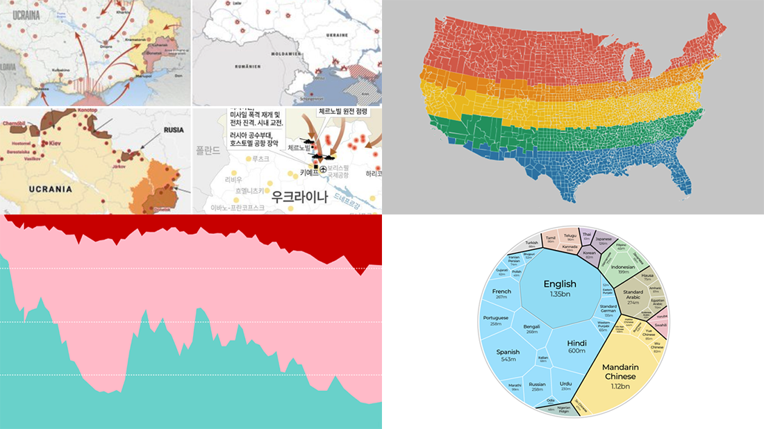 We are glad to continue our DataViz Weekly blog feature where we curate some of the most interesting and topical visualizations from around the internet. Check out a new selection:
- Russia–Ukraine conflict in maps — Lisa Charlotte Muth’s thread on Twitter
- The world’s most popular languages — Al Jazeera
- Dividing the U.S. by equal populations — Engaging Data
- Lifestyle changes during COVID-19 lockdowns — The Guardian
- Categories: Data Visualization Weekly
- No Comments »
Visualizing Data on Income, Volcano Eruption, Shopping, Climate — DataViz Weekly
January 28th, 2022 by AnyChart Team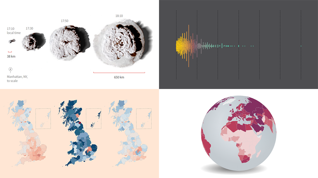 Continuing our regular roundups of the most interesting charts, maps, and infographics, we are glad to spotlight a bunch of new awesome projects for your inspiration. Today on DataViz Weekly:
- Americans’ annual personal income — Nathan Yau
- Tonga eruption’s true scale — Reuters
- High street crisis in Great Britain — The Financial Times
- Climate change drivers and sufferers — Der Tagesspiegel
- Categories: Data Visualization Weekly
- No Comments »
COVID-19 Risk Assessment App Pandemonium Uses AnyChart for Data Visualization
January 26th, 2022 by AnyChart Team We continue to support initiatives addressing the pandemic crisis by providing them with a full-featured free license for any of our data visualization tools. Today we are honored to be among the first to talk about a new project that joined this program, an innovative COVID-19 risk assessment app and framework called Pandemonium where all charts and maps are powered by AnyChart.
Built by Quantum Risk Analytics, Inc., a charitable nonprofit founded by MIT alumni, Pandemonium uses sophisticated machine learning algorithms to more accurately model the disease spread and provide a highly personalized evaluation of infection risks. It’s not yet publicly launched as the developers want to add a few more major features and data sources before the official release. But the app is already in the testing phase that the team encourages anyone to join.
We asked Richard Hamlin, CEO at Quantum Risk Analytics, Inc., to tell us more about Pandemonium, how it works, and how our data visualization solutions are used. Read on to know all the details.
- Categories: AnyChart Charting Component, AnyMap, Big Data, Dashboards, HTML5, JavaScript, Success Stories
- No Comments »
Creating Linear Gauge Chart in JavaScript — Tutorial
October 20th, 2021 by Shachee Swadia This article presents an easy-to-follow guide for building an interactive linear gauge chart in JavaScript.
We’ll show how to quickly create a cool and interactive linear gauge chart that highlights Covid-19 vaccination data around the world. Our chart will allow us to visualize the status of Covid-19 vaccination at the time of writing, and will display two types of data — showing how far away we are from the halfway target of both partially and fully vaccinating the global population.
Read the JS charting tutorial »
- Categories: AnyChart Charting Component, HTML5, JavaScript, JavaScript Chart Tutorials, Tips and Tricks
- No Comments »
New Interesting Visualizations on Jobs, Climate, TV Shows, Pandemic — DataViz Weekly
October 8th, 2021 by AnyChart Team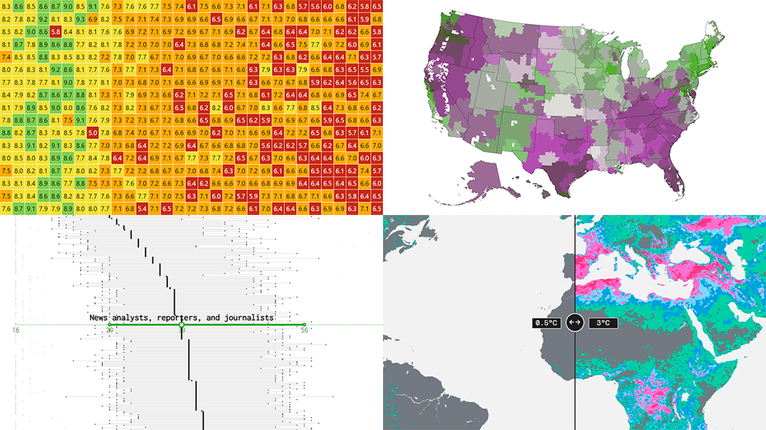 For all who already have an eye for data visualization or only want to get it, DataViz Weekly is here with an overview of four new interesting projects curated from around the web!
- U.S. jobs by age of workers — Nathan Yau
- Probable climate futures based on different scenarios — Probable Futures
- Average IMDb scores of all TV series by episode — Jim Vallandingham
- Vaccination vs hospitalization rates across the United States — The Washington Post
Read on to learn more about each and check them out!
- Categories: Data Visualization Weekly
- No Comments »
Most Compelling New Examples of Data Visualization in Action — DataViz Weekly
September 24th, 2021 by AnyChart Team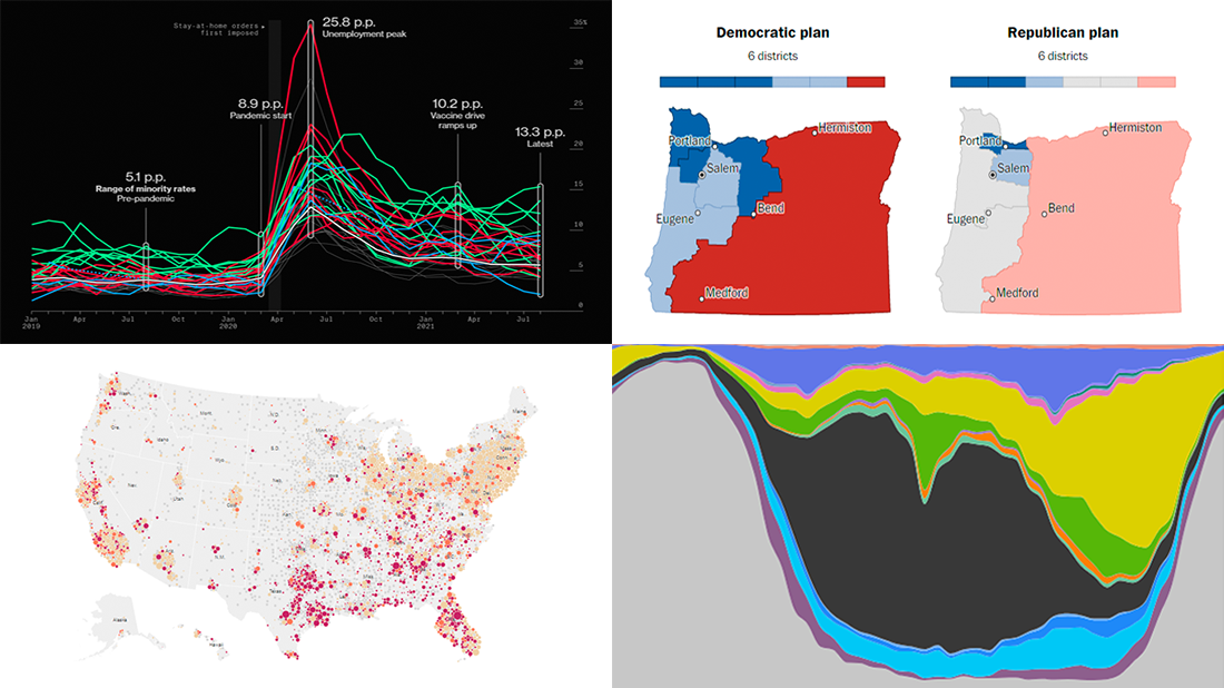 Hey everyone! It is Friday, and we are here to put a spotlight on the most compelling examples of sensible data visualization we have recently seen around the internet. As always, let’s start with a quick list and then look at each project. All aboard for DataViz Weekly!
- Intensive care unit occupancy rates in the United States — The New York Times
- Minority unemployment rates in 15 large U.S. cities. — Bloomberg
- Early proposals for congressional redistricting in Oregon, Indiana, and Colorado — The Washington Post
- Time use of American men and women by employment status — Nathan Yau
- Categories: Data Visualization Weekly
- No Comments »
Visualizing Mortality Statistics and Satellite Imagery Data — DataViz Weekly
September 10th, 2021 by AnyChart Team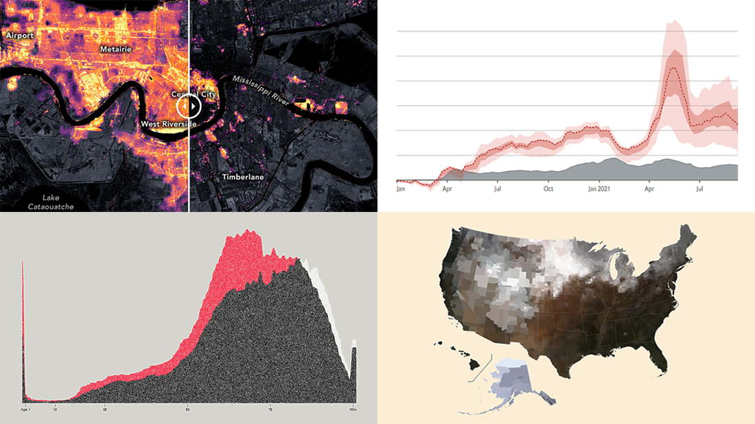 This week, we have come across a number of wonderful new data visualization projects out there. Here are the four that we’ve found most interesting and decided to showcase today in DataViz Weekly. Join us for a quick overview of these works and check them out!
- Black mortality gap in America — The Marshall Project
- Excess deaths worldwide during the COVID-19 pandemic — The Economist
- Ida-caused power outage in New Orleans as seen from space — NASA Earth Observatory
- Average seasonal colors of the United States — Erin Davis
- Categories: Data Visualization Weekly
- No Comments »
Excellent Examples of Data Graphics from Around Internet — DataViz Weekly
August 27th, 2021 by AnyChart Team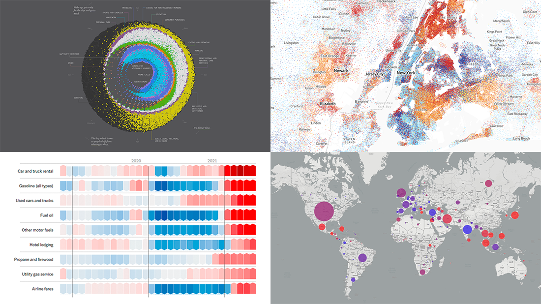 Are you ready for another set of excellent data graphics examples? It’s time! The following projects made it to the newest DataViz Weekly digest — see the list below and keep reading for a closer look!
- Average weekday in the life of Americans — Nathan Yau
- Race and ethnicity across the United States — CNN
- Inflation in the United States — NYT Opinion
- COVID-19 spread across the world over time — Olivia Jack
- Categories: Data Visualization Weekly
- No Comments »
Effective Visualizations of Information on Pandemic, Climate, Happiness, Travel Time — DataViz Weekly
July 30th, 2021 by AnyChart Team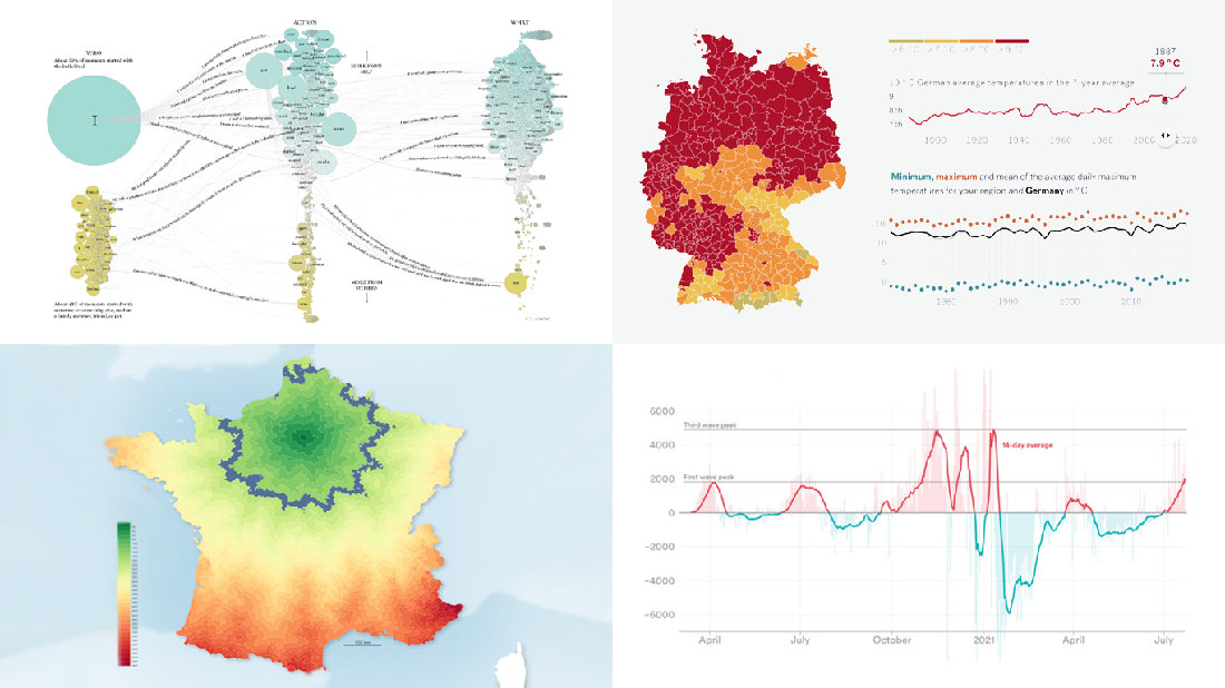 Data becomes easier to perceive and draw insights from when it is properly represented in charts and maps. For everyone interested to check out how information visualization works, we continue our regular feature DataViz Weekly curating the best new examples of effective graphics. Here are our latest picks:
- COVID-19 case acceleration rates — STAT
- Climate change risks across Germany — Vislab
- What makes people happy the most — Nathan Yau
- Driving time to Paris from across France — Nicolas Lambert
- Categories: Data Visualization Weekly
- No Comments »