 Data becomes easier to perceive and draw insights from when it is properly represented in charts and maps. For everyone interested to check out how information visualization works, we continue our regular feature DataViz Weekly curating the best new examples of effective graphics. Here are our latest picks:
- COVID-19 case acceleration rates — STAT
- Climate change risks across Germany — Vislab
- What makes people happy the most — Nathan Yau
- Driving time to Paris from across France — Nicolas Lambert
Data Visualization Weekly: July 23, 2021 — July 30, 2021
COVID-19 Case Acceleration Rates
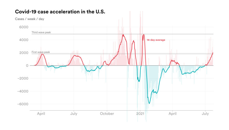
Regular charts representing the number of new confirmed COVID-19 cases per day work well to demonstrate the current pace of the COVID-19 pandemic. They also make it easy to see the magnitude of the waves at a glance. But they are not as good to let the data tell us how quickly the pace is speeding up, which could let us know where we are heading.
Emory Parker, the data project manager at STAT, decided to look at the rate of weekly case acceleration in the United States. To calculate it, he used COVID-19 case data compiled by the Center for Systems Science and Engineering (CSSE) at Johns Hopkins University (JHU) and Our World in Data, combined with the official statistics from the Centers for Disease Control and Prevention (CDC).
On the STAT website, you will find several charts showing how quickly the weekly average of new COVID-19 cases is changing — for the United States in general, for Louisiana and Florida where the acceleration rate is currently the highest, and for Massachusetts where it is much more moderate.
Climate Change Risks Across Germany
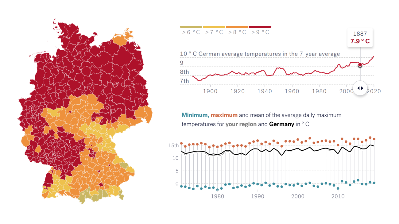
Experts anticipate the effects of climate change on the Earth to become more and more tangible over the next few decades. However, the magnitude of shifts will vary depending on the exact location. Take a closer look at Germany, for example.
Vislab, within the framework of the Location and Context-Based Surveys and Storytelling (LoCobSS) research project funded by the German Federal Ministry of Education and Research (BMBF), published an impressive data visualization work that allows everyone to explore the risks from climate change across Germany at the local level.
Start by choosing a region. Then you will be able to learn about the climate challenges in a scrollytelling format. At the end, there is an animated map visualizing how the average temperatures have changed across Germany since 1888.
What Makes People Happy
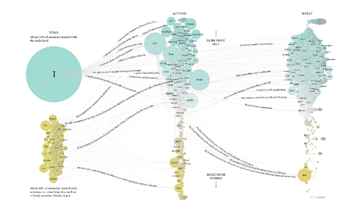
Several years ago, researchers from the University of Tokyo, Massachusetts Institute of Technology (MIT), and Recruit Institute of Technology (now Megagon Labs) asked people to specify the things that had recently made them happy and used their answers to generate HappyDB, a corpus of 100,000 happy moments. Yesterday, Nathan Yau shared a set of fascinating visualizations providing some cool insight into that data.
First, Nathan parsed the subject (who or what), action (verb), and object (what or whom) for each of the happy moments in the database. Then, he counted the occurrence and connected the points using a packed bubble charting technique.
In total, there are three visualizations. The first one allows you to see what makes people happy overall. The second chart shows the breakdown for happy moments with other people. The third one displays the distributions for happiness with pets. All of them are available in print.
By the way, if you missed it, you may also like to check out Nathan’s previous attempt to make sense of HappyDB. Also very interesting.
Driving Time to Paris from Across France
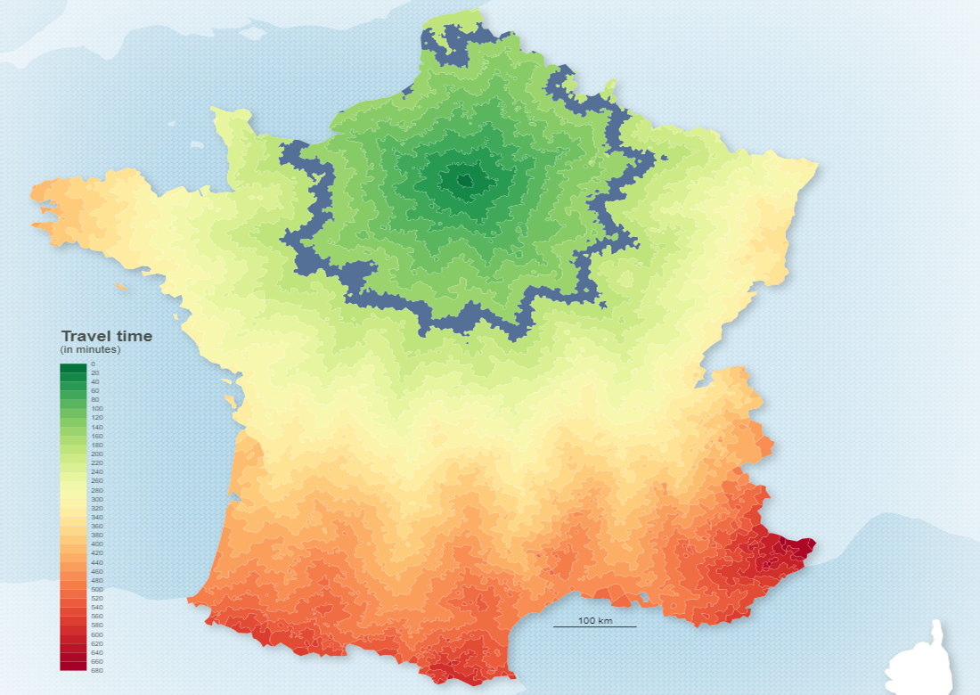
Last but not least, check out a stunning isochrone map recently created by Nicolas Lambert. Titled Time Distance to Paris by Road, it visualizes how long it takes to get to Paris from across France by car.
The isochrone lines here connect the areas of equal travel time to Paris and are colored accordingly based on a green-to-red scale explained in the legend on the left. Hover over a line to find out how far the capital of France is from the corresponding locations in minutes of driving. Or, vice versa, hover over a certain time to discover the areas from which you can reach Paris in a car that fast.
***
Many thanks for your attention. Stay tuned for Data Visualization Weekly.
- Categories: Data Visualization Weekly
- No Comments »