New Compelling Data Visualizations on Climate Change — DataViz Weekly
January 15th, 2021 by AnyChart Team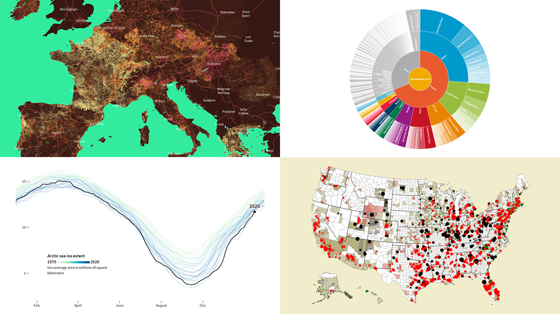 Lately, we’ve come across a number of compelling new data visualizations on climate change and related topics. And we’ll tell you about some of the most interesting ones right now! Check out the new DataViz Weekly roundup.
- Fingerprints of climate change in 2020 — Reuters
- Global warming in European municipalities — EDJNet
- Top greenhouse gas emitters — WRI
- Future of U.S. fossil fuel-fired electricity — Emily Grubert
- Categories: Data Visualization Weekly
- No Comments »
Power of Data Visualization in Four New Compelling Examples — DataViz Weekly
November 27th, 2020 by AnyChart Team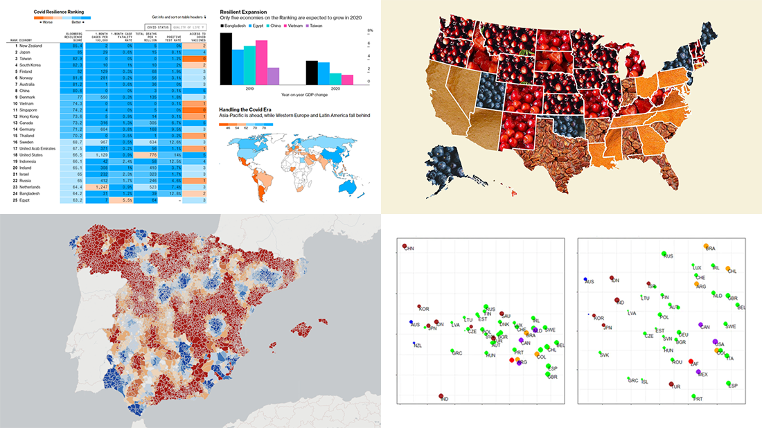 If you love good data visualizations, you’ve come to the right place at the right time! Every Friday, we choose the four most interesting projects making good use of charts and maps, from those we have come across out there just lately, and introduce you to them. Here are the visualizations we’re going to tell you about this time on DataViz Weekly:
- (False?) dichotomy between saving lives and saving the economy during the second wave — Michael Smithson on The Conversation
- COVID Resilience Ranking revealing the best and worst places to stay during the pandemic — Bloomberg
- Length of summers in Spain since 1950, by municipality — Predictia
- The most popular Thanksgiving pie in each state — Instagram
- Categories: Data Visualization Weekly
- No Comments »
New Stunning Data Graphics Projects Not to Miss — DataViz Weekly
October 16th, 2020 by AnyChart Team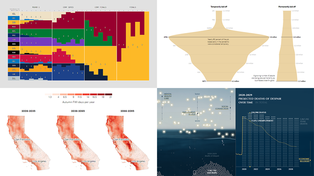 We know DataViz Weekly is read on a regular basis by data visualization practitioners from many countries, and we are happy you guys find it interesting and helpful. Are you ready for another bunch of new great data graphics projects worth looking at? There you go:
- NBA playoff win probabilities — Adam Pearce
- Fall fire weather days in California by the century’s end — ProPublica
- U.S. unemployment crisis shapes — NYT
- Deaths of despair in America — Periscopic
- Categories: Data Visualization Weekly
- No Comments »
New Environmental Maps Worth Checking Out — DataViz Weekly
September 18th, 2020 by AnyChart Team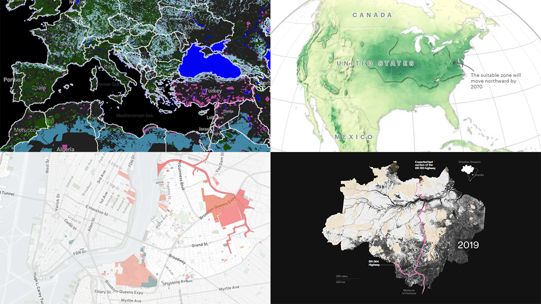 Lately, we’ve seen a bunch of cool geovisualizations on the topics of climate, pollution, and human impact. Here are some of the most interesting fresh ones. Check out the new DataViz Weekly post which is entirely dedicated to great examples of environmental maps:
- American climate shifts — ProPublica
- Earth’s most biologically important lands — RESOLVE
- Rainforest loss — Bloomberg Green
- Toxicity in North Brooklyn — North Brooklyn Neighbors
- Categories: Data Visualization Weekly
- No Comments »
4 Great Examples of Data Visualization in Action — DataViz Weekly
August 28th, 2020 by AnyChart Team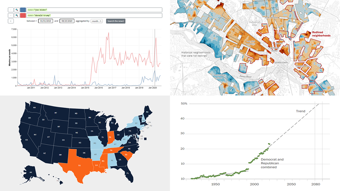 We’ve curated another four great examples of data visualization in action. Would you like to learn about them and check them out right now? Wait no longer! Below is a list of the projects highlighted in the new DataViz Weekly — just give it a glance and go ahead!
- Exploring a link between racism in the housing policy and hotter neighborhoods — The New York Times
- Analyzing the content of cable TV news — Stanford University
- Tracking gender inequality in American politics — The Washington Post
- Summarizing voting rules for the 2020 U.S. election by state — NBC News
- Categories: Data Visualization Weekly
- No Comments »
Charting COVID-19 Data and Models — DataViz Weekly
May 15th, 2020 by AnyChart Team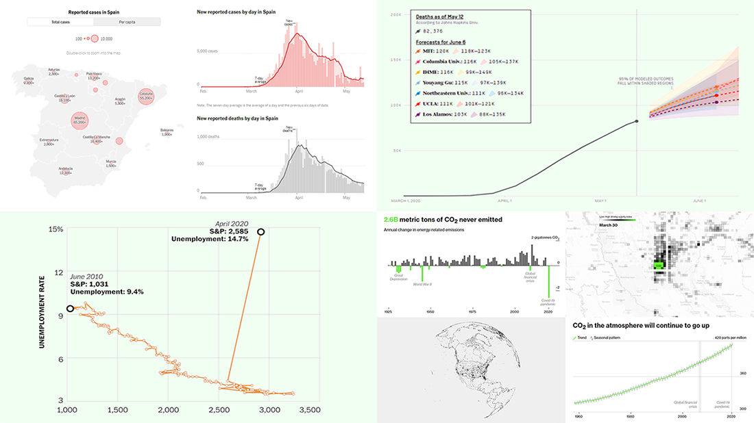 Check out new interesting examples of charting COVID-19 data in action. We have seen a lot of visualizations over the past few days and selected the following projects to share with you today in DataViz Weekly:
- Fatality models for the United States – FiveThirtyEight
- Impact on climate change – Bloomberg Green
- (Now broken) correlation between the stock market and unemployment rates in America – The Washington Post
- Situation in Spain – The New York Times
- Categories: Data Visualization Weekly
- No Comments »
Creative Visualizations on Climate, Protests, Jobs, and Wildlife — DataViz Weekly
March 27th, 2020 by AnyChart Team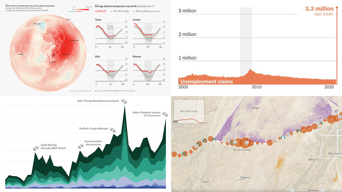 The new issue of DataViz Weekly puts a spotlight on some of the most interesting new creative visualizations from around the Web. Last week, we made a focus on COVID-19 charts. This time, we get along without the coronavirus subject. Well, mostly.
Here is what’s on DataViz Weekly this Friday:
- Winter temperatures in the northern hemisphere — The Economist
- Mass political protests worldwide — Center for Strategic and International Studies
- Spike in joblessness in the United States of America — The New York Times
- Wyoming wildlife corridors — The Washington Post
- Categories: Data Visualization Weekly
- No Comments »
Hot Visualizations on Youth Life, American Names, Climate Change, and Mother Tongues — DataViz Weekly
January 24th, 2020 by AnyChart Team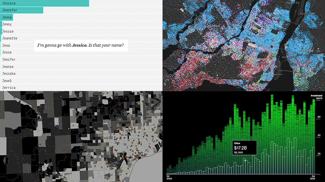 Check out some of the new hot visualizations we have come across this week! Not only are they good graphical data presentation examples, they also bring interesting insights.
- Youth life expectancy and educational opportunity across the United States — Child Trends
- Guessing names based on what letter(s) they start with — FlowingData
- Climate change scoreboard — Bloomberg Green
- Mother tongues across Canada — Anagraph
- Categories: Data Visualization Weekly
- No Comments »
Visual Data Analytics on Protests, GDP, Opinions, and Weather — DataViz Weekly
December 20th, 2019 by AnyChart Team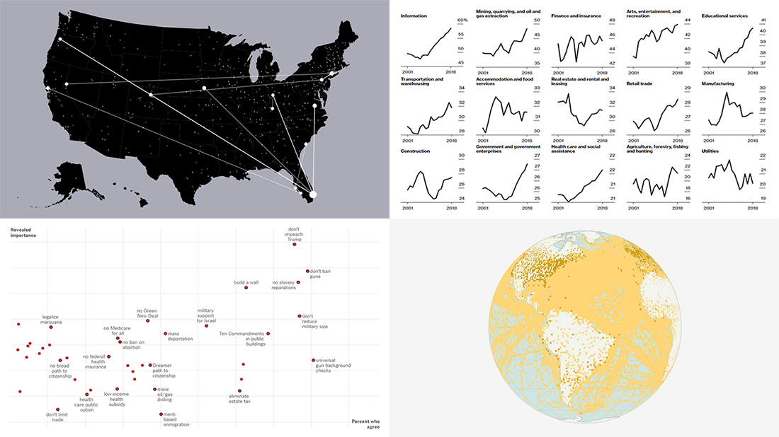 Visual data analytics with the help of charts and maps as efficient graphical presentation forms can quickly bring a lot of insight into mere numbers. We’ve curated some more examples from all over the web to illustrate this. See our new DataViz Weekly selection of great recently-published projects featuring data visualization in action:
- Street protests in the United States — Alyssa Fowers
- American GDP by county — Bloomberg
- Topical issues for U.S. voters — The Upshot, The New York Times
- Weather observations in old ship logbooks — Reuters
- Categories: Data Visualization Weekly
- No Comments »
Cool Charts on Housing, Climate, Jobs, and Economy — DataViz Weekly
December 13th, 2019 by AnyChart Team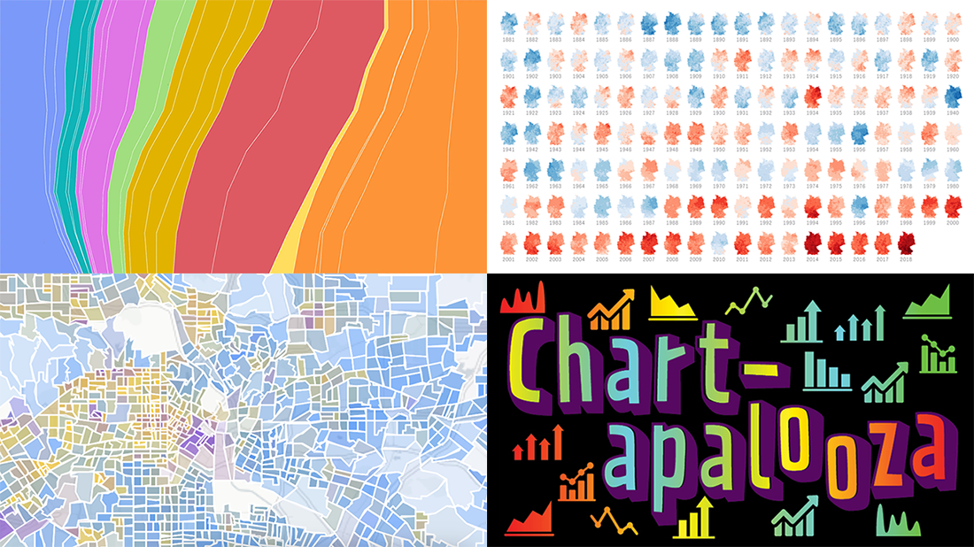 We know you love good data visualizations. So what we have here for you today is a presentation of new cool charts we’ve found this week. Look at the fresh examples of awesome data graphics, in DataViz Weekly:
- U.S. metropolitan growth — Zillow
- Climate change in Germany — Zeit Online
- Changes in job distribution in America — FlowingData
- Canada’s economy chartapalooza — Maclean’s Magazine
- Categories: Data Visualization Weekly
- No Comments »