Data Story and Visualization Examples Worth Seeing – DataViz Weekly
January 12th, 2018 by AnyChart Team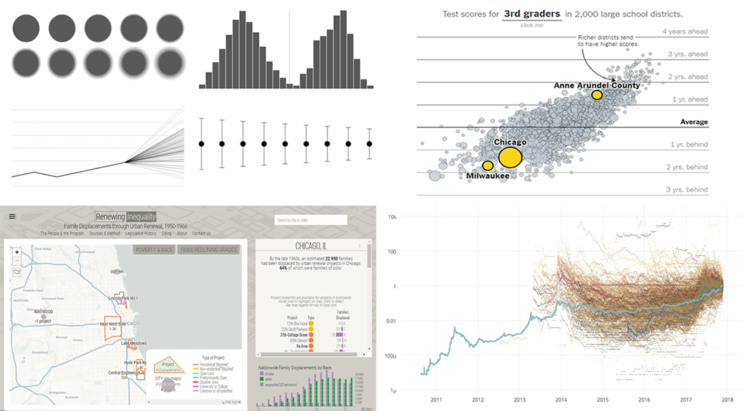 Hi there! Welcome to the new Data Visualization Weekly post! We’ve gathered another four interesting visualizations and data story examples that we hope you’ll like.
Today in DataViz Weekly:
- Options to Visualize Uncertainty in Data
- Renewing Inequality: Data Story, 1950s-1960s
- More and Less Effective US School Districts
- Investing in Bitcoin and Other Cryptocurrencies
- Categories: Data Visualization Weekly
- No Comments »
New 2018 Year Is Here! Take Another Look Back at 2017 in Charts – DataViz Weekly
January 5th, 2018 by AnyChart Team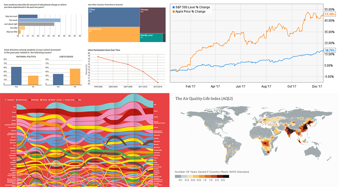 Yay! We are already living in the new 2018 year! And may it bring you plenty of success, joy and happiness!
In the meantime, we at AnyChart continue our Data Visualization Weekly series of articles devoted to some of the interesting data visualization projects and standalone charts and infographics we’ve recently come across. This time, let’s recall the last year once again and see how it looked for:
- the teaching profession,
- UK citizens,
- energy and
- Apple.
- Categories: Data Visualization Weekly
- No Comments »
Data Visualization in 2017: Highlights – DataViz Weekly
December 30th, 2017 by AnyChart Team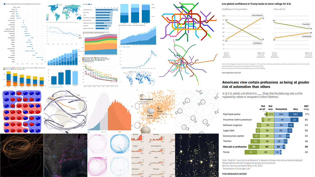
The new 2018 year is coming very soon, and now is a great time to look back and remember the highlights from data visualization in 2017.
A few words about our solutions to start with. After the very productive year of 2016, we at AnyChart JS Charts did a lot in 2017, too. 4 major releases full of new features! After versions 7.13.0 and 7.14.0, we launched the brand new, 8th generation of our JavaScript charting libraries, featuring a modular system and custom JS builder (8.0.0). In December 2017, we released AnyChart 8.1.0. In addition, we published a number of plugins (for Qlik, Android, Angular, Ionic and more) and technical integration samples for popular technology stacks, released Chartopedia and the brand new Playground with a whole bunch of chart examples added to our documentation, API reference and galleries. And even more.
A lot of great charts and infographics were created in 2017 by various people and companies from around the world. In the present, this year’s last Data Visualization Weekly post, we’ll tell you about 4 year-in-review articles featuring the most interesting visualizations of 2017:
- 10 Best Projects in Data Visualization in 2017 — FlowingData.
- Quartz: Top 5 Charts in 2017, According to Reddit — Quartz.
- Year of 2017 in 12 Charts — The World Bank.
- 17 Striking Findings in 2017 — Pew Research.
Compelling Charts Visualizing Data That Matter – DataViz Weekly
December 22nd, 2017 by AnyChart Team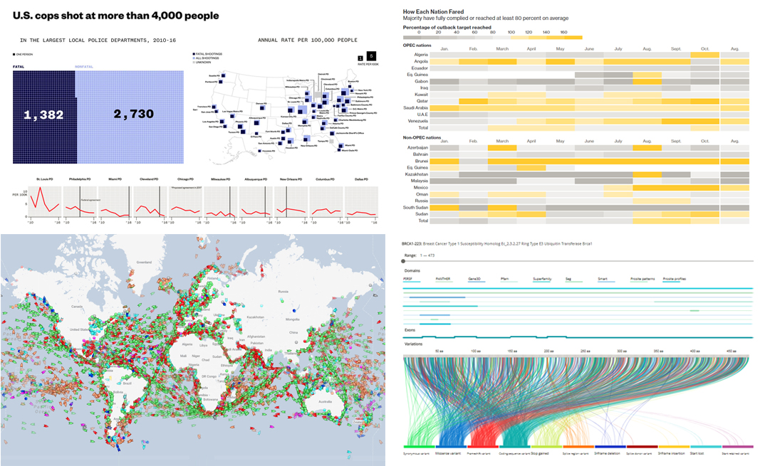 In fact, charts visualizing data are greatly helpful in revealing trends and patterns in this data. That’s why we love dataviz and continue Data Visualization Weekly, our regular blog feature showcasing interesting examples of charts and infographics.
Today in DataViz Weekly:
- US police shoot people more than twice as often as anyone could think;
- charts visualizing data about protein variation;
- marine traffic map showing the location of all major commercial ships worldwide;
- visualizing big gains in curbing the oil output in OPEC and its ally countries.
- Categories: Data Visualization Weekly
- No Comments »
Happy New Year in JavaScript Charting: AnyChart 8.1.0 Is Out!
December 20th, 2017 by AnyChart Team The New Year and Christmas are already just around the corner, and we have something astonishing for you in this magical time! The next major update for our product family of JavaScript charting libraries is now released, so meet AnyChart 8.1.0!
Check out what new cool and useful features are delivered in the new versions of our HTML5-based interactive data visualization solutions AnyChart, AnyStock, AnyGantt and AnyMap, as well as what we are going to work on next.
- Categories: AnyChart Charting Component, AnyGantt, AnyMap, AnyStock, Financial Charts, Gantt Chart, HTML5, JavaScript, News, Qlik, Stock Charts
- 2 Comments »
Various Data Represented in Interesting Visualizations – DataViz Weekly
December 15th, 2017 by AnyChart Team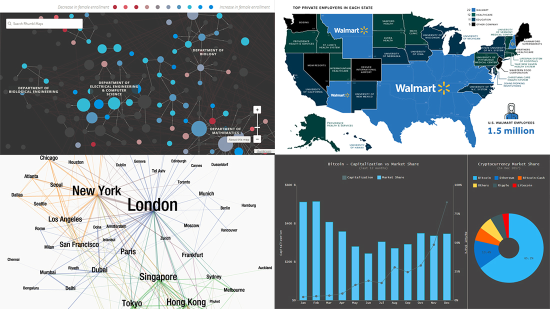 Data visualization is a great thing. It helps humans make sense of various data that’s all around. And we are glad to continue to share with you good dataviz examples on a regular basis, in the Data Visualization Weekly feature on our blog.
So, the new weekly article is here! Look what data visuals we are presenting this time:
- first and business class air travel flow between key global cities;
- the largest employers in every state of the US;
- gender diversity in undergraduate classes across MIT;
- Bitcoin capitalization and market share.
- Categories: Data Visualization Weekly
- No Comments »
Conditional Custom Drawing in JavaScript Charts — Challenge AnyChart!
December 13th, 2017 by Vitaly Radionov The time has come for a new Challenge AnyChart! article! We continue to receive interesting data visualization tasks from our wonderful customers and are happy to share with our blog readers how to solve some of the most inspiring ones with the help of our JavaScript charting libraries.
In today’s tutorial, let’s dig into custom drawing and create an interactive HTML5 line chart of which the segments with negative values are painted with a different color than the rest of the graph.
- Categories: AnyChart Charting Component, Challenge AnyChart!, Charts and Art, HTML5, JavaScript, Tips and Tricks
- No Comments »
Android Charts Made Easy – Meet AnyChart Library for Data Visualization in Android Apps!
November 21st, 2017 by AnyChart Team Android app developers can now use AnyChart Java wrapper to run our interactive data visualization solutions in native Android apps! Meet AnyChart Android Charts!
It’s a stunning data visualization library for making interactive HTML5 charts in Android apps, running on API 14+ (Android 4.0). AnyChart supplies dozens of different chart types and seamlessly works with any data from any database.
- Categories: AnyChart Charting Component, HTML5, News, Tips and Tricks
- 12 Comments »
Data Visualization Weekly: “US Maps” Edition
November 3rd, 2017 by AnyChart Team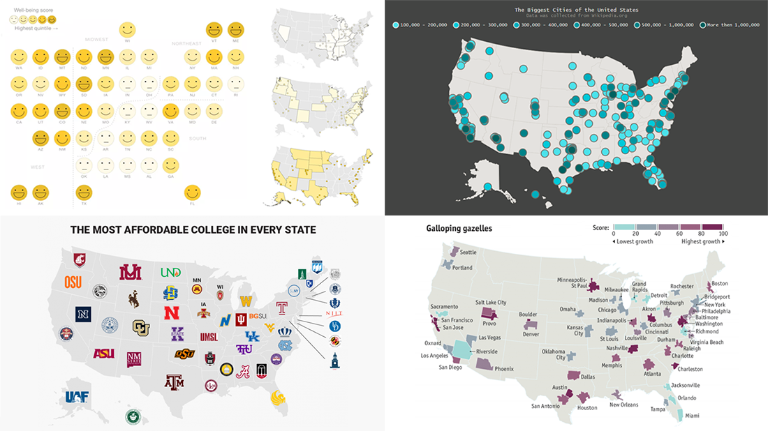 The new issue of DataViz Weekly is fully devoted to US maps. Here you’ll find four interesting geo visualizations telling data stories about the United States of America: the biggest cities, well-being, affordable colleges, high-growth entrepreneurship hotspots.
- Categories: Data Visualization Weekly
- No Comments »
Interesting Data Visualization Examples for Fun and Inspiration – DataViz Weekly
October 27th, 2017 by AnyChart Team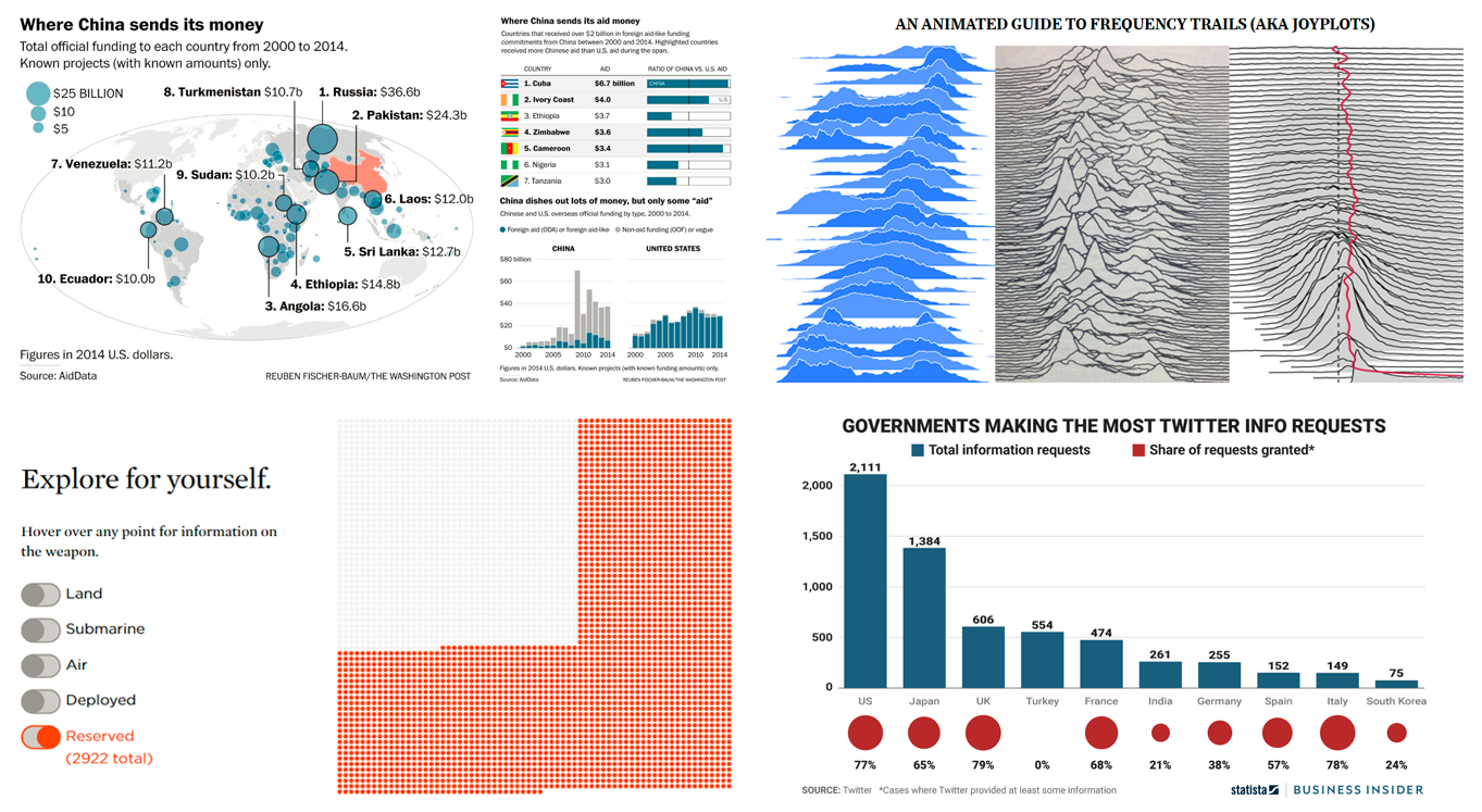 Here we are, bringing you the new pick of interesting data visualization examples we came across lately!
Check out what visual graphics we’ve included in this week’s Data Visualization Weekly post:
- where China sends money;
- what governments make the most requests for Twitter’s user data;
- visualizing every weapon in the US nuclear arsenal;
- animated interactive guide to frequency trails charts.
- Categories: Data Visualization Weekly
- No Comments »