 The new issue of DataViz Weekly is fully devoted to US maps. Here you’ll find four interesting geo visualizations telling data stories about the United States of America: the biggest cities, well-being, affordable colleges, high-growth entrepreneurship hotspots.
DataViz Weekly: October 27, 2017 – November 3, 2017
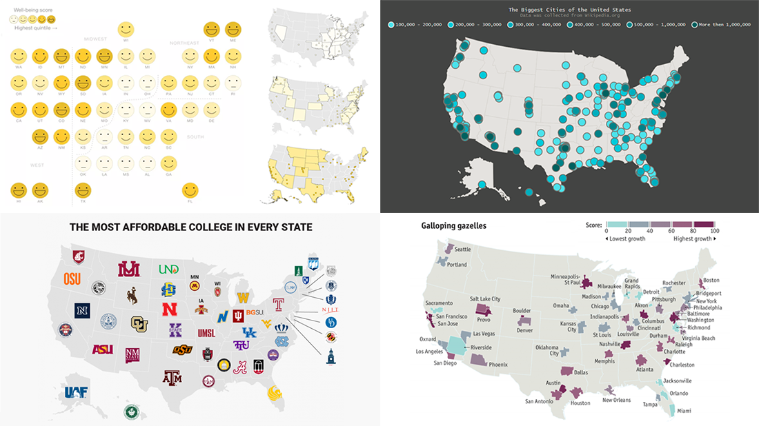
US Maps Showing Well-Being
National Geographic shared a series of interesting visualizations on the topic of well-being in the United States. These are based on data from Gallup’s recent survey.
Researchers asked 500,000 people all over the US to assess their own financial and physical health, satisfaction with daily life, companionship, and location. See the maps and charts in the article to learn about geographic trends in adults’ well-being across the country’s states and cities.
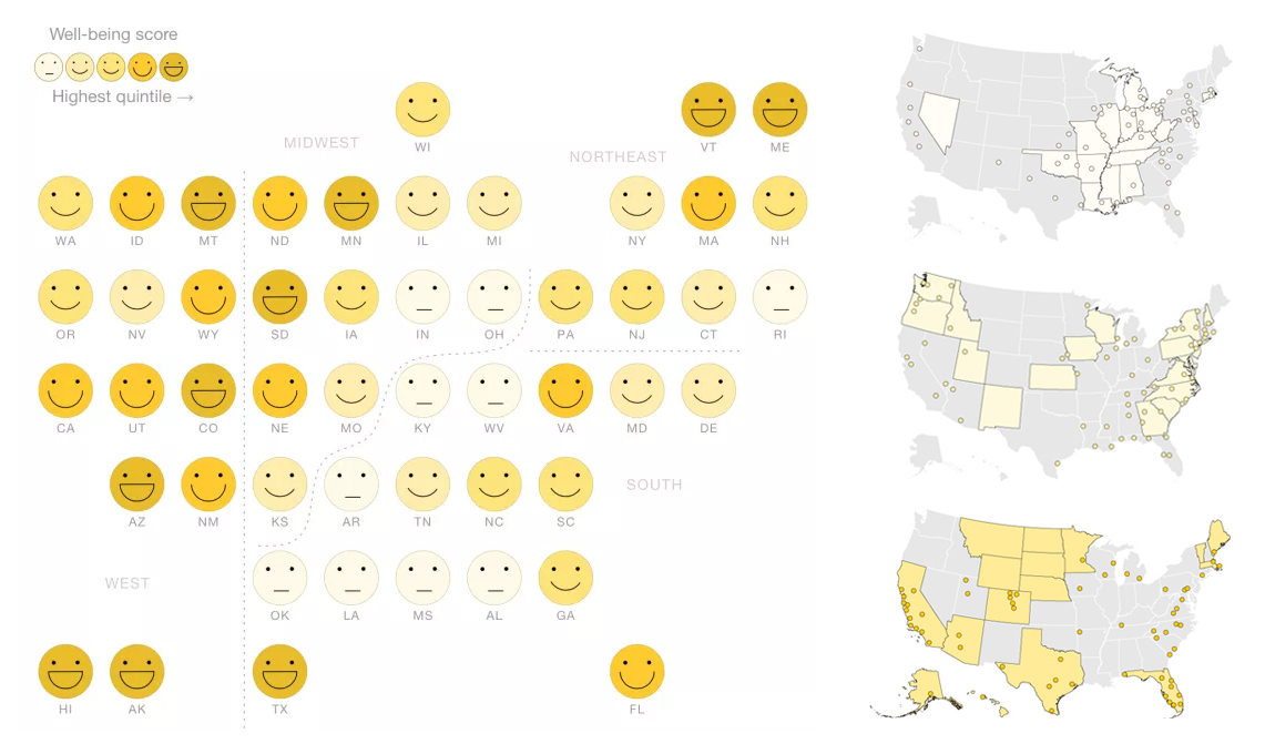
Map of Biggest Cities in United States
We at AnyChart visually represented data from Wikipedia’s List of United States Cities by Population on an interactive dot map powered by our JavaScript mapping library AnyMap. Now this dataviz is in our gallery of HTML5 maps along with other beautiful examples of geovisualization.
Check it out to find the biggest cities in the US. Hover over and click on the items in the interactive legend as well as make use of the zoom feature for the best exploratory experience.
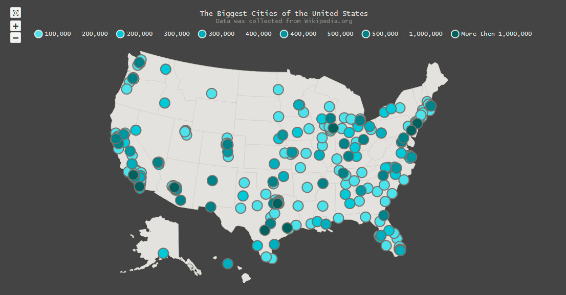
Map of Most Affordable Highly-Ranked Colleges in Every State of United States
At a time when college education in the US is so expensive, Business Insider conducted a research to reveal the most affordable college in every single state of the US.
Based on Tuition and Fees data collected by The Chronicle of Higher Education, they found the least expensive colleges in each state and checked with the US News & World Report’s National University Rankings to take into account only those from the top 220 positions. Take a look at the resulting map and charts along with further explanations on Business Insider.
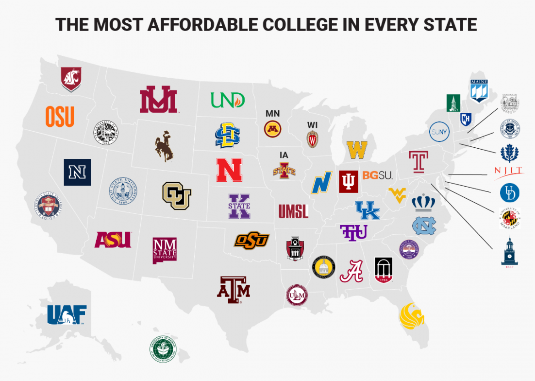
Map of High-Growth Entrepreneurship Hotspots in United States
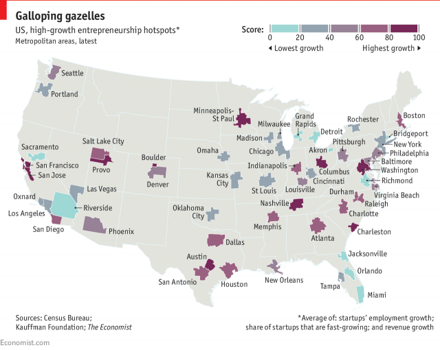
This map published on The Economist is helpful in understanding the location of hotspots for the fastest-growing startups across the United States of America. The Kauffman Foundation calls these companies “gazelles” in its recent report.
To learn more, read the piece mentioned and check out the full article “American entrepreneurship is flourishing, if you know where to look“.
***
We hope you like the current “US Maps” edition. Basically, if you are fond of data visualization as much as we are, follow our Data Visualization Weekly series. The next portion of chart and infographic inspirations and interesting visual reports is expected to go out on our blog in as few as seven days.
- Categories: Data Visualization Weekly
- No Comments »