 Here we are, bringing you the new pick of interesting data visualization examples we came across lately!
Check out what visual graphics we’ve included in this week’s Data Visualization Weekly post:
- where China sends money;
- what governments make the most requests for Twitter’s user data;
- visualizing every weapon in the US nuclear arsenal;
- animated interactive guide to frequency trails charts.
Data Visualization Weekly: October 20, 2017 – October 27, 2017
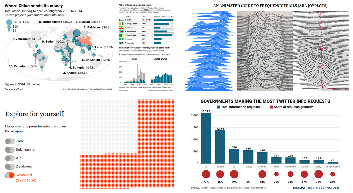
Where China Sends Money
While China keeps its official foreign funding figures secret, AirData succeeded to collect and put together data that sheds light on them. The Washington Post visualized it on a map and also provided two more charts to compare China’s aid and non-aid international money sending to the one of the United States.
It took as long as 5 years for AirData to get the data, and The Washington Post reports it to be “the first-ever global data set on Chinese overseas development spending between 2000 and 2014.”
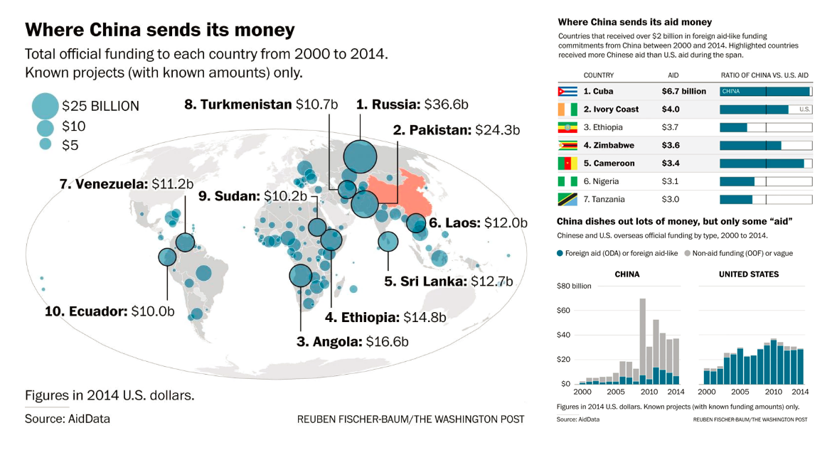
What Governments Make Most Twitter User Data Requests
Twitter issued a report about government requests for its user data in January to June this year. According to the interesting data visualization shared on Business Insider along with further insights, the United States still makes more of them than any other country.
Check out the chart to learn about what 10 governments requested the most Twitter user data, how many of requests they sent, and what share of their requests were granted with at least some information. Read the article to learn more.
Interesting Data Visualization of Every Weapon in US Nuclear Arsenal

Union of Concerned Scientists nailed another interesting data visualization. This time they graphically represented the nuclear arsenal of the United States, depicting every weapon as a point.
Take a look at the animated interactive visualization live on their website. There you’ll also be able to download the data.
Animated Interactive Guide to Frequency Trails Chart
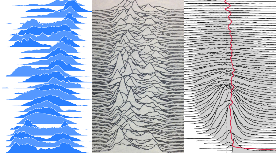
Luis Carli, a data visualization designer, made a cool animated guide to frequency trails (sometimes also called joyplots, or stacked distributions, or ridgeline plots).
The key peculiarity of this chart type is that it displays multiple distribution plots partially overlapping, separately but along the same axis. See this interactive explainer to learn more about frequency trails.
***
Stay tuned to our Data Visualization Weekly articles to get a portion of cool interesting data visualization inspirations every week!
- Categories: Data Visualization Weekly
- No Comments »