 In fact, charts visualizing data are greatly helpful in revealing trends and patterns in this data. That’s why we love dataviz and continue Data Visualization Weekly, our regular blog feature showcasing interesting examples of charts and infographics.
Today in DataViz Weekly:
- US police shoot people more than twice as often as anyone could think;
- charts visualizing data about protein variation;
- marine traffic map showing the location of all major commercial ships worldwide;
- visualizing big gains in curbing the oil output in OPEC and its ally countries.
Data Visualization Weekly: December 15, 2017 – December 22, 2017
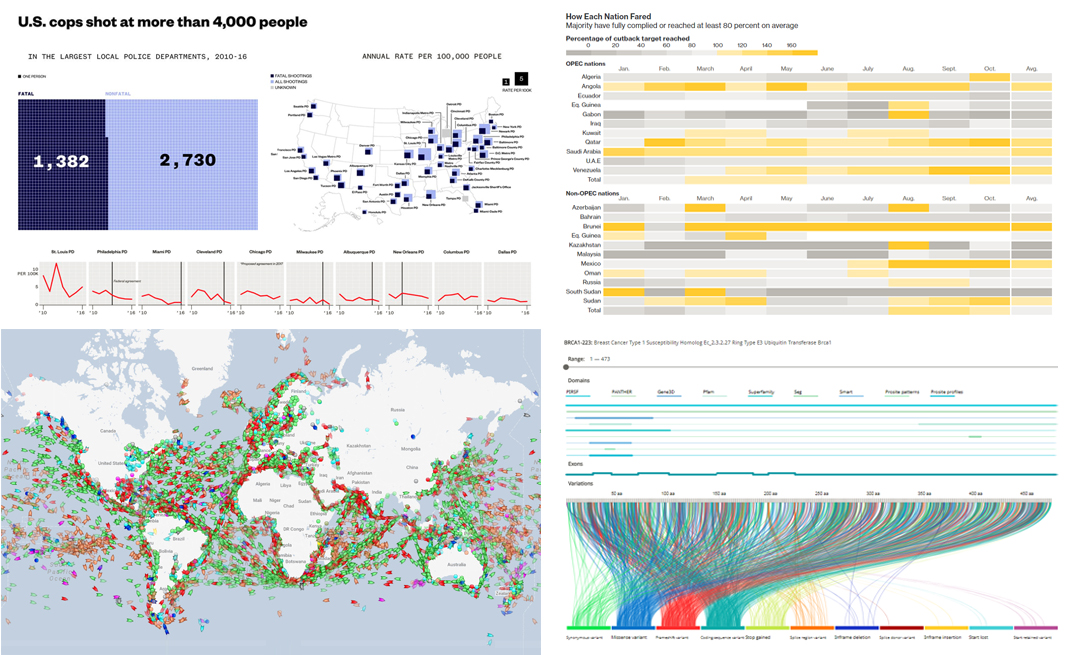
US Police Shoot People More Than Twice As Often As Thought
Police shooting is a subject that often gets covered in the news. And here’s what was recently found out on that. VICE held a special journalist investigation and analyzed data taken from the fifty biggest local departments of the US police to learn about incidents, both fatal and nonfatal, that involved cops.
The investigation revealed that police shoot more than twice more people than we used to think. To learn about the details, check out multiple charts on VICE News visualizing data about US police shootings.
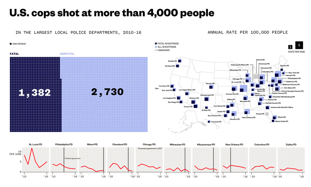
Charts Visualizing Data About Protein Variation
A group of computer scientists and information designers found out that the genome database of Ensembl contains a lot of important data, more than 100,000 gene transcripts that have never been visualized in an appropriate way. The team decided to change that.
Check out how they are visualizing data about protein variation and somatic mutations on VizGVar, a visualization portal for genetic variations, with the help of JavaScript. Generally speaking, these charts are helpful in identifying hidden patterns that can be relevant clinically.
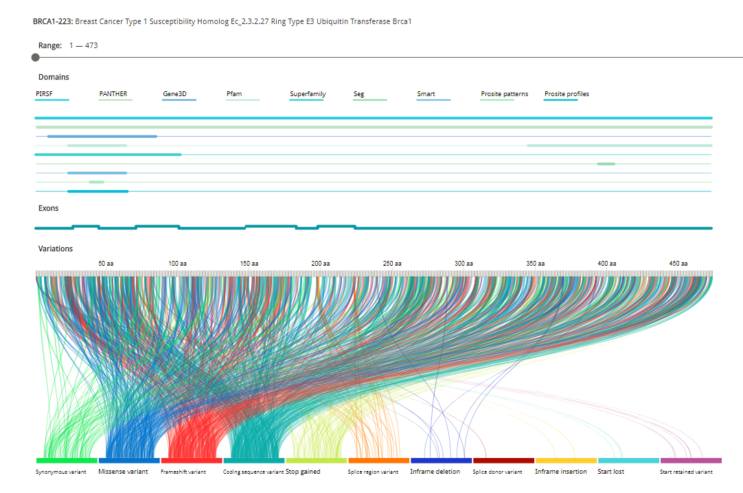
Marine Traffic Map Showing Location of All Ships Worldwide
The MarineTraffic ship tracking map will allow you to find the location of all major ships that are commercial vessels. What’s especially interesting, it works in real time!
Take a look at the interactive map on the MarineTraffic maritime database portal. You’ll see what ships are where in the sea or near you right now.
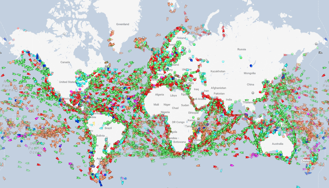
Visualizing OPEC and Allies Making Big Gains in Curbing Oil Output
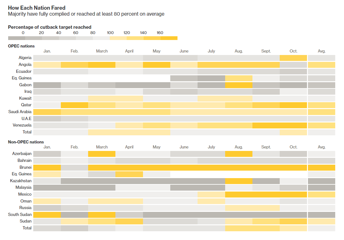
Bloomberg published a thorough set of charts visualizing data about oil output in the countries of OPEC and OPEC’s allies. Here we can assess the real-world dynamics of cutbacks and how successful these countries are in terms of reaching the targets they have.
Check out the details and all the visualizations in the article “OPEC and Its Allies Make Big Gains in Curbing Oil Output” on Bloomberg.
***
If you are interested not only in checking out various dataviz projects and charts visualizing data about something particular or anything in general but also in creating beautiful charts and maps by yourself, we have some great articles for you!
First, if you are new to the world of JavaScript charting, you’ll love our quick JS chart tutorials. They tell how to build a simple interactive chart of one chart type or another.
Second, if you are already an experienced developer and want to learn about making advanced interactive data visualizations, check out the new Challenge AnyChart! feature on our blog. In fact, we encourage everyone to give us complicated (yet stunning) data visualization tasks for the articles in its framework.
Unsure what chart type you should pick? Take a look at Chartopedia and don’t miss out on our articles on how to choose the right chart type.
And stay tuned for Data Visualization Weekly!
- Categories: Data Visualization Weekly
- No Comments »