Data Visualization in Action: Fresh Examples — DataViz Weekly
February 14th, 2025 by AnyChart Team We’re back with DataViz Weekly, where we showcase some of the best new data visualization examples — from individual charts and maps to full-scale visual stories and projects. Take a look at our latest picks:
- Swiss research funding — Colas Droin
- Education and voting patterns in U.S. presidential elections — Jon Boeckenstedt
- City walkability and improvement potential — The Economist & Matteo Bruno et al.
- Self-censorship in Super Bowl halftime shows — Artur Galocha for The Washington Post
- Categories: Data Visualization Weekly
- No Comments »
Awesome New Data Visualization Works — DataViz Weekly
November 15th, 2024 by AnyChart Team Welcome back to DataViz Weekly, where we spotlight the most awesome data visualization works we have recently come across. Check out the projects we’re diving into this time:
- Love songs: death or evolution? — The Pudding
- Historical dry streaks in NYC — Bloomberg Green
- NYC subway ridership in detail — Subway Stories
- Vote swings in U.S. presidential elections — NYT
- Categories: Data Visualization Weekly
- No Comments »
Building Bubble Chart with JavaScript
August 1st, 2023 by Awan Shrestha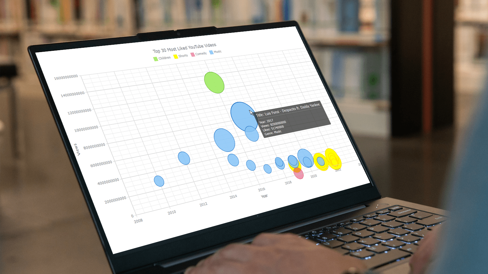 Do you want to turn that data chaos into a comprehensible data show? Look no further than data visualization! And let me tell you, one chart to rule them all is the bubble chart. It's like blowing bubbles at your data and watching them pop into understanding! And the best part? With JavaScript, you can easily create an interactive bubble chart, and I will show you how!
Bubble charts are versatile data visualizations that display data points in the form of bubbles, where the bubbles' size, color, and position represent different variables. In this tutorial, I'll walk you through building these graphics step by step, making the process a breeze. For illustration, we'll take data on the popularity of various YouTube videos and use JavaScript to create an interactive bubble chart showcasing the top 30 most-liked videos of all time, categorized by year of release, views, and likes.
By the end of this tutorial, you'll be able to create visually-stunning JS-based bubble charts without any hassle. So let's dive into the world of data bubbles and turn numbers into a visual feast for the eyes!
Read the JS charting tutorial »
- Categories: AnyChart Charting Component, Big Data, Business Intelligence, HTML5, JavaScript, JavaScript Chart Tutorials, Tips and Tricks
- No Comments »
How to Make Bubble Maps in JavaScript
November 16th, 2022 by Shachee Swadia Map charts are a great way to put data in a geographical context. And they are not difficult to create! I am eager to demonstrate that by walking you through the creation of a bubble map, one of the most popular types data maps, with the help of JavaScript.
A bubble map is a combination of a bubble chart and a geographical map. It uses circles of different sizes (and sometimes colors) to indicate numeric values relating to locations or territories.
In this tutorial, I will be visualizing the data on gasoline prices across the United States. They saw record highs this summer after a surge fueled by the outbreak of the Russia–Ukraine conflict. The first, basic bubble map will display the gas prices in July by state. The final one will add the magnitude of the change since February 23, one day before Russia launched an attack on Ukraine.
Follow along and you’ll learn to build beautiful interactive maps in JS with ease and no problem!
Read the JS charting tutorial »
- Categories: AnyChart Charting Component, AnyMap, Big Data, HTML5, JavaScript, JavaScript Chart Tutorials, Tips and Tricks
- No Comments »
Tokyo Olympics Medal Trackers — DataViz Weekly
August 6th, 2021 by AnyChart Team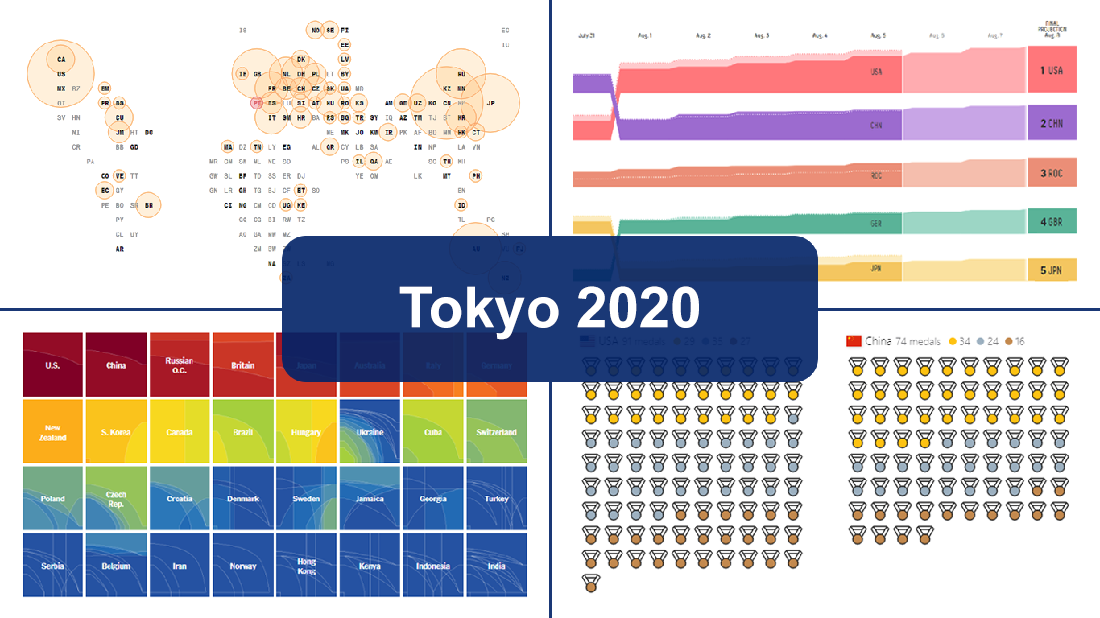 Delayed one year due to the COVID-19 pandemic, the 2020 Summer Olympics officially known as the Games of the XXXII Olympiad and commonly referred to simply as Tokyo 2020 have been underway for two weeks and are already coming to a close, with under 50 medal sets yet to be distributed over the remaining two days.
In this special edition of DataViz Weekly, we are happy to showcase four wonderful Olympic medal trackers providing an insightful view of medal counts and country standings with the help of telling visualizations — from Bloomberg News, The New York Times’s The Upshot, FiveThirtyEight, and Axios.
- Categories: Data Visualization Weekly
- 1 Comment »
Effective Visualizations of Information on Pandemic, Climate, Happiness, Travel Time — DataViz Weekly
July 30th, 2021 by AnyChart Team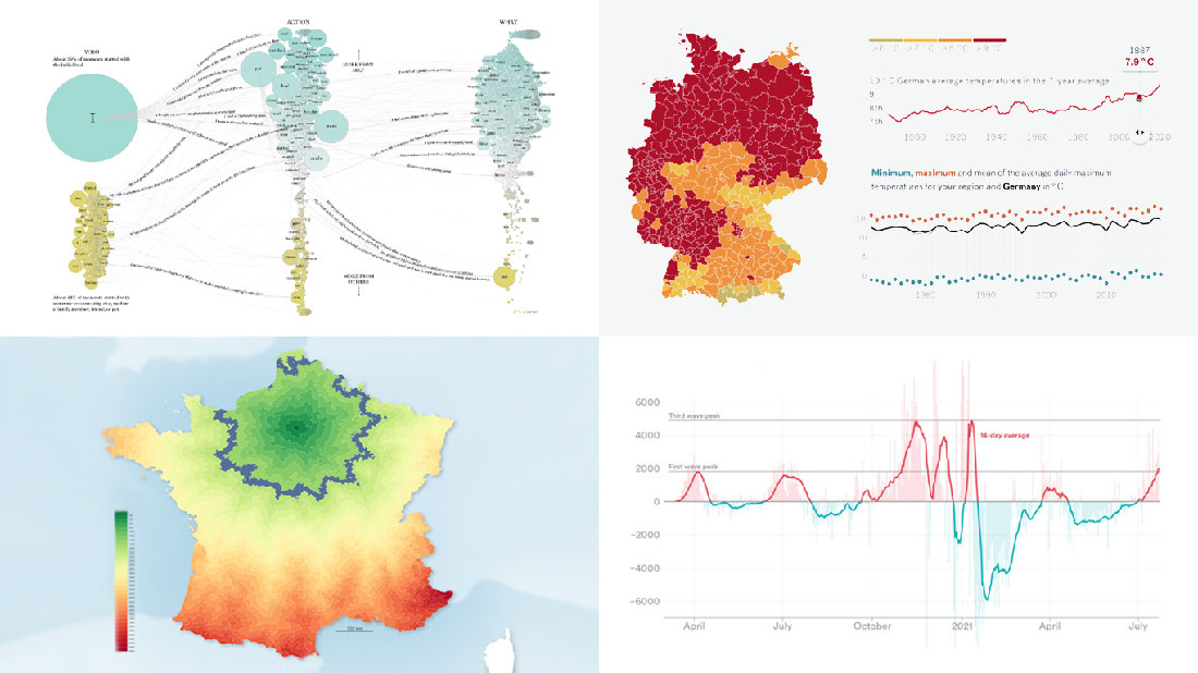 Data becomes easier to perceive and draw insights from when it is properly represented in charts and maps. For everyone interested to check out how information visualization works, we continue our regular feature DataViz Weekly curating the best new examples of effective graphics. Here are our latest picks:
- COVID-19 case acceleration rates — STAT
- Climate change risks across Germany — Vislab
- What makes people happy the most — Nathan Yau
- Driving time to Paris from across France — Nicolas Lambert
- Categories: Data Visualization Weekly
- No Comments »
Exploring Voting Bills, Birth Rates, Hospital Billing, Transit Equity — DataViz Weekly
June 25th, 2021 by AnyChart Team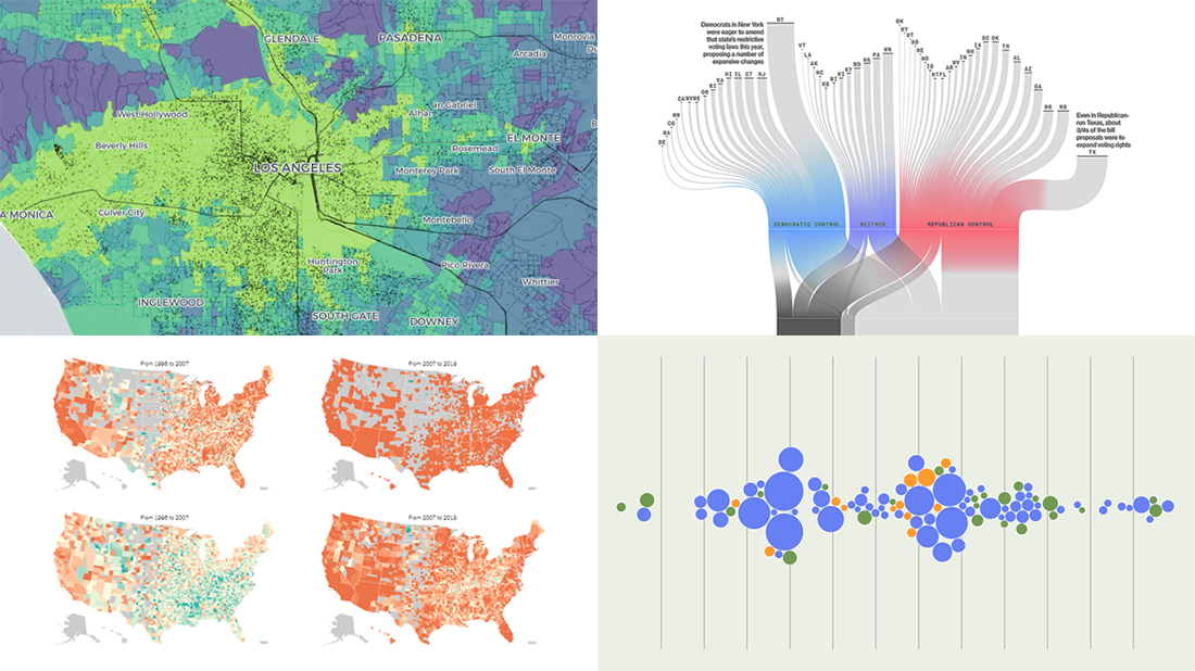 Join us to check out the most awesome data visualizations of all we have come across this week! To begin with, here is a full list of the projects featured today in DataViz Weekly:
- Proposed and passed voting bills across the U.S. in 2021 — Bloomberg
- Change in birth rates among American women — NYT
- Billing practices at the top 100 U.S. hospitals — Axios
- Transit equity in major U.S. cities — TransitCenter
- Categories: Data Visualization Weekly
- No Comments »
Building JavaScript Scatter Plot Module
May 27th, 2020 by Wayde Herman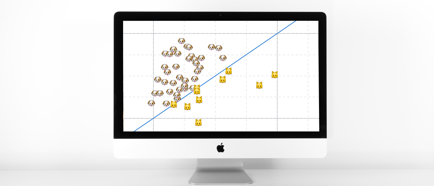 Scatter plots are a great way to visualize data. Data is represented as points on a Cartesian plane where the x and y coordinate of each point represents a variable. These charts let you investigate the relationship between two variables, detect outliers in the data set as well as detect trends. They are one of the most commonly used data visualization techniques and are a must have for your data visualization arsenal!
In this tutorial, I will teach you how to build your very own interactive scatter plot charts using JavaScript.
Ever wondered whether the population of the United States of America were dog people? Well, you’re about to find out! To help you learn more about building scatter plots I will be using the Cat vs Dog Popularity in US dataset. This dataset contains the percentage of homes with dogs and cats for each US state.
Read the JS charting tutorial »
- Categories: AnyChart Charting Component, Big Data, HTML5, JavaScript, JavaScript Chart Tutorials, Tips and Tricks
- 1 Comment »
How to Create JavaScript Bubble Chart — Tutorial for Web Developers
March 3rd, 2020 by Wayde Herman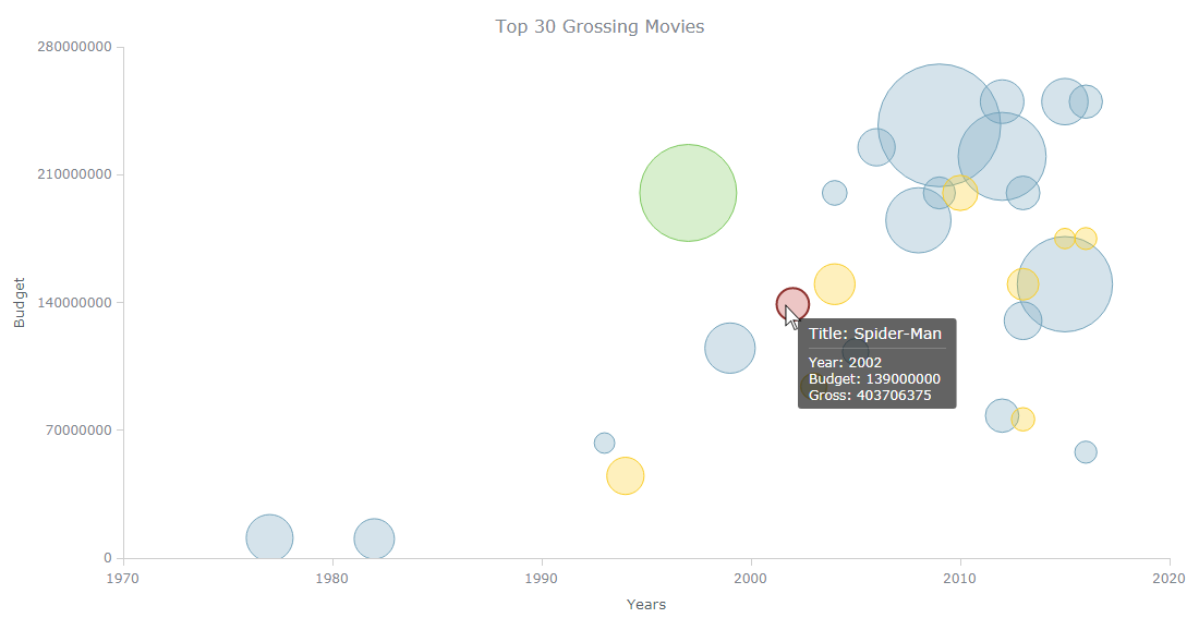 Have you ever wanted to create a bubble chart using JavaScript but did not know how? Then this tutorial is for you! Carry on reading to learn more about bubble charts and how we can build them quickly and painlessly.
Bubble charts are an extension of the scatter plot. Most commonly, they display three variables which are expressed as the horizontal distance of the point (x), the vertical distance of the point (y), and the size of the point (z). A bubble chart is a great visualization technique to let users compare data points. When designed well, it can be really eye-catching and engaging.
In this tutorial, I will teach you how to build your very own interactive JS bubble chart and bring it to life through customization. All examples will be available with the full code.
For this “getting started” guide, I have decided to explore the data of the top 30 grossing movies. Let’s look at the amount of money each movie has grossed, the budget, as well as the year of release. A bubble chart is a particularly good choice for the visualization of this dataset as it will allow us to easily compare these three numeric variables in an interesting and beautiful way.
Read the JS charting tutorial »
- Categories: AnyChart Charting Component, HTML5, JavaScript, JavaScript Chart Tutorials, Tips and Tricks
- No Comments »
Choose Right Chart Type for Data Visualization. Part 4: Data Distribution
May 4th, 2017 by AnyChart Team Displaying and researching some Data Distribution and relationship between data sets instead of studying precise values in each category is a quite common task in data analysis. It can be solved with the help of the chart types that we are going to identify and explain in this article.
Depending on a situation – the kind of data you have and the specific questions you’d like it to provide answers to – you can pick one approach or another. Just be careful when choosing between one chart type and another for the subsequent data distribution analysis. You want the visualization to clarify data, not obscure it or deliver any sort of confusion. Well, simply make sure you understand the following aspects, mind all the details of your situation, and you will have no problem with visualizing data distribution correctly.
- Categories: Choosing Chart Type, Tips and Tricks
- 1 Comment »