 Do you want to turn that data chaos into a comprehensible data show? Look no further than data visualization! And let me tell you, one chart to rule them all is the bubble chart. It's like blowing bubbles at your data and watching them pop into understanding! And the best part? With JavaScript, you can easily create an interactive bubble chart, and I will show you how!
Bubble charts are versatile data visualizations that display data points in the form of bubbles, where the bubbles' size, color, and position represent different variables. In this tutorial, I'll walk you through building these graphics step by step, making the process a breeze. For illustration, we'll take data on the popularity of various YouTube videos and use JavaScript to create an interactive bubble chart showcasing the top 30 most-liked videos of all time, categorized by year of release, views, and likes.
By the end of this tutorial, you'll be able to create visually-stunning JS-based bubble charts without any hassle. So let's dive into the world of data bubbles and turn numbers into a visual feast for the eyes!
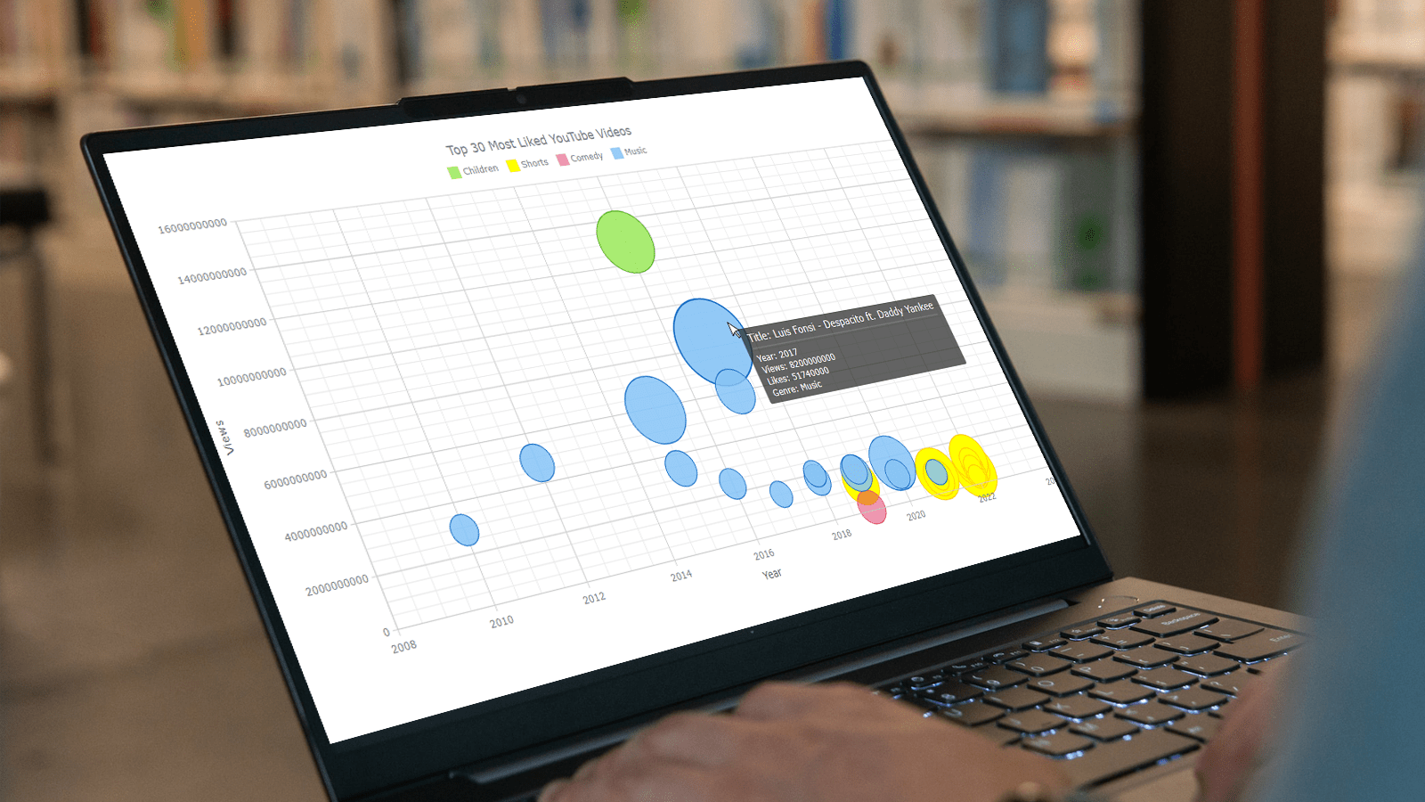
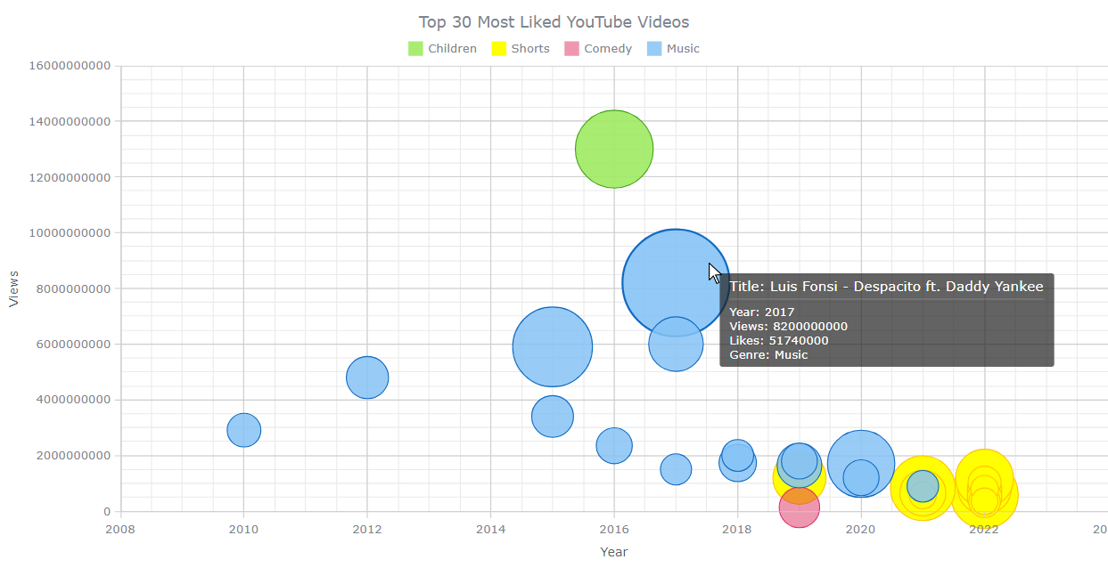
Bubble Chart That Will Be Created
Take a quick look at the JS bubble chart we will build together in this tutorial, and follow along!
A. Creating a Basic JS Bubble Chart
Don't be intimidated if you're new to creating JS charts — it's easier than you might think! In fact, all you need to do is follow these four steps to make it happen:
- Create a web page in HTML.
- Include the required JavaScript files.
- Add the data.
- Write some JS charting code.
1. Create a web page in HTML
The first step is a breeze — just create a basic HTML web page! From there, we'll add a <div> element and give it a unique ID like "container” to create the space for the bubble chart. To ensure that the graph takes up the entire page, we’ll use CSS code within the <style> tag to set the width and height to 100%; of course, this can be completely customized to fit your exact needs and preferences.
<!DOCTYPE html>
<html lang="en">
<head>
 <meta charset="utf-8">
 <title>JavaScript Bubble Chart</title>
 <style type="text/css">
   html, body, #container {
     width: 100%;
     height: 100%;
     margin: 0;
     padding: 0;
   }
 </style>
</head>
<body>
 <div id="container"></div>
</body>
</html>
2. Include the required JavaScript files
After setting up a basic HTML page, the next step is to include the necessary JavaScript files in the <head> section. There are numerous charting libraries available. In this tutorial, we'll be using AnyChart. This library supports bubble charts and offers comprehensive documentation. But no matter which library you choose, the basic steps for creating a chart are similar.
To create a bubble chart, we’ll use the Base module. The data will be in a JSON file, so we’ll need the Data Adapter module to load it.
<!DOCTYPE html>
<html lang="en">
  <head>
    <meta charset="utf-8">
    <title>JavaScript Bubble Chart</title>
    <script src="https://cdn.anychart.com/releases/8.11.1/js/anychart-base.min.js"></script>
    <script src="https://cdn.anychart.com/releases/8.11.1/js/anychart-data-adapter.min.js"></script>
    <style type="text/css">
      html, body, #container {
        width: 100%;
        height: 100%;
        margin: 0;
        padding: 0;
      }
    </style>
  </head>
  <body>
    <div id="container"></div>
    <script>
      // All the code for the bubble chart will come here.
    </script>
  </body>
</html>
3. Add the data
I compiled the data about the top 30 most liked YouTube videos from BuzzGuru and YouTube and saved it in a JSON file, which you can find here.
Each object in the dataset represents a YouTube video and is to be visualized as a single bubble. The objects have five properties: "x" for the year of upload to YouTube, "value" for the number of YouTube views, "size" for the number of YouTube likes, as well as "title" and "genre".
To load the data into a bubble plot, we’ll use the anychart.data.loadJsonFile() function.
anychart.data.loadJsonFile("https://gist.githubusercontent.com/awanshrestha/8df51b9b1c44b2d1bd3ebeb0757b5fb0/raw/28ee08902d393e02278a7ef7e3461b33e34c6c90/Top-liked-YouTube-Videos.json",
function (data) {});
You will find out where to put this code in a few moments.
4. Write some JS charting code
It’s time for a few lines of JavaScript code that will construct the visualization!
To begin, wrap the code in an anychart.onDocumentReady() function ensuring that it only executes once the page is fully loaded.
<script>
  anychart.onDocumentReady(function () {
    // The bubble chart data and code will be in this section.
  });
</script>
Add the data from Step 3.
<script>
  anychart.onDocumentReady(function () {
    anychart.data.loadJsonFile("https://gist.githubusercontent.com/awanshrestha/8df51b9b1c44b2d1bd3ebeb0757b5fb0/raw/28ee08902d393e02278a7ef7e3461b33e34c6c90/Top-liked-YouTube-Videos.json",
    function (data) {
      // The upcoming JS code will be here.
    });
  });
</script>
Pass the data to the anychart.bubble() function to create a bubble chart object.
chart = anychart.bubble(data);
It's possible to set the minimum and maximum bubble sizes using the minBubblesize() and maxBubblesize() functions respectively.
chart.minBubbleSize("3%");
chart.maxBubbleSize("12%");
Finally, let’s give the bubble chart a title and insert it into the designated <div> container. Once this is done, we can use the draw() function to render the visualization on the web page.
chart.title("Top 30 Most Liked YouTube Videos");
chart.container("container");
chart.draw();
It's here! Our first JavaScript bubble chart is ready. Its interactive version with the full code can be found on Playground. The code is also provided below for your convenience.
<!DOCTYPE html>
<html lang="en">
  <head>
    <meta charset="utf-8">
    <title>JavaScript Bubble Chart</title>
    <script src="https://cdn.anychart.com/releases/8.11.1/js/anychart-base.min.js"></script>
    <script src="https://cdn.anychart.com/releases/8.11.1/js/anychart-data-adapter.min.js"></script>
    <style type="text/css">
      html, body, #container {
        width: 100%;
        height: 100%;
        margin: 0;
        padding: 0;
      }
    </style>
  </head>
  <body>
    <div id="container"></div>
    <script>
      anychart.onDocumentReady(function() {
        // load data
        anychart.data.loadJsonFile("https://gist.githubusercontent.com/awanshrestha/8df51b9b1c44b2d1bd3ebeb0757b5fb0/raw/28ee08902d393e02278a7ef7e3461b33e34c6c90/Top-liked-YouTube-Videos.json",
        function (data) {
          // create a bubble chart
          chart =  anychart.bubble(data);
          // set the minimum and maximum bubble sizes
          chart.minBubbleSize("3%");
          chart.maxBubbleSize("12%");
          // add a chart title
          chart.title("Top 30 Most Liked YouTube Videos");
          // set the container
          chart.container("container");
          // initiate the chart drawing
          chart.draw();
        })
      });
    </script>
  </body>
</html>
B. Customizing JS Bubble Chart
Let's take our JavaScript bubble chart to the next level by adding some exciting customizations that will make it look even more visually appealing! We can transform our chart from good to great with just a few tweaks. Let’s do it!
1. Name the axes
First, we'll make it all easier to understand by adding titles to the X and Y axes.
chart.xAxis().title("Year");
chart.yAxis().title("Views");
2. Arrange the ticks
Next, we'll set custom intervals for the tick marks.
chart.xScale().ticks().interval(2);
chart.yScale().ticks().interval(2000000000);
3. Enable the grid
We'll add the grid to further enhance the bubble chart's appearance and functionality. By enabling major and minor gridlines for both axes, we'll make it easier to visually interpret the data displayed on the bubble chart.
chart.yGrid(true).xGrid(true).xMinorGrid(true).yMinorGrid(true);
4. Paint the bubbles by genre
To make our bubble chart really pop, we can generate a visual distinction between the videos of different genres using coloring.
First, we'll separate the data into different series based on genre using the JavaScript filter() method. This chart categorizes the videos into four groups: Shorts, Music, Comedy, and Children.
var videos_shorts = data.filter(function(entry) {
  return entry.genre === "Shorts";
});
var videos_music= data.filter(function(entry) {
  return entry.genre === "Music";
});
var videos_comedy = data.filter(function(entry) {
  return entry.genre === "Comedy";
});
var videos_children = data.filter(function(entry) {
  return entry.genre === "Children";
});
Next, we'll use the normal(), hovered(), and selected() methods to configure the appearance of these series in different states. With the fill() method, we can set the colors of the bubbles themselves, while the stroke() method controls their outlines.
Unique colors are specified for the different categories of videos. Feel free to add your own choice of colors, and make the chart vibrant.
// series 1
var series1 = chart.bubble(videos_children).name("Children");
series1.normal().fill("#A0EA63", 0.9);
series1.hovered().fill("#A0EA63", 0.7);
series1.selected().fill("#9EE57C", 0.9);
series1.normal().stroke("#41a312", 1);
series1.hovered().stroke("#41a312", 2);
series1.selected().stroke("#41a312", 4);

// series 2
var series2 = chart.bubble(videos_shorts).name("Shorts");
series2.normal().fill("#FFFF00", 1);
series2.hovered().fill("#FFFF00", 0.8);
series2.selected().fill("#FFFF00", 0.3);
series2.normal().stroke("#FFC000", 1);
series2.hovered().stroke("#FFC000", 2);
series2.selected().stroke("#FFC000", 4);

// series 3
var series3 = chart.bubble(videos_comedy).name("Comedy");
series3.normal().fill("#DE3163", 0.5);
series3.hovered().fill("#DE3163", 0.3);
series3.selected().fill("#DE3163", 0.3);
series3.normal().stroke("#DE3163", 1);
series3.hovered().stroke("#DE3163", 2);
series3.selected().stroke("#DE3163", 2);

// series 4
var series4 = chart.bubble(videos_music).name("Music");
series4.normal().fill("#87C4F6", 0.85);
series4.hovered().fill("#87C4F6", 0.9);
series4.selected().fill("#55A0E5", 0.98);
series4.normal().stroke("#1069c2", 1);
series4.hovered().stroke("#1069c2", 2);
series4.selected().stroke("#1069c2", 4);
5. Prevent clipping
Let’s also add a few lines of code to prevent any clipping of the bubbles, ensuring the chart looks as beautiful as possible. By setting the clip() function parameter to "false" for each data series, we provide that every bubble is fully visible and accounted for.
series1.clip(false);
series2.clip(false);
series3.clip(false);
series4.clip(false);
6. Add the legend
Adding a legend is a great idea, as it will help quickly realize which color means what. In addition to that, let’s set the padding to 12 pixels for both the top and bottom of the bubble chart legend.
chart.legend(true).padding({bottom: 12, top: 12});
7. Enhance the tooltip
The tooltip format can be customized to display any relevant data that helps better understand the bubble chart presentation.
First, we’ll create a tooltip variable and assign it to the chart's tooltip. After this, we’ll format the tooltip title using the titleFormat() function. Next, we’ll use the format() function to make the tooltip display the year, views, likes, and genre of the data point.
var tooltip = chart.tooltip();
tooltip.titleFormat("Title: {%title}");
tooltip.format("Year: {%x} \nViews: {%value} \nLikes: {%size} \nGenre: {%genre}");
Below is the final version of our JavaScript bubble chart that I am extremely satisfied with. The interactive visualization with its complete source code is available on Playground, allowing you to modify colors, interactivity, and other elements according to your preferences. For your convenience, I have included the entire code of this bubble chart below.
<!DOCTYPE html>
<html lang="en">
  <head>
    <meta charset="utf-8">
    <title>JavaScript Bubble Chart</title>
    <script src="https://cdn.anychart.com/releases/8.11.1/js/anychart-base.min.js"></script>
    <script src="https://cdn.anychart.com/releases/8.11.1/js/anychart-data-adapter.min.js"></script>
    <style type="text/css">
      html, body, #container {
        width: 100%;
        height: 100%;
        margin: 0;
        padding: 0;
      }
    </style>
  </head>
  <body>
    <div id="container"></div>
    <script>
      anychart.onDocumentReady(function() {
        // load data
        anychart.data.loadJsonFile("https://gist.githubusercontent.com/awanshrestha/8df51b9b1c44b2d1bd3ebeb0757b5fb0/raw/28ee08902d393e02278a7ef7e3461b33e34c6c90/Top-liked-YouTube-Videos.json",
        function (data) {
          // create a bubble chart
          chart = anychart.bubble();
          // set the minimum and maximum bubble sizes
          chart.minBubbleSize("3%");
          chart.maxBubbleSize("12%");
          // name the axes
          chart.xAxis().title("Year");
          chart.yAxis().title("Views");
          // set the intervals between the ticks
          chart.xScale().ticks().interval(2);
          chart.yScale().ticks().interval(2000000000);
          // enable the grid
          chart.yGrid(true).xGrid(true).xMinorGrid(true).yMinorGrid(true);
          // separate the data into different series based on genre
          var videos_shorts = data.filter(function(entry) {
            return entry.genre === "Shorts";
          });
          var videos_music= data.filter(function(entry) {
            return entry.genre === "Music";
          });
          var videos_comedy = data.filter(function(entry) {
            return entry.genre === "Comedy";
          });
          var videos_children = data.filter(function(entry) {
            return entry.genre === "Children";
          });
          // customize the appearance of each series
          // series 1
          var series1 = chart.bubble(videos_children).name("Children");
          series1.normal().fill("#A0EA63", 0.9);
          series1.hovered().fill("#A0EA63", 0.7);
          series1.selected().fill("#9EE57C", 0.9);
          series1.normal().stroke("#41a312", 1);
          series1.hovered().stroke("#41a312", 2);
          series1.selected().stroke("#41a312", 4);
          // series 2
          var series2 = chart.bubble(videos_shorts).name("Shorts");
          series2.normal().fill("#FFFF00", 1);
          series2.hovered().fill("#FFFF00", 0.8);
          series2.selected().fill("#FFFF00", 0.3);
          series2.normal().stroke("#FFC000", 1);
          series2.hovered().stroke("#FFC000", 2);
          series2.selected().stroke("#FFC000", 4);
          // series 3
          var series3 = chart.bubble(videos_comedy).name("Comedy");
          series3.normal().fill("#DE3163", 0.5);
          series3.hovered().fill("#DE3163", 0.3);
          series3.selected().fill("#DE3163", 0.3);
          series3.normal().stroke("#DE3163", 1);
          series3.hovered().stroke("#DE3163", 2);
          series3.selected().stroke("#DE3163", 2);
          // series 4
          var series4 = chart.bubble(videos_music).name("Music");
          series4.normal().fill("#87C4F6", 0.85);
          series4.hovered().fill("#87C4F6", 0.9);
          series4.selected().fill("#55A0E5", 0.98);
          series4.normal().stroke("#1069c2", 1);
          series4.hovered().stroke("#1069c2", 2);
          series4.selected().stroke("#1069c2", 4);
          // prevent the bubbles from clipping
          series1.clip(false);
          series2.clip(false);
          series3.clip(false);
          series4.clip(false);
          // add the legend
          chart.legend(true).padding({bottom: 12 , top: 12});
          // configure the tooltip
          var tooltip = chart.tooltip();
          tooltip.titleFormat("Title: {%title}");
          tooltip.format("Year: {%x} \nViews: {%value} \nLikes: {%size} \nGenre: {%genre}");
          // add a chart title
          chart.title("Top 30 Most Liked YouTube Videos");
          // set the container
          chart.container("container");
          // initiate the chart drawing
          chart.draw();
        })
      });
    </script>
  </body>
</html>
Conclusion
We have successfully generated a JavaScript-based (HTML5) bubble chart that presents the 30 most popular YouTube videos based on their number of likes. To help you create your data visualizations using this technique, I have provided a step-by-step tutorial that outlines each individual action taken to produce this chart. Simply follow these instructions, and you will be able to create interactive bubble charts that effectively represent your own data.
If you have any queries regarding the process or the bubble chart as such, please feel free to ask me in the comments section. I would be delighted to clarify any doubts you may have. Moreover, I would love to see the bubble plots you produce using this guide. Feel free to show me what you've created!
Published with the permission of Awan Shrestha. Originally appeared on Codementor with the title “Creating a Bubble Chart with JavaScript” on July 31, 2023.
You’re more than welcome to check out the JavaScript Bubble Chart Tutorial by Wayde Herman originally published on our blog earlier.
See other JavaScript charting tutorials to continue mastering interactive data visualization.
Would you like to write some nice guest post? Let us know.
- Categories: AnyChart Charting Component, Big Data, Business Intelligence, HTML5, JavaScript, JavaScript Chart Tutorials, Tips and Tricks
- No Comments »