 Creating a Pareto chart with JavaScript for HTML5 apps and websites is not a complicated or hectic development process at all. Get hands-on experience with this tutorial and you will find data visualization in such a form joyful and exciting!
Before we start, let’s remember how Pareto charts look and what their purpose is, just to make sure we are on the same page. A Pareto chart, also a Pareto diagram, is a combination of vertical bars (columns) and a line graph. Columns are used to depict values and are displayed in descending order, left to right. The line in a Pareto chart shows the cumulative total in percentages. Such a visualization helps data scientists and analysts quickly identify the most important among a set of factors, i.e. those characterized by the largest values and therefore making the most significant contribution to the total across all the represented factors.
In this JS Pareto chart tutorial, we’ll be visualizing statistics for the leading causes of death in the United States in 2019 and find out what claimed the most American lives during that year according to official data.
Now let’s move to JavaScript charting, and more precisely, building an interactive Pareto chart using JS!
(Below is how the final JavaScript-based Pareto chart will look if you’re interested.)
Building Basic JS Pareto Chart
The common order of visualizing data in JavaScript charts builds on the following four steps. To create a JS Pareto chart, you should follow them too:
- First, generate an HTML with a container to display the chart.
- Second, reference all JS scripts you are going to use.
- Third, load the data that needs to be charted.
- Fourth, write the JavaScript code required to visualize the chart.
Let’s go through each of these steps to make an interactive Pareto chart and understand the entire process which is quite simple overall.
Step 1: Create an HTML page
The following code sets up an HTML page with a container to hold our Pareto chart.
<!DOCTYPE html>
<html>
  <head>
    <title>Pareto Chart Example</title>
    <style>
      html, body, #container1 {
        width: 100%;
        height: 100%;
        margin: 0;
        padding: 0;
      }
    </style>
  </head>
  <body>
    <div id="container1"></div>
      // The Pareto chart code will be put here.
  </body>
</html>
The HTML page developed above consists of two main sections: <head> and <body>. The <head> section includes two subsections: <title> and <style>. The title of the page is set here as ‘Pareto Chart Example.’ The <style> element is used to apply a simple style sheet to the HTML document, the <body> section, and the <div> container with the id ‘container1’ (that’s where we will place our Pareto chart).
Step 2: Connect scripts
Then, we should link all scripts to be used when building a Pareto chart – in the <head> section.
There are many JavaScript charting libraries you might choose to employ to create an interactive Pareto chart for your web site or app. In this tutorial, I will be using AnyChart. It is a very flexible JavaScript library for cross-platform data visualization, enriched with a huge number of chart demos as well as vast and extremely detailed documentation and API reference making it easy enough to deal with even for beginners to web development and programming.
AnyChart features a modular system, which allows you to minimize the amount of JavaScript that needs to run on your page as you do not need to load more than you actually need. To develop a Pareto chart, you need only two modules: ‘core’ with all the JS charting library basics and ‘pareto’ specifically with the Pareto chart type.
<script src="https://cdn.anychart.com/releases/8.9.0/js/anychart-core.min.js"></script>
<script src="https://cdn.anychart.com/releases/8.9.0/js/anychart-pareto.min.js"></script>
Now let’s add these modules to the <head> section as shown below.
<!DOCTYPE html>
<html>
  <head>
    <title>Pareto Chart Example</title>
    <script src="https://cdn.anychart.com/releases/8.9.0/js/anychart-core.min.js"></script>
    <script src="https://cdn.anychart.com/releases/8.9.0/js/anychart-pareto.min.js"></script>
    <style>
      html, body, #container1 {
        width: 100%;
        height: 100%;
        margin: 0;
        padding: 0;
      }
    </style>
  </head>
  <body>
    <div id="container1"></div>
    <script>
      // The Pareto chart code will be put here.
    </script>
  </body>
</html>
Step 3: Load the data you want to visualize
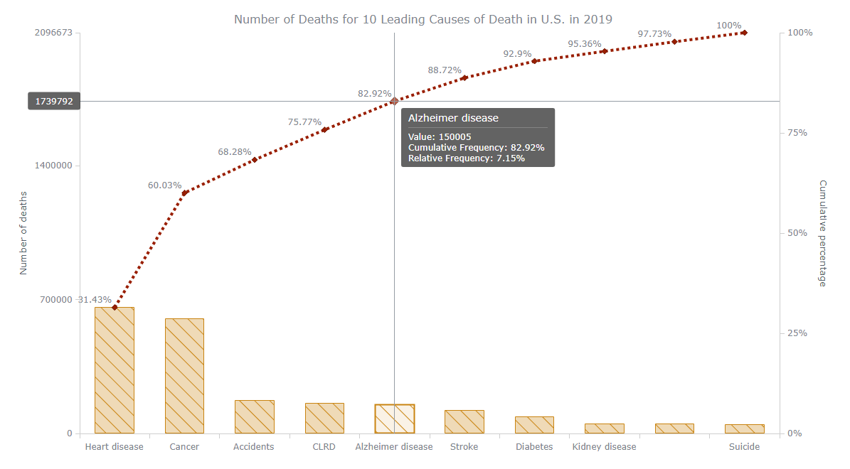
For this JavaScript Pareto chart tutorial, I decided to take CDC’s statistics revealing the ten leading causes of death in the United States of America in 2019. It is known that a total of 2,854,838 resident deaths were reported. The ten leading causes of death accounted for 73.4% of all the deaths. A Pareto chart will show the ten leading causes of death and the contribution of each to their total, in descending order.
So, let’s see the dataset first.
| Cause of death | Number of deaths |
|---|---|
| Heart disease | 659,041 |
| Cancer | 599,601 |
| Accidents | 173,040 |
| Chronic lower respiratory diseases (CLRD) | 156,979 |
| Alzheimer disease | 150,005 |
| Stroke | 121,499 |
| Diabetes | 87,647 |
| Kidney disease | 51,567 |
| Influenza and pneumonia | 49,783 |
| Suicide | 47,511 |
Using the JS Pareto charting module of AnyChart, you can simply set and feed the dataset in the form of a JavaScript object (like shown below). The library will handle the rest of the things required to build a Pareto chart such as sorting the factor frequencies, setting the highest frequent factor to the left and the lowest to the right, automatic calculation of cumulative percentages, and so on.
To generate a JavaScript object with our data, we need two data fields named ‘x’ and ‘value’ according to the following:
- ‘x’ is the name of a factor required to be displayed in a Pareto chart (in our case, the name of a cause of death), and
- ‘value’ is the frequency of the corresponding factor (in our case, the number of deaths from that cause).
Here’s how it can look with our data:
var data = [
  {x: 'Heart disease', value: 659041},
  {x: 'Alzheimer disease', value: 150005},
  {x: 'Cancer', value: 599601},
  {x: 'Accidents', value: 173040},
  {x: 'Kidney disease', value: 51567},
  {x: 'Suicide', value: 47511},
  {x: 'CLRD', value: 156979},
  {x: 'Stroke', value: 121499},
  {x: 'Diabetes', value: 87647},
  {x: 'Influenza and pneumonia', value: 49783}
];
Step 4: Writing the JS Pareto chart code
By now, we have obtained all fundamental things to generate an interactive Pareto chart using JavaScript. So, let’s collate everything else we need to reach our target.
All the JavaScript codes should be placed inside of the <script> tag. Moreover, as is shown in the following snippet, we write the Pareto chart-related lines of JS code within the onDocumentReady function. This function waits until the HTML page is fully loaded.
<script>
  anychart.onDocumentReady(function() {
    // The entire code of the Pareto chart will be here.
  });
</script>
So, in the onDocumentReady function, load the data like explained in step 3.
Once the data object is created, feed it to the Pareto chart.
// create a pareto chart
var chart = anychart.pareto();
// feed the data into the chart
chart.data(data);
Then, set the main Pareto chart title and add two Y-axis titles as shown below to make it clear where is what:
// set the chart title
chart.title('Number of Deaths for 10 Leading Causes of Death in U.S. in 2019');
// set the measure y axis title
chart.yAxis(0).title('Number of deaths');
// set the cumulative percentage y axis title
chart.yAxis(1).title('Cumulative percentage');
The final action is to feed the resulting Pareto chart to the division with the id ‘container1’ and provide the command to draw the graphic according to the given configuration:
// set the chart container id
chart.container('container1');
// draw the chart
chart.draw();
Wow! Here is how our Pareto chart created with JavaScript looks in the end. It is interactive and responsive! (See this basic Pareto chart on AnyChart Playground.)
The complete code of the interactive JS/HTML5 Pareto chart is below:
<!DOCTYPE html>
<html>
  <head>
    <title>Pareto Chart Example</title>
    <script src="https://cdn.anychart.com/releases/8.9.0/js/anychart-core.min.js"></script>
    <script src="https://cdn.anychart.com/releases/8.9.0/js/anychart-pareto.min.js"></script>
    <style>
      html, body, #container1 {
        width: 100%;
        height: 100%;
        margin: 0;
        padding: 0;
      }
    </style>
  </head>
  <body>
    <script>

anychart.onDocumentReady(function () {

  // set data
  var data = [
    {x: 'Heart disease', value: 659041},
    {x: 'Alzheimer disease', value: 150005},
    {x: 'Cancer', value: 599601},
    {x: 'Accidents', value: 173040},
    {x: 'Kidney disease', value: 51567},
    {x: 'Suicide', value: 47511},
    {x: 'CLRD', value: 156979},
    {x: 'Stroke', value: 121499},
    {x: 'Diabetes', value: 87647},
    {x: 'Influenza and pneumonia', value: 49783}
  ];

  // create a pareto chart
  var chart = anychart.pareto();
  // feed the data into the chart
  chart.data(data);

  // set the chart title
  chart.title('Number of Deaths for 10 Leading Causes of Death in U.S. in 2019');
  // set the measure y axis title
  chart.yAxis(0).title('Number of deaths');
  // set the cumulative percentage y axis title
  chart.yAxis(1).title('Cumulative percentage');

  // set the chart container id
  chart.container('container1');
  // draw the chart
  chart.draw();

});
    </script>
  </body>
</html>
Customizing JavaScript Pareto Chart
Do you need to make the chart handier and make it more beautiful, readable, or pack it with extra details? You have a lot of options to do that with the help of the AnyChart JS API. You can perform many visual design and functional changes for a Pareto chart as well. (Refer to the Pareto chart documentation for more details.)
For some more inspiration, you can look at AnyChart’s gallery with Pareto chart examples.
Now, let’s apply some improvements to our JS-based Pareto chart to make it look even more awesome – follow me then!
Using palettes to change the Pareto chart colors
Do you want to change the default light blue color of the Pareto chart according to your preference? If so, there is a very convenient way – palettes for auto coloring!
There are many pre-defined color palettes available in the AnyChart JS charting library, and it’s all really straightforward to make use of them. Let’s apply, for example, one called Earth:
// use one of the pre-built palettes for coloring
chart.palette(anychart.palettes.earth);
Below is the newly colored Pareto chart. (See it on AnyChart Playground.)
Earth tone colors are soothing and natural, so I like it. Make your own choice guys. Or create a custom color palette from scratch if you want.
Format the column and line series of Pareto
The Pareto chart consists of columns and lines, and they are separate series that have their own visual settings. Let’s apply some design changes to the appearance of our data visualization.
We can use different built-in methods to change the appearance of data points. Basically, there are three states: normal, hover, and selected. The normal() method is used to set the points’ appearance in the normal state, i.e. when nothing is performed on a point. The hovered() method is designed for determining the appearance in the hover state, i.e. when we hover over a point. Finally, the selected() method controls the look of the points when they are clicked (selected).
These three methods can be combined with the fill(), hatchFill(), and stroke() methods. The fill() method is used to fill the points with a given color. The hatchFill() method is to fill the points with stripe patterns. Finally, stroke() is to change the appearance of the points’ outline.
Let’s change it all for the Pareto column series first:
// configure the visual settings of the first (column) series
chart.getSeries(0).normal().fill("#c98411", 0.3);
chart.getSeries(0).hovered().fill("#c98411", 0.1);
chart.getSeries(0).selected().fill("#c98411", 0.5);
chart.getSeries(0).normal().hatchFill("forward-diagonal", "#c98411", 1, 15);
chart.getSeries(0).hovered().hatchFill("forward-diagonal", "#c98411", 1, 15);
chart.getSeries(0).selected().hatchFill("forward-diagonal", "#c98411", 1, 15);
chart.getSeries(0).normal().stroke("#c98411");
chart.getSeries(0).hovered().stroke("#c98411", 2);
chart.getSeries(0).selected().stroke("#c98411", 4);
Next, let’s customize the line series:
// configure the visual settings of the second (line) series
chart.getSeries(1).normal().stroke("#991e00", 4, "4 4", "round");
The above code changes the outline of the line series in the normal state.
The interactive Pareto chart with these new changes is displayed below. Isn’t the visualization looking even more interesting now? (See it on AnyChart Playground.)
Configure the Pareto chart tooltip
Do you know what the purpose of tooltips is? They show up when you hover over a point on a chart visualization to provide more information about the corresponding point.
Let’s work some more with our Pareto diagram’s tooltip now. By default, it displays values for both series, line (cumulative percentages) and column (absolute numbers). Let’s make it all look neater and also include relative percentages.
First, we access the column series and command the tooltip to display the text ‘Value:’ before the actual values.
// configure the pareto column series tooltip format
var column = chart.getSeriesAt(0);
column.tooltip().format('Value: {%Value}');
Second, we access the line series and add the text ‘Cumulative Frequency:’ before the cumulative percentages as well as set the display of the relative frequency values in the same way. The ‘\n’ character is used for a line break.
// configure the pareto line series tooltip format
var line = chart.getSeriesAt(1);
line
  .tooltip()
  .format('Cumulative Frequency: {%CF}% \n Relative Frequency: {%RF}%');
Check out how our JavaScript Pareto chart looks now when the tooltips are improved like that. (See it on AnyChart Playground.)
Set the Pareto chart labels
It could be helpful to make a Pareto chart more informative at a glance by displaying the cumulative percentage of each factor (causes of death in our case) on top of the line series, near each data point. Look at that:
// set the pareto line series labels
var line = chart.getSeriesAt(1);
line.labels().enabled(true).anchor('right-bottom').format('{%CF}%');
I’ll explain it real quick.
The Pareto chart’s line series can be obtained using chart.getSeriesAt(1) as we discussed earlier. Once we’ve got it, we enable the labels of the line series object. For that, the labels().enabled() method needs to be set, with ‘true’ as its parameter.
The anchor() function is used to set where the labels are wanted to be shown.
Finally, we use the format() method to configure the label display format.
Below is the new interactive JS Pareto chart, now with percentage information labels. (See it on AnyChart Playground.)
Enable the Pareto chart crosshair
Crosshairs are horizontal and vertical lines perpendicular to each other that follow the mouse pointer. They make it easy to see exact values in any data point. Let’s enable these for our Pareto chart:
// add and configure the crosshair
chart.crosshair().enabled(true).xLabel(false);
You can see that the xLabel method’s parameter is set as ‘false.’ So, no crosshair label will be shown on the X-axis.
Below is how the Pareto chart looks with the crosshair. (See it on AnyChart Playground.)
That’s the final interactive JavaScript Pareto chart for this tutorial. Looks great, doesn’t it?
Let’s see what we can read on this Pareto diagram. The chart makes it crystal clear, for example, that a vast majority of deaths of Americans in 2019 happened due to diseases of heart and cancers – these two leading causes of deaths account for more than 60% of the top ten ones.
Unintentional injuries lead to 173,040 deaths and became the third leading cause.
Suicide cases are displayed in the chart’s rightmost corner, which means they contributed the least to the total across all the ten leading causes; this is nonetheless horrible at the same time and definitely should be addressed by the U.S. authorities and non-government organizations in the coming years.
Conclusion
How was the creation of an interactive Pareto chart with the help of JS? Easy, right? Really, we merely needed to create a basic HTML page, reference necessary JavaScript scripts, load a dataset, and write some code according to clear instructions in the documentation depending on exactly what we wanted from such a data visualization. The AnyChart API handled basically everything and made it all spick and span.
Next, feel free to explore more on Pareto charts and play with these cool visualizations to continue learning. All the best!
We at AnyChart are glad to thank Dilhani Withanage for writing this stunning JS Pareto chart tutorial.
If you want to create an interesting guest post for our blog, get in touch.
Check out other JavaScript charting tutorials.
- Categories: AnyChart Charting Component, Big Data, HTML5, JavaScript, JavaScript Chart Tutorials, Tips and Tricks
- No Comments »