How to Create Box-and-Whisker Plot in JavaScript
March 16th, 2023 by Awan Shrestha Transform your data into insights with a stunning box-and-whisker plot! Learn what it is and how to create one with ease using JavaScript. In this tutorial, I’ll walk you through the steps to make a neat and visually appealing JS-based (HTML5) box chart with the yearly gross salaries of different IT professions in Europe. Unlock the power of data visualization and start quickly identifying trends and patterns today!
Read the JS charting tutorial »
- Categories: AnyChart Charting Component, Big Data, HTML5, JavaScript, JavaScript Chart Tutorials, Tips and Tricks
- No Comments »
Italian Gruppo Astrofili Galileo Galilei Uses AnyChart JS Charts for Astronomical Data Visualization
March 9th, 2023 by AnyChart Team We are glad to continue supporting non-profit initiatives all over the world by allowing them to use our JavaScript charting library free of charge. Recently, Giorgio Mazzacurati of Gruppo Astrofili Galileo Galilei, an Italian association of amateur astronomers, told us about how AnyChart helps with their visual data analysis. He also shared a few snapshots showing our interactive JS charts in action. Take a look! (Stack: Python/Flask/MySQL.)
- Categories: AnyChart Charting Component, AnyStock, Big Data, Dashboards, HTML5, JavaScript, Success Stories
- No Comments »
How to Build Venn Diagram Using JavaScript
March 2nd, 2023 by Shachee Swadia Humans are visual beings, and charts are widely used to boost the UX when it comes to showing a lot of information. Take Venn diagrams, for example, which are great at displaying commonalities and differences between several sets of items. And it’s possible to create a nice interactive one for a web page or app without much hassle.
Scrolling through Twitter before Christmas, I came across a cool Venn diagram comparing Santa Claus, Sauron, Gandolf, and Tom Bombadil. For fun, I reproduced it using JavaScript. That appeared to be easy enough to give me an idea of a tutorial on how to quickly build JS-based Venn diagrams, which I hoped could be helpful to both designers and developers.
So, here I am with the article! The original graphic by Tea with Tolkien that inspired me is used as an illustrative example — let’s build this Venn diagram in JavaScript step by step right now!
Read the JS charting tutorial »
- Categories: AnyChart Charting Component, Charts and Art, HTML5, JavaScript, JavaScript Chart Tutorials, Tips and Tricks
- No Comments »
CEO Anton Baranchuk Receives 2023 DEVIES Award for AnyChart
February 16th, 2023 by AnyChart Team Last night was amazing: Anton Baranchuk, CEO and Co-founder of AnyChart, received our award for Best in Data Analytics and Visualization at DeveloperWeek’s DEVIES Awards ceremony in Oakland, California!
Check out some photos from the event in this quick story!
- Categories: AnyChart Charting Component, AnyGantt, AnyMap, AnyStock, Big Data, Business Intelligence, Financial Charts, Gantt Chart, GraphicsJS, HTML5, JavaScript, News, Qlik, Stock Charts
- No Comments »
AnyChart Named Best in Data Analytics & Visualization ?
February 3rd, 2023 by AnyChart Team We’re proud to announce that AnyChart has won a prestigious 2023 DEVIES Award in the Data Analytics & Visualization category! Many thanks to the jury and congratulations to all our partners and customers!
Celebrating 20 years in the market this year, we at AnyChart have been working hard to develop the best-in-class data visualization solutions. And we will keep innovating and excelling!
The DEVIES Awards are the definitive annual awards for the software industry, recognizing outstanding design, engineering, and innovation in developer technology across multiple categories. This year’s winners were selected from record-high hundreds of nominations by an expert-led panel of the DevNetwork Advisory Board, including representatives of Accenture, DigitalOcean, EA, Google, IBM, Salesforce, and other great companies.
- Categories: AnyChart Charting Component, AnyGantt, AnyMap, AnyStock, Big Data, Business Intelligence, Dashboards, Financial Charts, Gantt Chart, GraphicsJS, HTML5, JavaScript, News, Oracle Apex, Qlik, Stock Charts, Success Stories
- 2 Comments »
Visualizing Text Data Hierarchy with Word Trees
January 19th, 2023 by Julien Blanchard, Meta Over the past few weeks, I have been looking for a quick and effective way of representing the structural differences within a set of similar-looking short sentences.
To provide a bit of context, as we approached the end of 2022, my workmates and I got heavily involved in a planning phase for the new year to start. More specifically, we were asked to write a set of objectives and key results that would help drive a common strategy across our supported programs and pillars over the months to come.
And as expected, each and every one of us ended up leaving comments for every subtle change made to the couple of sentences that had initially been dropped into a shared document. As the comments started piling up, it quickly became quite tedious to follow and understand the slight modifications that were being made to our original set of objectives and key results.
As I started exploring what we could have done to better capture and visualise these changes, I recently found a way to display text data in a hierarchical way that I thought would be worth sharing.
Read the JS charting tutorial »
- Categories: AnyChart Charting Component, Big Data, HTML5, JavaScript, JavaScript Chart Tutorials, Tips and Tricks
- No Comments »
Building Column Charts with JavaScript
December 29th, 2022 by Shachee Swadia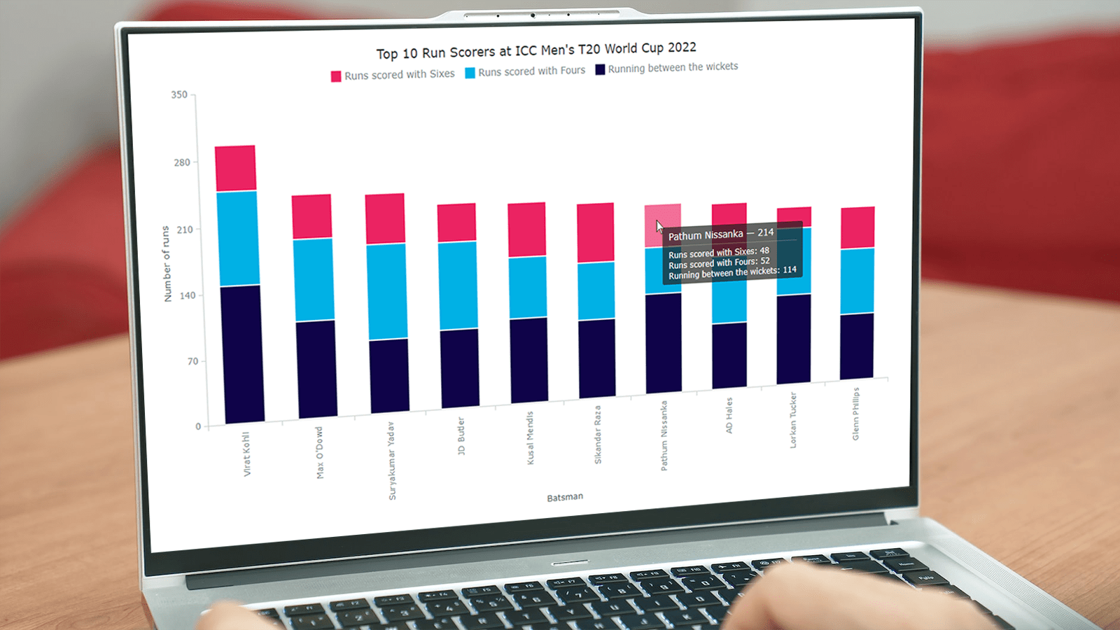 With data everywhere around, we should know how to graphically represent it to better (and faster) understand what it tells us. One of the most common data visualization techniques is column charts, and I want to show you how you can easily create interactive ones using JavaScript.
A column chart is a simple, yet powerful way to display data when you need to compare values. From this tutorial, you will learn to make its different variations — basic single-series, multi-series, stacked, and 100% stacked column graphs — and apply effective customizations in a few more lines of JS code.
As a cricket fan, I thoroughly watched the ICC Men’s T20 World Cup held last month in Australia. I decided to use some data related to the championship for illustrative visualizations. JavaScript column charts built throughout this tutorial will let us look into the batting statistics, and more precisely, the number of runs scored by the top 10 batsmen at the tournament. Let’s have fun learning!
Read the JS charting tutorial »
- Categories: AnyChart Charting Component, HTML5, JavaScript, JavaScript Chart Tutorials, Tips and Tricks
- 2 Comments »
Creating Radar Chart with JavaScript
December 23rd, 2022 by Awan Shrestha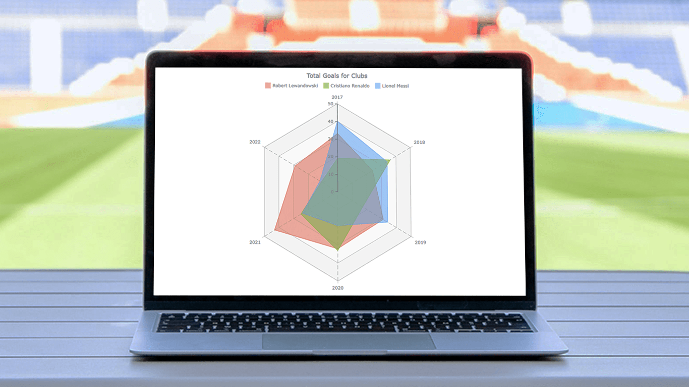 There are various data visualization techniques designed to reveal insights that numbers alone just can’t. In this tutorial, we will see how to easily create a radar chart using JavaScript. It is an effective way to graphically represent multivariate data of several quantitative variables.
Writing the tutorial during the FIFA World Cup 2022, I could not resist taking some football data for a practical illustration. The JS radar chart examples built and customized here step by step will plot the number of goals three top players have scored for their clubs over the last six years: Lionel Messi, Cristiano Ronaldo, and Robert Lewandowski.
The whistle for kickoff is blown, and it all begins!
Read the JS charting tutorial »
- Categories: AnyChart Charting Component, HTML5, JavaScript, JavaScript Chart Tutorials, Tips and Tricks
- No Comments »
How to Make Bubble Maps in JavaScript
November 16th, 2022 by Shachee Swadia Map charts are a great way to put data in a geographical context. And they are not difficult to create! I am eager to demonstrate that by walking you through the creation of a bubble map, one of the most popular types data maps, with the help of JavaScript.
A bubble map is a combination of a bubble chart and a geographical map. It uses circles of different sizes (and sometimes colors) to indicate numeric values relating to locations or territories.
In this tutorial, I will be visualizing the data on gasoline prices across the United States. They saw record highs this summer after a surge fueled by the outbreak of the Russia–Ukraine conflict. The first, basic bubble map will display the gas prices in July by state. The final one will add the magnitude of the change since February 23, one day before Russia launched an attack on Ukraine.
Follow along and you’ll learn to build beautiful interactive maps in JS with ease and no problem!
Read the JS charting tutorial »
- Categories: AnyChart Charting Component, AnyMap, Big Data, HTML5, JavaScript, JavaScript Chart Tutorials, Tips and Tricks
- No Comments »
How to Create Word Tree Using JavaScript
October 14th, 2022 by Awan Shrestha It is a pure fact that a graphical or pictorial representation of data, known as a data visualization, conveys information faster than raw data in arrays, spreadsheets, or dense reports. Charts make data easier to understand, which further helps to quickly develop valuable insights. Interesting, right? Now, let’s have a look at one chart type called a word tree and see how to build it with ease.
A word tree is a data visualization form designed to show multiple parallel sequences of words (or phrases) as they appear in a text. Analyzing texts becomes easier with word trees as they display, by means of a branching structure, how selected words are connected to others.
In this tutorial, I will walk you through the process of creating a beautiful word tree chart with JavaScript (HTML5). The text being visualized will be the famous speech “I Have a Dream” by minister and civil rights activist Martin Luther King Jr. Each step will be explained in detail, and you’ll see everything is pretty simple. Sit tight and enjoy the learning!
Read the JS charting tutorial »
- Categories: AnyChart Charting Component, HTML5, JavaScript, JavaScript Chart Tutorials, Tips and Tricks
- No Comments »