Data Visualization with Elasticsearch and AnyChart JavaScript Charts — Integration Sample
June 21st, 2018 by Irina Maximova
It’s always been important to AnyChart to make JavaScript charts run in HTML5 projects fast regardless of the users’ technology stack. Our AnyChart, AnyMap, AnyStock, and AnyGantt libraries for data visualization are compatible with all major technologies and platforms, and there is a bunch of different integration samples already available. All of them are a great help in making the process of chart creation more pleasant and less time-consuming. In this article, we will tell you how to integrate AnyChart JS Charts with Elasticsearch. To begin with, let’s find out what Elasticsearch is and what makes it special.
- Categories: AnyChart Charting Component, HTML5, JavaScript, News, Tips and Tricks
- 7 Comments »
Qlik Charts Updated to Version 2.4.0, Now with Multiple Scales, Localizations, and More
June 14th, 2018 by AnyChart Team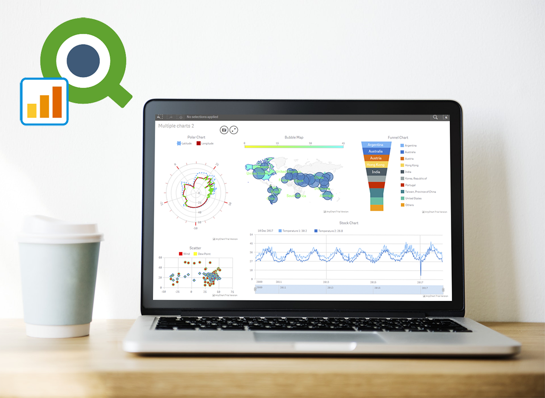 Great news for Qlik users! We’ve released version 2.4.0 of the AnyChart Qlik Extension. The latest update brings several important new features to Qlik charts: multiple scales, localization support, coloring controls for OHLC, candlestick and waterfall charts, as well as label rotation settings.
Learn more about the new version of our JavaScript (HTML5) charting library extension for interactive data visualization on Qlik data analytics platform, and what’s next in our plans.
- Categories: AnyChart Charting Component, HTML5, JavaScript, News, Qlik
- No Comments »
Regression Analysis in AnyChart JavaScript Charts
May 29th, 2018 by Irina Maximova
AnyChart is not only a beautiful charting library but also a multifunctional one. We’ve got lots of questions from our customers on how they can integrate regression analysis into AnyChart JavaScript Charts. There are many approaches that may be adopted in order to interpolate and approximate data. And the one we’re going to share with you today involves the use of the popular regression.js library along with AnyChart.
- Categories: AnyChart Charting Component, HTML5, JavaScript, News, Tips and Tricks
- 1 Comment »
Creating Half Polar Chart with JavaScript — Challenge AnyChart!
May 2nd, 2018 by Irina Maximova
Challenges are always fun, and we at AnyChart adore taking them up from our customers. AnyChart Support Team is happy to show how flexible AnyChart JS Charts are. Today’s Challenge AnyChart tutorial is about JS polar charts. Spend about 5 minutes and you’ll find out how to draw a beautiful polar chart, but display only its one half, making it a half polar chart.
- Categories: AnyChart Charting Component, Challenge AnyChart!, Charts and Art, HTML5, JavaScript, Tips and Tricks
- No Comments »
How AnyChart Team Makes Use of Clojure and ClojureScript
April 11th, 2018 by Irina Maximova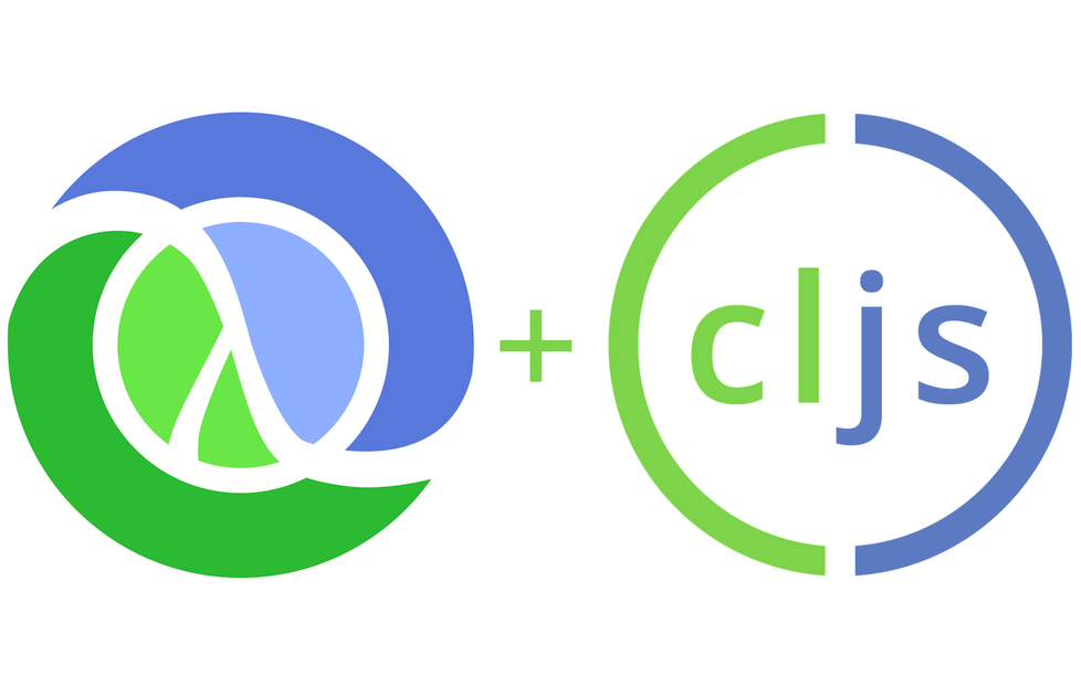
The prime directive of AnyChart team is to develop the best interactive charts possible. While doing so, we create and use a number of different tools and technologies, and we always search for the new technologies that may help us and make our work more efficient. In this article, we want to talk about the way we make use of Clojure and ClojureScript, and why.
- Categories: AnyChart Charting Component
- No Comments »
JavaScript Chart Libraries AnyChart, AnyGantt, AnyStock and AnyMap Receive Major 8.2.0 Update
March 27th, 2018 by AnyChart Team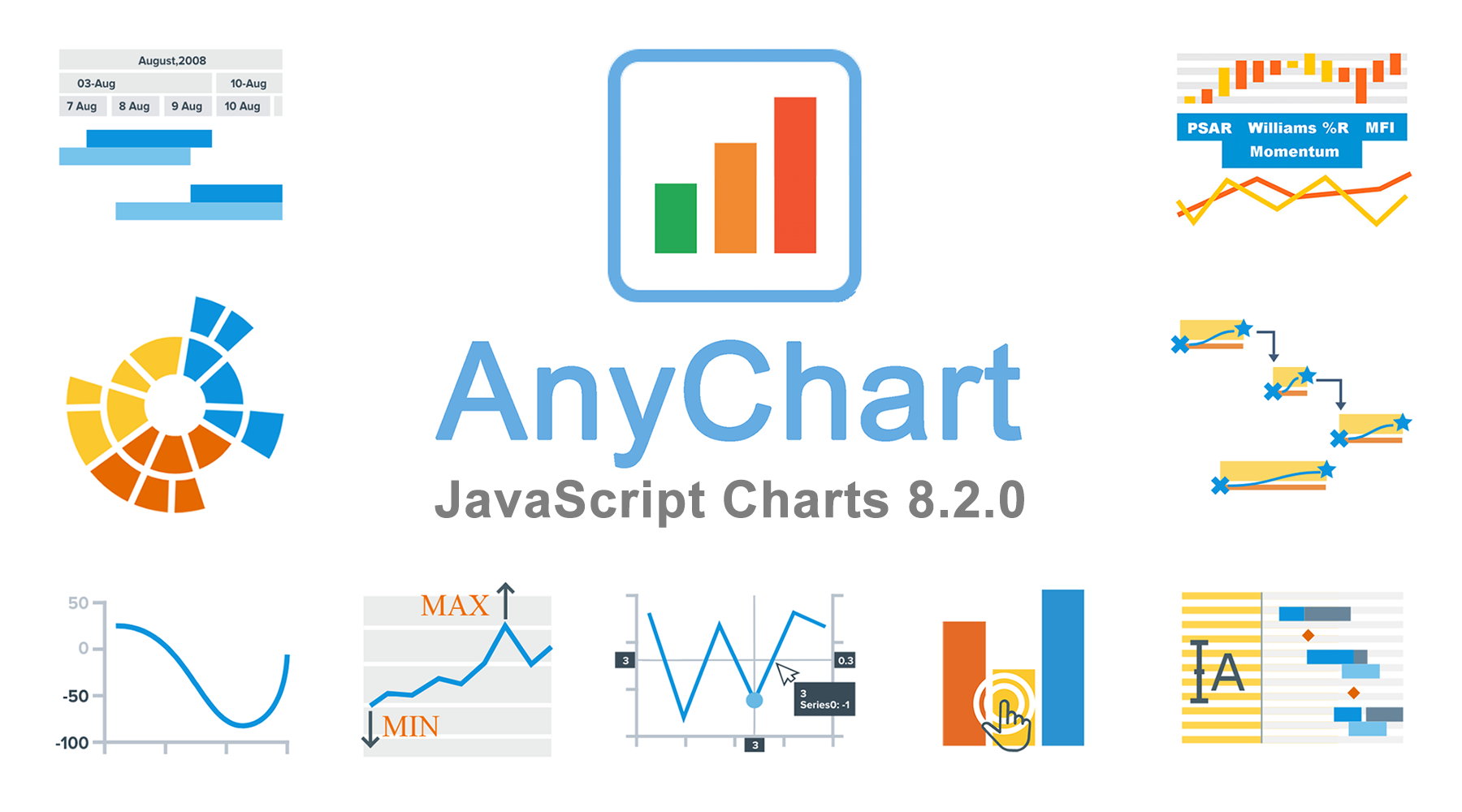 The time has come for another major update of our JavaScript chart libraries, recognized the best in JavaScript technologies earlier this year!
Meet version 8.2.0 of AnyChart, AnyStock, AnyGantt and AnyMap!
To start with, here’s a quick list of what major new cool features have been delivered to our interactive data visualization solutions with this new release:
- Sunburst Chart;
- negative logarithmic scale;
- crosshair multiple labels;
- minimum/maximum labels;
- new technical indicators and additional touch support in stock charts;
- custom drawing, data grid live editor, and new timeline in Gantt charts
Now, let’s take a closer look at each of the major news of AnyChart 8.2.0 and then see what’s next on our roadmap.
- Categories: AnyChart Charting Component, AnyGantt, AnyMap, AnyStock, Financial Charts, Gantt Chart, HTML5, JavaScript, News, Stock Charts
- 2 Comments »
Custom Technical Indicators in JavaScript Stock Charts — Challenge AnyChart!
March 14th, 2018 by Irina Maximova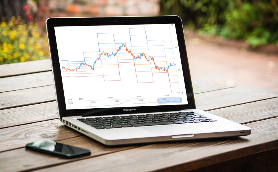
It is a pleasure to present a new Challenge AnyChart article! We love our customers and their original tasks, so we continue to show the unlimited capabilities of our JavaScript charting libraries to the blog readers.
The heroes of today’s tutorial are custom technical indicators. Below we’ll explore how to add them to a JS (HTML5) stock chart step by step. So, let’s begin.
- Categories: AnyChart Charting Component, AnyStock, Big Data, Business Intelligence, Challenge AnyChart!, Charts and Art, Financial Charts, HTML5, JavaScript, Stock Charts, Tips and Tricks
- 1 Comment »
AnyChart Qlik Sense Extension 2.3.0 Released Featuring Linear and Circular Gauges
March 8th, 2018 by AnyChart Team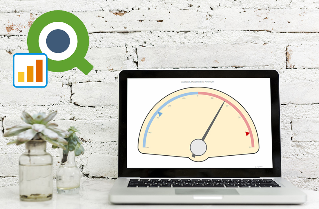 Less than four months have passed since we presented version 2.0 of our Qlik Sense extension for advanced data visualization. During that short time period, we released three more updates: 2.0.1, 2.1.0 and 2.2.0. And here’s a new one ready!
The latest update adds two new chart types – Linear and Circular Gauges – as well as several new important features, further extending the power of our JavaScript charting libraries to the Qlik Sense environment. Check out the details in a quick overview below.
- Categories: AnyChart Charting Component, HTML5, JavaScript, News, Qlik
- No Comments »
Best JavaScript Technology: AnyChart JS Charts Library Wins 2018 DEVIES Award!
February 6th, 2018 by AnyChart Team It’s happened! Our AnyChart JS Charts library has just been officially named the best in JavaScript Technology for innovation and received a prestigious DEVIES award in California! (See all the 2018 DEVIES winners — one for each of the 15 categories.)
2018 DEVIES is reported to be the world’s leading DevTech Awards event, taking place these days during DeveloperWeek in Oakland, CA, the largest developer expo and conference series globally.
- Categories: AnyChart Charting Component, AnyGantt, AnyMap, AnyStock, HTML5, JavaScript, News, Qlik, Success Stories
- 6 Comments »
Data Visualization in 2017: Highlights – DataViz Weekly
December 30th, 2017 by AnyChart Team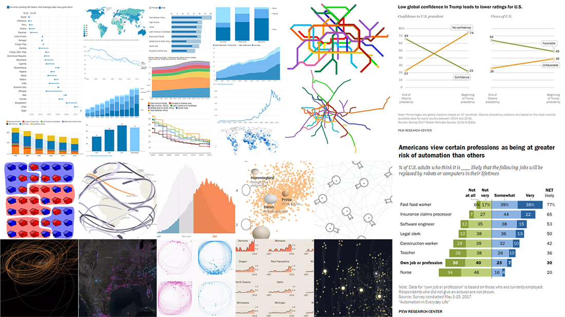
The new 2018 year is coming very soon, and now is a great time to look back and remember the highlights from data visualization in 2017.
A few words about our solutions to start with. After the very productive year of 2016, we at AnyChart JS Charts did a lot in 2017, too. 4 major releases full of new features! After versions 7.13.0 and 7.14.0, we launched the brand new, 8th generation of our JavaScript charting libraries, featuring a modular system and custom JS builder (8.0.0). In December 2017, we released AnyChart 8.1.0. In addition, we published a number of plugins (for Qlik, Android, Angular, Ionic and more) and technical integration samples for popular technology stacks, released Chartopedia and the brand new Playground with a whole bunch of chart examples added to our documentation, API reference and galleries. And even more.
A lot of great charts and infographics were created in 2017 by various people and companies from around the world. In the present, this year’s last Data Visualization Weekly post, we’ll tell you about 4 year-in-review articles featuring the most interesting visualizations of 2017:
- 10 Best Projects in Data Visualization in 2017 — FlowingData.
- Quartz: Top 5 Charts in 2017, According to Reddit — Quartz.
- Year of 2017 in 12 Charts — The World Bank.
- 17 Striking Findings in 2017 — Pew Research.