It is a pleasure to present a new Challenge AnyChart article! We love our customers and their original tasks, so we continue to show the unlimited capabilities of our JavaScript charting libraries to the blog readers.
The heroes of today’s tutorial are custom technical indicators. Below we’ll explore how to add them to a JS (HTML5) stock chart step by step. So, let’s begin.
Data Visualization Task
The exact question we’ll be answering here reads as follows:
How to visualize pivot points on a candlestick chart by means of AnyChart?
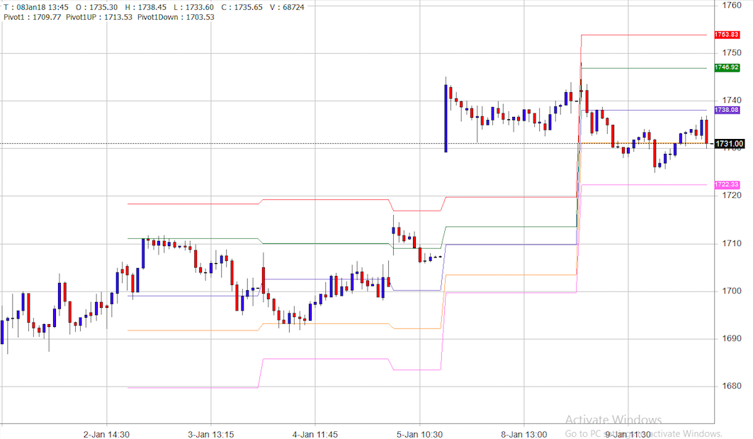
To explain how the chart with pivot points should look like, a customer attached the following picture:
Here is what we need to solve this task:
- the Custom Technical Indicators feature of our AnyStock JavaScript charting library;
- a few mathematical calculations for pivot points.
Solution Overview
The first thing we should do to visualize a chart like the one in the customer’s picture is draw a candlestick chart.
When it’s done we’ll have to calculate pivot points for specific periods. In this case, the period equals 30 candlesticks (30 days, weeks, months, etc. depending on zooming), and then draw indicators.
Custom Technical Indicators
The Custom Technical Indicators section of our documentation will lead you through the process of making the one you need.
Once you read it, you’ll realize that when data mapping is ready and the computer object is created, we need to define the setCalculationfunction () method. Our calculations start with collecting high and low values during the period:
computer.setCalculationFunction(function (row) {
  maxArr.push(row.get('high'));
  minArr.push(row.get('low'));
As we reach the 30th candlestick, we simply find the highest high value and the lowest low one, take the close value, and then calculate pivot points:
if (counter > 29) {
  closeValue = row.get('close');
  max = Math.max.apply(null, maxArr);
  min = Math.min.apply(null, minArr);
  pp = (max + min + closeValue) / 3;
  support1 = pp * 2 - max;
  resistance1 = pp * 2 - min;
  support2 = pp - (max - min);
  resistance2 = pp + (max - min);
  support3 = min - 2 * (max - pp);
  resistance3 = max + 2 * (pp - min);
  counter = 0;
  maxArr = [];
  minArr = [];
}
And the final step is to display all the series. Ta-da!
As you can see, this custom feature allows us to visualize any other indicators that are not on the list of Supported Technical Indicators.
So, here we have a beautiful stock chart with pivot points:
Check out the full code below:
anychart.onDocumentReady(function () {
  anychart.format.locales.default.numberLocale.decimalsCount = 2;
  anychart.format.locales.default.numberLocale.zeroFillDecimals = true;

  // create data table on loaded data
  var dataTable = anychart.data.table();
  // the data used in this sample can be obtained from the CDN
  // https://cdn.anychart.com/csv-data/csco-daily.js
  dataTable.addData(get_csco_daily_data());

  // map loaded data for the candlestick series
  var mapping = dataTable.mapAs({'open': 1, 'high': 2, 'low': 3, 'close': 4});

  // create stock chart
  chart = anychart.stock();

  var grouping = chart.grouping();
  // set maximum visible points count.
  grouping.maxVisiblePoints(250);

  // create first plot on the chart
  var plot = chart.plot(0);

  plot.yScale().maximumGap(0);
  plot.yScale().minimumGap(0);

  // move Y axis to the right
  plot.yAxis().orientation("right");

  var candleSeries = plot.candlestick(mapping);

  // create scroller series with mapped data
  chart.scroller().line(dataTable.mapAs({'value': 4}));

  // create computer
  var computer = dataTable.createComputer(mapping);
  // set computer output field
  computer.addOutputField('pp', 'pivot');
  computer.addOutputField('sup1', 'support1');
  computer.addOutputField('sup2', 'support2');
  computer.addOutputField('sup3', 'support3');
  computer.addOutputField('res1', 'resistance1');
  computer.addOutputField('res2', 'resistance2');
  computer.addOutputField('res3', 'resistance3');

  // initiate variables
  var maxArr = [];
  var minArr = [];
  var max = 0;
  var min = 0;
  var closeValue = 0;
  var pp = null;
  var support1 = null;
  var support2 = null;
  var support3 = null;
  var resistance1 = null;
  var resistance2 = null;
  var resistance3 = null;
  var counter = 0;

  computer.setStartFunction(function() {
    closeValue = 0;
    pp = null;
    support1 = null;
    support2 = null;
    support3 = null;
    resistance1 = null;
    resistance2 = null;
    resistance3 = null;
    counter = 0;
    //reset min and max arrays
    maxArr = [];
    minArr = [];
  });

  // set calculation function to produce custom indicator math
  computer.setCalculationFunction(function (row) {
    //collect high and low during the period
    maxArr.push(row.get('high'));
    minArr.push(row.get('low'));
    //if the end of the period (period = 30 candlesticks here)
    if (counter > 29) {
      //get close value
      closeValue = row.get('close');
      //get highest high and lowest low
      max = Math.max.apply(null, maxArr);
      min = Math.min.apply(null, minArr);
      //calculate pivot point
      pp = (max + min + closeValue) / 3;
      //calculate support1
      support1 = pp * 2 - max;
      //calculate resistance1
      resistance1 = pp * 2 - min;
      //calculate support2
      support2 = pp - (max - min);
      //calculate resistance2
      resistance2 = pp + (max - min);
      //calculate support3
      support3 = min - 2 * (max - pp);
      //calculate resistance3
      resistance3 = max + 2 * (pp - min);
      //reset candlesticks counter
      counter = 0;
      //reset min and max arrays
      maxArr = [];
      minArr = [];
    }
    //set calculated data
    row.set('pp', pp);
    row.set('sup1', support1);
    row.set('sup2', support2);
    row.set('sup3', support3);
    row.set('res1', resistance1);
    row.set('res2', resistance2);
    row.set('res3', resistance3);
    counter++;
  });

  // map computed column as value
  var pivotMapping = dataTable.mapAs({'value': 'pivot'});
  var support1Mapping = dataTable.mapAs({'value': 'support1'});
  var support2Mapping = dataTable.mapAs({'value': 'support2'});
  var support3Mapping = dataTable.mapAs({'value': 'support3'});
  var resistance1Mapping = dataTable.mapAs({'value': 'resistance1'});
  var resistance2Mapping = dataTable.mapAs({'value': 'resistance2'});
  var resistance3Mapping = dataTable.mapAs({'value': 'resistance3'});

  // create line series with mapping
  var pivotLine = plot.line(pivotMapping);
  pivotLine.name('Pivot');
  pivotLine.stroke('#ffaaff 1');

  var support1Line = plot.line(support1Mapping);
  support1Line.name('Support1');
  support1Line.stroke('#ffa000 1');

  var support2Line = plot.line(support2Mapping);
  support2Line.name('Support2');
  support2Line.stroke('#DF8577 1');

  var support3Line = plot.line(support3Mapping);
  support3Line.name('Support3');
  support3Line.stroke('#B75774 1');

  var resistance1Line = plot.line(resistance1Mapping);
  resistance1Line.name('Resistance1');
  resistance1Line.stroke('#98ccdd 1');

  var resistance2Line = plot.line(resistance2Mapping);
  resistance2Line.name('Resistance2');
  resistance2Line.stroke('#69A3C3 1');

  var resistance3Line = plot.line(resistance3Mapping);
  resistance3Line.name('Resistance3');
  resistance3Line.stroke('#1F72B2 1');

  // set title width for the chart
  var title = chart.plot(0).legend().title();
  title.width(100);

  // set legend for the chart
  var legend = plot.legend();
  legend.enabled(true);

  // set maximum height
  legend.maxHeight("17%");
  legend.itemsSpacing(2);
  // legend mode and position
  legend.itemsLayout("vertical-expandable");
  legend.position("top");
  // paginator position
  legend.paginator().orientation("bottom");

  // get chart margin.
  var margin = chart.margin();
  margin.right(30);
  margin.left(-30);

  chart.container('container').draw();
  chart.selectRange("year", 4, "last-date", true);
});
Advanced Visualization
And among other things, we can add Current Price Indicators to the pivot points. This will facilitate the exploratory data analysis:
var indPiv = plot.priceIndicator(0, {'series': pivotLine, valueField: 'value',
                                       value:'last-visible', stroke:'none'});
We may also set background colors for the labels of the indicators like this:
plot.priceIndicator(0).label({background: "#ffaaff 0.7"});
And after applying these parameters to all the line series, we have the pivot sample with CPI at AnyChart Playground:
Have an extraordinary data visualization task? Please, send it to us at support@anychart.com with “Challenge” in the subject line. Our Support Team will be happy to help you deal with it and to show that nothing is impossible with AnyChart JS Charts.
We hope that you liked this article! Interesting issues will continue to appear in Challenge AnyChart!, and your task may well become the topic of the next post and a great contribution to our development.
- Categories: AnyChart Charting Component, AnyStock, Big Data, Business Intelligence, Challenge AnyChart!, Charts and Art, Financial Charts, HTML5, JavaScript, Stock Charts, Tips and Tricks
- 1 Comment »