
Challenges are always fun, and we at AnyChart adore taking them up from our customers. AnyChart Support Team is happy to show how flexible AnyChart JS Charts are. Today’s Challenge AnyChart tutorial is about JS polar charts. Spend about 5 minutes and you’ll find out how to draw a beautiful polar chart, but display only its one half, making it a half polar chart.
Data Visualization Task
The question a customer wanted us to answer:
Is it possible to show just a half of a Polar Chart in AnyChart JS Charts?
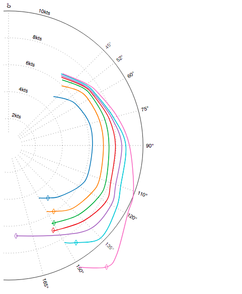
To explain what he is willing to see on his chart, the customer sent us a link to the following picture:
To solve this task, we need some knowledge of the API methods of Polar chart class to move a polar chart to the left and draw colored lines on it.
Solution Overview
To begin with, we set a container and draw a polar chart inside it. Next, we simply move a half of the chart beyond the container boundaries and change the chart appearance.
Displaying Half Polar Chart
To deal with the main task, we create a function where we use the chart.left() method. In this case, the chart is moved to the left by the width of the container (to hide a half of the chart) plus 30 (to make the axis labels look better).
function relocateChart(chart) {
  chart.left(-chart.container().getBounds().width+30);
}
The function is executed before we initiate chart drawing and every time when the container is resized, so our chart stays in place.
chart.listen('chartDraw', function(){
  relocateChart(chart);
});
That’s it! The Half Polar Chart is ready to be presented!
As you see, some challenges are actually easy tasks when there is a proper method in the API. Now let’s go through the Polar Chart section of the API to set up the chart appearance.
Changing Chart Appearance
What we should do here is draw several colored lines on the chart, display labels in the given format, and make the grid lines dotted.
First of all, we add some data to the data sets:
var data = [
    {x: 52, value: 5.5},
    {x: 60, value: 5.9},
    {x: 75, value: 6.24},
    {x: 90, value: 6.24},
    {x: 110, value: 6.28},
    {x: 120, value: 6.08},
    {x: 135, value: 5.36},
    {x: 150, value: 4.5},
    {x: 160, value: null},
];
Now we display lines using the data and setting specific color for each series:
var series = chart.polyline(data);
series.color("#4d9ece");
Then we display labels as we see fit:
chart.yAxis().labels().anchor('left-center')
    .offsetY(-2)
    .format('{%value}kts')
And customize the grid making the grid lines dotted:
chart.xGrid().stroke({
    dash: "1 5"
});
There it is! Now the chart looks like the one in the picture. You can try and modify this half polar chart sample at AnyChart Playground:
For more information look at the full code below:
anychart.onDocumentReady(function () {

var chart = anychart.polar();

// add the lines to the chart
var series = chart.polyline(getData()[0]);
series.color("#4d9ece");
var series2 = chart.polyline(getData()[1]);
  series2.color("#ff9941");
  var series3 = chart.polyline(getData()[2]);
  series3.color("#0db341");
  var series4 = chart.polyline(getData()[3]);
  series4.color("#f35556");
  var series5 = chart.polyline(getData()[4]);
  series5.color("#ad6ac7");
  var series6 = chart.polyline(getData()[5]);
  series6.color("#16ccda");
  var series7 = chart.polyline(getData()[6]);
  series7.color("#f873c7");

  // set the maximum value of the x-scale
  chart.xScale().maximum(360)
    .ticks([0,45,52,60,75,90,110,120,135,150,165]);
  chart.yScale().minimum(0)
    .ticks([0,2,4,6,8,10]);
  chart.yScale().maximum(10);

  // format labels
  chart.yAxis().labels().anchor('left-center')
    .offsetY(-2)
    .format('{%value}kts')
  chart.xAxis().labels().format('{%value}°')
  chart.xAxis().ticks().length(0);

  // customize grids
  chart.xGrid().stroke({
    dash: "1 5"
  });
  chart.yGrid().stroke({
    dash: "1 5"
  });

  // set the container id
  chart.container("container");
  relocateChart(chart);
  chart.draw();

  chart.listen('chartDraw', function(){
    relocateChart(chart);
  });
});

function relocateChart(chart) {
  chart.left(-chart.container().getBounds().width+30);
}

function getData() {
  return [[
    {x: 52, value: 5.5},
    {x: 60, value: 5.9},
    {x: 75, value: 6.24},
    {x: 90, value: 6.24},
    {x: 110, value: 6.28},
    {x: 120, value: 6.08},
    {x: 135, value: 5.36},
    {x: 150, value: 4.5},
    {x: 160, value: null},
  ],
          [
            {x: 52, value: 6.6},
            {x: 60, value: 6.85},
            {x: 75, value: 7.02},
            {x: 90, value: 7.06},
            {x: 110, value: 7.21},
            {x: 120, value: 7.1},
            {x: 135, value: 6.65},
            {x: 150, value: 5.66},
            {x: 160, value: null},
          ],
          [
            {x: 52, value: 6.98},
            {x: 60, value: 7.19},
            {x: 75, value: 7.42},
            {x: 90, value: 7.47},
            {x: 110, value: 7.71},
            {x: 120, value: 7.71},
            {x: 135, value: 7.31},
            {x: 150, value: 6.65},
            {x: 160, value: null},
          ],
          [
            {x: 52, value: 7.12},
            {x: 60, value: 7.34},
            {x: 75, value: 7.74},
            {x: 90, value: 7.95},
            {x: 110, value: 8.08},
            {x: 120, value: 8.36},
            {x: 135, value: 7.91},
            {x: 150, value: 7.25},
            {x: 160, value: null},
          ],
          [
            {x: 52, value: 7.2},
            {x: 60, value: 7.44},
            {x: 75, value: 7.94},
            {x: 90, value: 8.42},
            {x: 110, value: 8.48},
            {x: 120, value: 8.82},
            {x: 135, value: 8.7},
            {x: 170, value: 7},
            {x: 175, value: null},
          ],
          [
            {x: 52, value: 7.3},
            {x: 60, value: 7.53},
            {x: 75, value: 8.07},
            {x: 90, value: 8.72},
            {x: 110, value: 8.87},
            {x: 120, value: 9.27},
            {x: 135, value: 9.71},
            {x: 150, value: 8.34},
            {x: 160, value: null},
          ],
          [
            {x: 52, value: 7.41},
            {x: 60, value: 7.73},
            {x: 75, value: 8.35},
            {x: 90, value: 8.99},
            {x: 110, value: 9.89},
            {x: 120, value: 10.22},
            {x: 135, value: 11.4},
            {x: 150, value: 10.43},
            {x: 160, value: null},
          ]];
}
AnyChart Support Team is waiting for your original tasks. If you have one, please send it via email at support@anychart.com with “Challenge” in the subject line. You’ll see that AnyChart JS Charts are capable of everything.
We are glad if this article about how to build a half polar chart with JavaScript was useful to you! Feel free to share your questions and thoughts about Challenge AnyChart!. And maybe, your task will become the topic of our next post!
- Categories: AnyChart Charting Component, Challenge AnyChart!, Charts and Art, HTML5, JavaScript, Tips and Tricks
- No Comments »