Readership, NBA, Color, and Christmas Data Visualizations — DataViz Weekly
December 27th, 2019 by AnyChart Team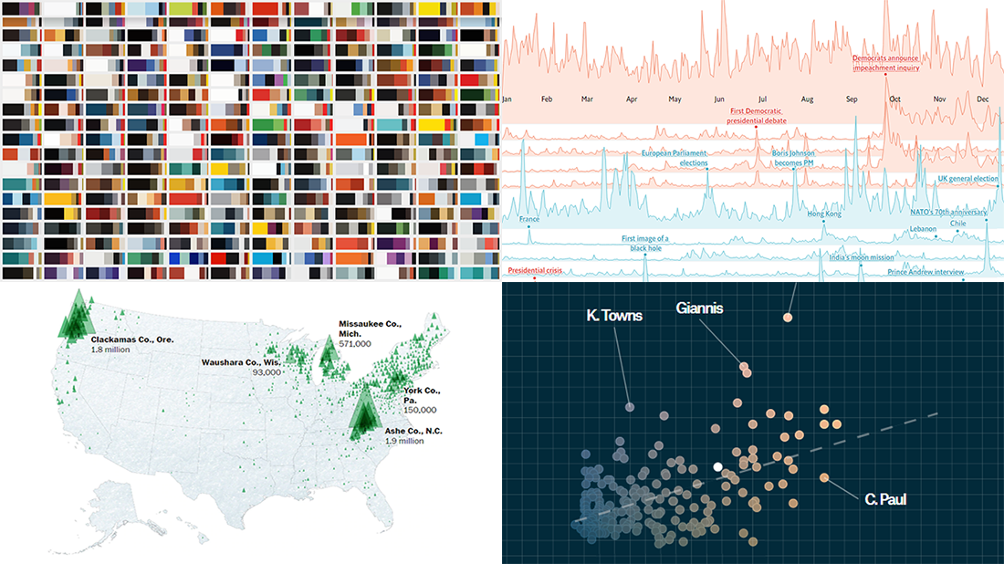 Merry Christmas to all who celebrate it! On the last Friday of 2019, we invite you to check out the year’s last DataViz Weekly article on AnyChart Blog, highlighting some of the most interesting charts published at the end of the year. Of course, we could not help featuring some Christmas data graphics in this festive week. But here you will also learn about projects with cool charts on other subjects. Here’s a list of what the data visualizations shown in today’s DataViz Weekly are about:
- Where American Christmas trees come from — The Washington Post
- Top news stories of 2019 by readership — The Economist
- NBA players’ performance against pay — The Pudding
- Colors on Scientific American’s covers over 175 years of the magazine’s life — Scientific American
- Categories: Data Visualization Weekly
- No Comments »
Visual Analytics Examples for City Climate, Pain Pills, Water Fountains, and Space Travels — DataViz Weekly
July 19th, 2019 by AnyChart Team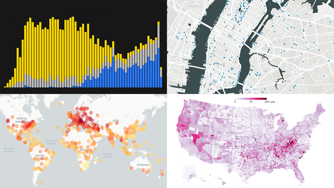 Enjoy another selection of new cool data visualization projects as great examples of visual analytics in action. Here’s what questions the charts featured today on DataViz Weekly show answers to:
- What city’s current climate will your city’s climate resemble in 2050? — Crowther Lab
- How legal pain pills were distributed across the United States in 2006-2012? — The Washington Post
- Where is the nearest water fountain? — Matthew Moy de Vitry
- How space travel has developed since Sputnik in 1957? — Reuters
- Categories: Data Visualization Weekly
- No Comments »
Plotting NBA Shots, Diversity, Disasters, and Air Traffic — DataViz Weekly
May 3rd, 2019 by AnyChart Team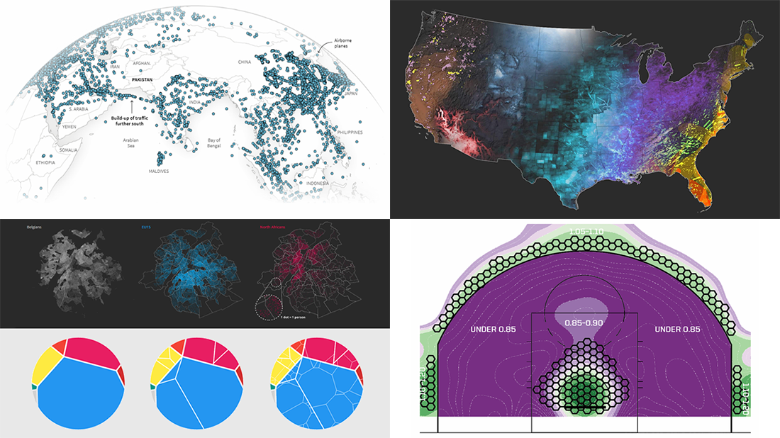 Check out new interesting examples of how plotting data on charts and maps can be both insightful and beautiful. Here is what we are happy to feature in today’s article in the DataViz Weekly series:
- Visualizing how India-Pakistan tensions disrupt air travel
- Plotting diversity of Brussels
- Mapping where natural disasters tend to strike in the United States
- Charting NBA shots
- Categories: Data Visualization Weekly
- No Comments »
New Interesting Data Visualizations on NBA, Spending, and Gender Pay Gap — DataViz Weekly
March 15th, 2019 by AnyChart Team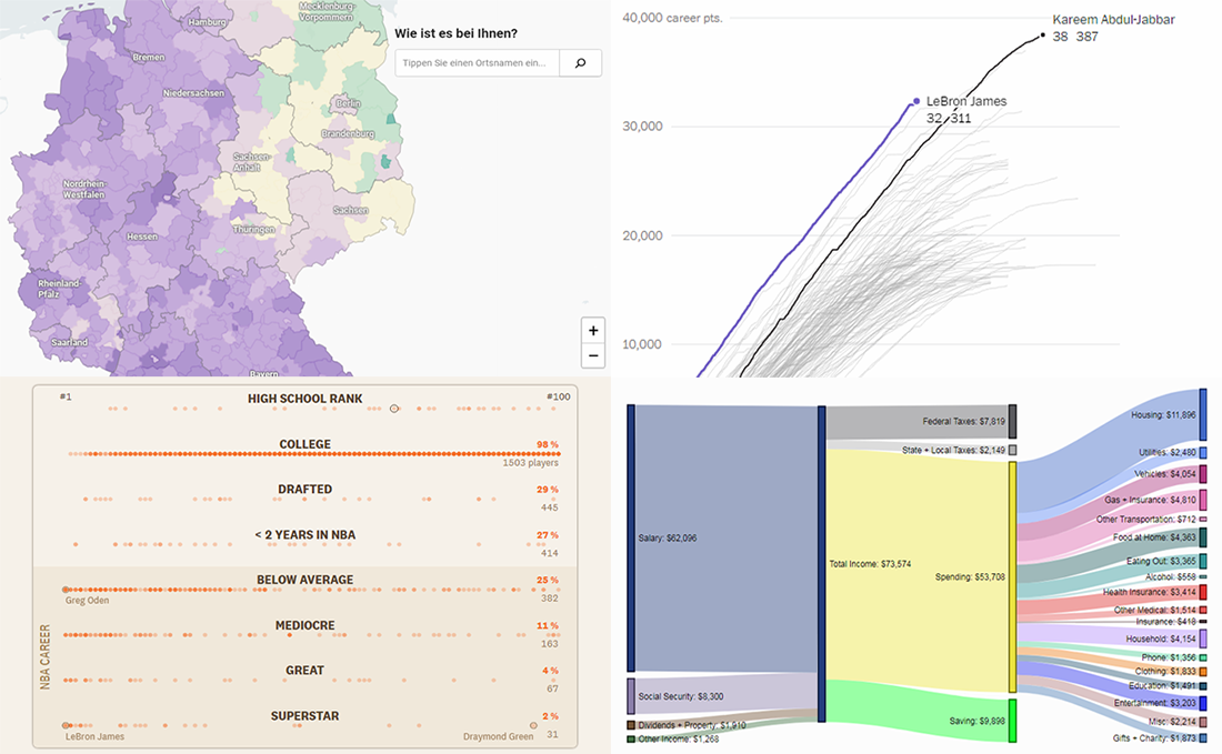 Continuing the regular DataViz Weekly feature on the AnyChart blog, today we are happy to tell you about new interesting data visualizations we’ve found these days — wonderful examples of charts designed for visual storytelling and analytics:
- gender pay gap in Germany;
- NBA’s all-time scoring leaders, now with LeBron James in top 4;
- from leading high school basketball players to NBA superstars;
- household spending in the United States, by income group.
- Categories: Data Visualization Weekly
- No Comments »
Year in Review in Graphics from Top U.S. Publications — DataViz Weekly
January 4th, 2019 by AnyChart Team Happy New Year, everyone! 2019 is already here. But while we still feel the proximity of the last year, let’s take another look back. 2018 brought us numerous interesting visual stories based on data and graphics. For this year’s first DataViz Weekly, we’ve put together year-in-review projects of the graphics teams at four leading media publications in the U.S. (we are a U.S. based company, right): The Wall Street Journal, The New York Times, The L.A. Times, and The Washington Post. Check out some of the key facts, trends, and findings of 2018 in their top picks.
- Categories: Data Visualization Weekly
- 1 Comment »
Interesting Data Visualization Projects About Thanksgiving, Air, Greenery, and Rape Clearance — DataViz Weekly
November 23rd, 2018 by AnyChart Team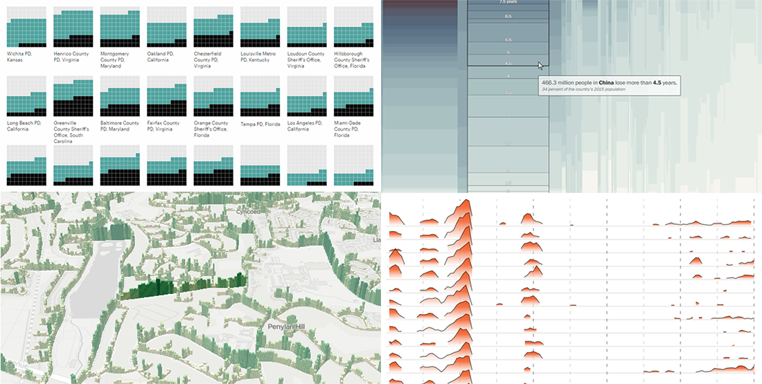 Happy Thanksgiving holiday! While the traditional Black Friday rush is getting into the full swing, we hope you can spare a minute to check out new interesting data visualization projects. Let’s see a list of what’s featured this time on DataViz Weekly and without more ado proceed to the charts:
- years lost due to air pollution;
- urban greenery in Cardiff and Newport;
- rape case clearance rates across the United States;
- Thanksgiving holiday trends.
- Categories: Data Visualization Weekly
- No Comments »
2018 Midterm Election Results in Data Visualization — DataViz Weekly
November 9th, 2018 by AnyChart Team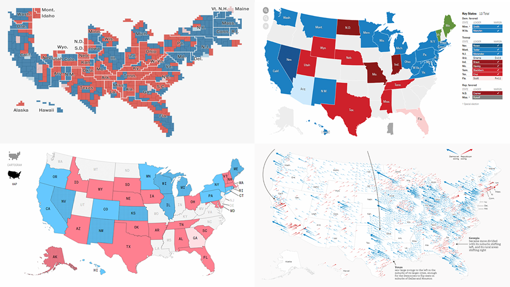 The 2018 midterm election in the United States of America has been among the hottest topics on the media agenda for quite a long time. Various publications were covering the course of the House, Senate, and governor campaigns, sharing forecasts from analysts, and so on. Now that voting is over, all eyes are on the outcome.
Today’s DataViz Weekly will show you how several prominent publications communicated the results of the midterms to their readers with the help of data visualization techniques: The New York Times, The Washington Post, Bloomberg, and The Guardian. So get ready for a lot of choropleth maps! But not only.
- Categories: Data Visualization Weekly
- 1 Comment »
Mapping Data About Cancer, Nobel Physicists, Rain, and Fall Foliage — DataViz Weekly
September 28th, 2018 by AnyChart Team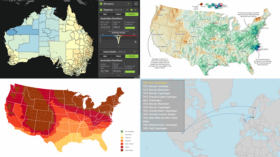 Today’s DataViz Weekly article highlights new beautiful map visualizations, demonstrating how mapping data can help to get geographical insights such as spatial trends, clusters, and so on:
- Australian Cancer Atlas;
- lifetime movements of Nobel Prize laureates in physics;
- U.S. summer rain levels;
- fall foliage prediction across the U.S.
- Categories: Data Visualization Weekly
- 1 Comment »