Paris 2024 Olympic Medal Count Trackers — DataViz Weekly
August 9th, 2024 by AnyChart Team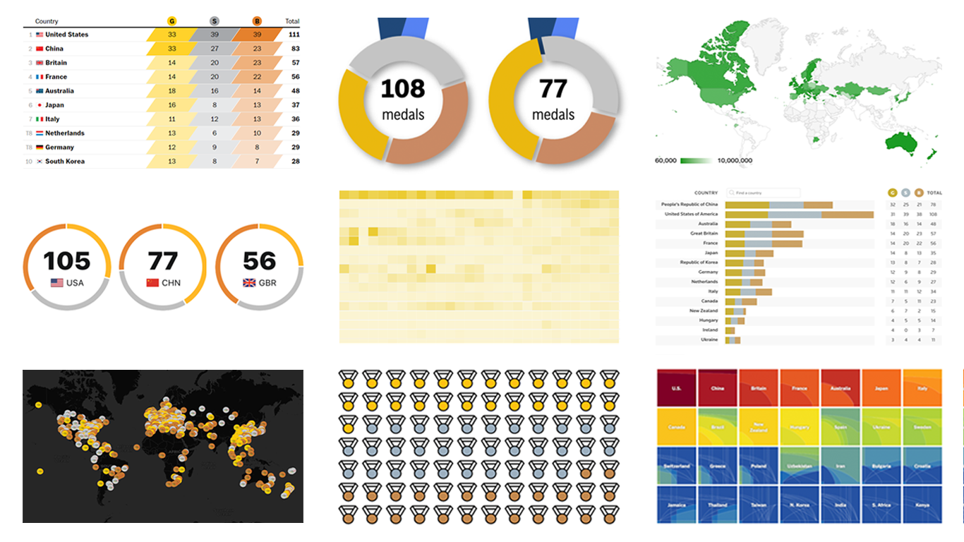 The Paris Summer Olympics are in full swing. If you’re interested in tracking the results and want to know which countries are excelling, numerous media outlets have prepared a variety of medal count trackers. In this special edition of DataViz Weekly, we showcase a selection of these projects, with a special focus on those that not only display numbers but also present them through compelling visualizations. Let’s dive in!
- Categories: Data Visualization Weekly
- No Comments »
Stunning New Data Visualization Examples in Our Curated Collection — DataViz Weekly
July 26th, 2024 by AnyChart Team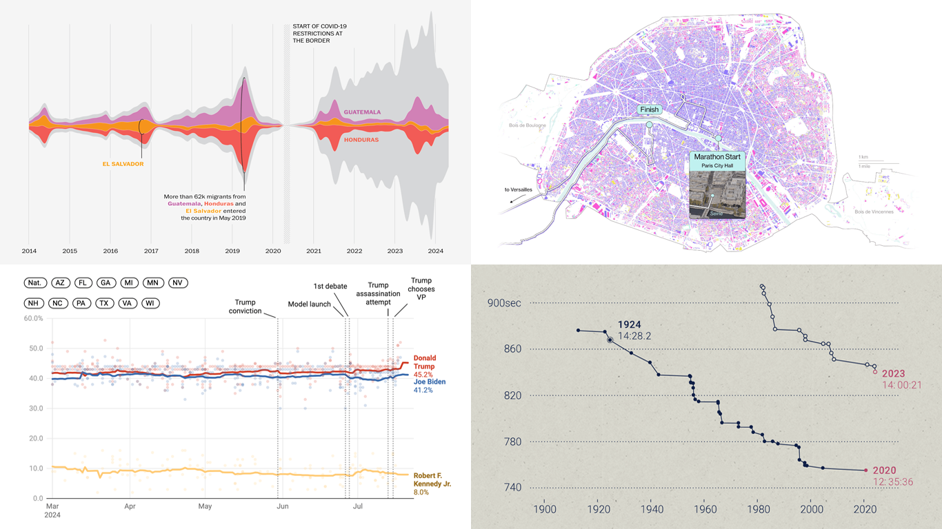 Welcome to DataViz Weekly, where we present a curated selection of stunning data visualization examples our there. Whether you’re a data professional or simply interested in visual data, these charts and maps can provide both inspiration and practical ideas. Here’s what we have for you to explore today:
- U.S. immigration patterns — WaPo
- 2024 U.S. presidential election forecast — Silver Bulletin
- Paris Olympics 100 years later — SCMP
- Extreme heat challenges at the 2024 Summer Olympics — Bloomberg Green
- Categories: Data Visualization Weekly
- No Comments »
Visualizing Forecast Accuracy, College Admissions, Global Demographics, and Election Results — DataViz Weekly
July 12th, 2024 by AnyChart Team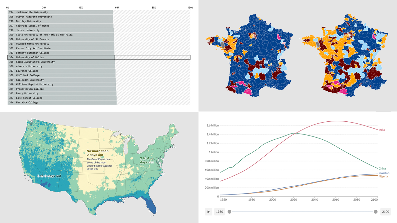 Ready for a fresh dose of impressive data visualizations crafted by seasoned professionals? Here’s what DataViz Weekly has in store for you this time:
- Weather forecast accuracy across the United States — The Washington Post
- U.S. college admission rates — FlowingData
- Global demographic shifts — Our World in Data
- France’s parliamentary election results — Various publications
- Categories: Data Visualization Weekly
- No Comments »
Exploring Insights with Data Visualization — DataViz Weekly
May 3rd, 2024 by AnyChart Team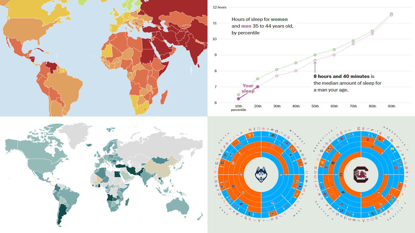 Welcome to the new DataViz Weekly, where we continue exploring the transformative power of data visualization. This edition presents a selection of new examples of how charts and maps can help us understand trends and patterns in various subjects — from sports and philanthropy to global challenges like press freedom and inflation, and everyday topics such as sleep. Here are the projects featured this time:
- March Madness philanthropy challenge — Bloomberg
- 2024 World Press Freedom Index — Reporters Without Borders
- Global Inflation Tracker — Council on Foreign Relations
- Sleep trends in America — The Washington Post
- Categories: Data Visualization Weekly
- No Comments »
Newest Collection of Effective Data Visualization Examples — DataViz Weekly
December 16th, 2022 by AnyChart Team It’s easier to analyze data when it is visualized in the form of a chart or a map. On DataViz Weekly, we share with you some vivid examples we have recently seen out there. Here’s our newest collection!
- Blackouts in Kyiv — Volodymyr Agafonkin
- Earth’s slowest-warming parts — The Washington Post
- Twitter Blue subscribers — The New York Times
- Land use in the United Kingdom — Bloomberg
- Categories: Data Visualization Weekly
- No Comments »
Impressive New Visualizations Allowing Data to Speak — DataViz Weekly
December 2nd, 2022 by AnyChart Team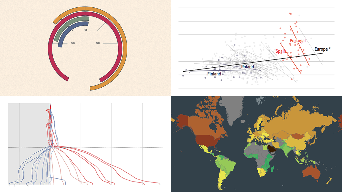 We continue the DataViz Weekly series with a new collection of interesting charts and maps curated from around the internet. Today, we want to put a spotlight on the following impressive visualizations that truly let data speak:
- Winter death toll in Europe — The Economist
- Upward mobility from personal experience — The Pudding
- Shifts in Democrat and Republican follower counts on Twitter under Elon Musk — The Washington Post
- Carbon footprint by country — Electricity Maps
- Categories: Data Visualization Weekly
- No Comments »
Visualizing Data on Global Population, Mariupol Destruction, Mississippi River Exports, Air Traffic — DataViz Weekly
November 18th, 2022 by AnyChart Team It’s Friday, which means it’s time for DataViz Weekly to shine and illuminate the best we’ve recently seen in data visualization! Meet the following projects and check them out!
- Your place among the 8-billion population — The Washington Post
- Destruction of Mariupol in a time-lapse record — Conflict Observatory
- U.S. exports through the Mississippi River — Bloomberg Green
- Global air traffic on a single day — Carlos Bergillos
- Categories: Data Visualization Weekly
- No Comments »
Coolest New Data Graphics to Not Miss Out On — DataViz Weekly
November 4th, 2022 by AnyChart Team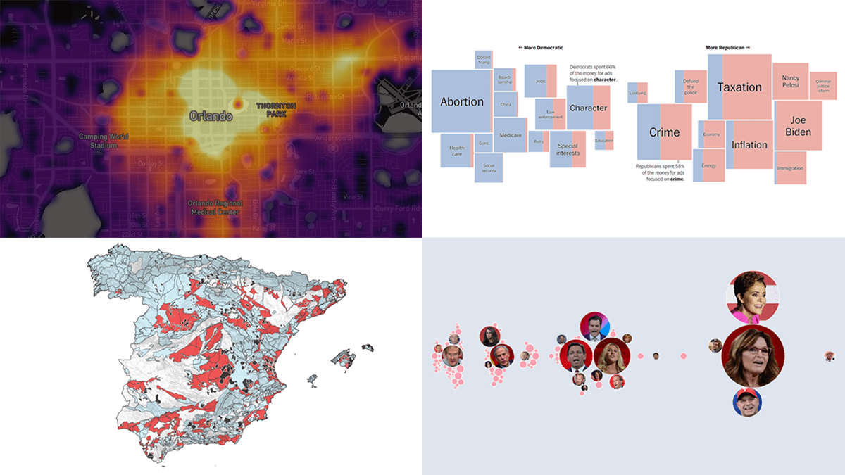 DataViz Weekly is where we curate the coolest data graphics published just about now around the web. Check out our new collection!
- Top topics in political ads ahead of the U.S. midterms — The Washington Post
- Republican candidates spreading election denial online — Bloomberg
- Access to essential services in cities — Leonardo Nicoletti, Mikhail Sirenko, Trivik Verma
- Tap water contamination across Spain — DATADISTA
- Categories: Data Visualization Weekly
- No Comments »
Interesting Recent Graphics Demonstrating Power of Effective Data Visualization — DataViz Weekly
September 30th, 2022 by AnyChart Team Effective data visualization makes it easy to discover trends and patterns hidden in the data. Now for several years, DataViz Weekly has been showing you real-world examples demonstrating how that can work in practice. The following projects are in the spotlight today:
- U.S. housing market trends — The Washington Post
- Wildfire smoke pollution across the U.S. — The New York Times
- Physics of celebratory gunfire — 1POINT21 Interactive
- Cars in Berlin — Hans Hack
- Categories: Data Visualization Weekly
- No Comments »
New Examples of Charts Enabling Effective Visual Data Exploration — DataViz Weekly
September 9th, 2022 by AnyChart Team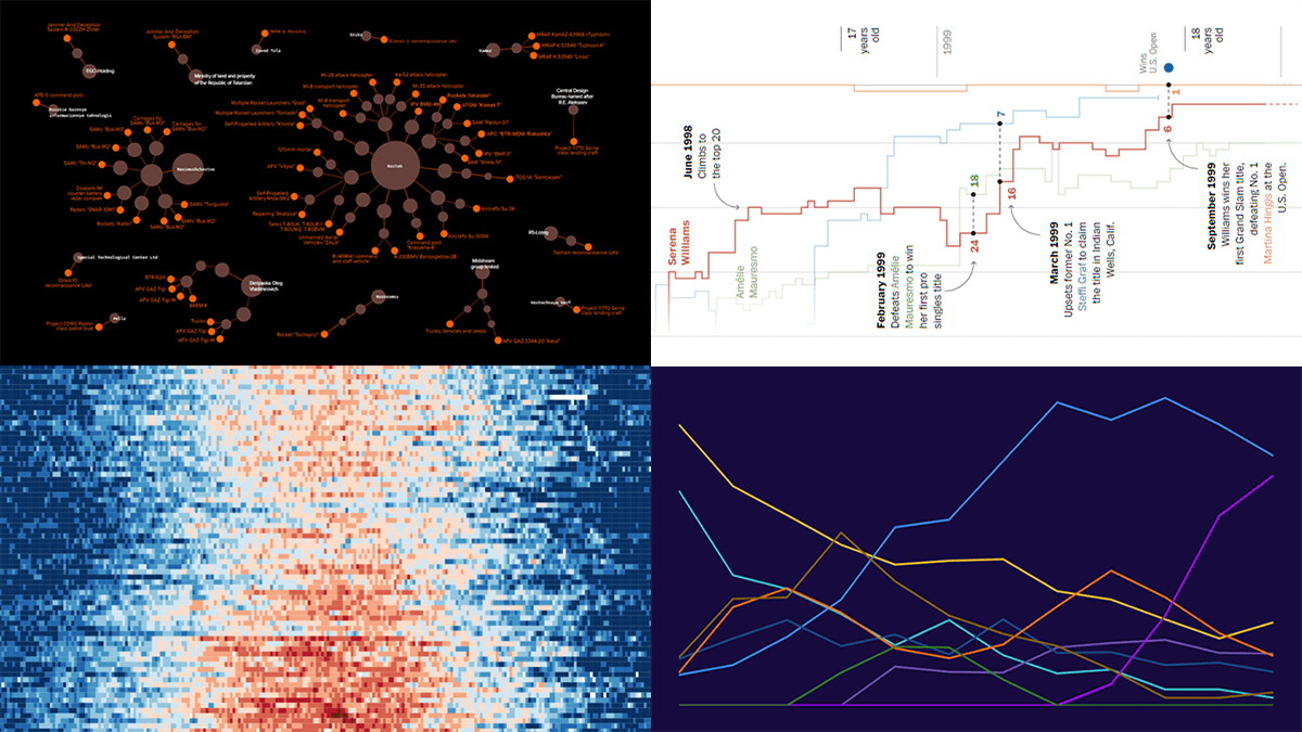 DataViz Weekly is back with a quick look at some of the most interesting new examples of charts that enable effective visual data exploration. Here are the projects featured this time:
- Producers of Russian military equipment — Texty
- Wins, losses, and comebacks in Serena Williams’s professional tennis career — The Washington Post
- Tropical nights in Spain over the decades — elDiario.es
- Platform origins of viral memes — Know Your Meme
- Categories: Data Visualization Weekly
- No Comments »