Four Recent Data Visualization Projects That Held Our Interest — DataViz Weekly
May 15th, 2026 by AnyChart Team
A new Friday, a new round of DataViz Weekly. We are here to share a small selection of data visualization projects that pulled us in lately and we believe will do the same for you. See what is in this edition:
- Winners and losers on Polymarket — The Washington Post
- Patterns in English similes — The Pudding
- Big Tech lobbying in Germany — Zentrum für Digitalrechte und Demokratie
- Atlas of global progress — The World Bank
- Categories: Data Visualization Weekly
- No Comments »
New Data Graphics Worth Exploring — DataViz Weekly
April 10th, 2026 by AnyChart Team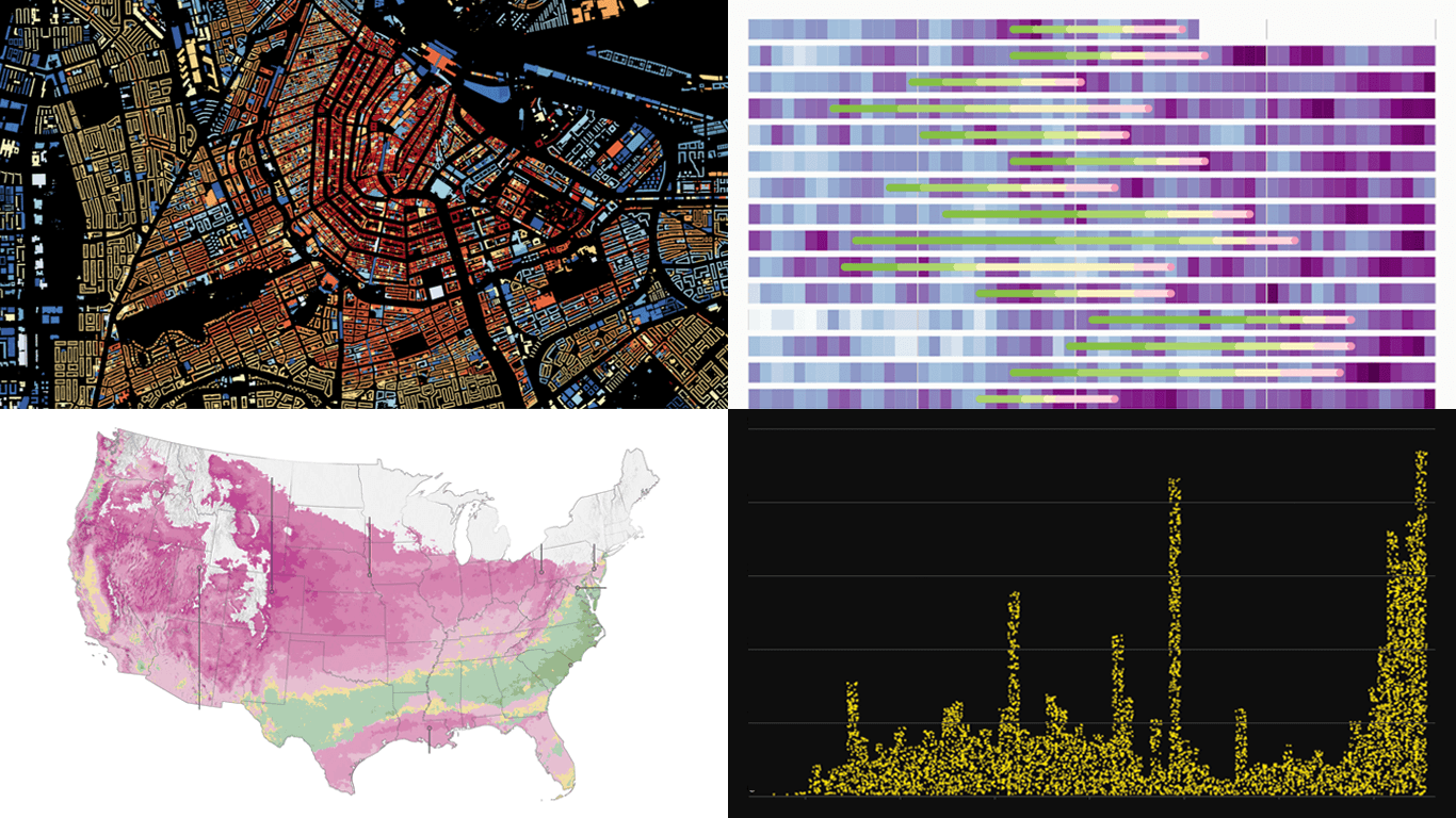 Good data graphics keep turning up online, and we never stop looking. DataViz Weekly is our regular roundup of the latest examples we think are worth your attention. Take a look at our new picks:
- Early leaves and blooms across the United States — The Washington Post
- D.C. cherry blossom shifts — Sara Staedicke
- Satellites crowding Earth’s orbit — The Guardian
- Every building in the Netherlands by year built — Bert Spaan
- Categories: Data Visualization Weekly
- No Comments »
From Personal Grocery Receipts to Global Data Centers — DataViz Weekly
March 20th, 2026 by AnyChart Team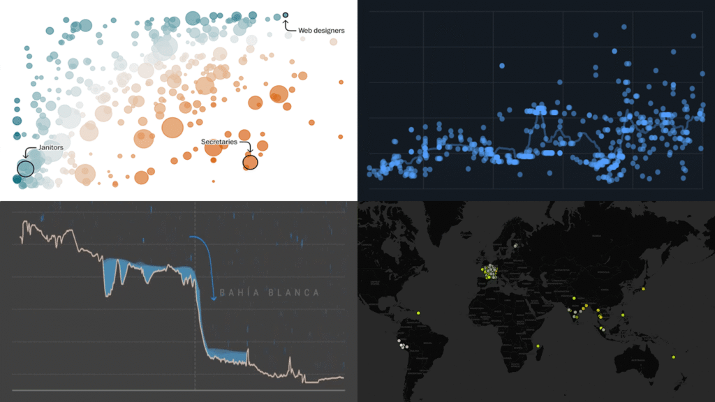
Data is everywhere, but what it means is rarely obvious on its own. DataViz Weekly is back with four projects that illustrate how good visuals help close that gap. Featured today:
- 25 years of egg prices — John Rush
- Jobs most at risk from AI — The Washington Post
- Bahía Blanca flood reconstruction — LA NACION
- Global data center expansion — Environmental Reporting Collective
- Categories: Data Visualization Weekly
- No Comments »
Great New Visuals Letting Data Speak — DataViz Weekly
October 10th, 2025 by AnyChart Team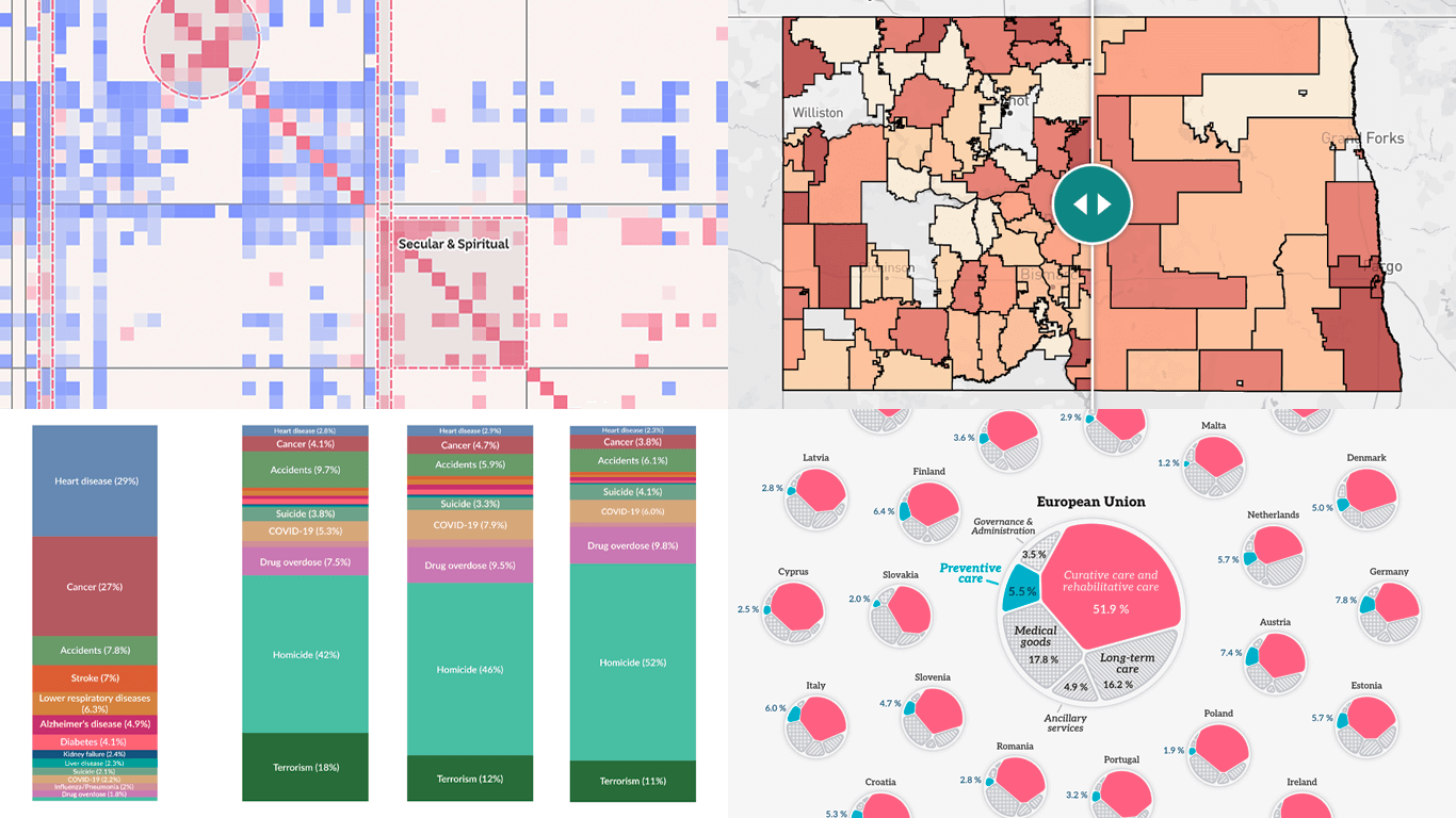 Raw data can be difficult to read and interpret at a glance. Charts and maps make it easier to see what it has to say. We continue to curate great new visuals in our regular series DataViz Weekly, and here’s our latest selection:
- Causes of death in reality and in media — Our World in Data
- EU healthcare priorities — European Data Portal
- U.S. school system redistricting — New America
- Religious mixing in Australian marriages — ABC News
- Categories: Data Visualization Weekly
- No Comments »
Politics Across New Data Visualizations — DataViz Weekly
April 4th, 2025 by AnyChart Team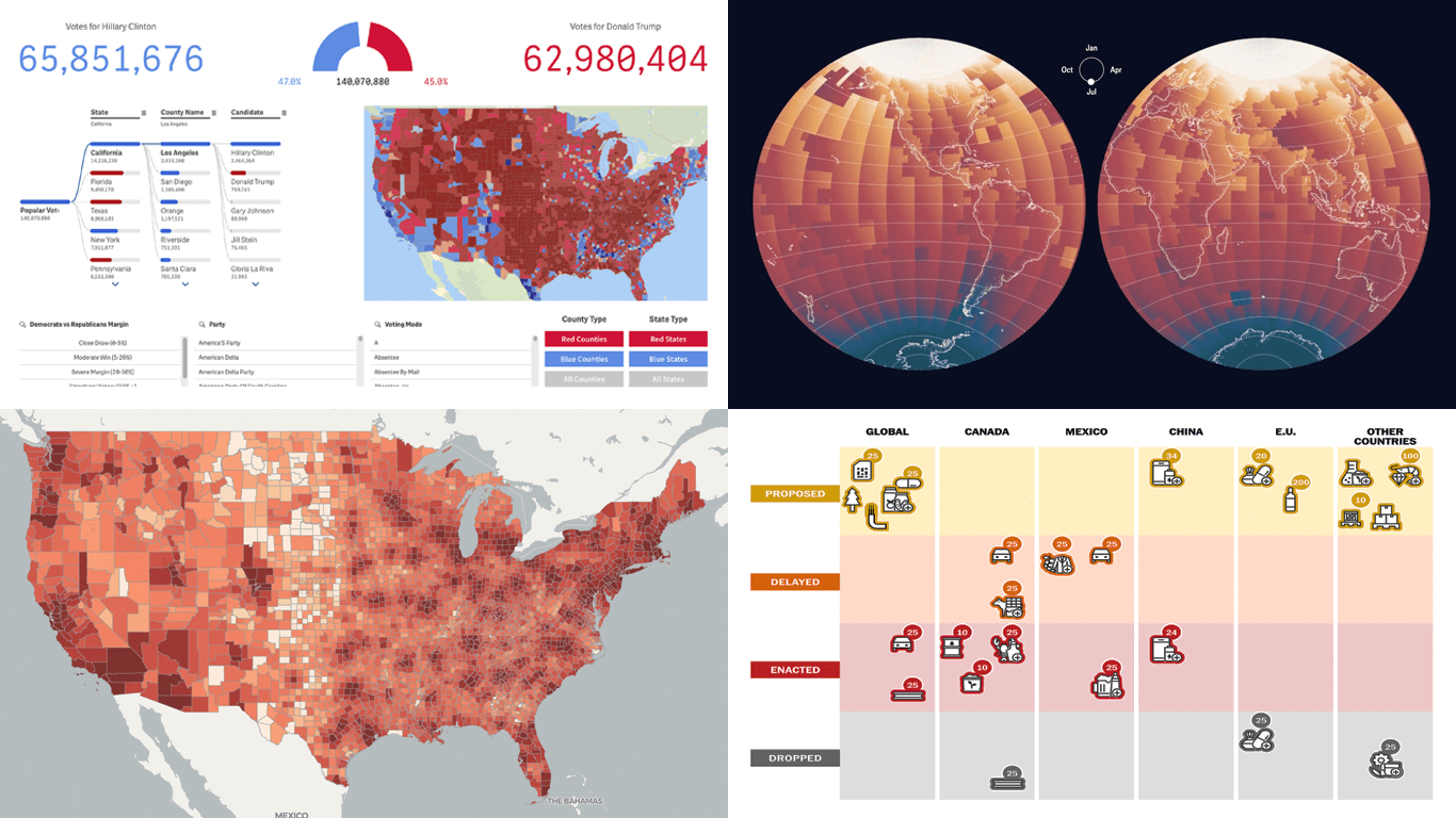 Politics shapes the world in many ways — and, as always, data visualization helps make sense of it all. This time in DataViz Weekly, we are looking at how charts and maps reflect political shifts, decisions, and consequences — from election results and government budgets to tariff policies and even time zones.
One of these projects is ours. We hesitated for a moment — but let’s be honest, we would have featured it anyway if we had stumbled upon it elsewhere.
So, without further ado, here are the four new data visualization projects we think you’ll want to check out:
- U.S. presidential elections — AnyChart
- Trump tariffs timeline — The Washington Post
- Science funding cuts in the United States — SCIMaP
- Politics of time zones — The Economist
- Categories: Data Visualization Weekly
- No Comments »
Data Visualization in Action: Fresh Examples — DataViz Weekly
February 14th, 2025 by AnyChart Team We’re back with DataViz Weekly, where we showcase some of the best new data visualization examples — from individual charts and maps to full-scale visual stories and projects. Take a look at our latest picks:
- Swiss research funding — Colas Droin
- Education and voting patterns in U.S. presidential elections — Jon Boeckenstedt
- City walkability and improvement potential — The Economist & Matteo Bruno et al.
- Self-censorship in Super Bowl halftime shows — Artur Galocha for The Washington Post
- Categories: Data Visualization Weekly
- No Comments »
New Charts & Maps Turning Data Into Insights — DataViz Weekly
January 31st, 2025 by AnyChart Team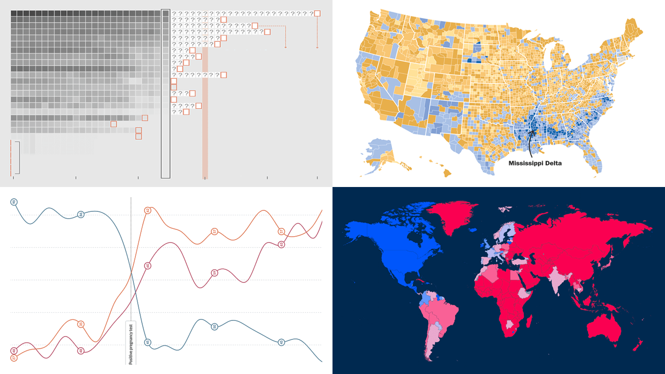 DataViz Weekly is here with a spotlight on new charts and maps that do a great job of turning data into meaningful insights. Today, we invite you to explore the following projects, each demonstrating how data visualization helps reveal patterns, tell stories, and deepen understanding:
- European electricity transition — Ember
- The United States vs. China on global trade — Lowy Institute
- Single-parent families in America — The Washington Post
- Pregnancy through health metric shifts — Maggie Appleton
- Categories: Data Visualization Weekly
- No Comments »
27 Election Maps of 2024 U.S. Presidential Vote Results — DataViz Weekly Special Edition
November 8th, 2024 by AnyChart Team The 2024 U.S. presidential election has concluded, and media outlets worldwide are offering a plethora of data graphics to convey the election results. In this special edition of DataViz Weekly, we’ve curated a collection of over twenty election maps, showcasing diverse ways to represent voting data — cartograms, choropleth maps, bubble maps, and more. Whether you’re a data enthusiast, professional, or simply intrigued by the 2024 election outcomes, explore the latest U.S. election maps from top media!
? Also see our previous special editions with election maps: 2020 U.S. election maps and 2024 UK election maps.
- Categories: AnyMap, Dashboards, Data Visualization Weekly
- No Comments »
New Real-Life Data Visualization Examples — DataViz Weekly
September 27th, 2024 by AnyChart Team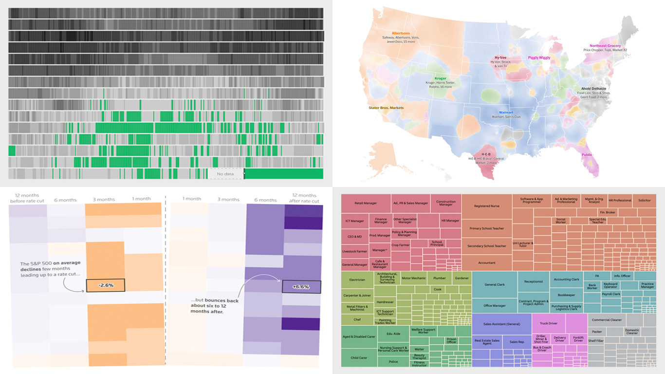 Each week, DataViz Weekly brings you a curated selection of charts and maps based on real-life data. Welcome to our new roundup, continuing to demonstrate how effective data graphics can truly help make sense of complex topics. Take a look at the new data visualization examples we’ve lately found worth highlighting:
- The United Kingdom’s coal-free power era — Ember
- Grocery store ownership in the United States — The Washington Post
- Market reactions to the Federal Reserve’s rate cuts — Reuters
- Marriage patterns by occupation in Australia — ABC News
- Categories: Data Visualization Weekly
- No Comments »
Discovering Fresh Compelling Visual Data Stories — DataViz Weekly
September 20th, 2024 by AnyChart Team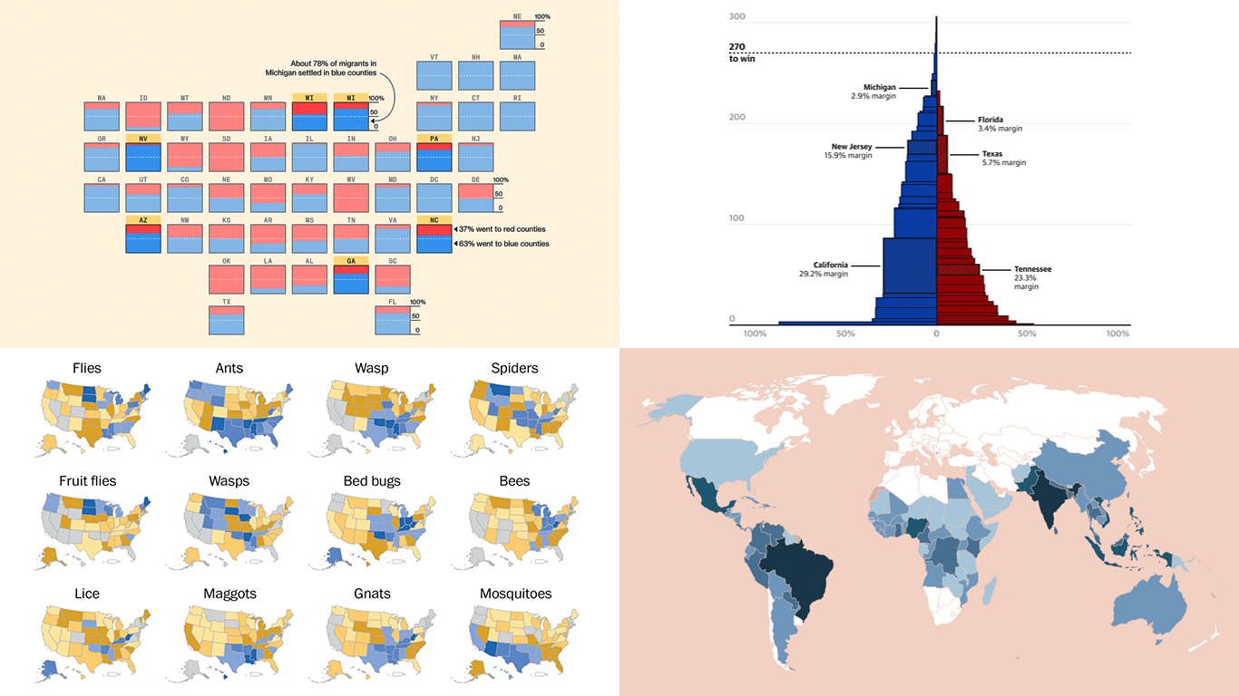 When properly visualized, data comes to life and reveals the stories hidden within the numbers. In this edition of DataViz Weekly, we showcase a selection of new projects that present data in compelling and insightful ways. Let’s dive into the visual data stories that caught our attention this week.
- Neglected tropical diseases — Nexo
- Migrants in U.S. swing states — Bloomberg
- Decisive votes in U.S. presidential elections — The Guardian
- What Americans are searching to kill — The Washington Post
- Categories: Data Visualization Weekly
- No Comments »