 Politics shapes the world in many ways — and, as always, data visualization helps make sense of it all. This time in DataViz Weekly, we are looking at how charts and maps reflect political shifts, decisions, and consequences — from election results and government budgets to tariff policies and even time zones.
One of these projects is ours. We hesitated for a moment — but let’s be honest, we would have featured it anyway if we had stumbled upon it elsewhere.
So, without further ado, here are the four new data visualization projects we think you’ll want to check out:
- U.S. presidential elections — AnyChart
- Trump tariffs timeline — The Washington Post
- Science funding cuts in the United States — SCIMaP
- Politics of time zones — The Economist
Data Visualization Weekly: March 28, 2025 — April 4, 2025
U.S. Presidential Elections 2016–2024, With 1789 in Sight
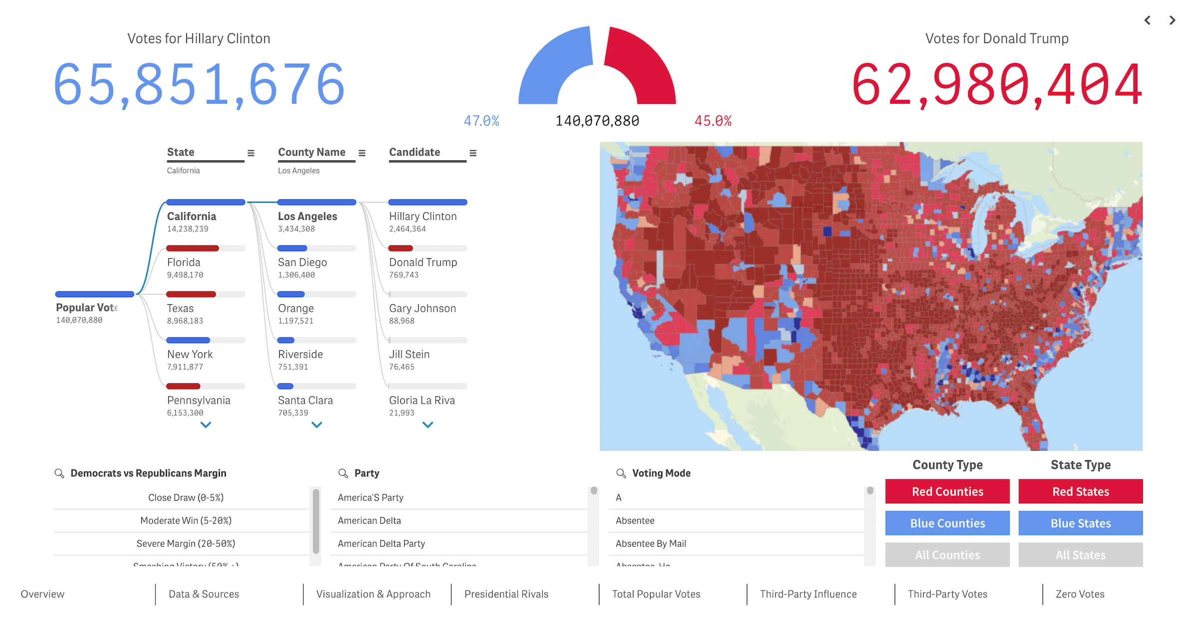
We at AnyChart recently put together an interactive multi-dashboard project visualizing the results of the last three U.S. presidential elections — 2016, 2020, and 2024. What began as a regular Qlik Sense demo app quickly took on a life of its own! Built in Qlik Sense, it brings together Qlik’s native charts and our own extensions to let you explore voting patterns across national, state, and county levels.
The app features a variety of visuals — from maps and bar charts to decomposition trees and circular gauges — for digging into candidate performance, swing regions, the role of third-party candidates, and even the long tail of write-in votes. (Yes, even Donald Duck and Daenerys Targaryen actually show up! No, we’re not kidding.) The data comes from the Harvard Dataverse and the MIT Election Data and Science Lab (MEDSL).
The current version covers three elections, but we plan to expand it all the way back to 1789 — and to keep building out the visual analytics toolkit along the way.
Try our U.S. Presidential Elections app — you can view it live in your browser, even without a Qlik account, or download the QVF.
Spotted something fun? Got an idea? Join the discussion in the Qlik Gallery and help shape what comes next for this project.
Trump Tariffs Timeline
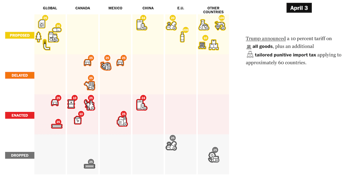
Following Donald Trump’s victory in the 2024 U.S. presidential election, his administration has actively pursued a trade policy centered on tariffs. With actions affecting a wide range of products and countries, and changes coming fast, the shifting landscape can be hard to follow.
The Washington Post published an interactive timeline that meticulously tracks each tariff measure by its changing status — from proposal to postponement, enactment, or cancellation. Presented in a scrollytelling format, this grid-style visualization begins on January 20, Inauguration Day, and moves chronologically through trade actions across product categories. Canada, Mexico, China, and the European Union take center stage, with “Global” and “Other Countries” columns completing the view.
Check out the timeline on The Washington Post, in the article by Alyssa Fowers, Leslie Shapiro, and Amaya Verde.
Science Funding Cuts in U.S.
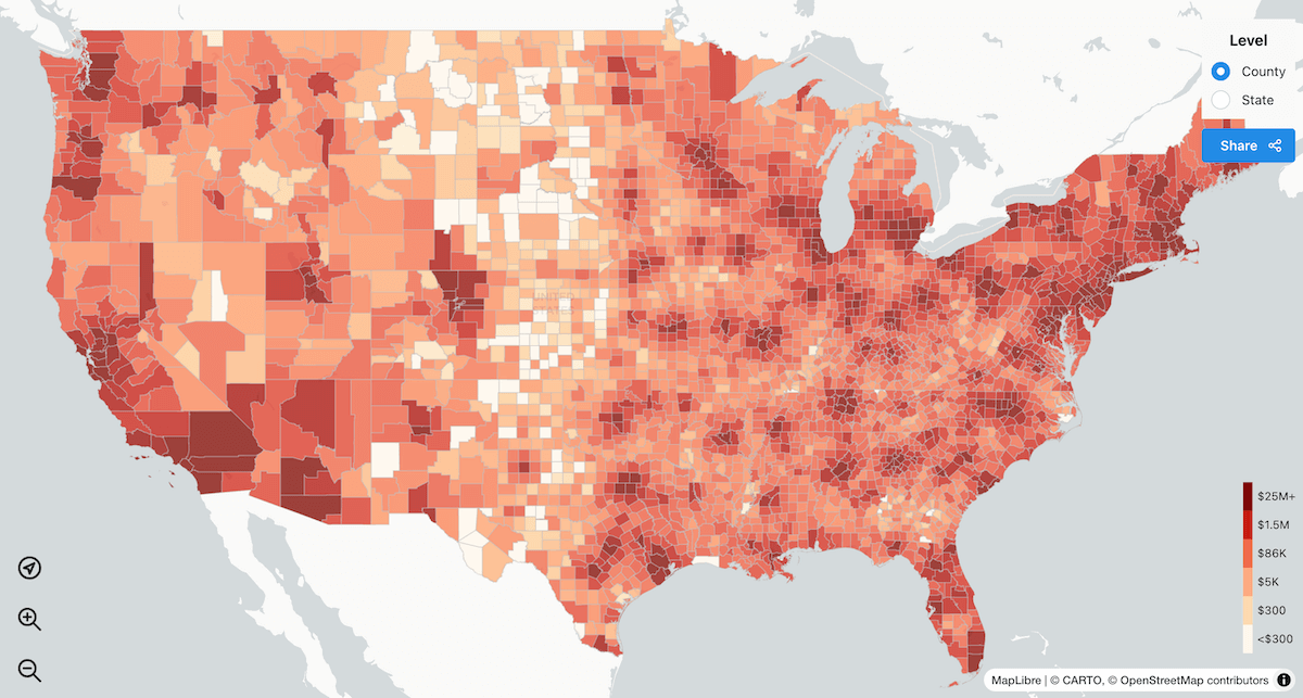
In the early days of the new Trump administration, major changes began unfolding on both the international and domestic fronts. Alongside a tariff-centered trade agenda, sweeping budget decisions started reshaping internal priorities — including a broad reduction in federal support for health-related scientific research.
A team of researchers from the University of Maryland, University of Oregon, University of Pennsylvania, University of Utah, and Georgia Tech developed an interactive choropleth map that estimates how proposed NIH funding cuts could affect local economies across the United States. The focus is on a plan to sharply limit support for indirect costs — the part of research budgets that covers facilities, administrative services, and staff not tied to specific projects but essential to scientific work. The map shows projected economic losses by state and county, with tooltips also indicating the estimated number of jobs at risk.
Explore the SCIMaP project at scienceimpacts.org, created by Joshua Weitz, Alyssa Sinclair, Emily Falk, Danielle Cosme, Angela Fagerlin, Clio Andris, and Ellen Peters.
Politics of Time Zones
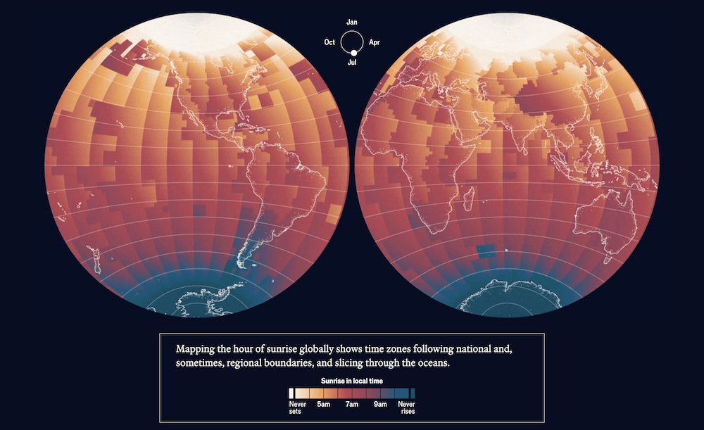
Policy decisions shape the world in many ways — from tariffs and funding to something as fundamental as time itself. While time zones may seem like a purely geographic matter, they often reflect political choices made to project unity, assert identity, or align with allies.
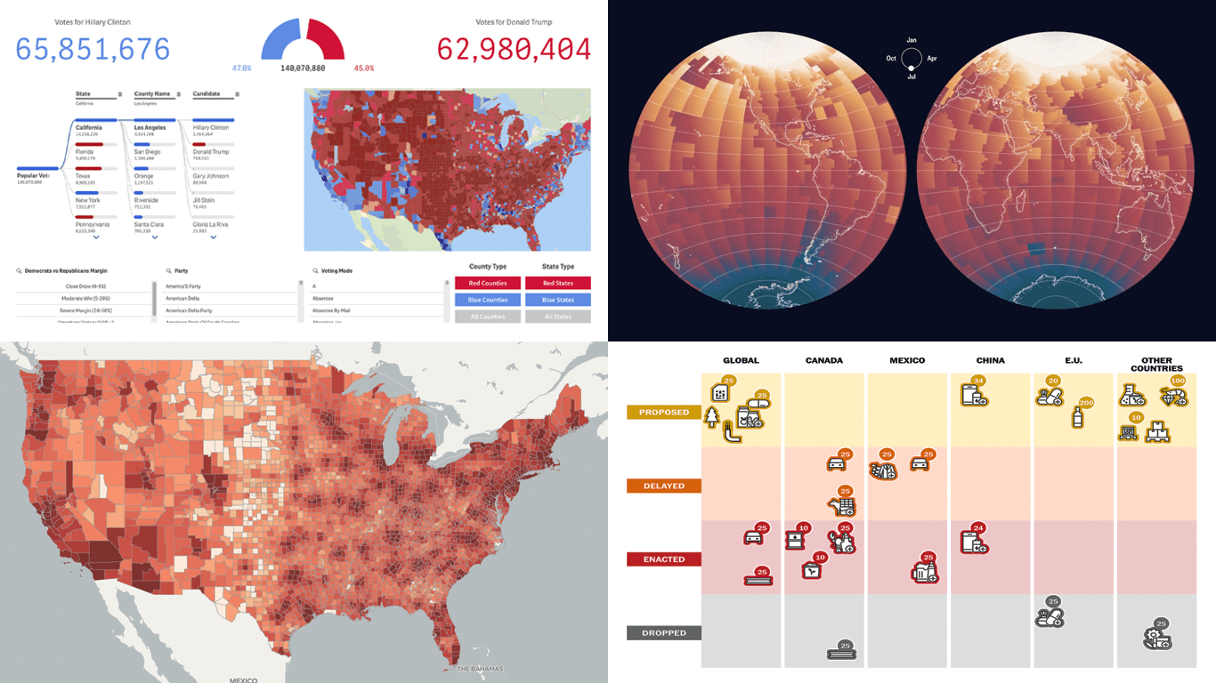
The Economist published an interactive feature that explores how and why official time in quite a few countries and places departs from solar time. Opening with a global perspective, the piece highlights examples such as China’s use of a single time zone across five natural ones, Spain’s alignment with Berlin during Franco’s rule, and North Korea’s adoption of “Pyongyang Time.” Its central visual component is a set of animated globe-style maps that show the hours of sunrise and sunset across the year, clearly illustrating how time zones follow political borders rather than geography. Timelines provide additional context, tracing shifts in time policy.
See the visual story on The Economist, by Olivia Vane.
Wrapping Up
Politics moves fast, but data visualizations help us keep up — and even look deeper. These projects remind us how much clarity a well-built chart or map can bring to what might otherwise feel opaque or abstract.
Stay connected for more visual brilliance — right here in the next edition of Data Visualization Weekly.
- Categories: Data Visualization Weekly
- No Comments »