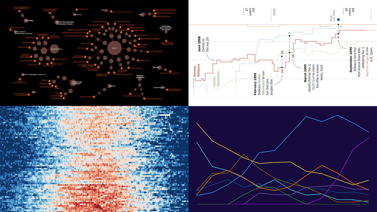
 DataViz Weekly is back with a quick look at some of the most interesting new examples of charts that enable effective visual data exploration. Here are the projects featured this time:
- Producers of Russian military equipment — Texty
- Wins, losses, and comebacks in Serena Williams’s professional tennis career — The Washington Post
- Tropical nights in Spain over the decades — elDiario.es
- Platform origins of viral memes — Know Your Meme
Data Visualization Weekly: September 2, 2022 — September 9, 2022
Producers of Russian Military Equipment
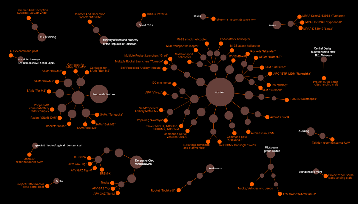
International sanctions have already been imposed on a lot of Russian individuals related to the country’s military and industrial complex. At the same time, directors of many companies directly involved in the production of Russia’s military equipment are not sanctioned.
Trap Agressor, a team of analysts formed by Ukrainian think tank StateWatch, identified manufacturers of the Russian military equipment reported (by open-source intelligence defence analysis project Oryx) to have been captured or destroyed in Ukraine. Then Texty visualized the ownership and management structure of these companies in an interactive network graph.
See the chart and other visuals and learn more on Texty.
Wins, Losses & Comebacks in Professional Tennis Career of Serena Williams
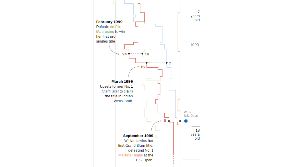
One of the greatest women’s tennis players of all time, Serena Williams announced her upcoming retirement from professional tennis last month. Now, the lost match against Ajla Tomljanovic at the U.S. Open is likely to be the last one of her career.
Artur Galocha and Adrian Blanco of The Washington Post made a timeline representation providing a look at the professional career of Serena Williams through the lens of ascents and descends in the WTA ranking. A general view is then zoomed in to show the most significant milestones along with who (and what) challenged her at different stages.
Explore the timeline of Serena Williams’s career on The Post.
Tropical Nights in Spain over Decades
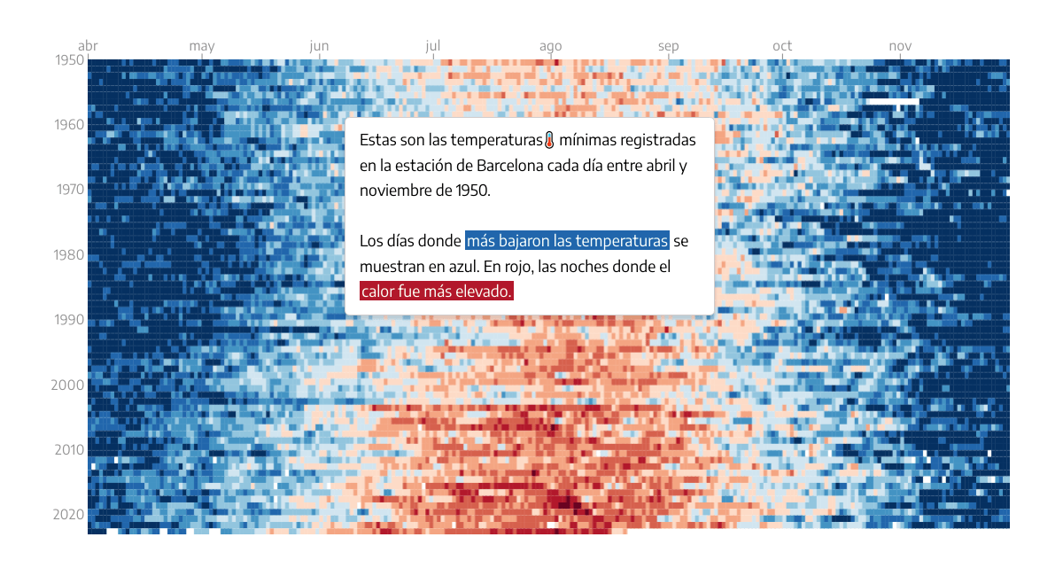
In Europe, the nights when air temperature stays at or above 68 degrees Fahrenheit (20 degrees Celsius) are called tropical nights. They often occur during heat waves and are increasingly common due to climate change.
Raul Sanchez, Victoria Oliveres, and Carmen Martinez of elDiario.es analyzed daily minimum temperatures recorded by the State Meteorological Agency (AEMET) in the capitals of Spanish provinces to find out how the number of tropical nights has increased in recent decades. The upward trend appears to be significant in the majority of those cities, which can be visually grasped thanks to the heatmaps and other data graphics made by the journalists.
Check out the piece on elDiario.es.
Platform Origins of Viral Memes
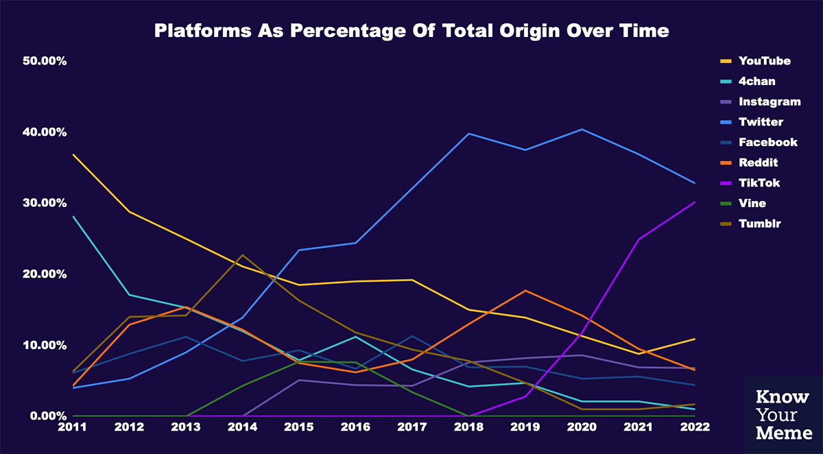
Memes are a part of internet culture. Looking at how they changed can be helpful in understanding the evolution of the internet.
Know Your Meme, tracking internet memes, visualized over a decade of its own data to see (and show all of us) the top platforms they originated on, with a breakdown by year. Pie charts display which platforms dominated in each year from 2010 to 2022. The line graph after them represents an over-time summary.
Look at the charts on Know Your Meme.
***
You might also like the circle packing chart showing the world’s 100 richest billionaires (2022) created by Nepal-based programmer Awan Shrestha along his hot new tutorial on how to create circle packing charts with JavaScript published this week on our blog.
Thanks for your interest in good data visualizations! Stay tuned for DataViz Weekly to not miss a (cool) thing!
- Categories: Data Visualization Weekly
- No Comments »