Heat and Drought in American West in Visualizations — DataViz Weekly
July 2nd, 2021 by AnyChart Team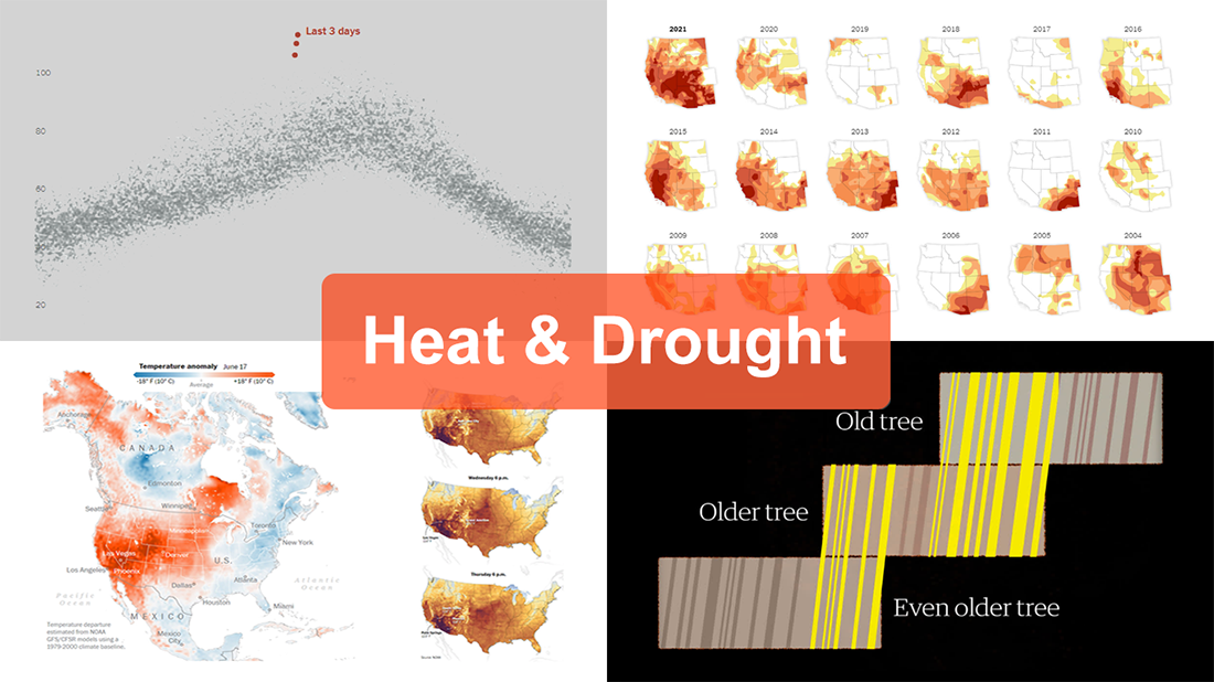 The extreme heat that has gripped the Western United States this summer basically aligns with scientists’ expectations for climate change. On top of that, as all the more scorchers are likely coming up, the year 2021 may well be remembered as a relatively cool one.
For this new edition of DataViz Weekly, we’ve curated a set of recent visualizations shedding light on the essence and context of the record-breaking heat and drought in the U.S. West. Take a look!
- Heat dome and temperature extremes in the West — The Washington Post
- Heat in the Pacific Northwest since 1979 — The Upshot
- Drought conditions in the West since 2000 — The New York Times
- Southwestern droughts since 800 CE (as shown by tree tings) — The Guardian
- Categories: Data Visualization Weekly
- No Comments »
Exploring Voting Bills, Birth Rates, Hospital Billing, Transit Equity — DataViz Weekly
June 25th, 2021 by AnyChart Team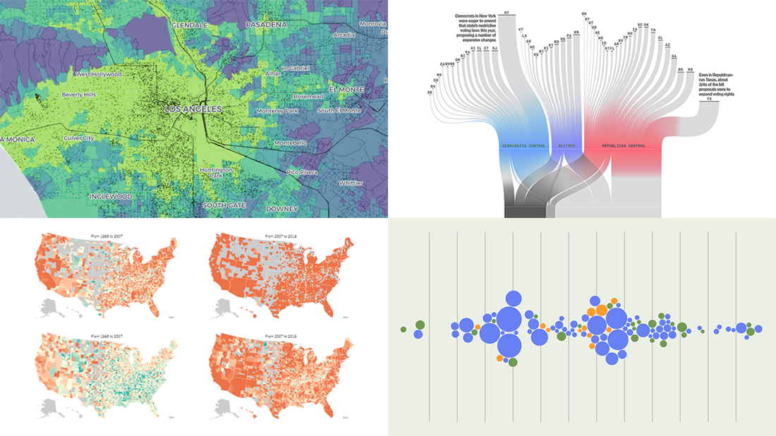 Join us to check out the most awesome data visualizations of all we have come across this week! To begin with, here is a full list of the projects featured today in DataViz Weekly:
- Proposed and passed voting bills across the U.S. in 2021 — Bloomberg
- Change in birth rates among American women — NYT
- Billing practices at the top 100 U.S. hospitals — Axios
- Transit equity in major U.S. cities — TransitCenter
- Categories: Data Visualization Weekly
- No Comments »
Feel Power of Data Visualization in Four New Examples — DataViz Weekly
October 2nd, 2020 by AnyChart Team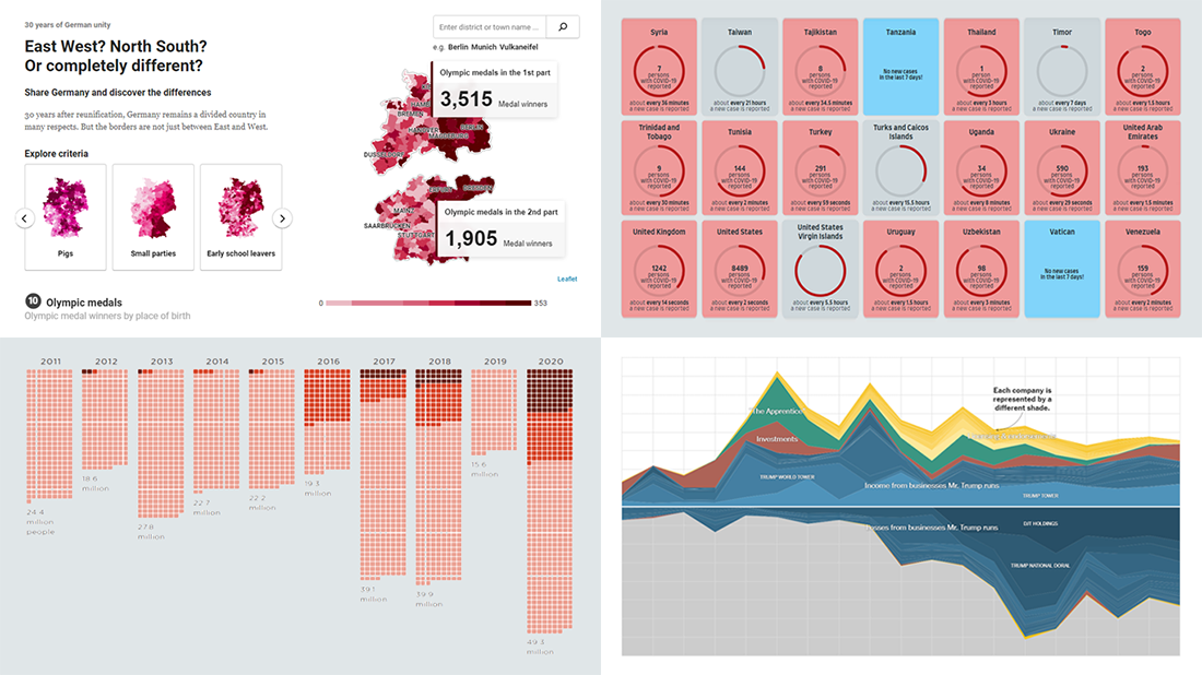 We’ve curated another four new wonderful examples from around the web that greatly illustrate the power of data visualization in action. Meet them straight away, on DataViz Weekly!
- COVID-19 spreading rates by country — Jan Willem Tulp
- Two decades of Trump’s finances — The New York Times
- Dangerous air pollution in the record wildfire season in the Western U.S. — NPR
- Germany divided — Berliner Morgenpost
- Categories: Data Visualization Weekly
- No Comments »
COVID-19 Vaccine, Future, Impact, and Non-COVID Wiki Atlas Visualizations — DataViz Weekly
May 8th, 2020 by AnyChart Team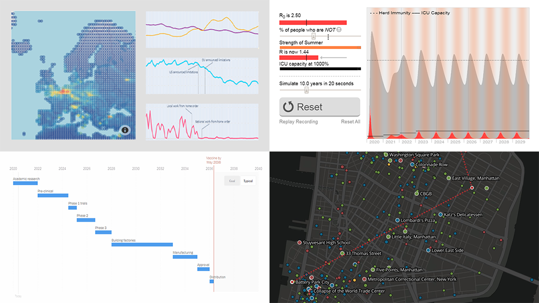 Without any exaggeration, the vast majority of data visualizations made public these weeks (and already months) are about the novel coronavirus pandemic. In compliance with the general trend, three of the four projects presented in the new DataViz Weekly article shed light on issues related to COVID-19. Take a glance at a quick list of the featured data visualization works and read more to meet them.
- COVID-19 vaccine development timeframe and how to reduce it – NYT
- COVID-19 future, in playable simulators – M. Salathé & N. Case
- COVID-19 impact on traffic and air pollution in Europe – European Data Portal
- Atlas of places featured in Wikipedia – T. Noulas, R. Schifanella, D. Sáez-Trumper & J. Tan
- Categories: Data Visualization Weekly
- No Comments »
Social Distancing in Data Visualizations — DataViz Weekly
April 3rd, 2020 by AnyChart Team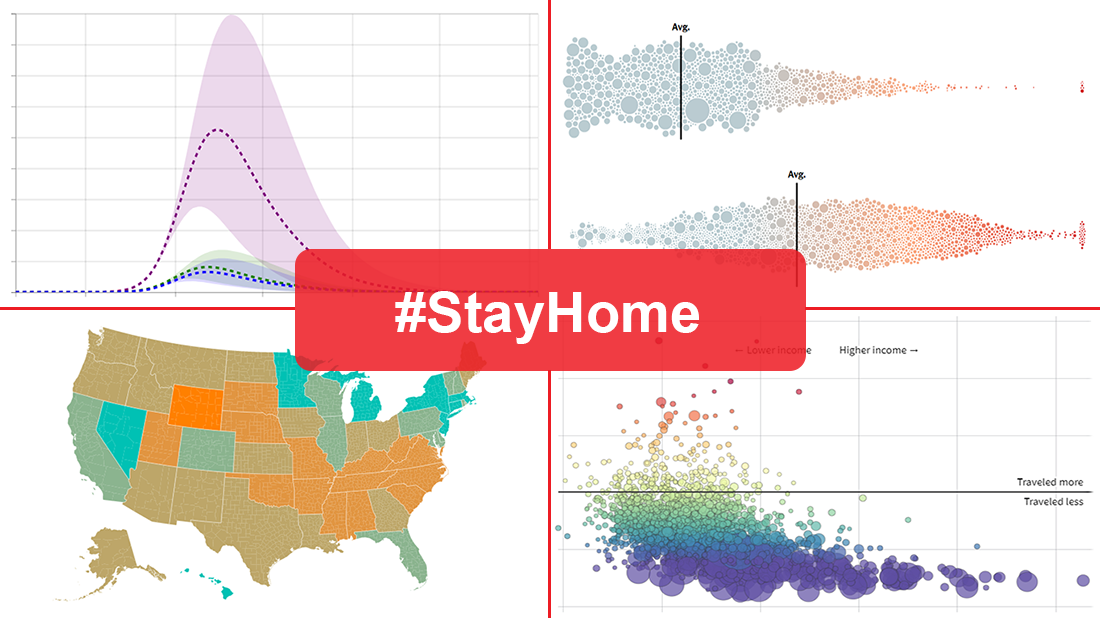 Many health and epidemiology experts consider social distancing to be the most effective way to slow the spread of COVID-19 at the current stage. But does it really work and help?
In today’s DataViz Weekly, we put a focus on data visualizations — charts and maps — on where we, in the United States, have been on social distancing. The following projects deserved to get featured in this special “#StayHome” edition:
- “The Social Distancing of America” — Reuters
- “Where America Didn’t Stay Home Even as the Virus Spread” — NYT
- “Social Distancing Scoreboard” — Unacast
- “COVID-19 Projections Assuming Full Social Distancing Through May 2020” — IHME, UW Medicine
- Categories: Data Visualization Weekly
- 1 Comment »
Creative Visualizations on Climate, Protests, Jobs, and Wildlife — DataViz Weekly
March 27th, 2020 by AnyChart Team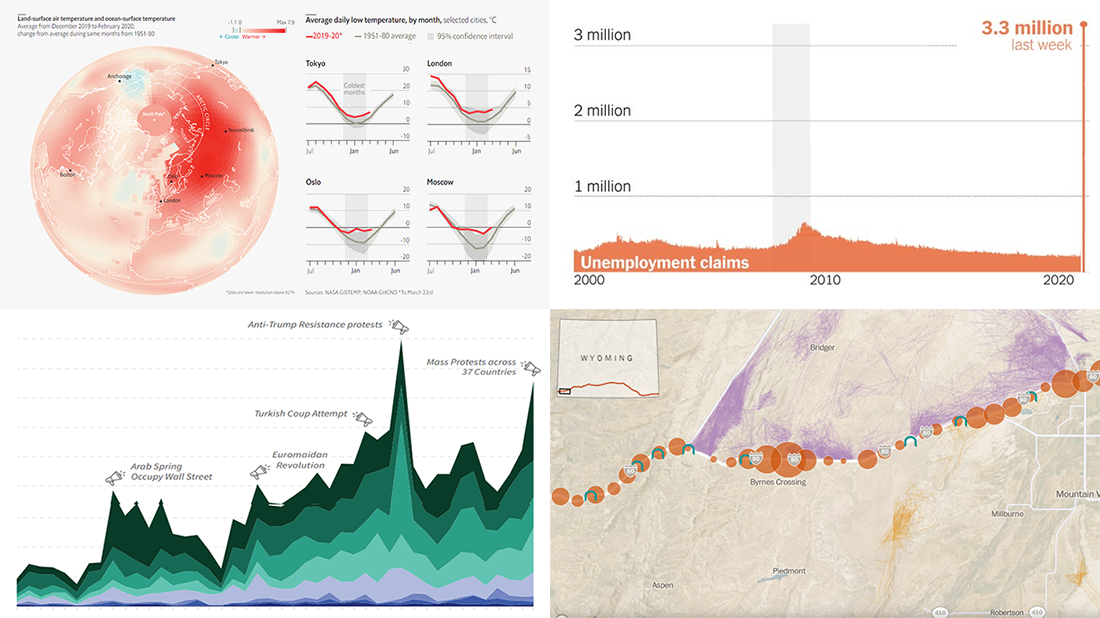 The new issue of DataViz Weekly puts a spotlight on some of the most interesting new creative visualizations from around the Web. Last week, we made a focus on COVID-19 charts. This time, we get along without the coronavirus subject. Well, mostly.
Here is what’s on DataViz Weekly this Friday:
- Winter temperatures in the northern hemisphere — The Economist
- Mass political protests worldwide — Center for Strategic and International Studies
- Spike in joblessness in the United States of America — The New York Times
- Wyoming wildlife corridors — The Washington Post
- Categories: Data Visualization Weekly
- No Comments »
Coronavirus in US in Charts and Maps — DataViz Weekly
March 20th, 2020 by AnyChart Team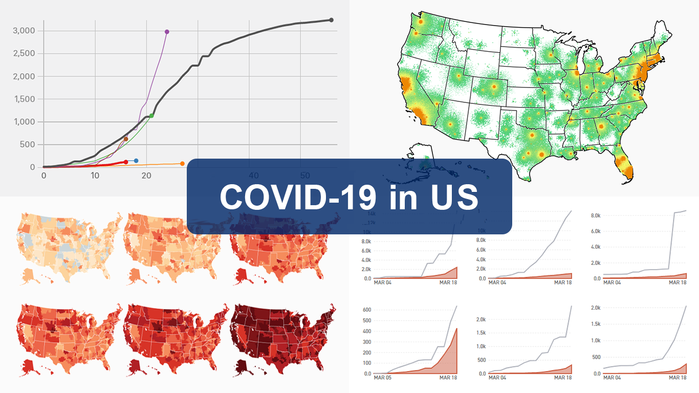 As the novel coronavirus pandemic is in full swing, COVID-19 is now by far the most topical issue on the global agenda. So it’s no surprise that the vast majority of the data visualization projects we’ve come across this week are about the outbreak. That’s why the new DataViz Weekly article is entirely devoted to the same subject — the coronavirus.
We are quite sure many of you have already seen some if not all of the best dashboards, charts, and trackers of the global COVID-19 outbreak from Johns Hopkins University, The New York Times, Financial Times, Business Insider, The Guardian, Bloomberg, and others. Awesome animated simulations from The Washington Post’s Harry Stevens, showing why epidemics like this spread exponentially and how social distancing could help to flatten the curve of COVID-19 cases, have almost certainly came to your attention and does not need to be presented additionally.
Headquartered in the United States, we decided to find out more about what has been going on about COVID-19 in America. Join us on a review of four interesting (though sometimes a bit frightening) data graphics features created by top media outlets, which provide insight into where the U.S. stands — from the perspective of cases and tests (Politico), scenarios (TIME), and hospital bed capacity (The Upshot by NYT), as well as compared to the rest of the world (BuzzFeed News). Check out the special “COVID-19 in US” edition of DataViz Weekly on the AnyChart blog.
- Categories: Data Visualization Weekly
- 2 Comments »
Charting Data About Retirement Savings, Warren’s Plans, California Housing, and UK Election — DataViz Weekly
November 15th, 2019 by AnyChart Team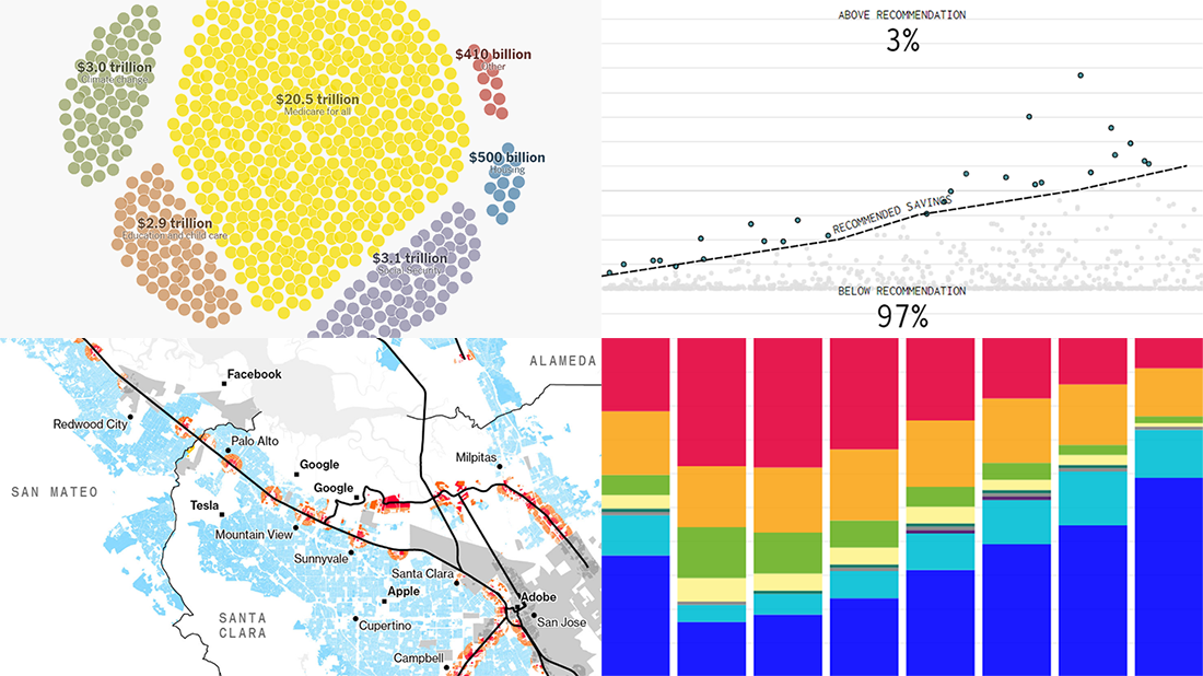 It’s Friday, which means we are ready to share with you new awesome examples of charting in action. Look how powerful the right visualization can be when one needs to explore or communicate various statistics. Here’s a quick list of the projects presented in this new DataViz Weekly post — we’ve found them out there these days:
- Saving for retirement in the United States — FlowingData
- Costs of Elizabeth Warren’s policy plans — The New York Times
- Housing crisis in California — Bloomberg
- Voting intentions before the 2019 United Kingdom general election — CNBC
- Categories: Data Visualization Weekly
- No Comments »