How to Create Sparklines with JavaScript
January 13th, 2022 by Shachee Swadia Sparklines are elegant microcharts introduced by Edward Tufte, a renowned statistician and data visualization pioneer. Drawn without any axis and occupying minimal space, these tiny graphs are designed to represent the big picture displaying trends in line with text and within table cells. If you want to learn about an easy way of building a sparkline chart, it is the right place!
In this article, I will show you how to quickly create cool sparkline charts using JavaScript. With OTT content ruling the world of entertainment these days, let’s have fun learning and look at the IMDb ratings of one of the most popular shows nowadays — Money Heist (La Casa de Papel in its original Spanish).
Without more ado, come along on this journey of knowledge heist!
Read the JS charting tutorial »
- Categories: AnyChart Charting Component, Big Data, HTML5, JavaScript, JavaScript Chart Tutorials, Tips and Tricks
- No Comments »
Coolest Latest Visualizations You Can’t Miss — DataViz Weekly
October 29th, 2021 by AnyChart Team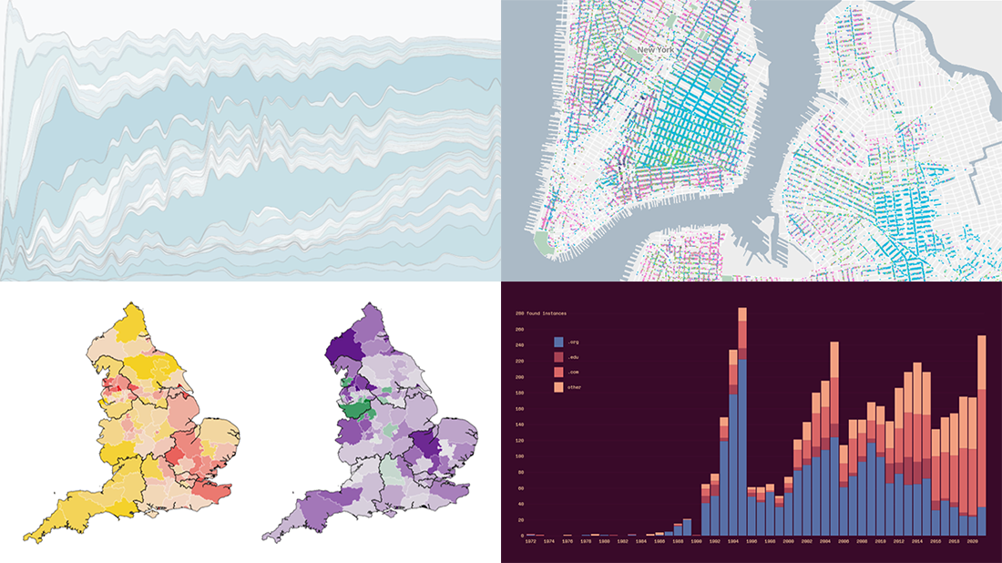 Welcome back to DataViz Weekly, a regular series of posts on AnyChart Blog putting a spotlight on the coolest data visualization works we have come across over the last few days! Today, we’re glad to feature and tell you about the following projects:
- Mapping historical New York City — Columbia University
- Tracking the Lenna image — The Pudding
- Analyzing the number of doctors in England — Sky News
- Charting TV genres over time — Nathan Yau
- Categories: Data Visualization Weekly
- No Comments »
New Interesting Visualizations on Jobs, Climate, TV Shows, Pandemic — DataViz Weekly
October 8th, 2021 by AnyChart Team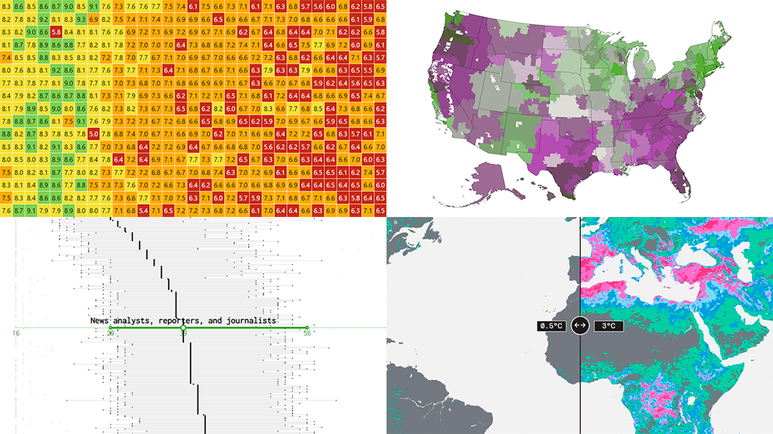 For all who already have an eye for data visualization or only want to get it, DataViz Weekly is here with an overview of four new interesting projects curated from around the web!
- U.S. jobs by age of workers — Nathan Yau
- Probable climate futures based on different scenarios — Probable Futures
- Average IMDb scores of all TV series by episode — Jim Vallandingham
- Vaccination vs hospitalization rates across the United States — The Washington Post
Read on to learn more about each and check them out!
- Categories: Data Visualization Weekly
- No Comments »
How to Create JavaScript Bubble Chart — Tutorial for Web Developers
March 3rd, 2020 by Wayde Herman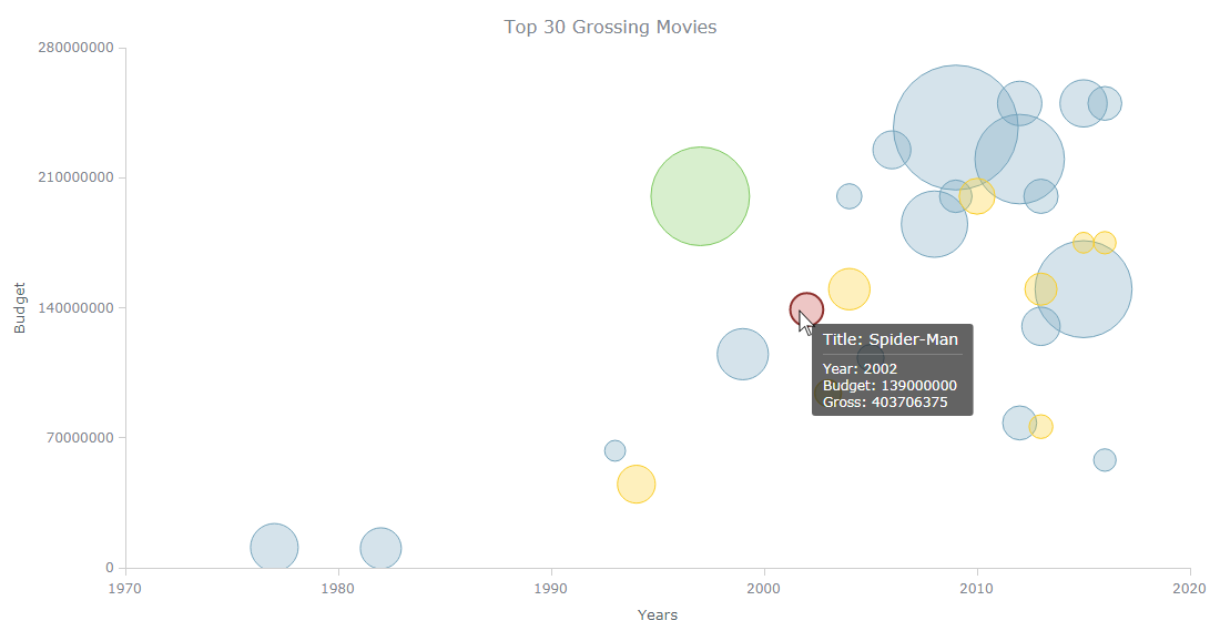 Have you ever wanted to create a bubble chart using JavaScript but did not know how? Then this tutorial is for you! Carry on reading to learn more about bubble charts and how we can build them quickly and painlessly.
Bubble charts are an extension of the scatter plot. Most commonly, they display three variables which are expressed as the horizontal distance of the point (x), the vertical distance of the point (y), and the size of the point (z). A bubble chart is a great visualization technique to let users compare data points. When designed well, it can be really eye-catching and engaging.
In this tutorial, I will teach you how to build your very own interactive JS bubble chart and bring it to life through customization. All examples will be available with the full code.
For this “getting started” guide, I have decided to explore the data of the top 30 grossing movies. Let’s look at the amount of money each movie has grossed, the budget, as well as the year of release. A bubble chart is a particularly good choice for the visualization of this dataset as it will allow us to easily compare these three numeric variables in an interesting and beautiful way.
Read the JS charting tutorial »
- Categories: AnyChart Charting Component, HTML5, JavaScript, JavaScript Chart Tutorials, Tips and Tricks
- No Comments »
New Data Chart Examples Worth Seeing About Coal, People, Movies, and Migration — DataViz Weekly
May 31st, 2019 by AnyChart Team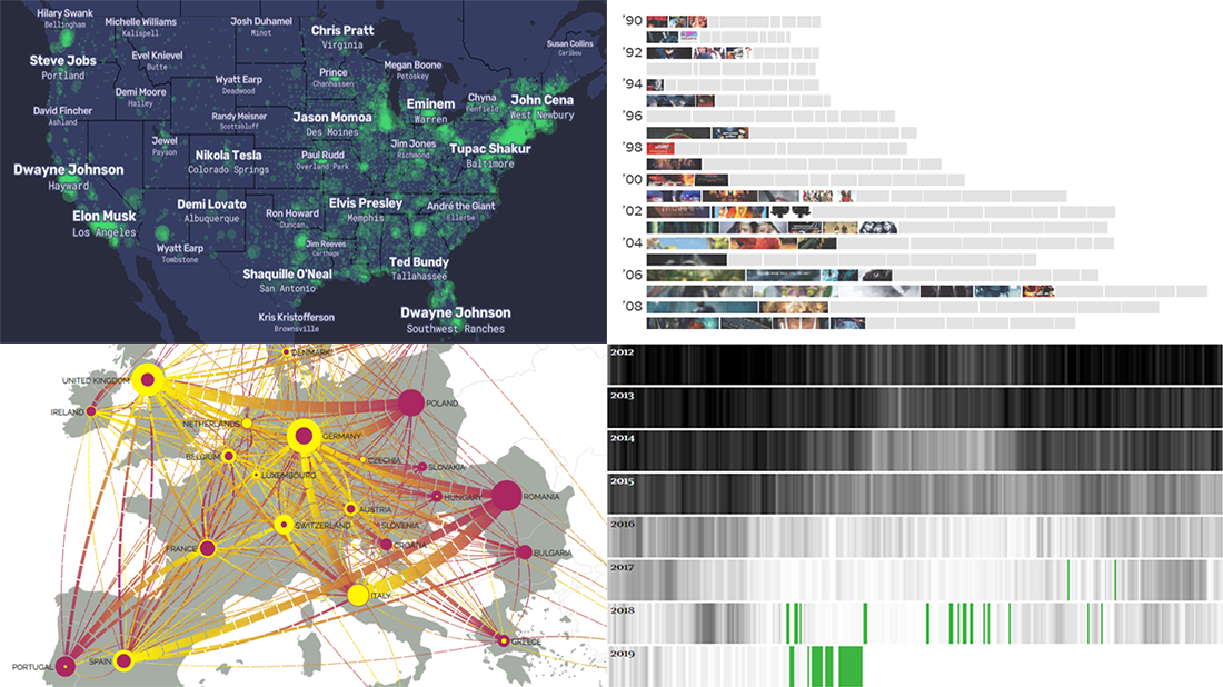 Data visualization is a powerful way to facilitate making sense of numbers. It can provide an insightful look at data and display trends and patterns at a glance for a more efficient and quicker analysis. Check out new data chart examples from around the web that nicely show how it works in practice.
Today on DataViz Weekly:
- How Britain is phasing out coal-powered energy
- U.S. cities’ most Wikipedia’ed residents
- Rise of summer movie sequels
- European migration flow map
- Categories: Data Visualization Weekly
- 1 Comment »
Data Visualization Practices on Relationships, Brands, Hollywood, and Wildlife — DataViz Weekly
March 29th, 2019 by AnyChart Team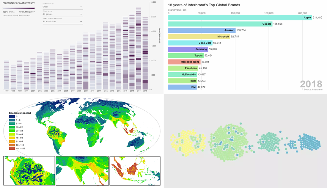 By looking at the best data visualization practices, not only do you have fun and learn something interesting about life and the world around us, but you can also pull together ideas that will help you take your charting skills to the next level. DataViz Weekly on the AnyChart blog is the right place to get such inspiration as that’s where we share with you some of the most interesting charts and graphics-based projects that have recently come to our attention.
Join us as we take a quick overview of new data visualizations on the following subjects:
- relationship timeline in 1970s vs 2010s
- top global brands in 2000-2018
- Asian on-screen representation in Hollywood movies
- global hotspots of human impact on threatened species
- Categories: Data Visualization Weekly
- No Comments »
Chart Visualization Examples Showing Data About Snow, Prejudice, Names, and Prosperity — DataViz Weekly
March 8th, 2019 by AnyChart Team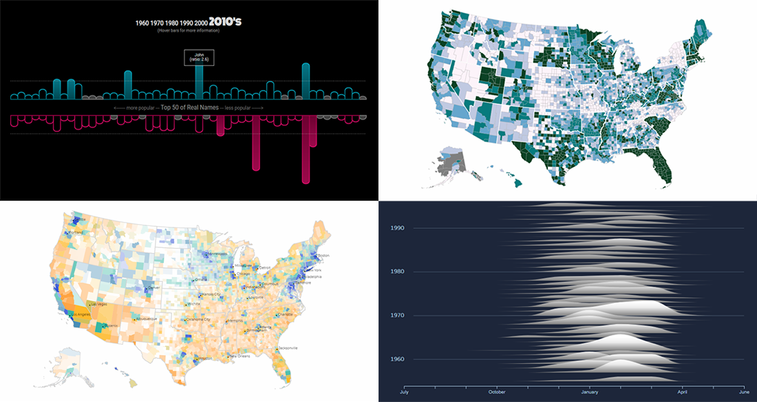 It’s Friday, and here’s another selection of cool chart visualization projects we’ve come across these days. Look at them for fun and inspiration!
Today on DataViz Weekly:
- winter weather and snow in Canada;
- partisan prejudice across the United States of America;
- names in movies and TV shows vs real life;
- prosperity in the United States, by county.
- Categories: Data Visualization Weekly
- No Comments »