 It’s Friday, and here’s another selection of cool chart visualization projects we’ve come across these days. Look at them for fun and inspiration!
Today on DataViz Weekly:
- winter weather and snow in Canada;
- partisan prejudice across the United States of America;
- names in movies and TV shows vs real life;
- prosperity in the United States, by county.
New Chart Visualization Examples: March 1, 2019 — March 8, 2019
Winter Weather and Snow in Canada
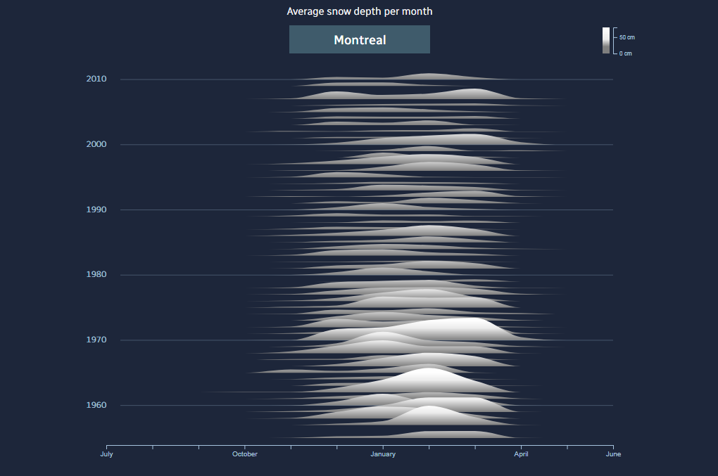
Naël Shiab, a data journalist at CBC/Radio-Canada, together with his colleagues made an awesome visual story telling about the reduction in the amount of snow in the Canadian winter. The underlying research is based on the snowfall data from Environment Canada, a government department responsible for coordinating environmental and climate change programs. Take a look to understand how winter temperatures and snow depth have changed for decades, as well as why, and what to expect in the future.
Partisan Prejudice Across America
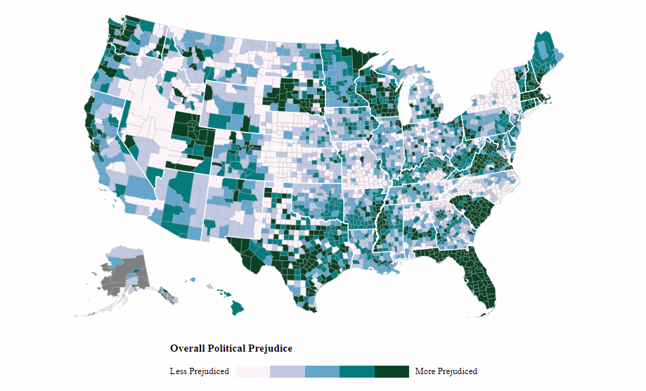
The Atlantic, in collaboration with experts in polling and data analysis from PredictWise, conducted U.S.-wide research into what political scientists and statisticians call “affective partisan polarization,” indicating the degree of the mutual dislike between Democrats and Republicans across the country. The interactive maps published on Monday along with the analytics nicely display the geography of such a partisan prejudice in every U.S. county. If you are an American, find out whether your area appears to be more (or less) politically tolerant than the others and learn more on The Atlantic.
Names in Movies and TV Shows vs Real Life
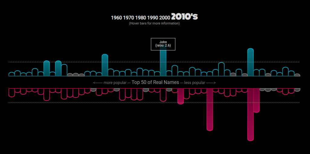
Mary Zam, a data visualization enthusiast and software developer, looked into cinematic names to see how naming in movies and TV shows is different from real life. For this research, she took data from the U.S. Social Security Administration (for real baby names) and IMDb (for the names of cinema characters). Check it out. There are multiple cool charts in the story, and the resulting data sets and the full source code are accessible on GitHub.
Prosperity Across United States
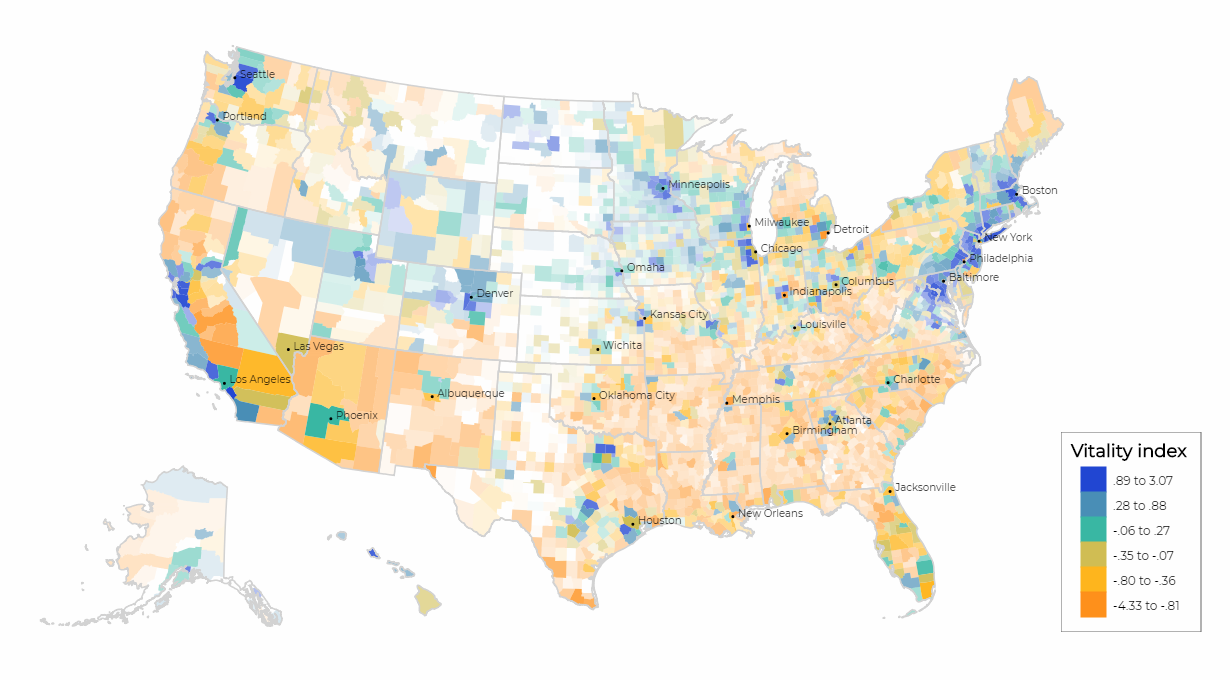
The Hamilton Project, an economic policy initiative within the Brookings Institution, published its Vitality Index, measuring well-being in each U.S. country across six specific indicators. Those are median household income, poverty rate, life expectancy, prime-age employment-to-population ratio, housing vacancy rate, and unemployment rate. Explore the dedicated interactive map to take a closer look at the results of their research.
***
Have a great time, everyone! And stay tuned!
- Categories: Data Visualization Weekly
- No Comments »