Information Visualization Techniques in Action on Democracy, Covid-19, Inequality & Gerrymandering — DataViz Weekly
June 26th, 2020 by AnyChart Team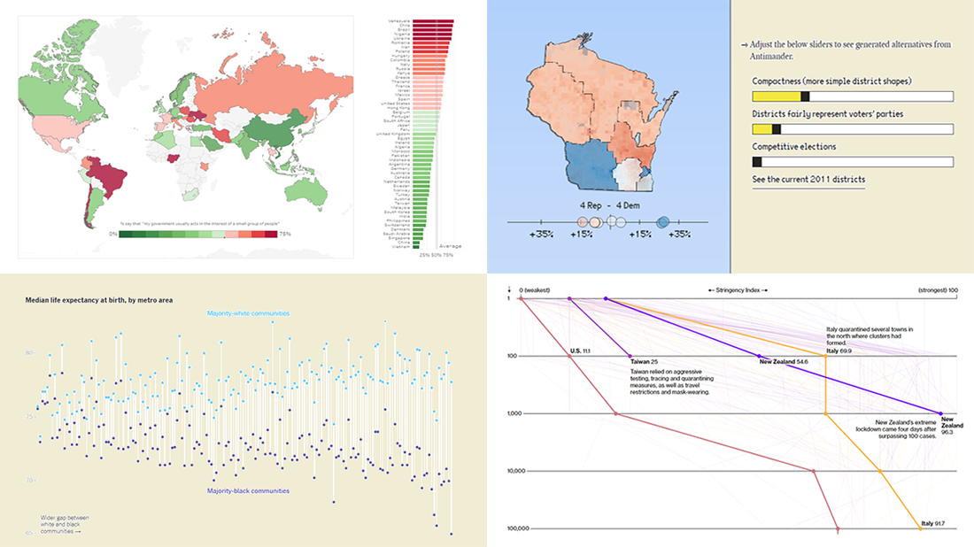 DataViz Weekly is here exhibiting new interesting projects from around the web that demonstrate a great use of different information visualization techniques to deliver better insight. See our new picks:
- Democracy Perception Index 2020 — Dalia
- Government reactions to the Covid-19 pandemic — Bloomberg News
- Gaps between Black and White America — The New York Times Opinion
- Antimander, a tool to expose gerrymandering in congressional districts — Joel Simon
- Categories: Data Visualization Weekly
- No Comments »
Visual Data Analytics on Protests, GDP, Opinions, and Weather — DataViz Weekly
December 20th, 2019 by AnyChart Team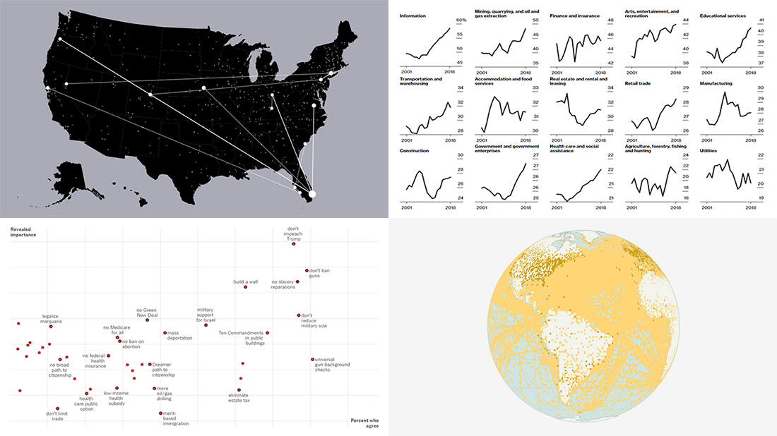 Visual data analytics with the help of charts and maps as efficient graphical presentation forms can quickly bring a lot of insight into mere numbers. We’ve curated some more examples from all over the web to illustrate this. See our new DataViz Weekly selection of great recently-published projects featuring data visualization in action:
- Street protests in the United States — Alyssa Fowers
- American GDP by county — Bloomberg
- Topical issues for U.S. voters — The Upshot, The New York Times
- Weather observations in old ship logbooks — Reuters
- Categories: Data Visualization Weekly
- No Comments »
Information Graphics Examples for Data About Primaries, Prices, Flu, and Thanksgiving — DataViz Weekly
November 29th, 2019 by AnyChart Team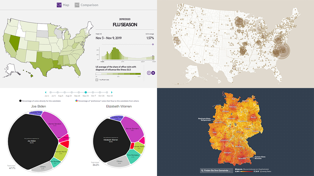 Hardly a day goes by without new visualizations appearing around the internet, providing insight into data about various things, big and small. Every week, we curate some of the most interesting ones to meet you with them within the framework of our regular DataViz Weekly feature. Enjoy and get inspired by information graphics examples on the following subjects in our new selection of cool visual data projects:
- Preferential polling for the Democratic presidential primaries — Swayable
- Rent prices in Germany — Zeit Online
- Flu season in the United States — athenaInsight
- Thanksgiving harvest origins — Esri’s StoryMaps team
- Categories: Data Visualization Weekly
- No Comments »
Charting Data About Retirement Savings, Warren’s Plans, California Housing, and UK Election — DataViz Weekly
November 15th, 2019 by AnyChart Team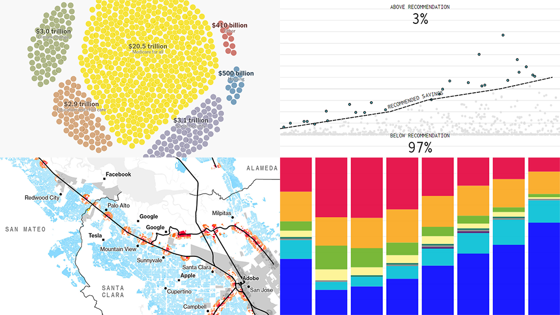 It’s Friday, which means we are ready to share with you new awesome examples of charting in action. Look how powerful the right visualization can be when one needs to explore or communicate various statistics. Here’s a quick list of the projects presented in this new DataViz Weekly post — we’ve found them out there these days:
- Saving for retirement in the United States — FlowingData
- Costs of Elizabeth Warren’s policy plans — The New York Times
- Housing crisis in California — Bloomberg
- Voting intentions before the 2019 United Kingdom general election — CNBC
- Categories: Data Visualization Weekly
- No Comments »
Compelling Data Visualizations to Check Out This Weekend — DataViz Weekly
October 25th, 2019 by AnyChart Team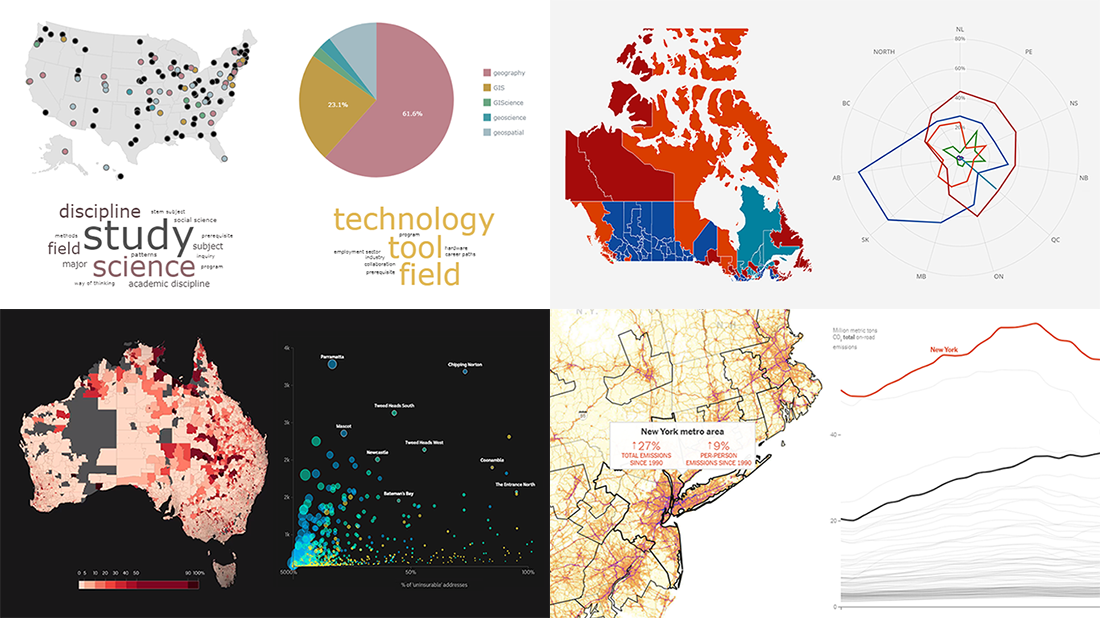 Continuing our regular DataViz Weekly feature, we invite you to check out several compelling data visualizations worth taking a look at, which we’ve noticed and enthusiastically explored these days. Here’s a quick list of the projects highlighted in the new roundup:
- Impact of climate change on the costs and availability of insurance in Australia — ABC News
- “Geography” and “GIS” in the U.S. higher education — Alicia Bradshaw, UW Tacoma
- Auto emissions in America — The New York Times
- Canadian federal election results — CBC/Radio-Canada
- Categories: Data Visualization Weekly
- No Comments »
Visualizing Diversity and Absence in Schools, Child Mortality, and Debate Topics — DataViz Weekly
September 20th, 2019 by AnyChart Team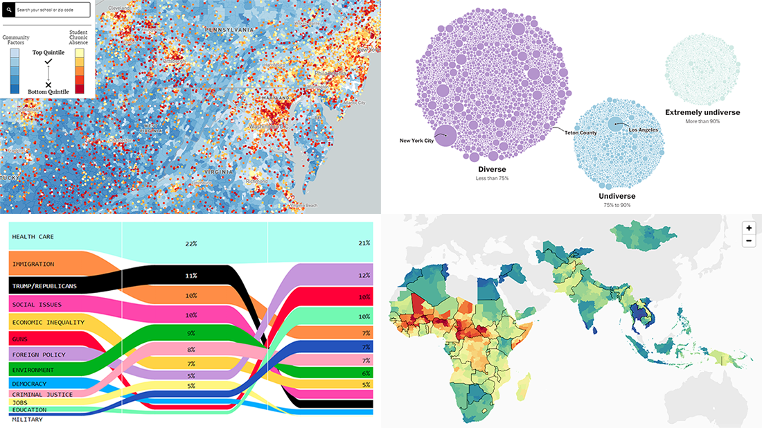 Enjoy new awesome chart examples! The following cool projects visualizing diversity and integration, presidential debate topics, and more have captured our attention this week, and we’re excited to feature them now within the framework of the DataViz Weekly series on AnyChart Blog:
- Chronic absence in U.S. schools
- Racial diversity across all America’s school districts
- Child mortality in low-to-middle-income countries
- Top issues discussed at the first three Democratic debates
- Categories: Data Visualization Weekly
- No Comments »
Graphics Visualizations About Immigration, Elections, Pitchers, and Salinity — DataViz Weekly
May 17th, 2019 by AnyChart Team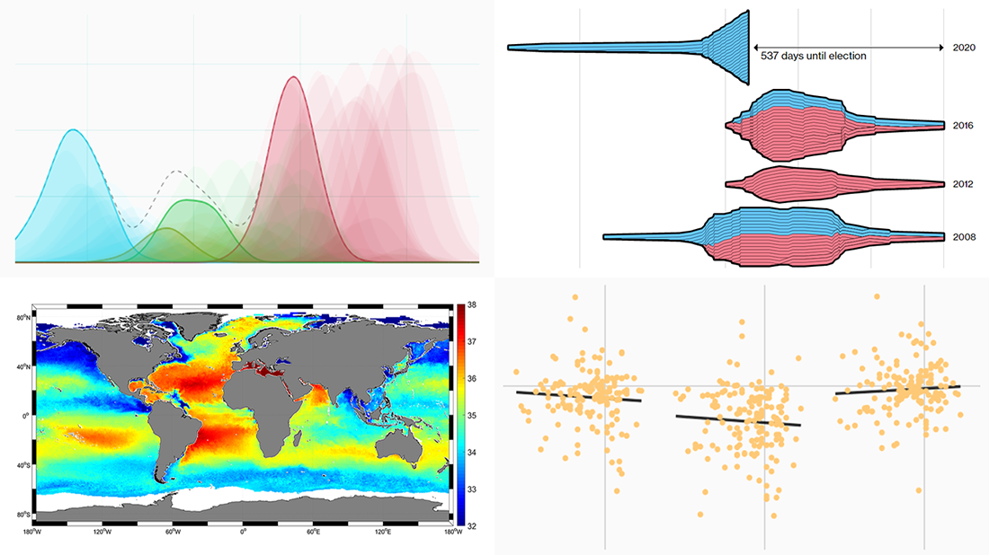 New DataViz Weekly is here, highlighting some of the new cool graphics visualizations we found around the web just recently:
- Finding a link between undocumented immigration and crime in the United States
- Competition in the U.S. presidential elections since 1980
- MLB pitchers’ pitch distribution
- Sea-surface salinity
- Categories: Data Visualization Weekly
- No Comments »
Data Analytics and Visualization Examples Worth Seeing: High Street, Neighborhoods, Trains, Climate — DataViz Weekly
February 8th, 2019 by AnyChart Team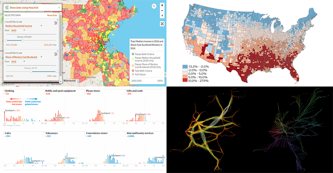 Check out new interesting data analytics and visualization examples from around the web. Here are the topics in the focus of today’s DataViz Weekly:
- high-street crisis in town centers across England and Wales;
- interactive maps of changes in Greater Boston’s neighborhoods;
- connectivity between train stations in the Netherlands;
- economic costs of climate change vs election results in the United States.
- Categories: Data Visualization Weekly
- No Comments »
2018 Midterm Election Results in Data Visualization — DataViz Weekly
November 9th, 2018 by AnyChart Team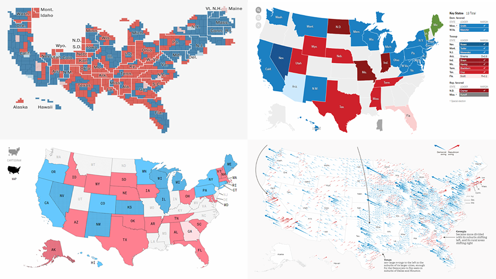 The 2018 midterm election in the United States of America has been among the hottest topics on the media agenda for quite a long time. Various publications were covering the course of the House, Senate, and governor campaigns, sharing forecasts from analysts, and so on. Now that voting is over, all eyes are on the outcome.
Today’s DataViz Weekly will show you how several prominent publications communicated the results of the midterms to their readers with the help of data visualization techniques: The New York Times, The Washington Post, Bloomberg, and The Guardian. So get ready for a lot of choropleth maps! But not only.
- Categories: Data Visualization Weekly
- 1 Comment »