Creating Interactive Network Graph Using JavaScript with Ease
April 18th, 2024 by Taylor Brooks Creating a vibrant network graph in JavaScript might seem like crafting a digital cosmos: intricate, fascinating, yet entirely within reach. Whether you’re aiming to illustrate the complex interconnections within a galaxy, a social network, or the internal hierarchy of a multinational corporation, network graphs serve as a powerful tool to bring data to life, revealing hidden patterns and insights through visual representation.
Let’s embark on a journey to demystify the process, guiding you step-by-step on how to construct your very own network graph, with the Solar System as our illustrative example.
Read the JS charting tutorial »
- Categories: AnyChart Charting Component, HTML5, JavaScript, JavaScript Chart Tutorials, Tips and Tricks
- No Comments »
Creating Calendar Charts with JavaScript
March 4th, 2024 by Nick Gogin Building an interactive calendar chart from scratch may initially seem daunting and time-consuming. However, I'm here to show you it's not only manageable but straightforward once you know the steps. Whether you're developing a scheduling application, tracking events, or looking to enhance your web page with a sleek calendar graphic, this tutorial is designed specifically for you. I'll guide you through the steps to create impressive interactive calendar charts using JavaScript, simplifying what may seem complex.
We'll delve into this process using a JavaScript charting library. As a support engineer at AnyChart, and with our JS library recently named best in data visualization, it was a natural choice to use our tool for this tutorial. What about the example data? Other tutorials! There's a treasure trove of JS charting tutorials on our blog, and it occurred to me that compiling these tutorials into a calendar chart would serve as a unique, engaging, and practical example for this guide.
Therefore, the calendar chart created by the end of this tutorial will offer a concise overview of all tutorials published on the AnyChart blog over the last four years, enabling you to quickly discover the ones that interest you the most. All aboard, fellow web developers and data enthusiasts!
Read the JS charting tutorial »
- Categories: AnyChart Charting Component, HTML5, JavaScript, JavaScript Chart Tutorials, Tips and Tricks
- No Comments »
OHLC Chart: Understanding & Creating in JavaScript Step-by-Step
November 13th, 2023 by Awan Shrestha Unearthing insights from vast datasets is an intricate blend of art and science. In the realm of financial analysis, a pivotal instrument for visually exploring complex data is the Open-High-Low-Close (OHLC) chart. This tutorial is your roadmap to swiftly crafting your OHLC chart using JavaScript, a step-by-step journey. We’ll harness S&P 500 data, and by the end of this article, you’ll possess the skills to orchestrate visual stock analysis adeptly.
Read the JS charting tutorial »
- Categories: AnyChart Charting Component, AnyStock, Big Data, Business Intelligence, Financial Charts, HTML5, JavaScript, JavaScript Chart Tutorials, Stock Charts, Tips and Tricks
- No Comments »
Building Waterfall Charts in JS
November 2nd, 2023 by Awan Shrestha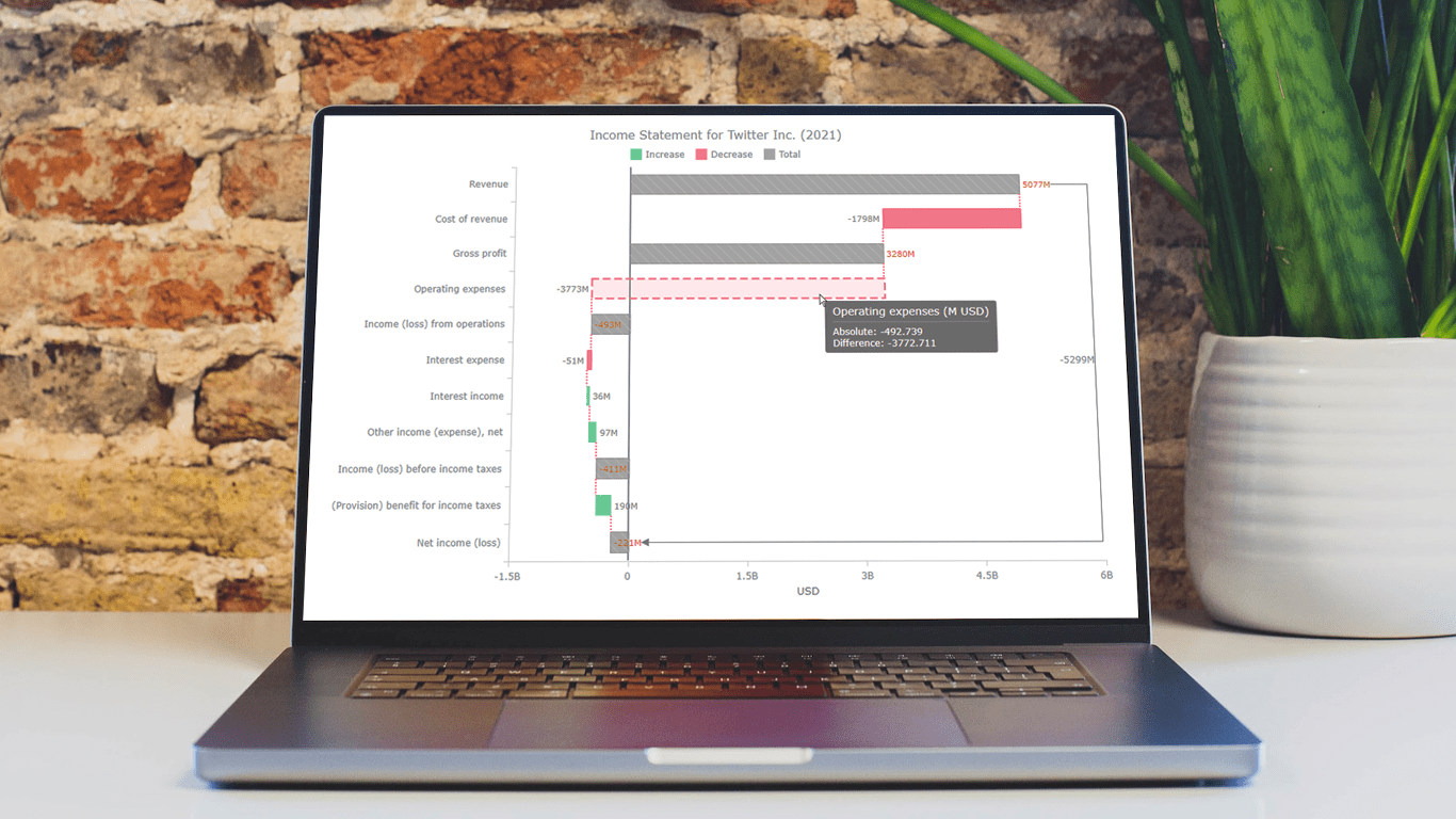 Data visualization is an essential tool for understanding complex data sets and effectively conveying insights. Among the various types of charts and graphs used for this purpose, the waterfall chart stands out as a powerful way to represent changes in financial data, such as revenue, expenses, and profits over a specific period.
In this tutorial, we'll explore how to create a waterfall chart using JavaScript. To illustrate the process, we'll use the example of an income statement for a company, in this case, Twitter Inc.’s latest (and last) one.
Whether it’s to analyze a company's financial performance, project budgets, or inventory fluctuations, this step-by-step guide will help you easily create a useful interactive JS-based waterfall chart.
Read the JS charting tutorial »
- Categories: AnyChart Charting Component, Big Data, Business Intelligence, HTML5, JavaScript, JavaScript Chart Tutorials, Tips and Tricks
- No Comments »
Nobel Laureates’ Countries, or Making Tag Cloud with JavaScript
October 3rd, 2023 by Awan Shrestha The Nobel Prize 2023 announcements are just around the corner, scheduled from October 2 to 9. Recently, I stumbled upon this news, sparking my interest in Nobel laureates and their countries of origin.
This curiosity led me to the comprehensive list of Nobel Prize winners on Britannica, which I transformed into an interactive tag cloud (or word cloud) using JavaScript, providing an elegant means to explore and uncover the countries with the highest number of Nobel laureates throughout history.
During this process, it dawned on me that this visualization could serve as an excellent illustrative example for a tutorial on creating interactive JS-based tag clouds. So, if you share my curiosity about Nobel laureates by country, you’re in for a treat right below! and if you’re eager to learn how I brought this tag cloud to life — and, therefore, how you can create your own — read on!
Read the JS charting tutorial »
- Categories: AnyChart Charting Component, Big Data, HTML5, JavaScript, JavaScript Chart Tutorials, Tips and Tricks
- No Comments »
Stock Chart Creation in JavaScript: Step-by-Step Guide
September 5th, 2023 by Shachee Swadia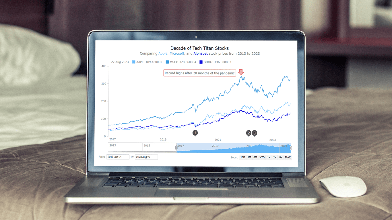 Chances are, you’ve come across various stock charts, whether you’re a seasoned trader or not. If crafting your data graphics piques your interest, you’re in the right place. Welcome to this user-friendly tutorial on building an interactive stock chart using JavaScript!
The JS stock chart we’ll create by the end of this guide will visually compare stock prices for three tech giants — Apple, Microsoft, and Google (Alphabet) — over the past decade. It’s a robust example to illustrate the stock charting process and the power of market data visualization.
So, hop on board as we explore the world of stock charts and learn how to create one from scratch.
Read the JS charting tutorial »
- Categories: AnyChart Charting Component, AnyStock, Big Data, Financial Charts, HTML5, JavaScript, JavaScript Chart Tutorials, Stock Charts, Tips and Tricks
- No Comments »
Creating Dynamic Linear Gauge for Real-Time Typing Speed Test Data Visualization: Using JavaScript
August 17th, 2023 by Nick Gogin From clocks to weight scales, speedometers to thermostats, and even the battery charge icon on your phone, Gauge Charts are widely used to represent a value on a scale or range, providing a clear visual indication of the represented measurement. Gauges can be circular or linear, and in this article, our focus will be on the latter style. I will guide you on how to create a cool linear gauge using JavaScript.
Specifically, we will explore the demonstration of linear gauges using an example of a real-time typing speed test. Throughout the article, we will delve into the structure of linear gauges, discuss styling options, explore how they can be connected to data, and show how you can easily build your Linear Gauges using JavaScript in just a matter of minutes. By the end of the tutorial, you’ll have an awesome example of a linear gauge used to dynamically illustrate typing speed test results or whichever data you want.
So, let’s dive in and elevate your web-based interactive data visualization game!
Read the JS charting tutorial »
- Categories: AnyChart Charting Component, Big Data, Charts and Art, HTML5, JavaScript, JavaScript Chart Tutorials, Tips and Tricks
- No Comments »
Building Bubble Chart with JavaScript
August 1st, 2023 by Awan Shrestha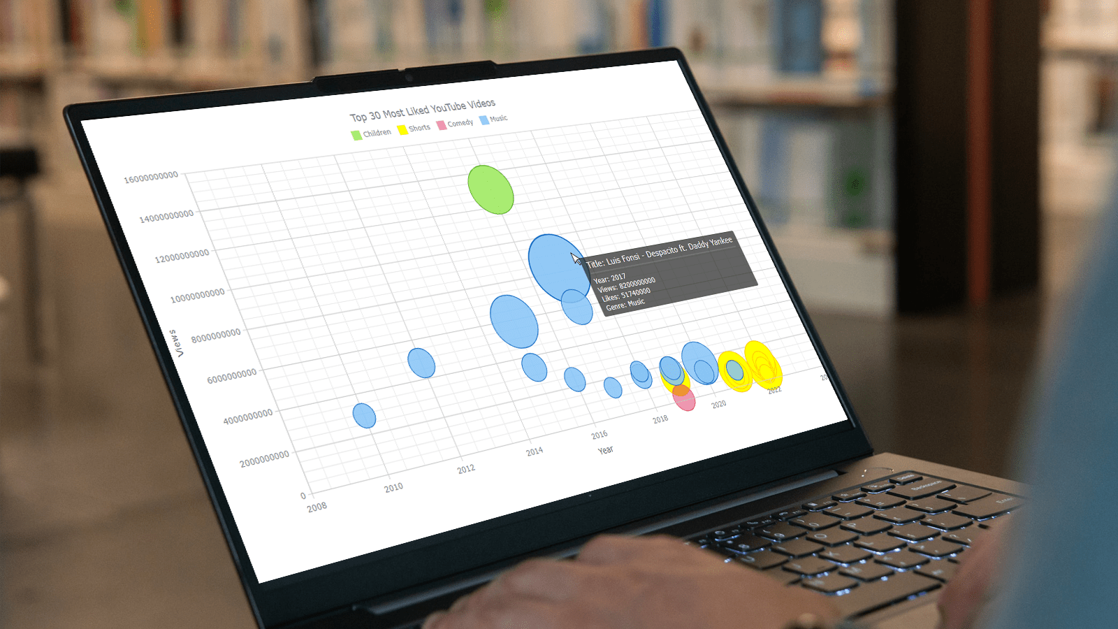 Do you want to turn that data chaos into a comprehensible data show? Look no further than data visualization! And let me tell you, one chart to rule them all is the bubble chart. It's like blowing bubbles at your data and watching them pop into understanding! And the best part? With JavaScript, you can easily create an interactive bubble chart, and I will show you how!
Bubble charts are versatile data visualizations that display data points in the form of bubbles, where the bubbles' size, color, and position represent different variables. In this tutorial, I'll walk you through building these graphics step by step, making the process a breeze. For illustration, we'll take data on the popularity of various YouTube videos and use JavaScript to create an interactive bubble chart showcasing the top 30 most-liked videos of all time, categorized by year of release, views, and likes.
By the end of this tutorial, you'll be able to create visually-stunning JS-based bubble charts without any hassle. So let's dive into the world of data bubbles and turn numbers into a visual feast for the eyes!
Read the JS charting tutorial »
- Categories: AnyChart Charting Component, Big Data, Business Intelligence, HTML5, JavaScript, JavaScript Chart Tutorials, Tips and Tricks
- No Comments »
How to Visualize Data with Pareto Charts Using JavaScript
July 11th, 2023 by Shachee Swadia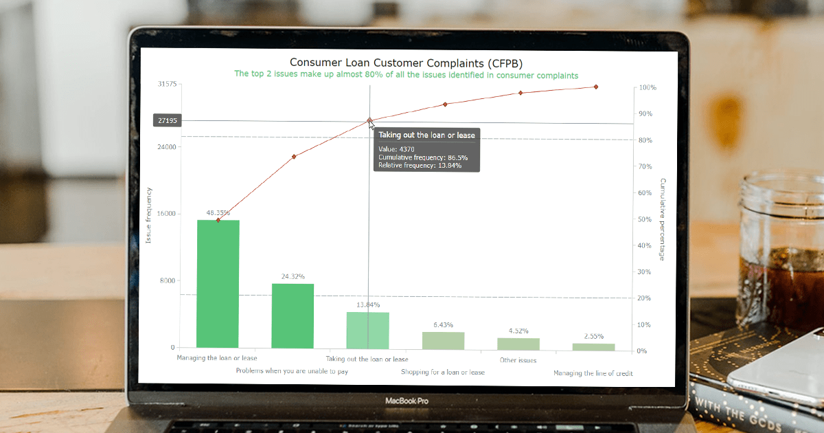 Welcome to this step-by-step tutorial that will empower you to create an interactive Pareto chart using JavaScript that will look nice on any device and in any browser!
A Pareto chart is a captivating graphical combo representation that showcases individual values through descending bars, while a line graph illustrates the cumulative total. It is a powerful tool highlighting the relative importance of different categories within a dataset. Named after the visionary economist Vilfredo Pareto, the Pareto chart embodies the Pareto principle, also known as the 80/20 rule. This principle reveals that approximately 80% of effects stem from a mere 20% of causes. With their ability to pinpoint the most significant elements driving a specific scenario, Pareto charts have become indispensable in certain areas of data analysis.
Every chart needs data, and for this tutorial, I have chosen a dataset to serve as an example for illustration. Together, we will embark on a journey to visualize the major customer complaints for consumer loans in a Pareto chart, demonstrating how easily you can achieve it at every step. So get ready, and let’s dive into the world of Pareto charts and create our own interactive masterpiece!
Read the JS charting tutorial »
- Categories: AnyChart Charting Component, Big Data, Business Intelligence, HTML5, JavaScript, JavaScript Chart Tutorials, Tips and Tricks
- No Comments »
Freiheit Gruppe Uses AnyChart JS to Visually Organize Berliners’ Ideas for Berlin University Alliance
July 5th, 2023 by AnyChart Team Data visualization is a game-changer when it comes to exploring and making sense of data. And here at AnyChart, we’re passionate about making the development of interactive charts a breeze. Our award-winning JavaScript charting library is not only trusted by the big players in enterprise data intelligence systems, with over 75% of Fortune 500 companies relying on it. It is a go-to choice for thousands of developers worldwide who want to easily create awesome visualizations for their – and their clients’ – websites and apps.
Recently, we discovered a stunning sunburst chart powered by AnyChart on the website of the Berlin University Alliance. This diagram effectively organizes the ideas submitted by Berliners within the framework of the #Berlinforschtmit project, which calls upon the local community to tip scientists regarding new research topics. These collective efforts aim to make significant contributions toward enhancing the quality of life in the city.
We’ve had the pleasure of having a quick conversation with Björn Knetter from Freiheit Gruppe, the team responsible for the design and technical implementation of #Berlinforschtmit. He told us more about this innovative initiative and how they leverage AnyChart for impactful data visualization. All aboard for our quick interview!
- Categories: AnyChart Charting Component, Big Data, HTML5, JavaScript, Success Stories
- No Comments »