 Chances are, you’ve come across various stock charts, whether you’re a seasoned trader or not. If crafting your data graphics piques your interest, you’re in the right place. Welcome to this user-friendly tutorial on building an interactive stock chart using JavaScript!
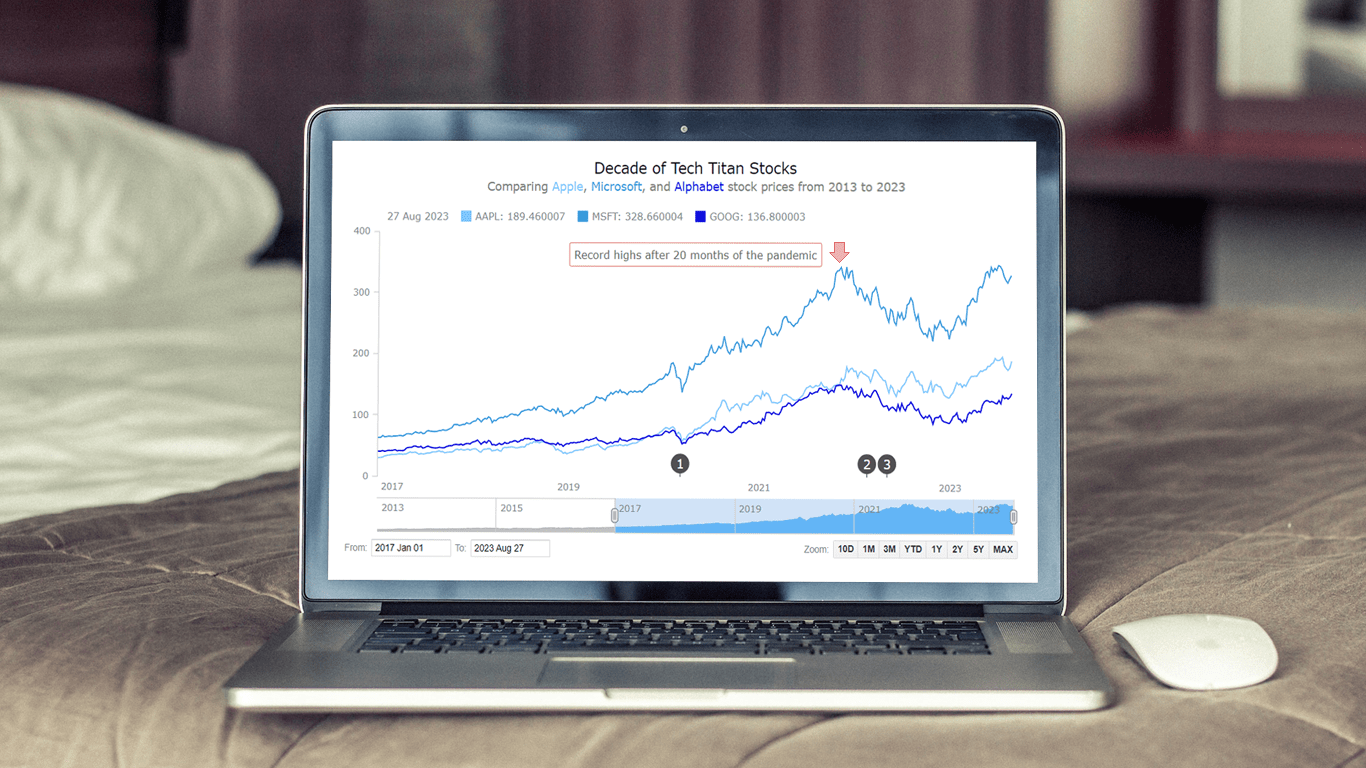
The JS stock chart we’ll create by the end of this guide will visually compare stock prices for three tech giants — Apple, Microsoft, and Google (Alphabet) — over the past decade. It’s a robust example to illustrate the stock charting process and the power of market data visualization.
So, hop on board as we explore the world of stock charts and learn how to create one from scratch.
Understanding Stock Charts
At its essence, a stock chart is a visual representation that encapsulates the movements and trends in the price of financial instruments, including a listed company’s stocks. These graphical tools play a pivotal role in the financial world, serving as windows into the dynamic realm of markets. Mapping out historical data points, stock charts provide valuable insights into how financial instruments have performed over a specified period.
Offering a snapshot of price fluctuations, trading volumes, and other critical information, stock charts aid analysts, investors, and traders in making informed decisions. They facilitate the identification of patterns, trends, support and resistance levels, and potential trading opportunities.
In the realm of financial data visualization, stock charts serve as powerful instruments that transform raw numbers into comprehensible narratives. In the upcoming sections, we’ll leverage JavaScript to construct our very own interactive stock chart, gaining a firsthand understanding of how these visualizations come to life.
Stock Chart We’ll Build
Before we proceed, take a moment to preview the anticipated appearance of the final JS stock chart. As we embark on this journey, I’ll guide you through creating an interactive stock chart, complete with event markers, annotations, and more.
Building JS Stock Chart
Building a stock chart might initially appear intricate, but I’m here to demonstrate how straightforward it can be. Much like you wouldn’t want to miss the opening bell of the trading day, I encourage you to focus your attention here. We’re about to embark on the journey of crafting our own interactive JavaScript-based stock chart. So, let’s roll up our sleeves and initiate the process of bringing this type of visualization to life.
1. Setting up an HTML container
Let’s start by creating an HTML container to house our stock chart. We’ll set up a basic web page (feel free to use an existing one) and insert a <div> element with a unique ID to serve as the chart’s rendering area. Specifying the width and height of this block element as 100% will ensure the chart occupies the entire screen.
<!DOCTYPE html>
<html>
<head>
  <title>Stock Chart (JS)</title>
</head>
<body>
  <div id="container" style="width: 100%; height: 100%;"></div>
</body>
</html>
2. Including necessary scripts
Next, we need to incorporate the relevant JavaScript and CSS files into the <head> section of the HTML page.
For this tutorial, I am using the AnyChart library which has many cool options for JS stock charts, excellent ready-to-use stock chart examples, and great stock chart documentation to get you started.
For constructing a stock chart, we’ll include the Core and Stock modules. The Data Adapter module will make loading data from a file easy. The UI module along with the respective CSS file will be needed for user interface elements.
<!DOCTYPE html>
<html>
<head>
  <title>Stock Chart (JS)</title>
  <script src="https://cdn.anychart.com/releases/8.11.1/js/anychart-core.min.js"></script>
  <script src="https://cdn.anychart.com/releases/8.11.1/js/anychart-stock.min.js"></script>
  <script src="https://cdn.anychart.com/releases/8.11.1/js/anychart/data-adapter.min.js"></script>
  <script src="https://cdn.anychart.com/releases/8.11.1/js/anychart/ui.min.js"></script>
  <link href="https://cdn.anychart.com/releases/8.11.1/css/anychart-ui.min.css" type="text/css" rel="stylesheet">
</head>
<body>
  <div id="container" style="width: 100%; height: 100%;"></div>
    // Your chart code will go here
  </script>
</body>
</html>
3. Preparing the data
Now, let’s connect our data. I have already taken stock price data for the three tech companies (Apple, Microsoft, and Google (Alphabet)) from Yahoo Finance as three CSV data files. We’ll load them using the anychart.data.loadCsvFile() function:
// for apple
anychart.data.loadCsvFile("https://cdn.anychart.com/csv-data/AAPL.csv", function (appleData) {
  // for microsoft
  anychart.data.loadCsvFile("https://cdn.anychart.com/csv-data/MSFT.csv", function (msData) {
    // for alphabet (google)
    anychart.data.loadCsvFile("https://cdn.anychart.com/csv-data/GOOG.csv", function (googleData) {
    });
  });
});
4. Writing the JavaScript charting code
Now that our foundation is set, let’s move on to writing the JavaScript code that will bring our stock chart visualization to life.
First, we’ll encapsulate the code within the anychart.onDocumentReady() function, ensuring it executes only when the page is fully loaded.
<script type="text/javascript">
  anychart.onDocumentReady(function() {
    // Your chart drawing code will go here
  });
</script>
Next, we’ll add the CSV files as shown in the previous step and create three data tables, one for each tech company:
// load stock data:
// for apple
anychart.data.loadCsvFile("https://cdn.anychart.com/csv-data/AAPL.csv", function (appleData) {
  // for microsoft
  anychart.data.loadCsvFile("https://cdn.anychart.com/csv-data/MSFT.csv", function (msData) {
    // for alphabet (google)
    anychart.data.loadCsvFile("https://cdn.anychart.com/csv-data/GOOG.csv", function (googleData) {
      // create data tables:
      // for apple
      let appleDataTable = anychart.data.table();
      appleDataTable.addData(appleData);
      // for microsoft
      let msftDataTable = anychart.data.table();
      msftDataTable.addData(msData);
      // for alphabet (google)
      let googleDataTable = anychart.data.table();
      googleDataTable.addData(googleData);
    });
  });
});
With the data tables in place, let’s proceed to create a stock chart instance and add plots for each of the tech stocks with area series (check out the list of all available stock series types, including OHLC, candlestick, column, etc., and choose a different one if you want).
It’s essential to map the data points before rendering the chart. Stock data usually includes four values: open, high, low, and close. We’ll specifically use the close value for our area graphs and map it to each series. Additionally, we’ll assign names to the series to identify each tech giant.
// create a stock chart
let chart = anychart.stock();
// create three stock plots with area series:
// for apple
let firstPlot = chart.plot(0);
let appleSeries = firstPlot.area(
  appleDataTable.mapAs({ value: 4 })
);
appleSeries.name("AAPL");
// for microsoft
let secondPlot = chart.plot(1);
let msftSeries = secondPlot.area(
  msftDataTable.mapAs({ value: 4 })
);
msftSeries.name("MSFT");
// for alphabet (google)
let thirdPlot = chart.plot(2);
let googleSeries = thirdPlot.area(
  googleDataTable.mapAs({ value: 4 })
);
googleSeries.name("GOOG”);
Congratulations! We’ve successfully crafted an elegant JavaScript-based stock chart that visually represents the stock price data of the three tech giants over a decade. Check it out with the complete code and feel free to experiment here.
Basically, you’re now equipped to build your own interactive stock charts using JavaScript. However, don’t stop here—this is just the starting point. Let’s delve into customizing this chart further, enhancing its visual appeal with some more JS code.
Customizing JS Stock Chart
Now, let’s use some helpful additional features and customization options to enhance the stock chart’s appearance and functionality. We’ll change the series type and combine all the series in a single plot, create a scroller series, add event markers and annotations, and enhance the chart title.
1. Combining the series in one plot
Instead of having separate plots for each stock, combining them into one plot can provide a cleaner and more unified visualization. By doing this, we can easily compare their price movements.
We’ll represent each series as a line graph with distinct colors for better differentiation.
let plot = chart.plot(0);
  plot
    .line()
    .name("AAPL")
    .data(appleDataTable.mapAs({ value: 4 }))
    .stroke("1.5 #7CC7FF");
  plot
    .line()
    .name("MSFT")
    .data(msftDataTable.mapAs({ value: 4 }))
    .stroke("1.5 #3498DB");
  plot
    .line()
    .name("GOOG")
    .data(googleDataTable.mapAs({ value: 4 }))
    .stroke("1.5 #0000DD");
2. Adding a scroller series
The scroller element is a valuable navigational UI control. Automatically added to all stock charts, it offers users an efficient way to explore. The scroller can accommodate a series.
For example, let’s introduce a scroller series utilizing MSFT (Microsoft) stock data.
chart.scroller().area(msftDataTable.mapAs({ value: 4 }));
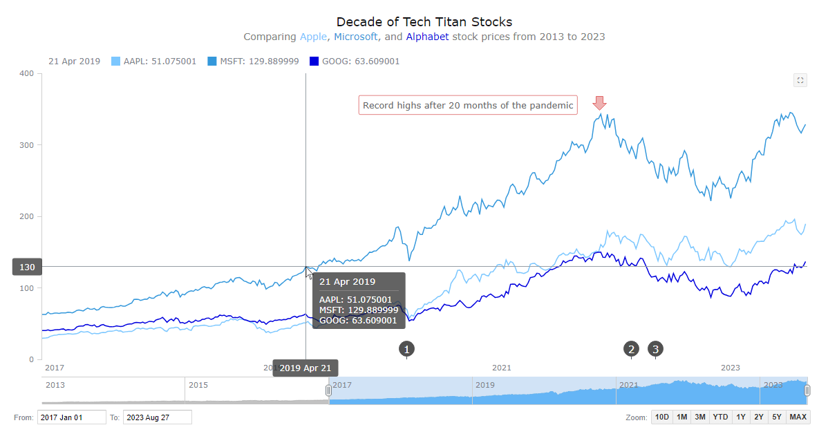
3. Setting the date range UI
To enhance the stock chart’s user experience and provide greater control over data exploration, let’s implement UI controls for date range selection, making it easy to select specific time periods to narrow the focus to certain intervals for analysis.
We’ll add a range selector for quick period selection and a range picker that lets you input start and end dates directly. Let’s also predefine a custom range that will be shown by default.
// create a date range ui:
// picker
let rangePicker = anychart.ui.rangePicker();
rangePicker.render(chart);
// selector
let rangeSelector = anychart.ui.rangeSelector();
rangeSelector.render(chart);
chart.selectRange("2017-01-01", "2023-09-01");
4. Adding event markers
Now, allow me to introduce another cool enhancement for our JS stock chart. It’s essential to recognize that various events can impact stock prices, and seamlessly integrating event markers into the chart can be effortlessly achieved.
The process is simple: We’ll input the event data and create markers to highlight the respective events.
// access the object
let eventMarkers = plot.eventMarkers();
// set the symbol
plot.eventMarkers().format(function () {
  return this.getData("symbol");
});
// set the data
eventMarkers.data([
  {
    symbol: "1",
    date: "2020-03-11",
    description: "COVID-19 declared a global pandemic by the WHO"
  },
  {
    symbol: "2",
    date: "2022-02-24",
    description: "Ukraine attacked by Russia"
  },
  {
    symbol: "3",
    date: "2022-05-10",
    description: "Start of the 2022 crypto winter"
  }
]);
5. Adding annotations
Annotations within a stock chart are visual components strategically employed to emphasize and draw attention to particular points, trends, and more.
For example, let’s focus on showcasing the notable occurrence of record-high tech stock prices reached 20 months after the onset of the pandemic. To explore diverse annotation possibilities, take advantage of the demo.
// access the object
let controller = plot.annotations();
// create a marker annotation
let marker = controller.marker({
  xAnchor: "2021-11-11",
  valueAnchor: 368,
  markerType: 'arrow-down',
  size: 20,
  offsetY: 0,
  offsetX: 0
});
// create a label annotation
controller
  .label()
  .xAnchor("2021-09-01")
  .valueAnchor(374)
  .anchor("right-top")
  .offsetY(5)
  .padding(6)
  .text("Record-highs after 20 months of the pandemic")
  .fontColor("#666")
  .background({
    fill: "#fff 0.65",
    stroke: "0.5 #c20000",
    corners: 2
  }
);
6. Improving the chart title
To conclude, we’ll elevate the stock chart title. By altering the font style and incorporating a sub-title using HTML, we can achieve a more compelling visual presentation.
chart
  .title()
  .enabled(true)
  .useHtml(true)
  .text(
    '<span style = "color: #111; font-size:18px; margin-bottom:15px; dy:20px">Decade of Tech Titan Stocks</span>' +
      '<br/><span style="color:grey; font-size: 14px; margin-bottom:10px;">Comparing <span style="color:#7CC7FF;">Apple</span>, <span style="color:#3498DB;">Microsoft</span>, and <span style="color:#0000DD;">Alphabet</span> stock prices from 2013 to 2023</span>'
  );
With these enhancements in place, we’ve completed the process of customizing our stock chart. Now, let’s take a look at the final result of our efforts. If you’re interested in accessing all the HTML, CSS, and JS code, you can find it here. Our stock chart is now not only visually engaging but also equipped with interactive features for insightful data exploration.
Conclusion
This tutorial has highlighted how straightforward it is to create a compelling and informative stock chart using JavaScript (HTML5). Feel free to experiment and customize it further as you like. For instance, why not display some technical indicators for technical analysis?
While the stock market’s trajectory may remain uncertain, mastering the art of creating interactive stock charts is undoubtedly a valuable addition to your web data visualization development skill set.
Feel free to reach out if you have any questions. Happy stock charting!
We are thankful to Shachee Swadia for contributing this awesome tutorial as a guest post for our blog.
Don’t miss more JavaScript charting tutorials.
Got an idea for a cool guest post? Let’s make it work!
- Categories: AnyChart Charting Component, AnyStock, Big Data, Financial Charts, HTML5, JavaScript, JavaScript Chart Tutorials, Stock Charts, Tips and Tricks
- No Comments »