New Election Maps to Check Out — DataViz Weekly
October 14th, 2022 by AnyChart Team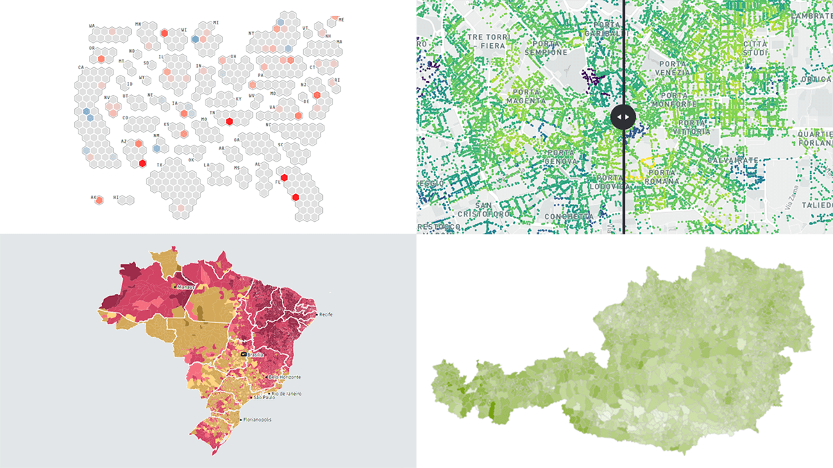 Some of the election races scheduled for this fall have already ended. Others are yet to be decided. And obviously now is a time for election maps to shine again! In this DataViz Weekly piece, we highlight a selection of maps visualizing data on the recent votes in Italy, Austria, and Brazil, as well as the upcoming midterm elections in the United States. Take a look.
- Categories: Data Visualization Weekly
- No Comments »
How to Create Word Tree Using JavaScript
October 14th, 2022 by Awan Shrestha It is a pure fact that a graphical or pictorial representation of data, known as a data visualization, conveys information faster than raw data in arrays, spreadsheets, or dense reports. Charts make data easier to understand, which further helps to quickly develop valuable insights. Interesting, right? Now, let’s have a look at one chart type called a word tree and see how to build it with ease.
A word tree is a data visualization form designed to show multiple parallel sequences of words (or phrases) as they appear in a text. Analyzing texts becomes easier with word trees as they display, by means of a branching structure, how selected words are connected to others.
In this tutorial, I will walk you through the process of creating a beautiful word tree chart with JavaScript (HTML5). The text being visualized will be the famous speech “I Have a Dream” by minister and civil rights activist Martin Luther King Jr. Each step will be explained in detail, and you’ll see everything is pretty simple. Sit tight and enjoy the learning!
Read the JS charting tutorial »
- Categories: AnyChart Charting Component, HTML5, JavaScript, JavaScript Chart Tutorials, Tips and Tricks
- No Comments »
Interesting Recent Graphics Demonstrating Power of Effective Data Visualization — DataViz Weekly
September 30th, 2022 by AnyChart Team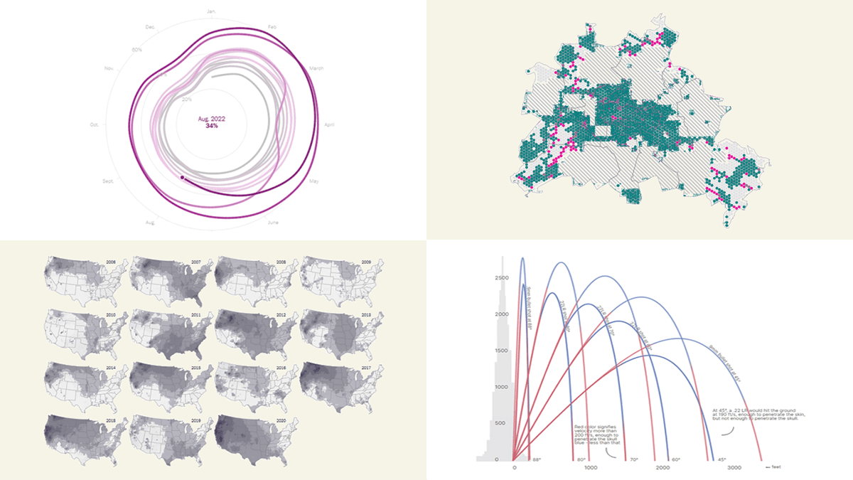 Effective data visualization makes it easy to discover trends and patterns hidden in the data. Now for several years, DataViz Weekly has been showing you real-world examples demonstrating how that can work in practice. The following projects are in the spotlight today:
- U.S. housing market trends — The Washington Post
- Wildfire smoke pollution across the U.S. — The New York Times
- Physics of celebratory gunfire — 1POINT21 Interactive
- Cars in Berlin — Hans Hack
- Categories: Data Visualization Weekly
- No Comments »
Vasari Diagram Visualizes Wikipedia Networks of Painters with AnyChart JS
September 29th, 2022 by AnyChart Team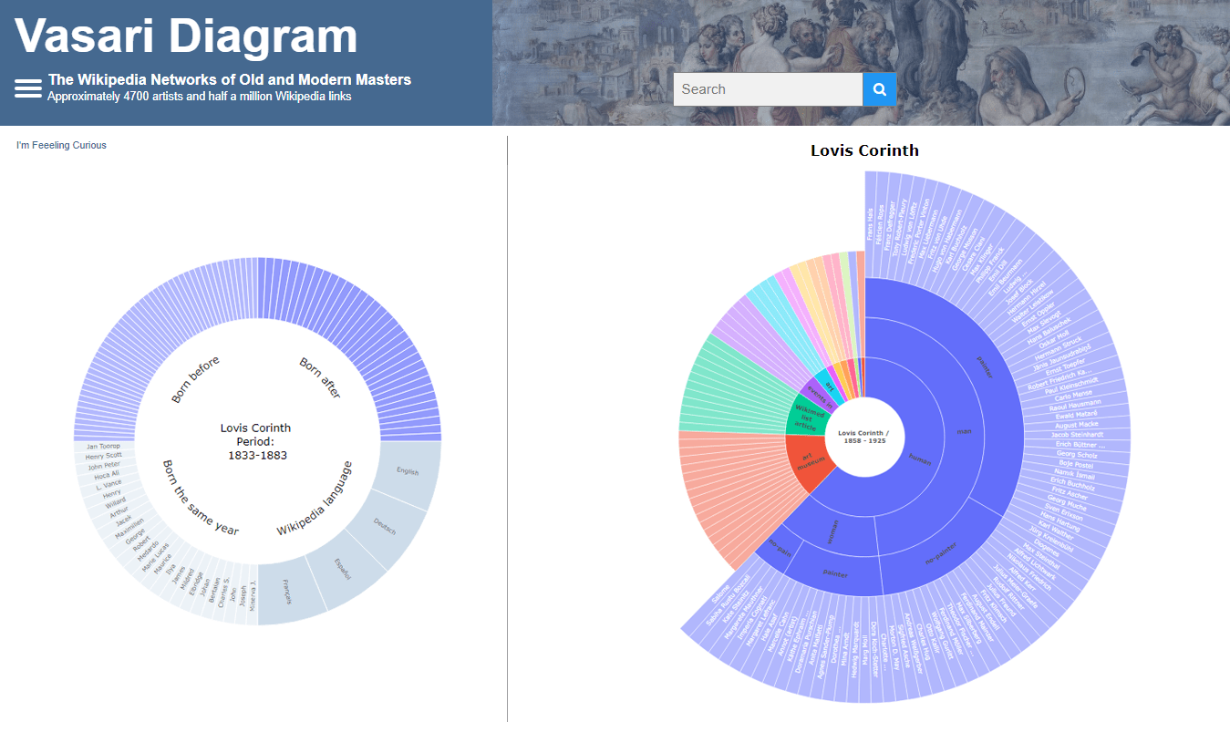 There are numerous cases where our customers first picked a different JavaScript charting library to operate data visualization in their projects but then could not get absolutely what they wanted, and in the end, switched to AnyChart and are happy with their new and final choice. Here is one of such examples.
Francis Lapique and Temenuzhka Dimova ended up using our Sunburst Chart solution in their Vasari Diagram, a fascinating asset for art history researchers and enthusiasts. This project lets anyone explore which people and topics various painters are connected with.
Read our interview where Francis describes the Vasari Diagram project and how AnyChart is used, and check it out!
- Categories: AnyChart Charting Component, Big Data, Charts and Art, HTML5, JavaScript, Success Stories
- No Comments »
Data on American Birds, Ukrainian Children, Mega Warehouses, U.S. Government in Interactive Visualizations — DataViz Weekly
September 23rd, 2022 by AnyChart Team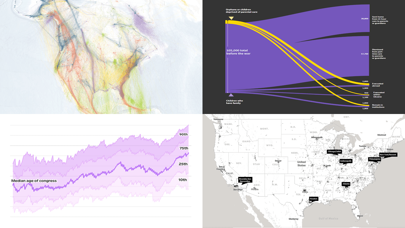 DataViz Weekly keeps you informed of the latest data visualizations that are definitely worth seeing, from our point of view. Check out our new picks:
- American bird migration — Audubon
- Ukrainian children dismissed from residential care institutions — Reuters
- Mega warehouses and their impacts — Sierra
- Age of the U.S. political leaders — Insider
- Categories: Data Visualization Weekly
- No Comments »
New Data Visualization Projects You Shouldn’t Miss Out There — DataViz Weekly
September 16th, 2022 by AnyChart Team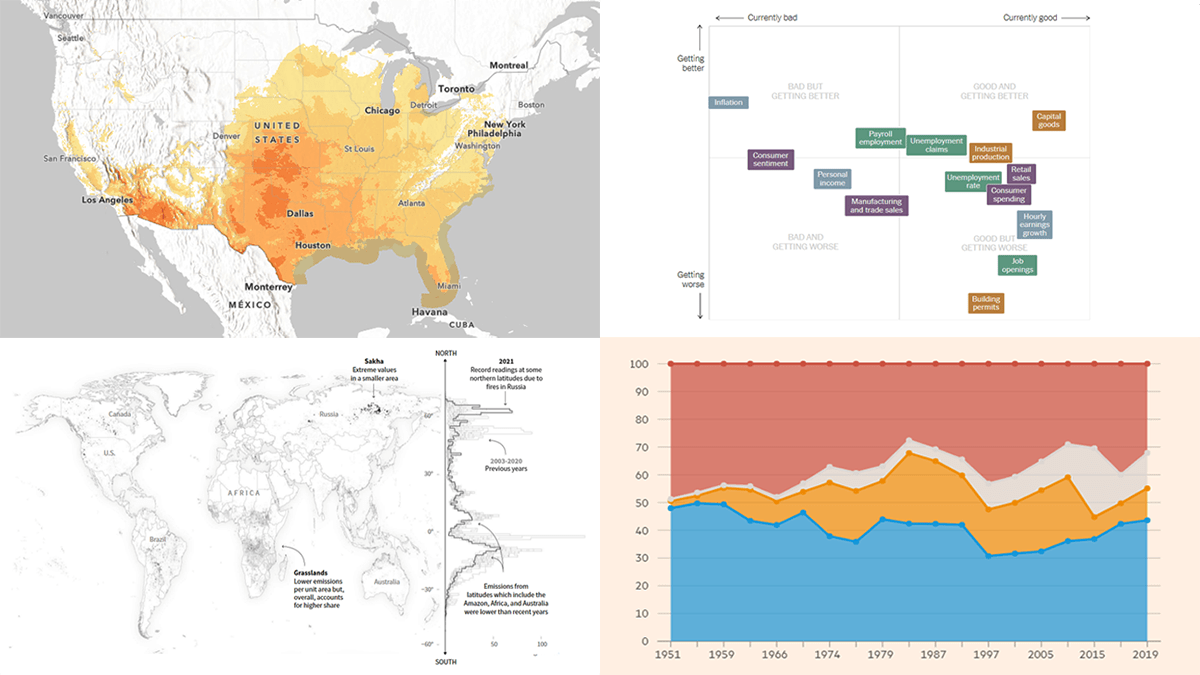 Each Friday, DataViz Weekly gives you a therapeutic dose of data visualization inspiration headed into the weekend! Here are four new projects we believe you should not miss:
- Queen Elizabeth II’s 70-year reign — The Financial Times
- Current condition of the U.S. economy — The New York Times
- Carbon emissions from Arctic wildfires — Reuters
- Local exposure to climate-related hazards across the U.S. — Esri for NOAA
- Categories: Data Visualization Weekly
- No Comments »
Making Line Chart — and Step Line Chart — in JavaScript
September 14th, 2022 by Shachee Swadia Data visualization is a vast field with so many different types of charts to learn and create. But there are several basic, evergreen graphs that every data designer and web developer dealing with analytics should know how to build. One of them is a Line Chart (or Line Graph). It’s primarily designed to represent data over time.
You can follow along with this tutorial to learn how to quickly create beautiful interactive line (and step-line) charts using JavaScript. We’ll look at some cool examples and build them step by step, which will make the process both clear and entertaining.
For your convenience, you can find all of them on CodePen [and on AnyChart Playground] so you could play with the line charting code further without limits.
Read the JS charting tutorial »
- Categories: AnyChart Charting Component, HTML5, JavaScript, JavaScript Chart Tutorials, Tips and Tricks
- No Comments »
New Examples of Charts Enabling Effective Visual Data Exploration — DataViz Weekly
September 9th, 2022 by AnyChart Team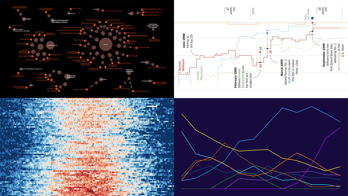 DataViz Weekly is back with a quick look at some of the most interesting new examples of charts that enable effective visual data exploration. Here are the projects featured this time:
- Producers of Russian military equipment — Texty
- Wins, losses, and comebacks in Serena Williams’s professional tennis career — The Washington Post
- Tropical nights in Spain over the decades — elDiario.es
- Platform origins of viral memes — Know Your Meme
- Categories: Data Visualization Weekly
- No Comments »
Creating Circle Packing Chart with JavaScript
September 8th, 2022 by Awan Shrestha A circle packing chart is a common data visualization technique for representing hierarchically organized data through nested circles. Due to the similarity to a treemap, which uses nested rectangles for the same purpose, sometimes it is called a circular treemap. Introduced to data analysis by American mathematician William Thurston in 1985, circle packings greatly reveal the hierarchical structure of data.
I want to show how you can easily build an elegant interactive circle packing chart with the help of JavaScript! In this step-by-step tutorial, we will be representing the world’s 100 wealthiest people in 2022 by country and industry, according to Forbes’ list of billionaires. So, get your packings done and get ready as your brain is going to get slightly richer!
Read the JS charting tutorial »
- Categories: AnyChart Charting Component, HTML5, JavaScript, JavaScript Chart Tutorials, Tips and Tricks
- 1 Comment »
Most Stunning Recent Data Representations — DataViz Weekly
September 2nd, 2022 by AnyChart Team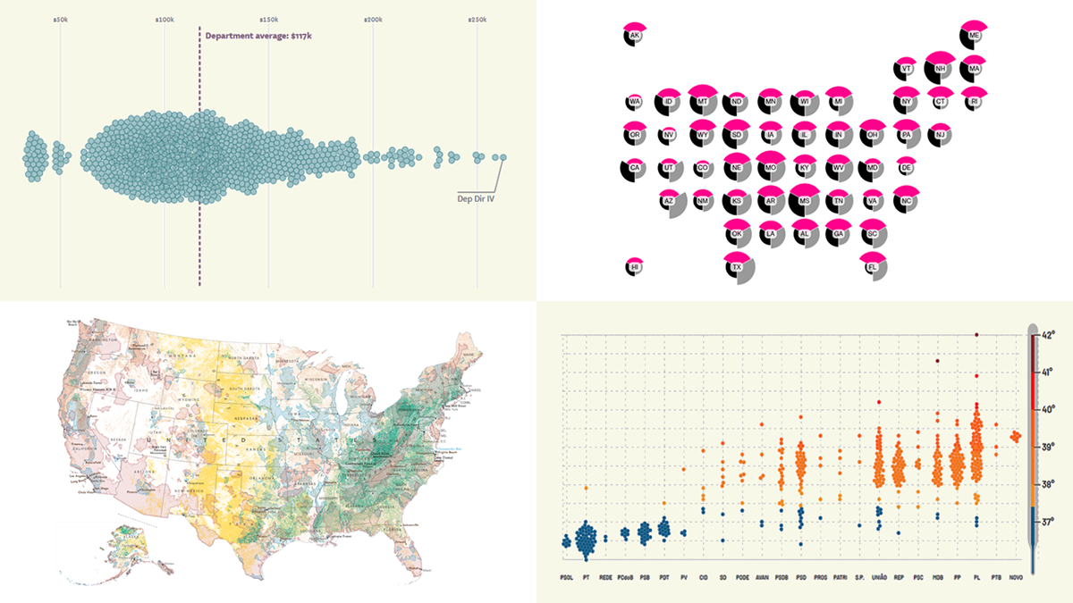 Hey y’all fans of charts and maps! It’s time for DataViz Weekly where we traditionally show you the most stunning data representations we have recently come across! See our newest picks and check them out right away:
- Salary of full-time employees in San Francisco’s government — The San Francisco Chronicle
- Vulnerability to political election interference across the United States — Bloomberg
- Brazilian federal deputies’ performance on socio-environmental issues — Repórter Brasil
- The most important places to conserve in the U.S. — National Geographic
- Categories: Data Visualization Weekly
- No Comments »