 Hey y’all fans of charts and maps! It’s time for DataViz Weekly where we traditionally show you the most stunning data representations we have recently come across! See our newest picks and check them out right away:
- Salary of full-time employees in San Francisco’s government — The San Francisco Chronicle
- Vulnerability to political election interference across the United States — Bloomberg
- Brazilian federal deputies’ performance on socio-environmental issues — Repórter Brasil
- The most important places to conserve in the U.S. — National Geographic
Data Visualization Weekly: August 26, 2022 — September 2, 2022
Salary of Full-Time Employees in San Francisco’s Government
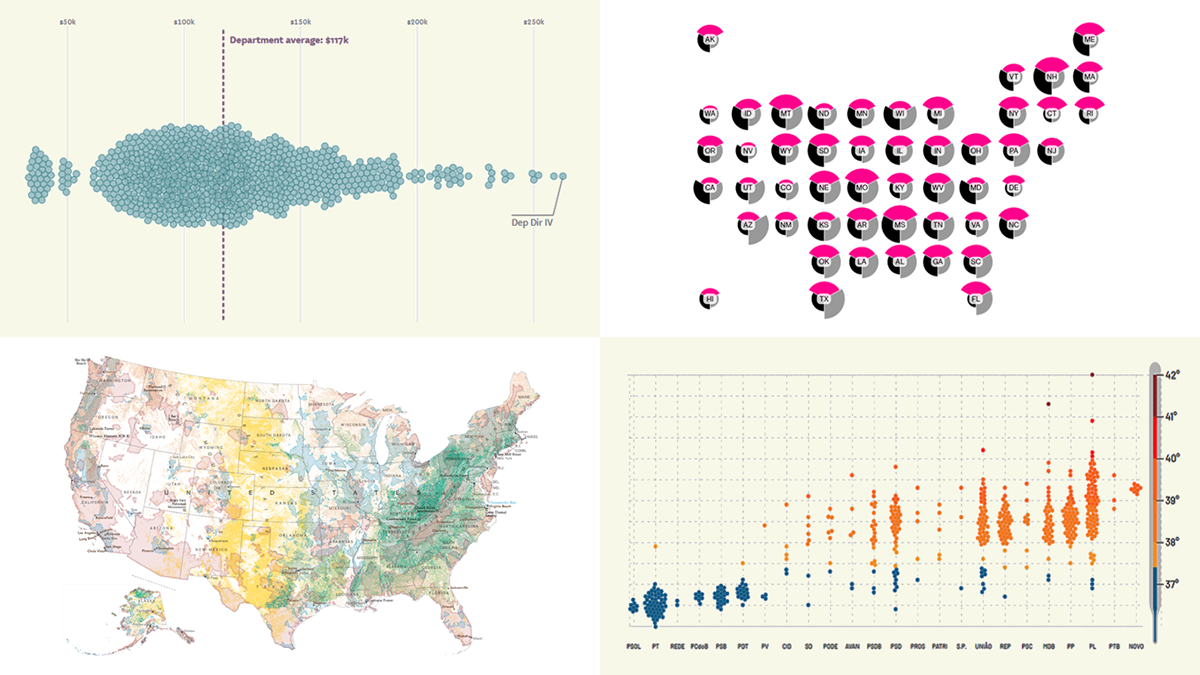
Last year, the highest-paid employee in the government of San Francisco earned $601,610. And it’s not Mayor London Breed (who made $351,116).
The San Francisco Chronicle published a story where Nami Sumida is looking into the earnings of full-time public workers across the S.F. government’s 50 city and county departments during the 2020-2021 fiscal year. The analysis is based on data from the Controller’s Office and covers those 21,000 employees who worked not less than 2,080 hours.
The interactive chart displayed at the beginning of the article shows the total salary of each of them as a dot, department by department. Hover over a dot to see the worker’s name and job title in the tooltip. There is also a separate graphic comparing pay ranges across departments.
Check out the charts and the story — and explore how much the S.F. public employees made in 2020-2021 — on the S.F. Chronicle.
Vulnerability to Political Election Interference Across U.S.
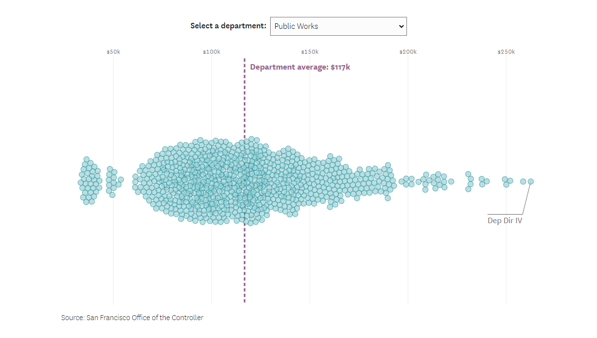
Some American politicians who continue to insist that Donald Trump did not lose in 2020 are currently candidates for offices that could determine how the next U.S. presidential election will be decided. What if they attempt to cheat? Is there really a chance that the outcome of the 2024 election can be not what voters intend?
Bloomberg examined the laws and bills related to elections to determine how vulnerable each state is to political interference. States were judged based on the ease to register and vote, the degree of security and reliability of the count, and how likely officials will try to cheat. The results are represented in the U.S. Election Risk Index project with the help of visual graphics by Paul Murray, Allison McCartney, and Mira Rojanasakul.
There is a diagram for each state. Details on all benchmarks are provided below. Click on a state to learn more about it on its individual page.
Look at the election risk explorer on Bloomberg.
Brazilian Federal Deputies’ Performance on Socio-Environmental Issues
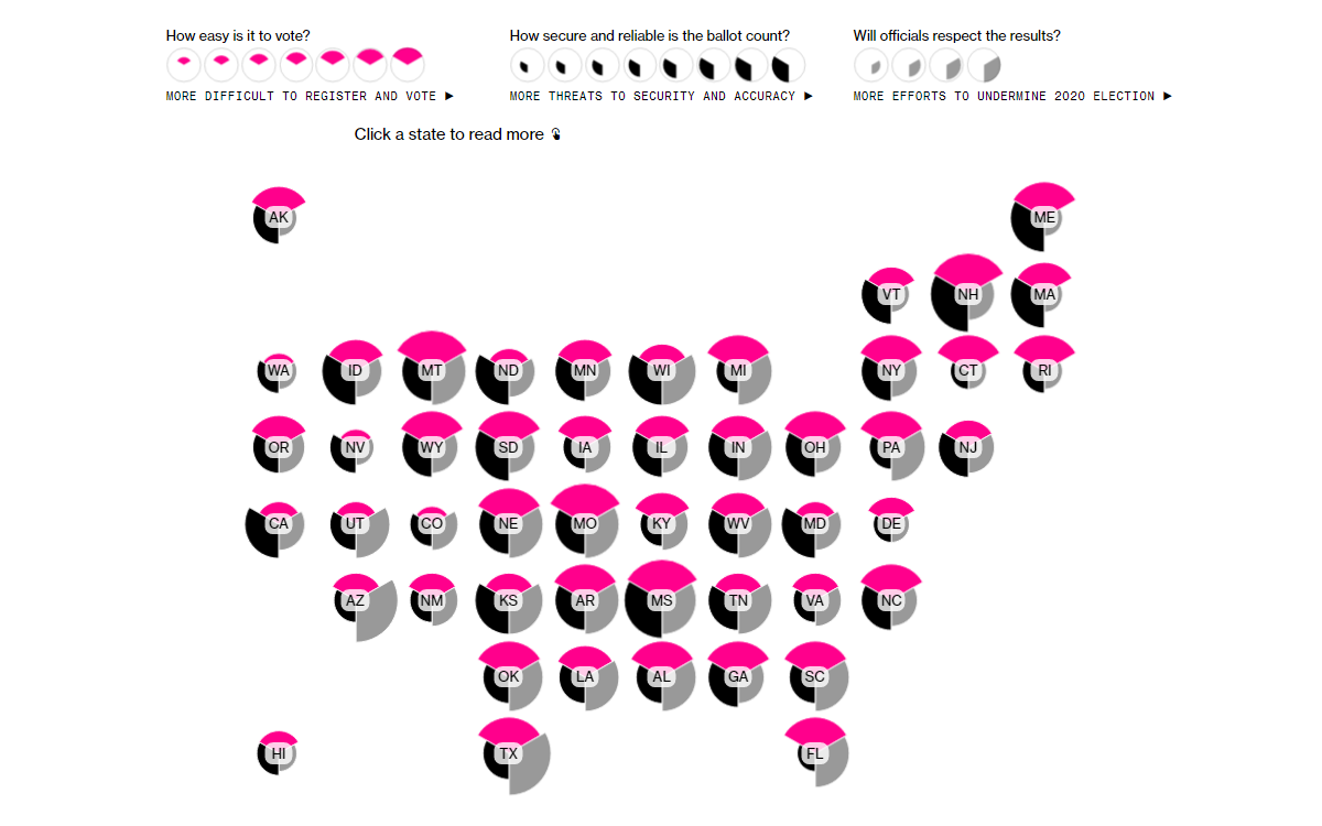
68% of Brazil’s Chamber of Deputies, the lower house of the National Congress of Brazil, work against the environment, rural workers, and indigenous people. That is according to Ruralómetro 2022.
Built by Repórter Brasil, Ruralómetro 2022 is an interactive data visualization tool measuring the performance of Brazilian federal deputies on those issues, including how they voted and what kind of bills they presented. Each individual has a score based on a human body temperature scale, in the range from 36°C to 42°C.
Scores above 37.4°C indicate “rural fever,” which means unfavorable performance. The worse the impact of the bills proposed or voted for by a deputy, the higher their “temperature.”
See Ruralómetro 2022 on Repórter Brasil’s website.
Most Important Areas to Conserve in U.S.
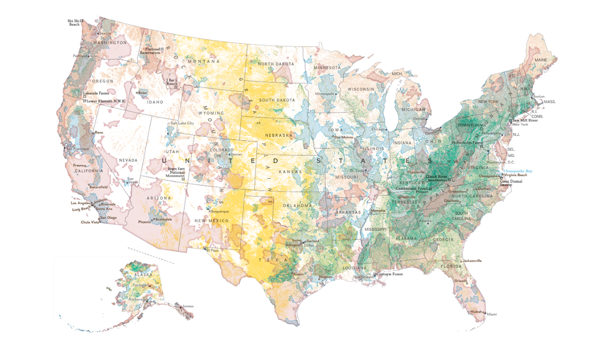
To keep our planet flourishing, we need to protect its land and water. Some areas are especially important in that regard and should be cared about first of all.
National Geographic published maps that display priority territories in the U.S. where scientists believe conservation would provide the biggest benefit to nature (and people), based on four major environmental objectives: providing clean drinking water, trapping carbon dioxide, saving wildlife, and preserving ecosystem diversity. In the map you see above, all those areas are shown at once. This visualization makes it visible at a glance that land or water in just about every part of America falls into at least one of those categories requiring conservation.
Take a closer look at this map in this story by Monica Serrano, Matthew W. Chwastyk, and Marty Schnure on National Geographic. There, you’ll also find separate maps for each category and can find out where some of today’s most disruptive conservation efforts are made.
***
Next Friday we will introduce you to more great data visualizations. In the meantime, feel free to check out DataViz Weekly‘s previous issues.
Stay tuned!
- Categories: Data Visualization Weekly
- No Comments »