New Selection of Significant Data Visualization Examples — DataViz Weekly
February 28th, 2025 by AnyChart Team Our JavaScript charting library, Qlik Sense extensions, and other products give you the flexibility to visualize data how, where, and when you need. But making a chart or map truly effective — whether for exploration or explanation — is an art of its own. That is why we run DataViz Weekly: to share a selection of significant examples we have recently encountered, showcasing how others tackle visualization challenges across different contexts and datasets.
Here are some new examples — take a closer look and see what insights they might inspire:
- All books in the ISBN space — phyresky
- Germany’s 2025 federal election — The New York Times (and more)
- Baby boom in 7 charts — Our World in Data
- School shootings in America — Mohamad Waked
- Categories: Data Visualization Weekly
- No Comments »
Awesome New Data Visualization Works — DataViz Weekly
November 15th, 2024 by AnyChart Team Welcome back to DataViz Weekly, where we spotlight the most awesome data visualization works we have recently come across. Check out the projects we’re diving into this time:
- Love songs: death or evolution? — The Pudding
- Historical dry streaks in NYC — Bloomberg Green
- NYC subway ridership in detail — Subway Stories
- Vote swings in U.S. presidential elections — NYT
- Categories: Data Visualization Weekly
- No Comments »
27 Election Maps of 2024 U.S. Presidential Vote Results — DataViz Weekly Special Edition
November 8th, 2024 by AnyChart Team The 2024 U.S. presidential election has concluded, and media outlets worldwide are offering a plethora of data graphics to convey the election results. In this special edition of DataViz Weekly, we’ve curated a collection of over twenty election maps, showcasing diverse ways to represent voting data — cartograms, choropleth maps, bubble maps, and more. Whether you’re a data enthusiast, professional, or simply intrigued by the 2024 election outcomes, explore the latest U.S. election maps from top media!
? Also see our previous special editions with election maps: 2020 U.S. election maps and 2024 UK election maps.
- Categories: AnyMap, Dashboards, Data Visualization Weekly
- No Comments »
Discovering Fresh Compelling Visual Data Stories — DataViz Weekly
September 20th, 2024 by AnyChart Team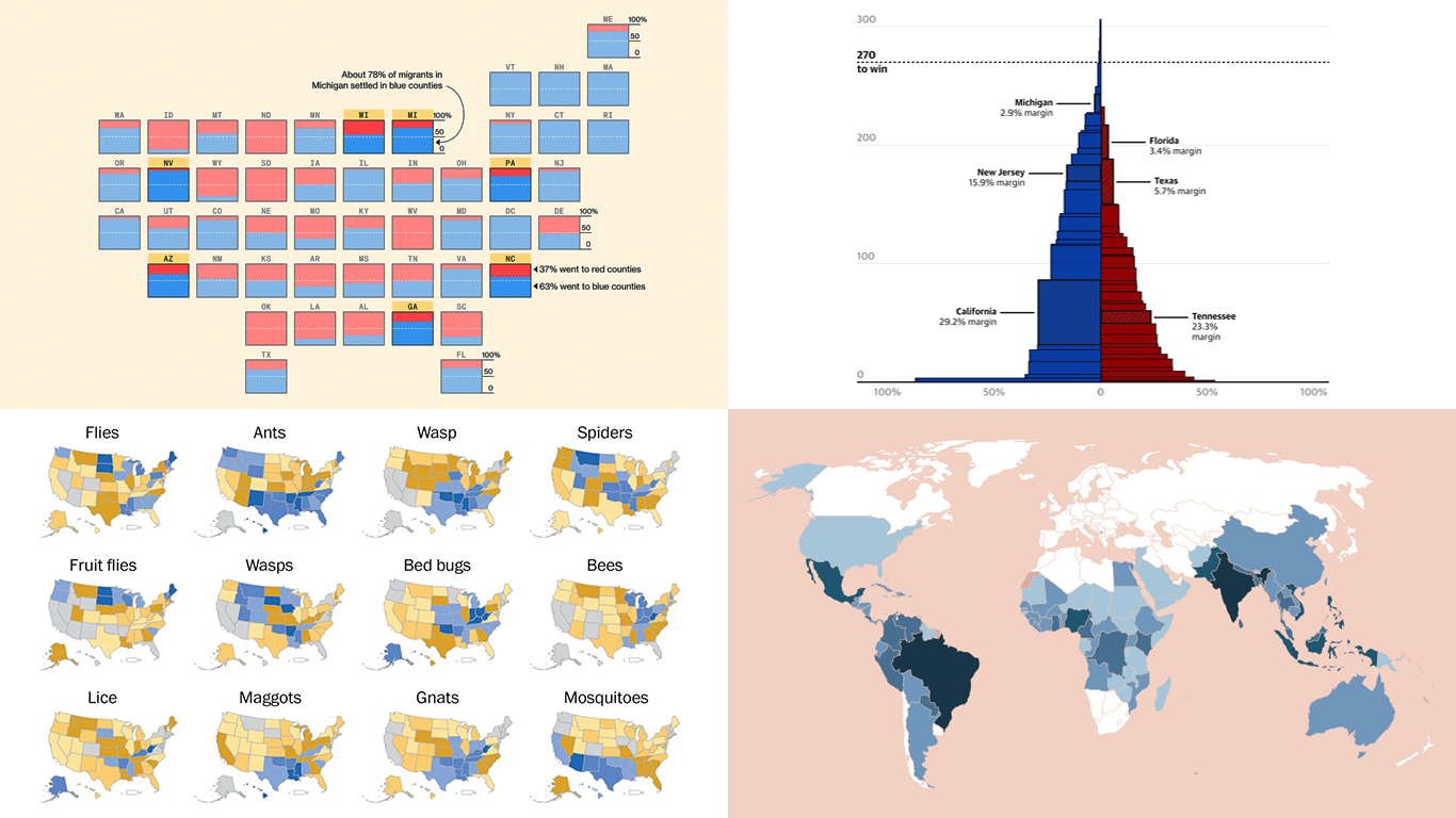 When properly visualized, data comes to life and reveals the stories hidden within the numbers. In this edition of DataViz Weekly, we showcase a selection of new projects that present data in compelling and insightful ways. Let’s dive into the visual data stories that caught our attention this week.
- Neglected tropical diseases — Nexo
- Migrants in U.S. swing states — Bloomberg
- Decisive votes in U.S. presidential elections — The Guardian
- What Americans are searching to kill — The Washington Post
- Categories: Data Visualization Weekly
- No Comments »
2024 UK Election Maps — DataViz Weekly
July 8th, 2024 by AnyChart Team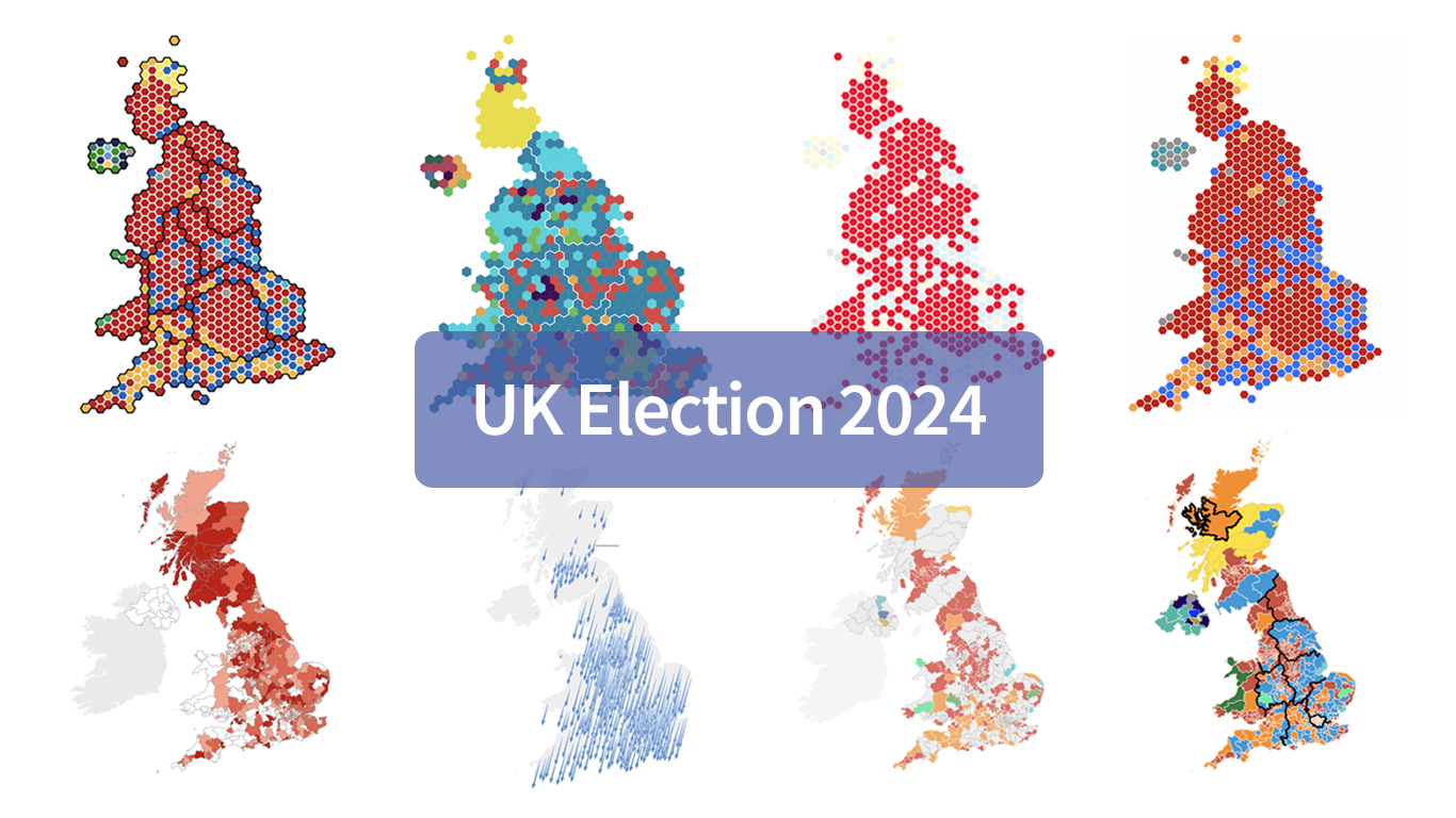 Last Thursday’s 2024 United Kingdom general election resulted in a historic shift within the nation’s political landscape, marking the Conservatives’ most severe defeat in nearly two centuries. As people look for clarity on these changes, election maps have come to the forefront as effective visual tools to make sense of voting outcomes and underlying patterns.
In this special edition of DataViz Weekly, we present a quick overview of UK election maps from prestigious sources including Sky News, The Independent, the BBC, The Financial Times, The Guardian, CNN, Open Innovations, and The New York Times, complete with links to them. Explore these data visualization projects to delve deeper into the dramatic shifts of the 2024 election, experience the power of effective electoral data mapping, and perhaps find inspiration for your own work.
? See also: 2024 U.S. Election Maps (November 2024).
- Categories: Data Visualization Weekly
- No Comments »
Revealing Insights with Data Visualizations — DataViz Weekly
June 14th, 2024 by AnyChart Team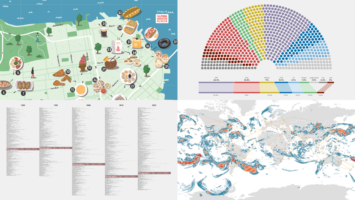 Data visualizations bridge the gap between raw numbers and clear, understandable insights. This week on DataViz Weekly, we showcase four remarkable new examples of how charts and maps illuminate diverse topics in a comprehensible and engaging manner:
- In-flight turbulence — South China Morning Post
- Shifts in occupation and income — FlowingData
- San Francisco’s culinary diversity — California Migration Museum
- EU election results — Reuters
- Categories: Data Visualization Weekly
- No Comments »
New Election Maps to Check Out — DataViz Weekly
October 14th, 2022 by AnyChart Team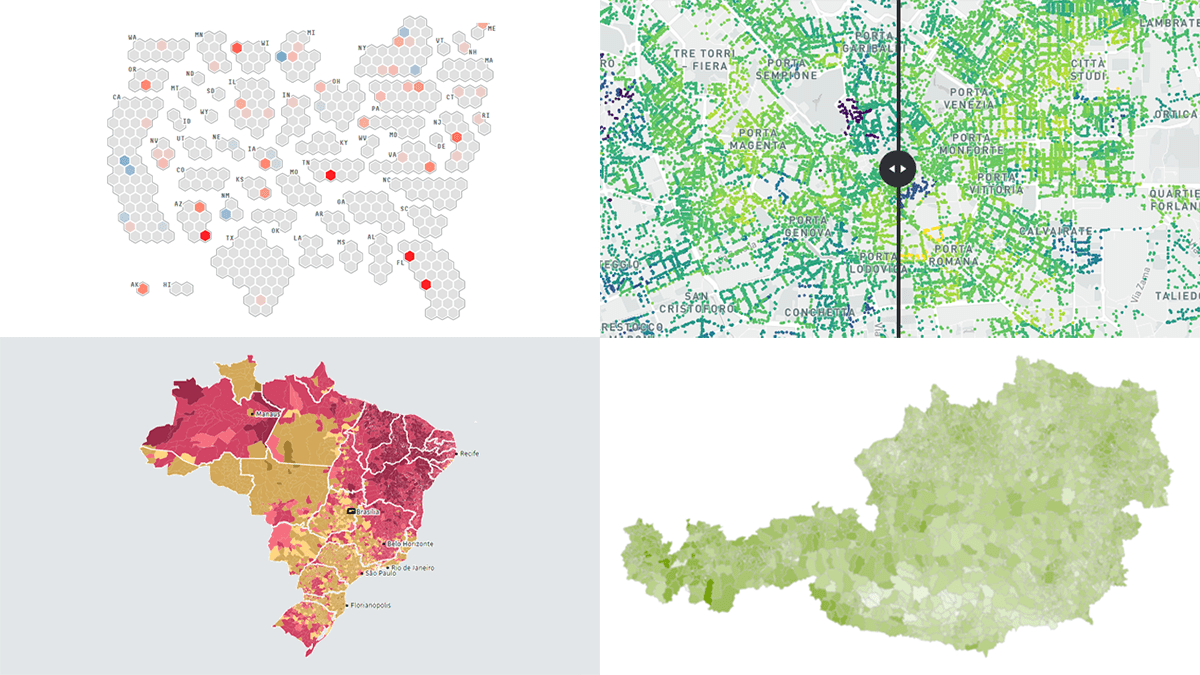 Some of the election races scheduled for this fall have already ended. Others are yet to be decided. And obviously now is a time for election maps to shine again! In this DataViz Weekly piece, we highlight a selection of maps visualizing data on the recent votes in Italy, Austria, and Brazil, as well as the upcoming midterm elections in the United States. Take a look.
- Categories: Data Visualization Weekly
- No Comments »
Most Compelling New Examples of Data Visualization in Action — DataViz Weekly
September 24th, 2021 by AnyChart Team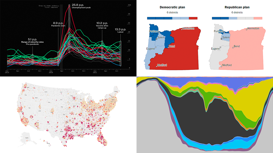 Hey everyone! It is Friday, and we are here to put a spotlight on the most compelling examples of sensible data visualization we have recently seen around the internet. As always, let’s start with a quick list and then look at each project. All aboard for DataViz Weekly!
- Intensive care unit occupancy rates in the United States — The New York Times
- Minority unemployment rates in 15 large U.S. cities. — Bloomberg
- Early proposals for congressional redistricting in Oregon, Indiana, and Colorado — The Washington Post
- Time use of American men and women by employment status — Nathan Yau
- Categories: Data Visualization Weekly
- No Comments »
Canadian Elections, Germany Under Merkel, Caracas Sounds, Night Temperatures in U.S. Cities — DataViz Weekly
September 17th, 2021 by AnyChart Team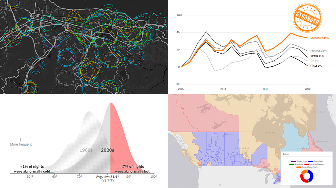 We continue to choose the most interesting out of all the newest data visualizations published here and there and show you them in weekly roundups. It’s time to look at our fresh selection! This time, the following projects are featured in DataViz Weekly:
- Canadian federal elections since 2000 — Stephen Taylor
- Germany under the 16-year leadership of Angela Merkel — Reuters
- Sounds of Caracas — Valeria Escobar
- Abnormally hot summer nights in American cities — The Upshot
- Categories: Data Visualization Weekly
- No Comments »
How to Create Bubble Map with JavaScript to Visualize Election Results
January 25th, 2021 by Shachee Swadia In these times of exponentially growing data, visualization is a necessary skillset to have in your tool box. Popular techniques include bar charts, line graphs, pie charts, and bubble maps among others.
Building interactive charts from scratch with JavaScript can be a difficult endeavor for any developer, especially someone starting out new. That is exactly why we have JS charting libraries which make it much easier and quicker to conjure up insightful visualizations!
Read on to see how I create a JavaScript Bubble Map with one of these libraries.
Read the JS charting tutorial »
- Categories: AnyChart Charting Component, AnyMap, Big Data, Charts and Art, HTML5, JavaScript, JavaScript Chart Tutorials, Tips and Tricks
- No Comments »