Exploring Data About COVID-19, Road Curvature & U.S. Elections — DataViz Weekly
October 23rd, 2020 by AnyChart Team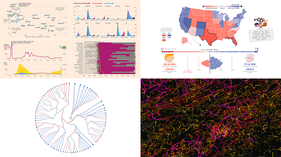 Meet a set of new amazing visualizations we’ve spotted and admired lately. Below is a list of the projects featured today on DataViz Weekly. Keep reading to learn about each and then check them out right away.
- Global COVID-19 crisis in data — FT
- Twisty roads worldwide — Adam Franco
- Ways Biden or Trump could win — FiveThirtyEight
- Electoral College Decision Tree — Kerry Rodden
- Categories: Data Visualization Weekly
- No Comments »
Fresh Examples of Data Visualization Best Practices in Action — DataViz Weekly
October 9th, 2020 by AnyChart Team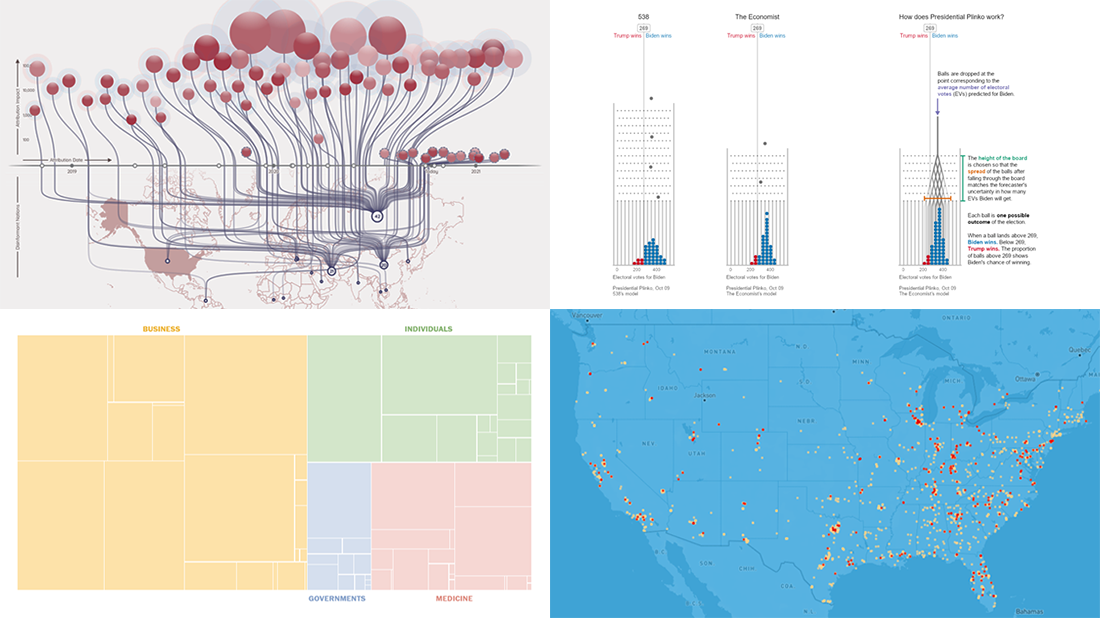 DataViz Weekly is here featuring a selection of new compelling projects with awesome charts and maps. Check out some of the coolest fresh examples of data visualization best practices in action!
- $4 trillion coronavirus bailout under the microscope — The Washington Post
- Presidential Plinko — Matthew Kay, Northwestern University
- Allegations of foreign interference in the 2020 U.S. election — DFRLab
- American streets named after athletes — ESPN
- Categories: Data Visualization Weekly
- No Comments »
New Maps and Charts Showing Power of Data Visualization — DataViz Weekly
September 11th, 2020 by AnyChart Team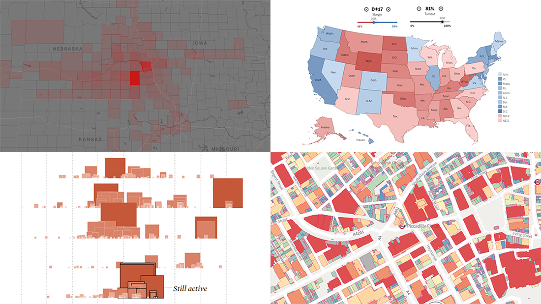 The long wait is over! DataViz Weekly is here bringing some of the best new maps and charts from all over the web to the spotlight! Look at these amazing examples that show the power of smart data visualization:
- College football fan movement and COVID-19 risk — ESPN
- California wildfires over the past 17 years — FlowingData
- London solar opportunities — UCL Energy
- Voter scenarios for the U.S. presidential election — The Washington Post
- Categories: Data Visualization Weekly
- No Comments »
Awesome Fresh Data Visualization Projects for Inspiration — DataViz Weekly
September 4th, 2020 by AnyChart Team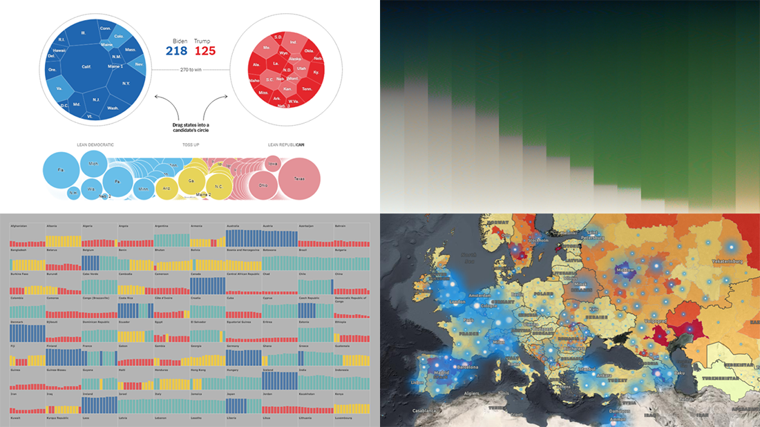 Celebrating the first Friday of September, don’t miss these awesome fresh data visualization projects for inspiration! We have recently met them around the web and are glad to introduce you to them in a quick overview. So our new picks for DataViz Weekly include:
- COVID-19 situation in Europe, a subnational view — WHO/Europe
- Potential outcomes of the U.S. presidential election — The New York Times
- State of democracy worldwide since 2006 — Preity Lodha
- Colors of the American landscape vs electoral map colors — The Upshot
- Categories: Data Visualization Weekly
- 1 Comment »
4 Great Examples of Data Visualization in Action — DataViz Weekly
August 28th, 2020 by AnyChart Team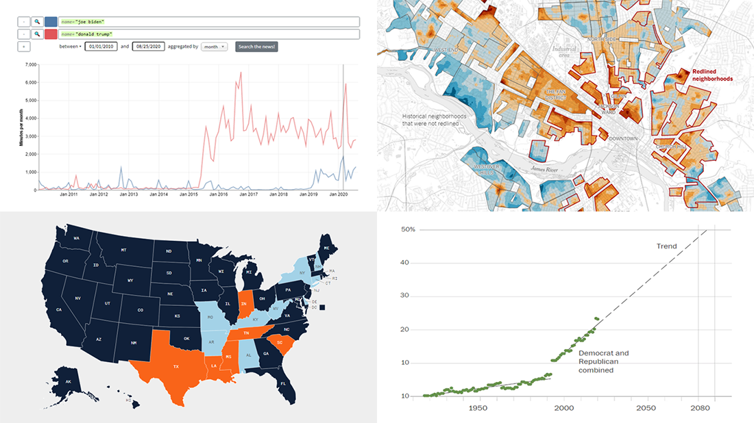 We’ve curated another four great examples of data visualization in action. Would you like to learn about them and check them out right now? Wait no longer! Below is a list of the projects highlighted in the new DataViz Weekly — just give it a glance and go ahead!
- Exploring a link between racism in the housing policy and hotter neighborhoods — The New York Times
- Analyzing the content of cable TV news — Stanford University
- Tracking gender inequality in American politics — The Washington Post
- Summarizing voting rules for the 2020 U.S. election by state — NBC News
- Categories: Data Visualization Weekly
- No Comments »
New Information Visualization Projects Not to Be Missed — DataViz Weekly
August 14th, 2020 by AnyChart Team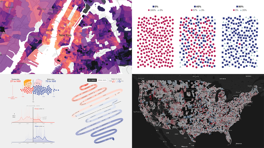 Look at these new cool information visualization projects and notice how different techniques help explore and communicate data, in practice.
Today in DataViz Weekly:
- FiveThirtyEight’s 2020 U.S. presidential election model — FiveThirtyEight
- Herd immunity simulations — The Washington Post
- Unemployment in the United States at the census tract level — The Upshot
- Home prices in America — Realbloc
- Categories: Data Visualization Weekly
- No Comments »
Fresh Visualization Projects on Super Tuesday, Cost of Living in Germany, London Cycling, and NO2 in China — DataViz Weekly
March 6th, 2020 by AnyChart Team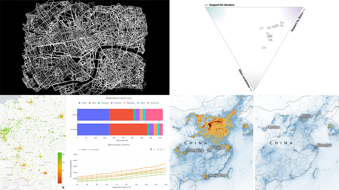 Today is Friday. We have already chosen four new stunning visualization examples and are excited to show you them! Look how powerful the right charts and maps can be when you need to explore and communicate data. Here’s a quick list of the fresh visualization projects this new DataViz Weekly blog post puts a spotlight on:
- Takeaways from Super Tuesday — The New York Times
- Cost of living in German cities — Fabian Nobis
- Cycling all streets in central London — Davis Vilums
- Nitrogen dioxide over China and Wuhan — NASA Earth Observatory
- Categories: Data Visualization Weekly
- No Comments »
Information Graphics Examples for Data About Primaries, Prices, Flu, and Thanksgiving — DataViz Weekly
November 29th, 2019 by AnyChart Team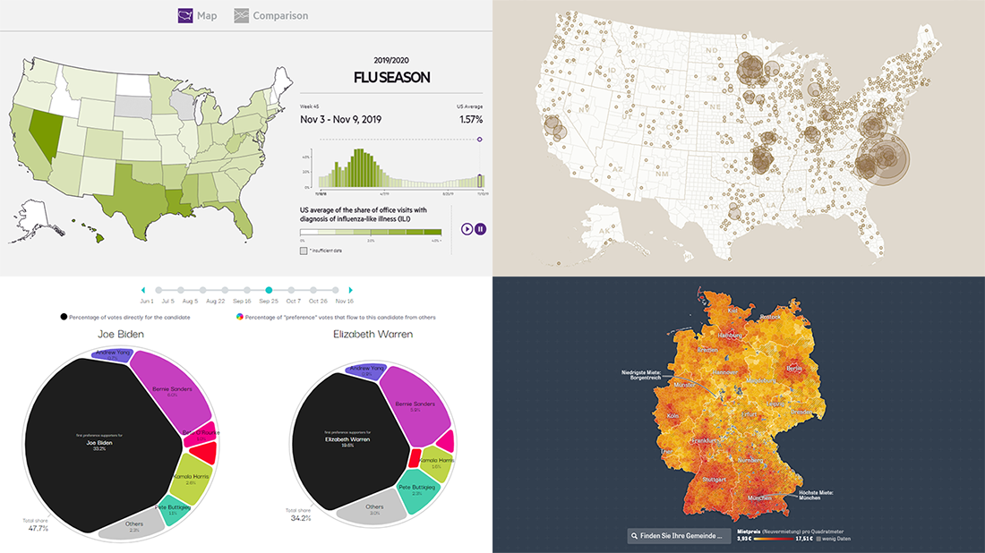 Hardly a day goes by without new visualizations appearing around the internet, providing insight into data about various things, big and small. Every week, we curate some of the most interesting ones to meet you with them within the framework of our regular DataViz Weekly feature. Enjoy and get inspired by information graphics examples on the following subjects in our new selection of cool visual data projects:
- Preferential polling for the Democratic presidential primaries — Swayable
- Rent prices in Germany — Zeit Online
- Flu season in the United States — athenaInsight
- Thanksgiving harvest origins — Esri’s StoryMaps team
- Categories: Data Visualization Weekly
- No Comments »
Charting Data About Retirement Savings, Warren’s Plans, California Housing, and UK Election — DataViz Weekly
November 15th, 2019 by AnyChart Team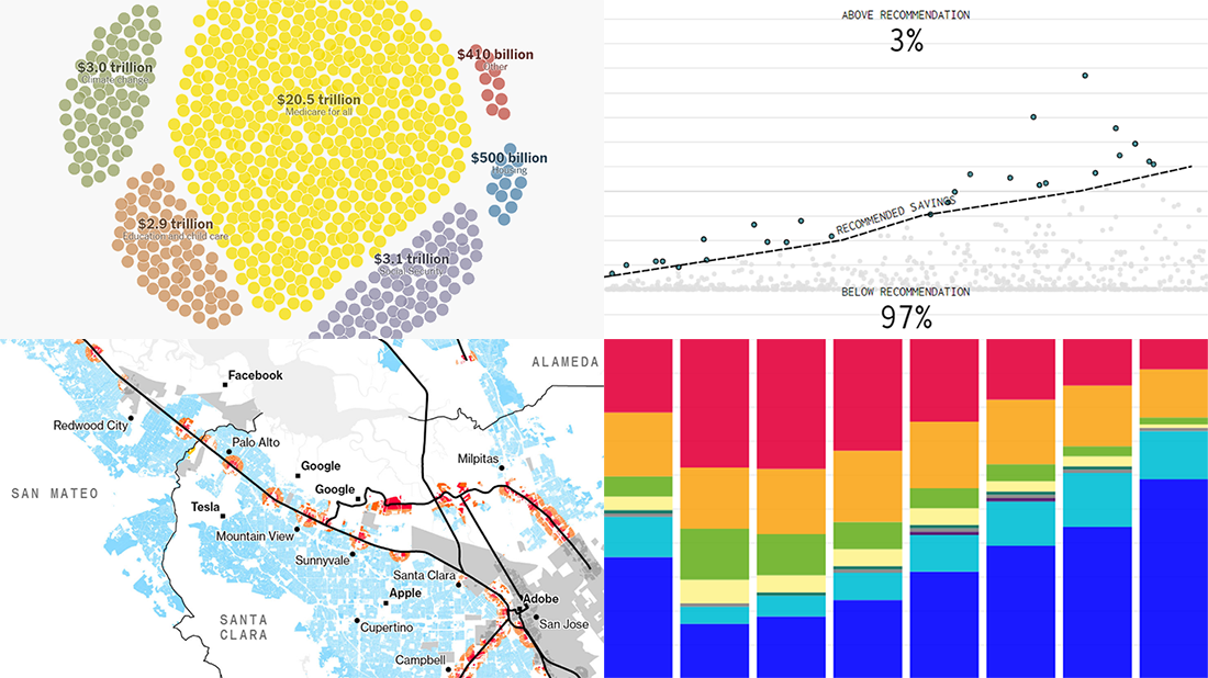 It’s Friday, which means we are ready to share with you new awesome examples of charting in action. Look how powerful the right visualization can be when one needs to explore or communicate various statistics. Here’s a quick list of the projects presented in this new DataViz Weekly post — we’ve found them out there these days:
- Saving for retirement in the United States — FlowingData
- Costs of Elizabeth Warren’s policy plans — The New York Times
- Housing crisis in California — Bloomberg
- Voting intentions before the 2019 United Kingdom general election — CNBC
- Categories: Data Visualization Weekly
- No Comments »
Visualizing Diversity and Absence in Schools, Child Mortality, and Debate Topics — DataViz Weekly
September 20th, 2019 by AnyChart Team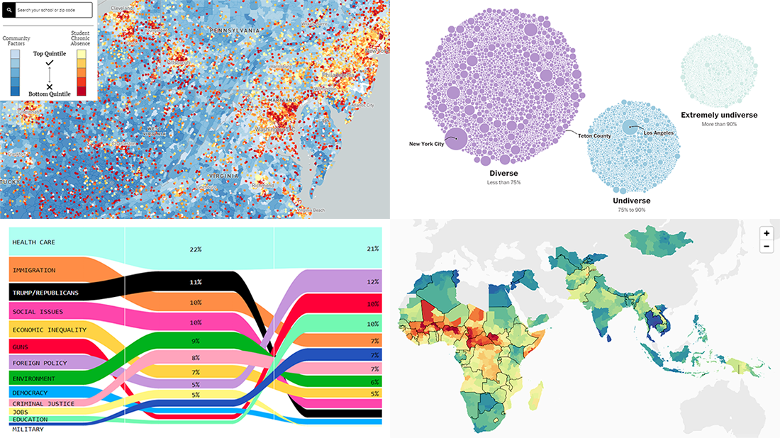 Enjoy new awesome chart examples! The following cool projects visualizing diversity and integration, presidential debate topics, and more have captured our attention this week, and we’re excited to feature them now within the framework of the DataViz Weekly series on AnyChart Blog:
- Chronic absence in U.S. schools
- Racial diversity across all America’s school districts
- Child mortality in low-to-middle-income countries
- Top issues discussed at the first three Democratic debates
- Categories: Data Visualization Weekly
- No Comments »